30 White Bathroom Ideas That Are Too Hot To Handle
An all-white palette feels fresh, bright, and clean — making it the perfect backdrop for your bathroom. Luckily, it's a classic look that doesn't seem to be going out of style anytime soon. "White is always a great option for giving a bathroom a bright, airy feel," says Jillian Hayward Schaible, principal at Susan Hayward Interiors. "Creating a spa-like feel with natural textures and materials is a great way to stay in style and keep your white bathroom trending."
The only (potential) problem for homeowners? It can run the risk of reading boring or stark (and tends to show dirt faster). For this reason, Schaible recommends adding textures or vibrant finishes for extra interest. "Choosing materials that have subtle texture or even creating playful, interesting patterns with tile are great ways to add a unique, unexpected touch to a monochromatic space," the designer says.
You also run into the issue of too many white shades to choose from. Gideon Mendelson, founder and creative director of Mendelson Group, explains there are so many variations of white, especially in tile. That's why it's important to pay attention to the undertones and how different shades of white work together. "You don't want a white counter with a blue tint next to a white tile with a pink tint," he says
With the right tools, you can create a retreat that effortlessly bridges the gap between stark and inviting. Need a little visual inspiration? Take a peek at these beguiling bathroom decorating ideas.
30 Refreshing White Bathroom Design Ideas
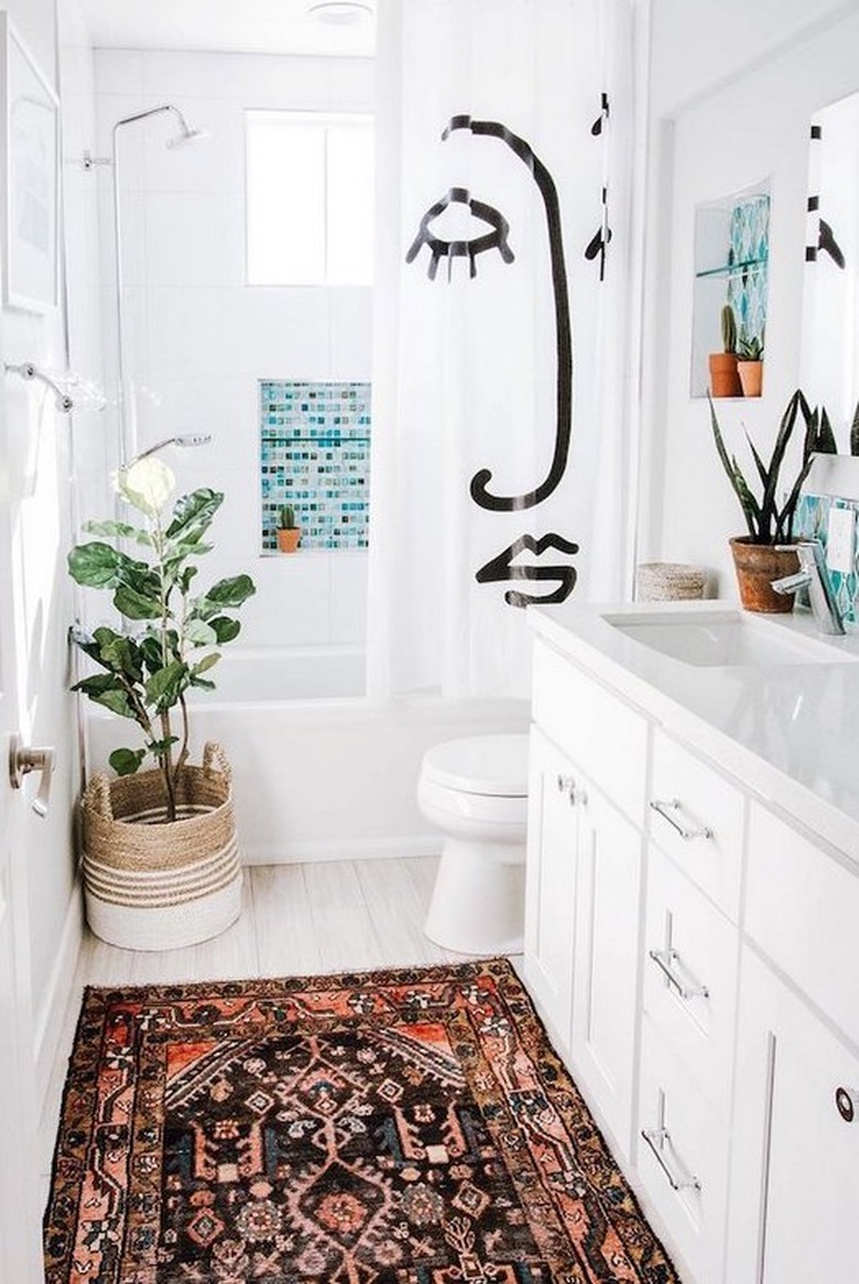
1. Bring in a bit of whimsy.
An all-white space is literally a blank canvas. Inject personality like Anita Yokota did in this bathroom with whimsical accents such as a shower curtain showcasing a hand-drawn face, an area rug, and verdant plants.
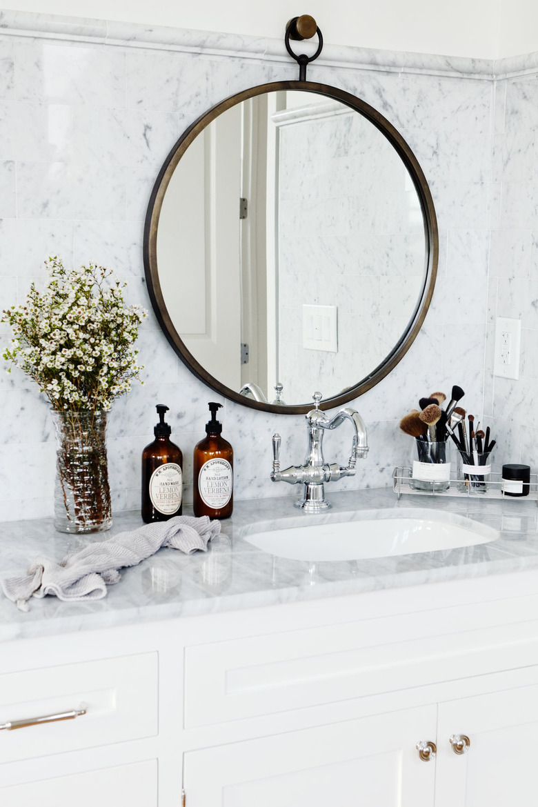
2. Make marble the focus.
Marble is sleek, sophisticated, and super luxurious. And it doesn't hurt that this natural stone brings with it an impressive amount of depth and dimension. If you have the budget, go all-in and use it on the walls as well as the countertop like Hannah Phillips-Kaplan, the founder of Repeat+World, did in this white bathroom.
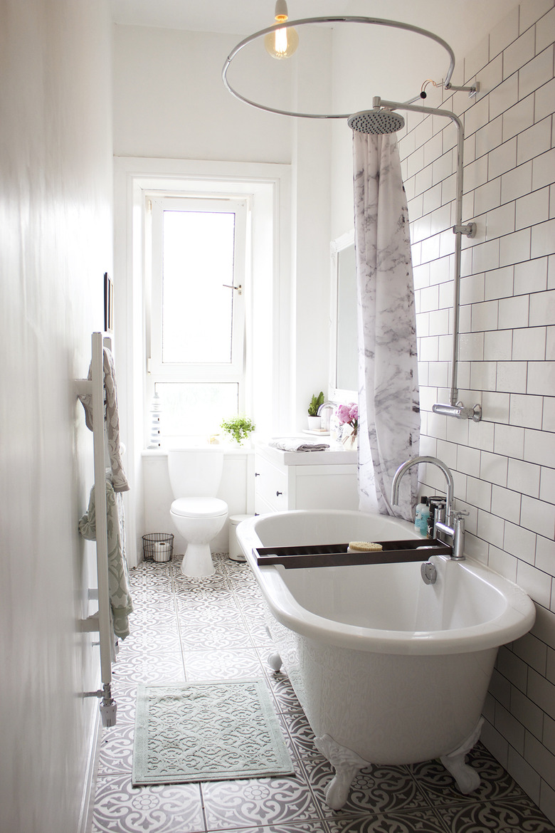
3. Consider a clawfoot tub.
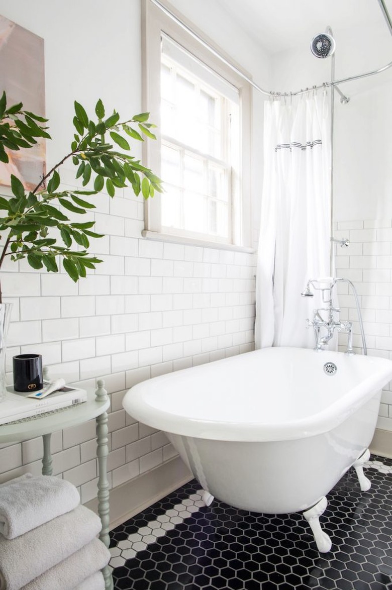
With its ceramic tile and thoughtful decor, this bathroom belonging to Kate Spiers of Kate La Vie strikes the balance between contemporary comfort and vintage romance. Of course, the gorgeous clawfoot bathtub is the star.
4. Keep it simple.
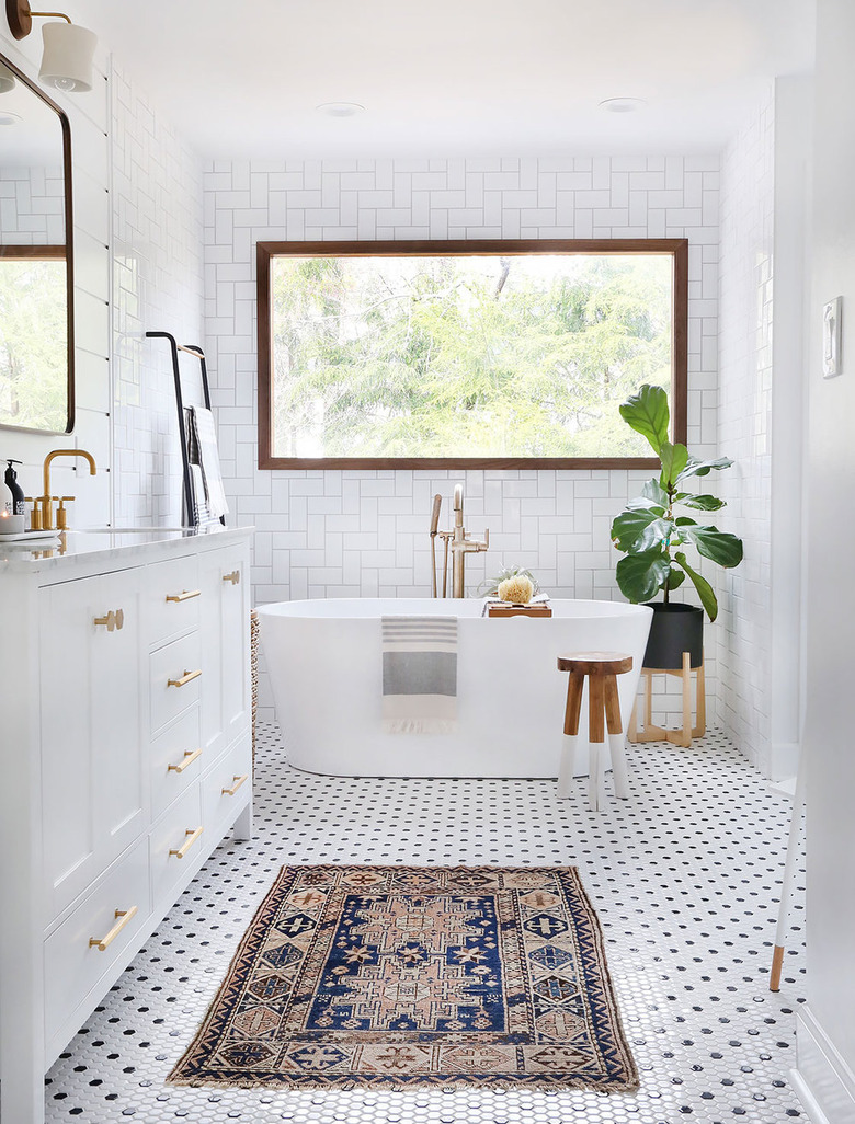
Black and white mosaic floor tile and on-trend brass cabinet hardware provide eye-popping contrast to the snowy scheme in this sparsely adorned oasis belonging to Erin from Sunny Circle Studio. It's quite striking. Don't ya think?
5. Try out an eye-catching pattern.
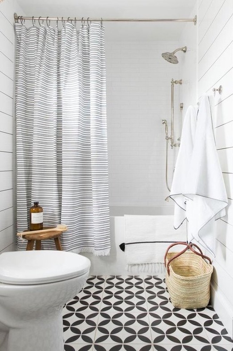
If your bathroom is small, investing in a bold floor tile is a great way to break up the monotony without overpowering the rest of the space. And did you notice how Shea from Studio McGee used the striped shower curtain to play off the linear quality of the shiplap walls?
6. Introduce tranquil tones.
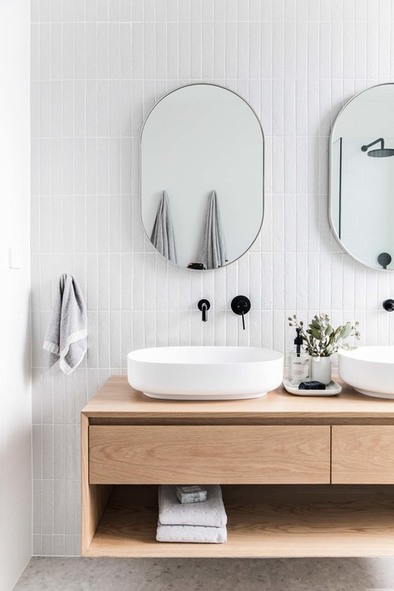
A pop of color, such as black wall-mounted faucets, can go a long way in a monochrome bathroom. In this spa-like sanctuary, designed by the team over at The Stables, the soothing light wood finish of the floating vanity reinforces the serene vibe.
7. Mix and match bathroom tile.
The last thing you want is for your design to fall flat. Create a multidimensional wow factor with a mix of tiles. In this white bathroom idea, subway and hexagonal tile are an absolutely dazzling duo.
8. Consider terra cotta tile.
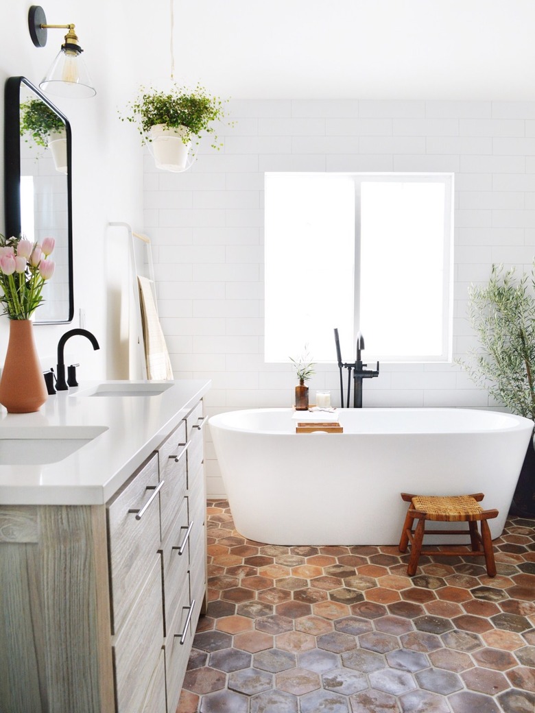
Clean and minimal but far from austere, this bathroom belonging to interior designer Kristin Dion highlights an array of warm textures. From the hexagonal terra cotta flooring to the shiplap walls, distressed wood vanity, and lush foliage, this white bathroom idea is far from boring.
9. Switch out the hardware and fixtures.
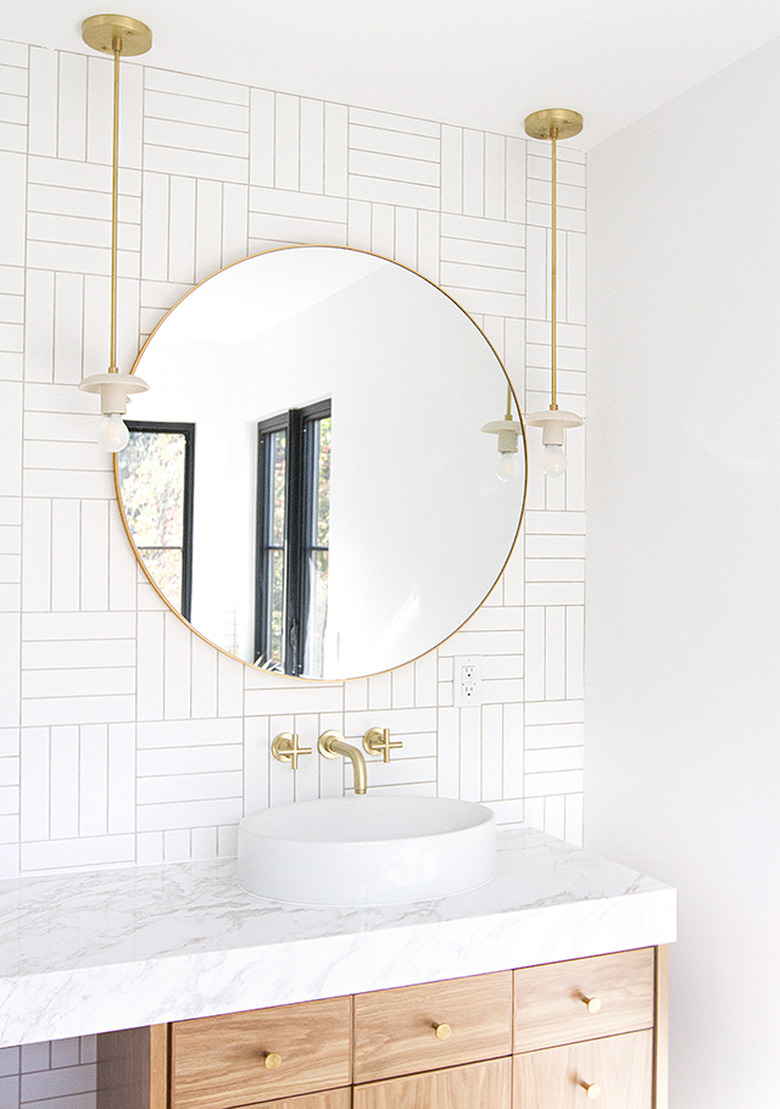
Kick drab to the curb. For a rental-friendly update, swap out your existing hardware for something slightly more interesting. Sarah Sherman Samuel gave this bathroom a dazzling upgrade with brass hardware and fixtures.
10. Opt for blue flooring.
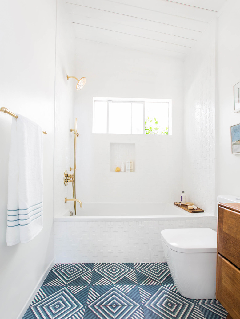
Take a cue from Emily Henderson and add a dynamic pop of color by installing patterned blue floor tile. We're loving the way it offsets the crisp white, well, everything and adds subtle coastal flair. The edited approach to decor and materials is also worth noting.
11. Embrace unique architecture.
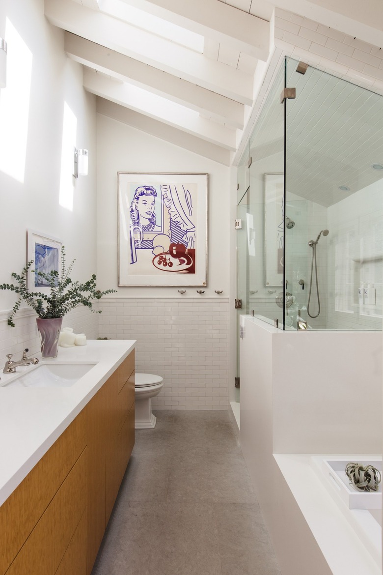
In this 1920s-era pool house bathroom, the architecture is the star of the show. The sloped ceiling with exposed beams and skylights provide intriguing angles while the retro artwork adds charming personality. The luxurious walk-in shower doesn't hurt either.
12. Invest in eye-catching artwork.
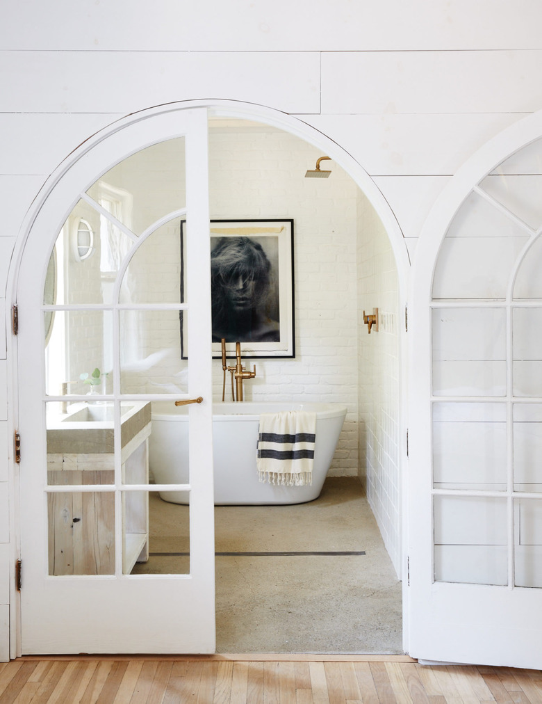
We're pretty much obsessed with this white farmhouse bathroom with concrete floors designed by Leanne Ford. The striking black-and-white work of art provides a beautiful backdrop for the modern bathtub-shower combo. And can we talk about those arched French doors? Swoon.
13. Bring in fresh flowers.
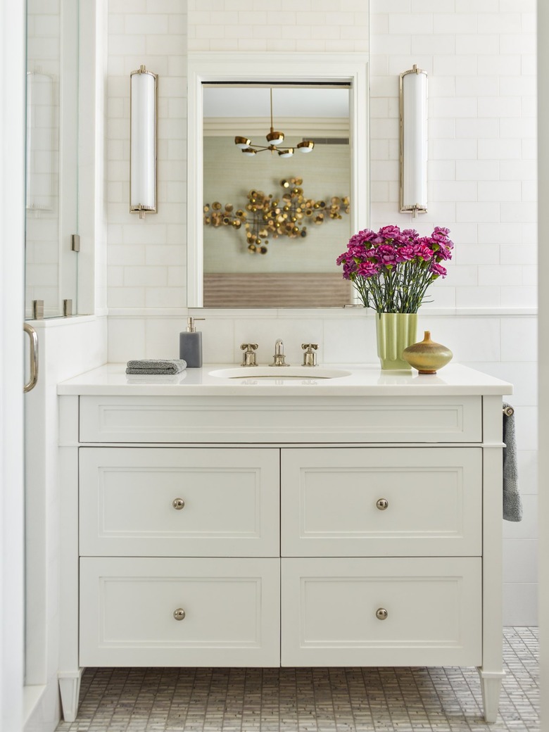
Fresh florals can add that necessary pop of color to any all-white space, as demonstrated in this setup from the Mendelson Group. The bright pink carnations are great for the spring, but can easily be swapped out with darker hues for the fall season. Plus, the golden vase matches the hardware perfectly.
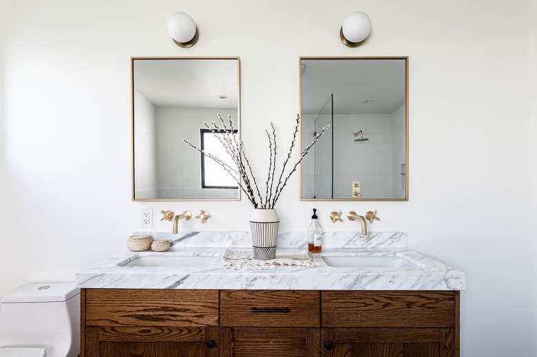
14. Welcome a dark wood vanity cabinet.
Wood finishes are a great way to add warmth and color to a space without actually adding color. For example, in this modern white setup, the dark wood bathroom vanity cabinet anchors the airy design and complements the lustrous brass fixtures. The gray and white marble counter completes the luxurious scene.
15. Focus on fabrication.
Bringing in one key material like marble and using it throughout the bathroom will add an understated elegance and cohesive quality to your space. Marble in particular enables you to play with the concentration and direction of the veining. In this Canadian home's bath, designer Jaclyn Peters employs the tactic beautifully — varying the tub surround and floor tile. How's that for tying things together?
16. Mix in different shapes.
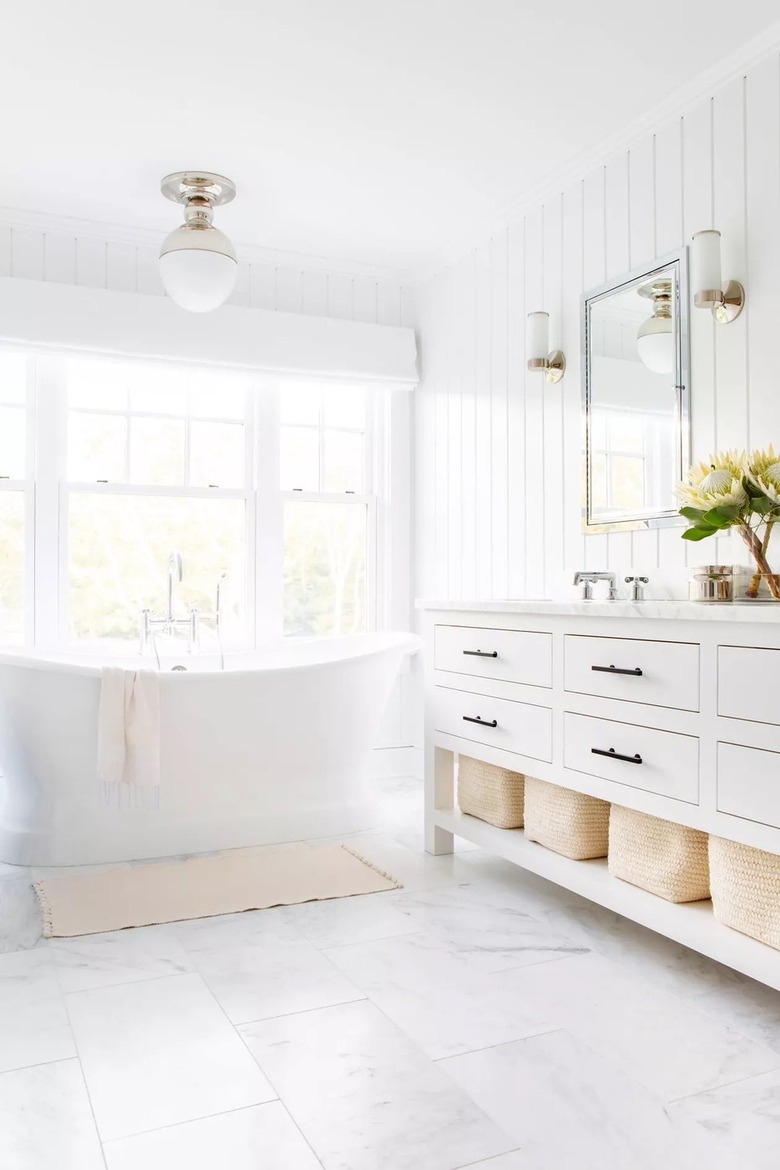
In this white bathroom, the team over at the Brooklyn-based design firm Chango & Co. balanced the sharp lines used throughout the space — the vertical tongue and groove wall paneling, square floor tile, windowpanes, vanity cabinet, and woven storage baskets — with a couple of key pieces. The curved silhouettes of the freestanding tub and the ceiling light above are an unexpected but welcome visual treat.
17. Let the light in.
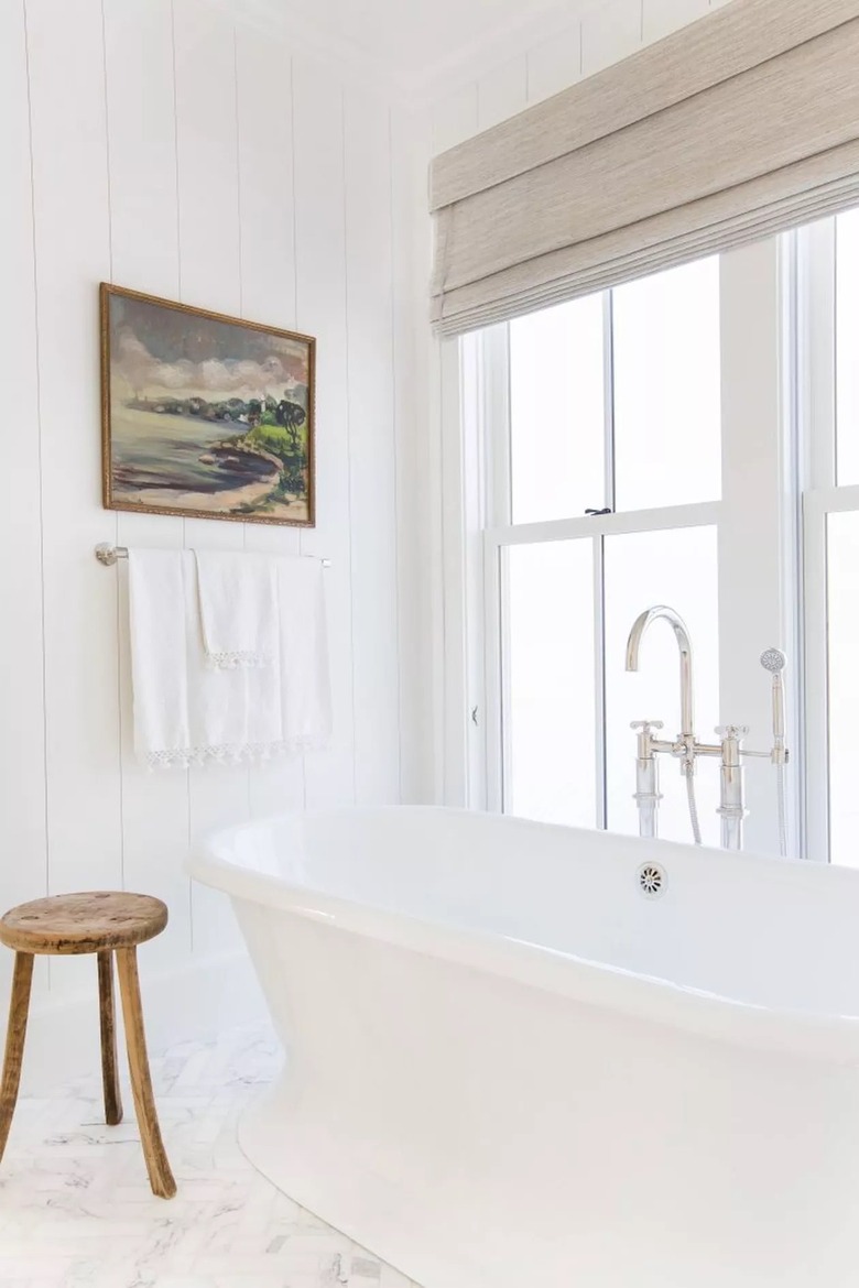
California-based designer Amber Lewis knows how to play with light, especially when it comes to an all-white palette. For this project, stark wood wall paneling and hints of marble are enhanced by the natural light streaming in through the window alongside the freestanding tub. Minimalist touches like a wooden stool, Roman shade, and beach-inspired artwork round out the look.
18. Work with symmetry
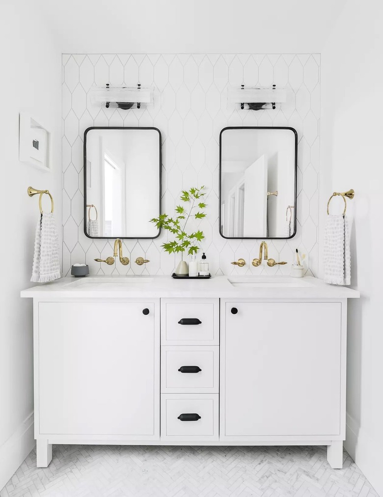
This symmetrical bathroom layout styled by Emily Henderson Design boasts a pair of mirrors above the double vanity that make the space feel more expansive than it really is. And since more is always better, we're also loving the way that the shimmering gold fixtures seemingly multiply in the reflection.
19. Draw the eye up.
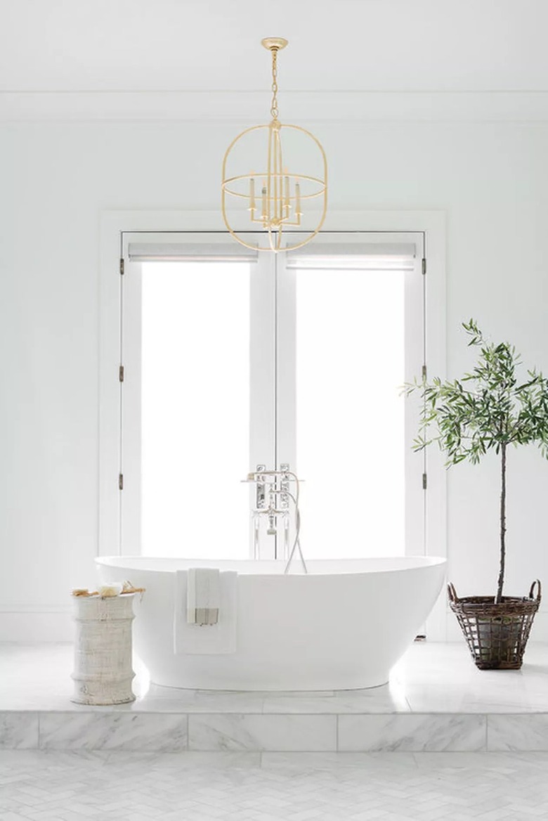
A gilded light fixture will immediately catch the attention of anyone who walks into a white bathroom — especially when it sits above a sculptural freestanding tub that is framed by a pair of French doors. Plus, it's easy to create a focal point when the rest of the space is in the same hue, as evidenced by this project from Studio McGee. The open pendant light design works perfectly because the white wall still has the ability to peek through.
20. Try splashes of neutral.
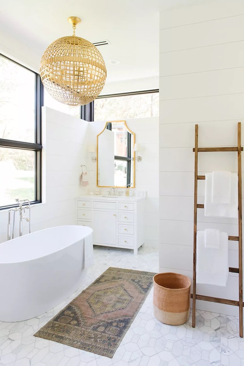
If this white bathroom idea had one rule, it would be that neutrals should stick together. The team over at Studio McGee made sure this space wasn't matchy-matchy, instead that it blended together in perfect harmony. Thanks in part to a smattering of rattan and wood accents that add rustic flair to an otherwise stark space.
21. Play up traditional details.
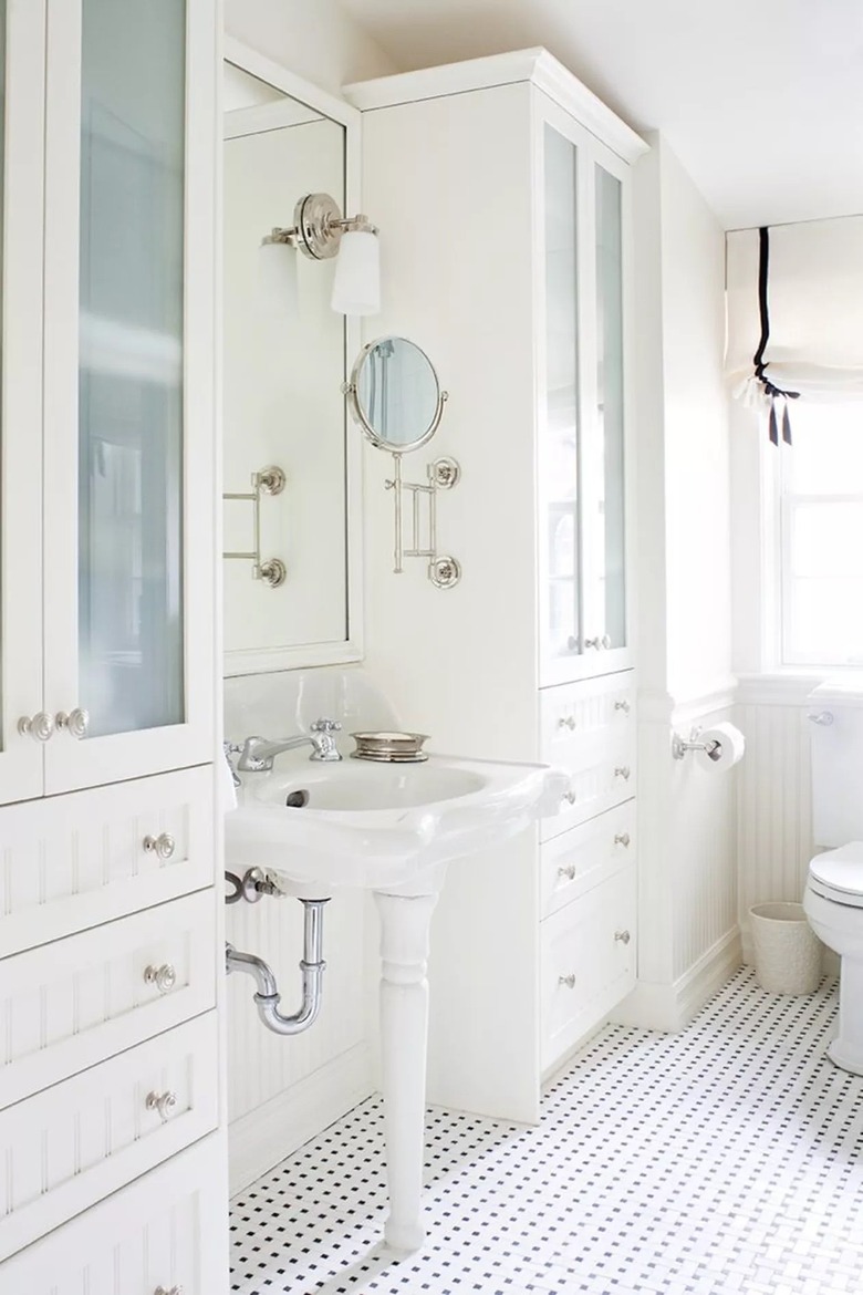
It's true that all-white bathrooms have a connotation that they should be sleek and modern. And while many are, it doesn't mean that antique pieces can't also mesh. Take, for example, the gorgeous 100-year-old pedestal sink that designer Anne Hepfer kept in this setup. Thanks to the small mosaic floor tile and built-in cabinets on either side, the sink is able to take center stage.
22. Have a little fun with wallpaper.
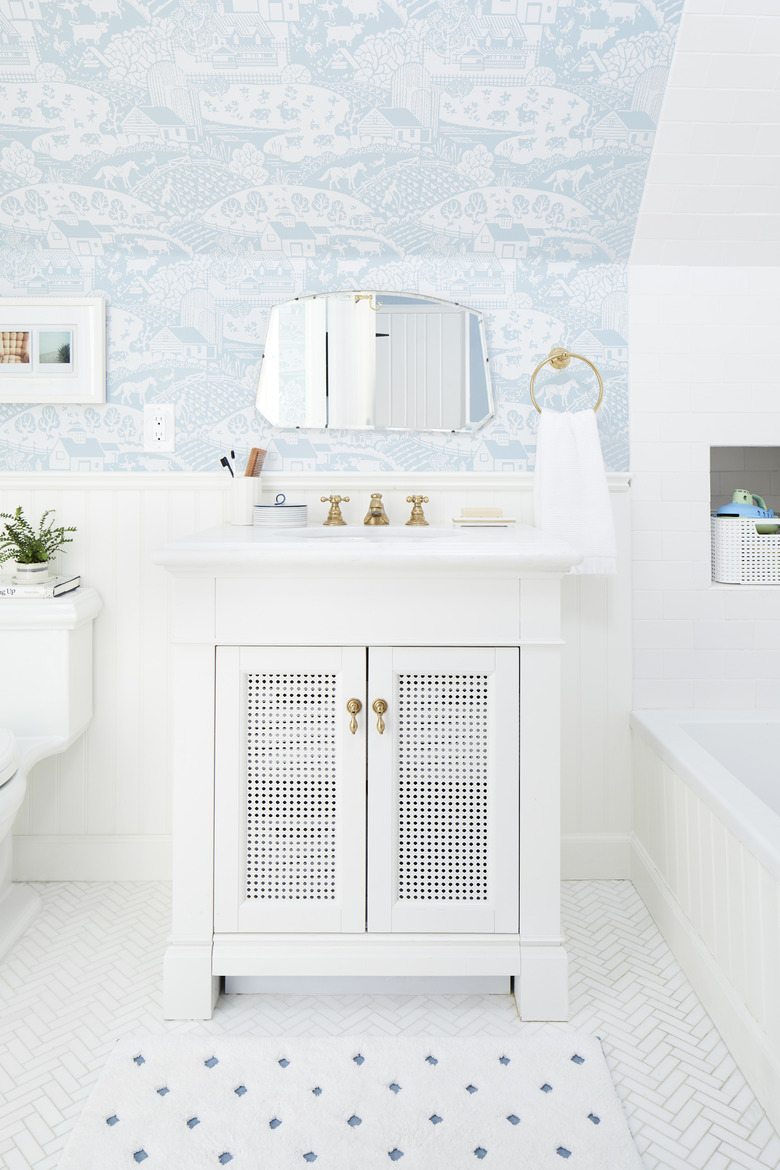
You know the notion that white bathroom ideas are boring? Throw it out of the window this instant. A sleek backdrop made up of white, vertical tongue and groove wainscoting and white wall tile, allows whimsical pale-blue patterned wallpaper to pop in this Emily Henderson-designed bath. Pro tip: Select a print that includes white as an accent color, so it fits in with the overall aesthetic.
23. Introduce contrast.
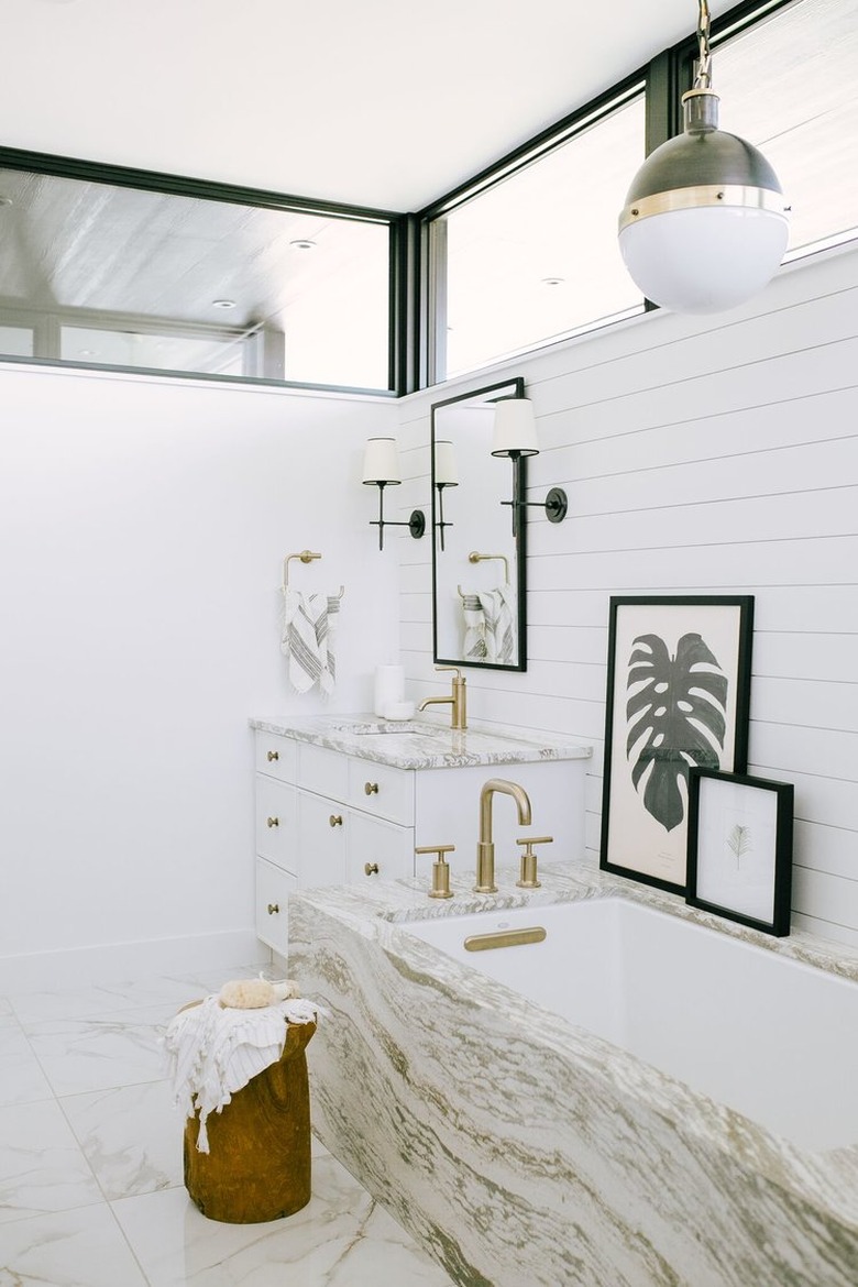
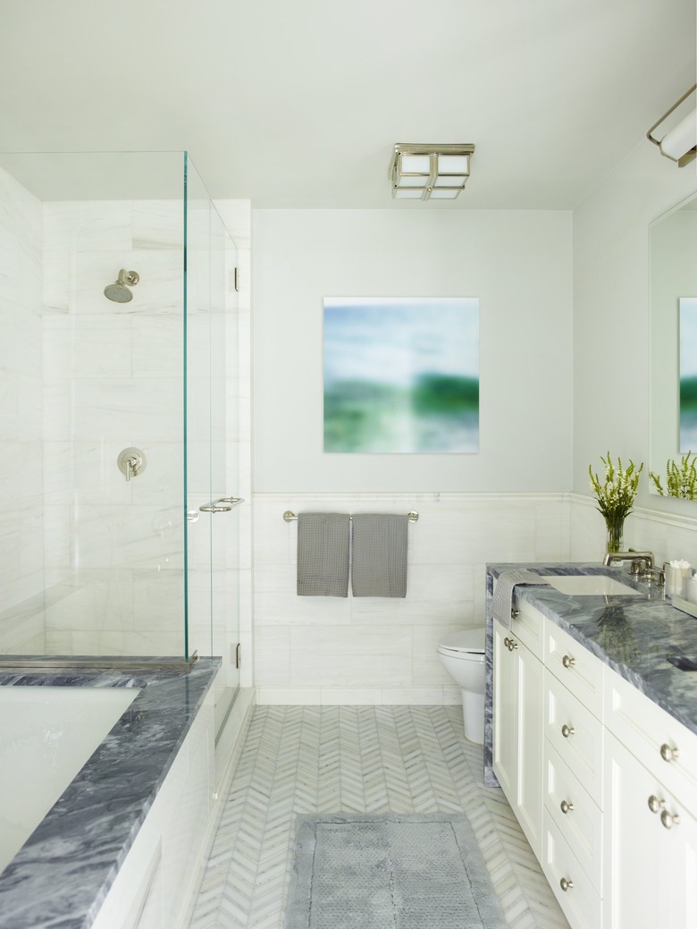
The dark marble countertop and matching bathtub edge provide the perfect pop against the white walls and chevron tile bathroom floor. Designers from the Mendelson Group also went with seamless hardware and fixtures to pull it all together. Just make sure the undertones won't clash before you add a contrasting color.
24. Invest in a frameless glass shower divider.
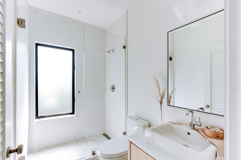
One of the benefits of a white bathroom is that the light and airy scheme can make your space look and feel bigger than it really is — which is especially helpful if you're working with a tiny floor plan. Another way to visually open up your space even further is to swap the curtain or bulky shower door for a frameless glass screen, like the one used in this minimal setup. The subtle design feature is functional without interrupting the view.
25. Limit yourself to a few pieces of decor.
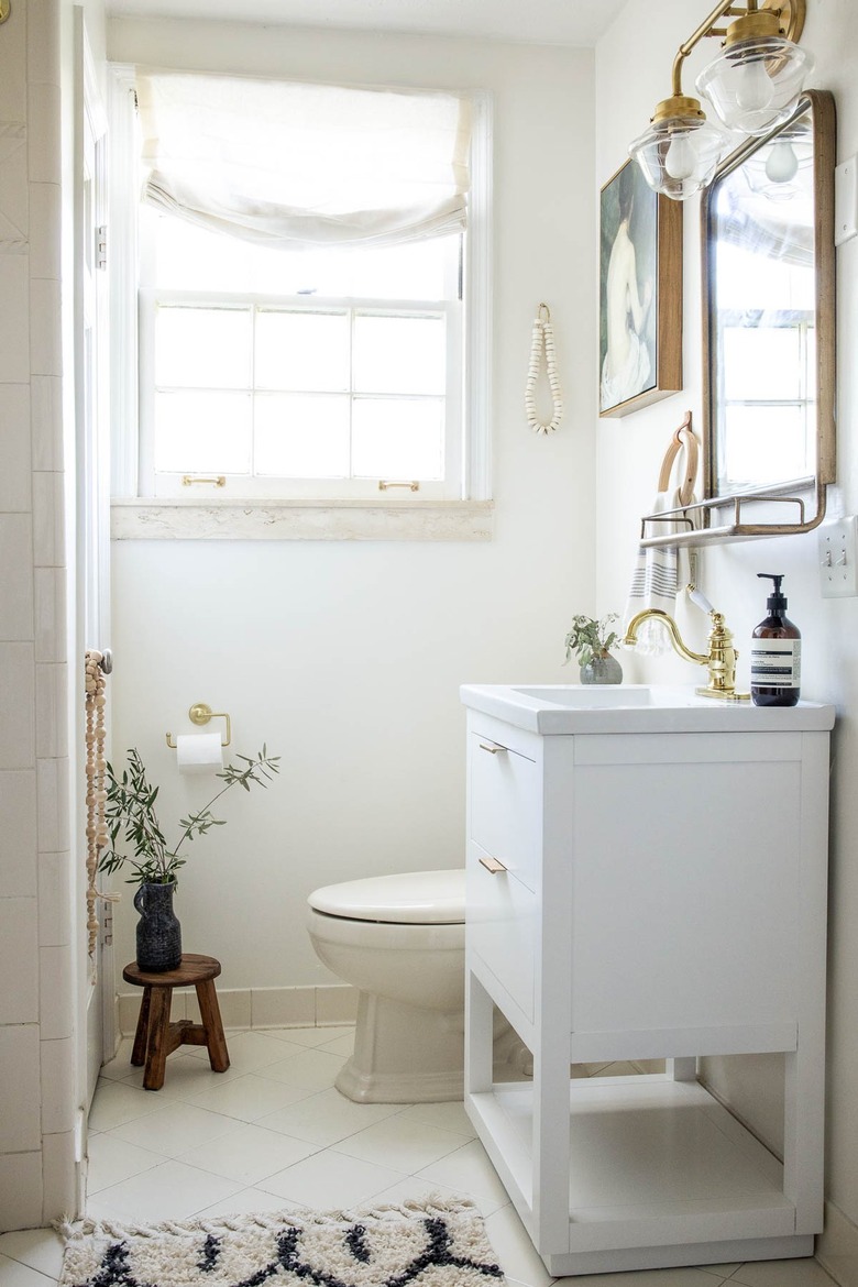
As we mentioned, using an all-white palette in tight quarters can make your space feel bigger and brighter. However, if you fill your small bathroom with an overabundance of home decor, it won't really matter what color you use. Follow the lead of this setup and limit yourself to a few thoughtful accents such as an old-school light fixture, a small wooden stool, bath rug, wall decor, and a flourish of greenery.
26. Consider a black-and-white scheme.
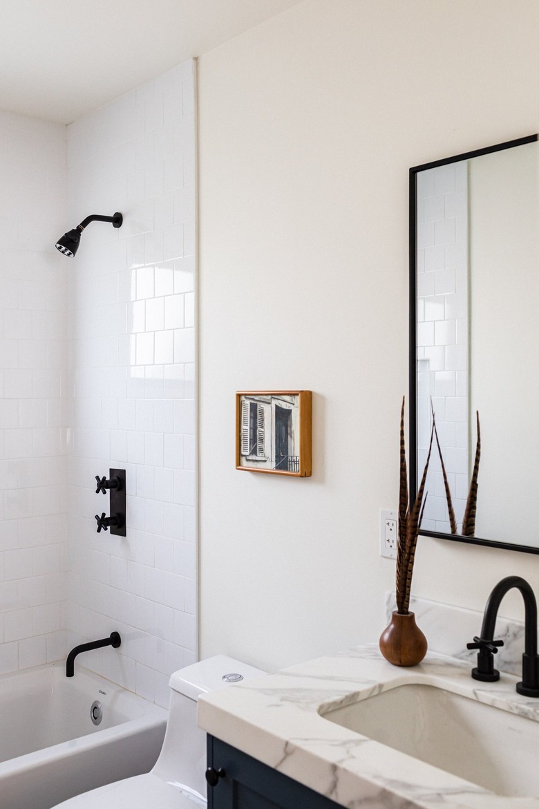
Break up an all-white color scheme by adding some matte black accents to the mix. Unlike gold and copper, the fixtures in this bathroom add a bit of an edge. And if you really want to complete your black-and-white palette, throw in an ebony vanity, to boot.
27. Splurge on a soaking tub.
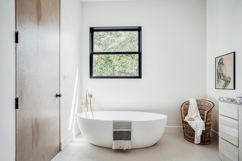
A big, white freestanding tub is the ultimate focal point in any bathroom, and this one is no exception. The minimal decor — including a woven accent chair and artwork hanging on the wall — allows the design feature to take center stage.
28. Warm things up with peach floor tile.
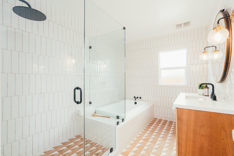
Patterned tile flaunting a pop of color is an especially sweet way to mix up an all-white space. For instance, the white and peach flooring in this bathroom adds loads of visual interest that keeps the space from feeling too stark. And if you look closely you can spot the peach-colored grout used on the tile walls, which is a fun detail that ties the whole look together.
29. Make the most of white subway tile.
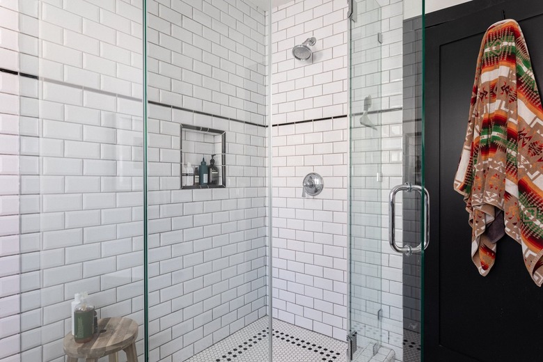
Hear us out: Subway tile may feel overdone but there are definitely ways to spice it up in the bathroom. Here, thin black accent tile breaks up the sea of white in the shower and coordinates with the black and white mosaic tile floor.
30. Showcase your artistic side with mosaic tile.
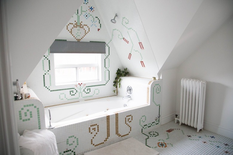
If you really want to get creative in your all-white bathroom design, you can't go wrong with mosaic tile. For instance, this unique setup showcases an interesting floral tile design that continues from the floor up to the tub, onto the wall, and even part of the ceiling, resulting in an intricate mural. You can always opt for something a little less whimsical or limit the artistic display to only one accent wall or the floor — the choice is yours.
