A Copenhagen Hotel Designed By A Former Ballet Dancer Is Dang Elegant
Welcome to Scandi-land, our celebration of the magic that is Scandinavian design. All week, we'll be bringing you tours, features, and shopping guides that dive deep into what makes Nordic design so covetable. Want more to read? Check here.
When former Royal Danish Ballet principal dancer Alexander Kolpin sought to open a hotel in Copenhagen's city center, he didn't want to rely solely on what travelers might envision when they think "Danish design." "There was a distinct intention to shy away from the latest trends," explains Kolpin, who opened Hotel Sanders with help from London interior design team Lind + Almond in 2017. Tucked into an Art Nouveau building that dates back to 1869, the 54-room stay reflects a variety of design influences: old world, modernist, and yes, some Scandinavian thrown in.
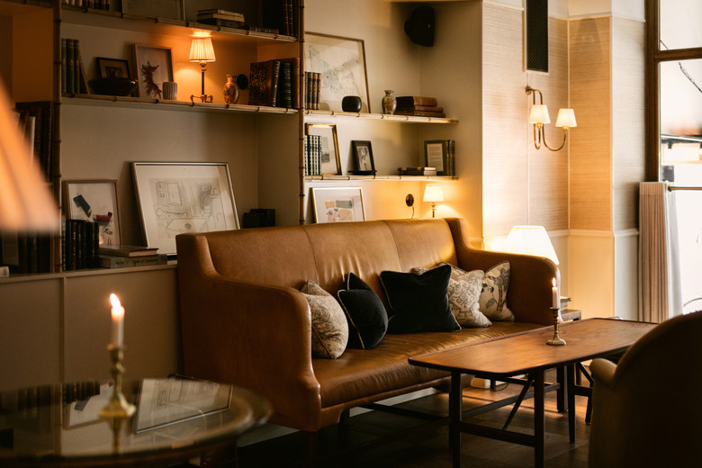
Earth tones mingle with bold hues and natural materials like timber and stone in a minimalist environment that feels timeless. There's a heavy play on textures, with areas defined by a mix of materials like velvet, rattan, and leather. Darker and neutral tones, combined with strategically soft lighting, crafts an atmosphere that is cozy, yet stately. (Speaking of light fixtures, there are real gems to be found here, like a vintage 1940s chandelier designed by Carlo Scarpa — scored from a Zurich bank, and crafted with glass cut in Murano — that hangs above the reception desk.)
"The design is inspired by personal experience and travels," says Kolpin, "bringing a refined aesthetic sensibility and ideology to the property, which is deeply rooted in my creative history."
1. Exterior
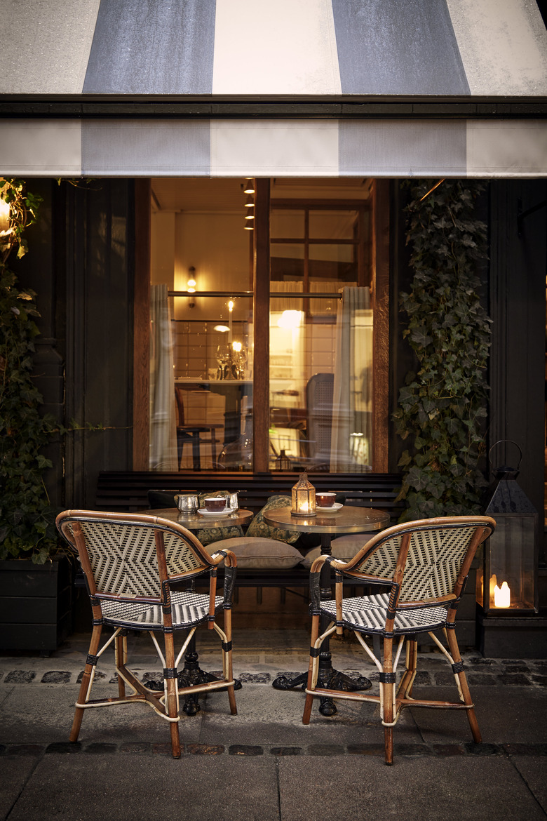
"The exterior is very Scandinavian," explains Kolpin, "though as with all our projects, we renovated it to have a modern and elegant twist whilst preserving its original qualities." (His family also owns Helenekilde Badehotel and Tisvildeleje Strandhotel.)
2. Lobby
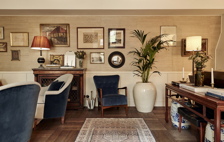
The lobby is affectionately dubbed the "Living Room" and that's purely intentional: Behind the sideboard are shelves of books and framed art, a fireplace, and conversation-style seating, making the area feel more like a home than a hotel.
3. Rooftop Terrace
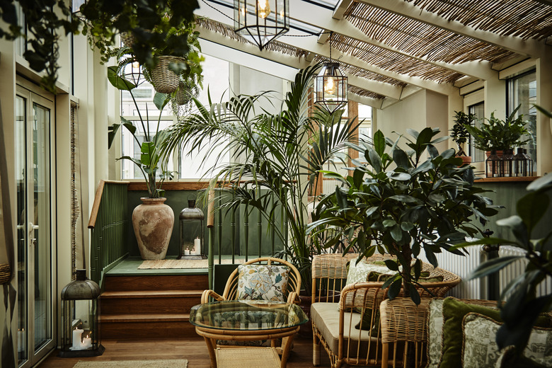
The glass-enclosed rooftop terrace is an oasis year-round, with midcentury-style rattan and bamboo furnishings. By surrounding the space with greenery — as well as touches of green in upholstery and paint trim — there's a constant reminder of warmer months, a nod to casual backyard gatherings.
4. Guest Room
"Coupé" and "Coupé+" rooms (like this one photographed here), designed for single guests, are inspired by train travel (read: small and cute). Lampshades in all rooms are from A Shade Above.
5. Suite
Above each bed is a grouping of frames, which might include works by Mat Chivers, Kirsty Buchanan, or Elke Sada. Some bedrooms feature elegant clawfoot tubs.
6. Bath
"Classic" and "timeless" were two key words that drove the design of each bathroom, with gold finishes on the mirror, sconces, and vintage-looking floor tile.
7. Sanders Kitchen
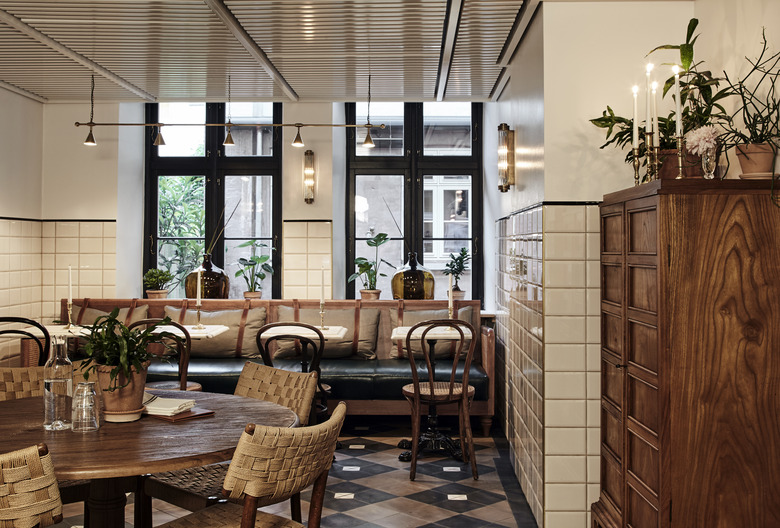
In Sanders Kitchen, the hotel's all-day dining venue: classic bentwood bistro chairs, home-y details like a dresser with cubbyhole drawers, and tile-heavy floors and walls.
8. Tata
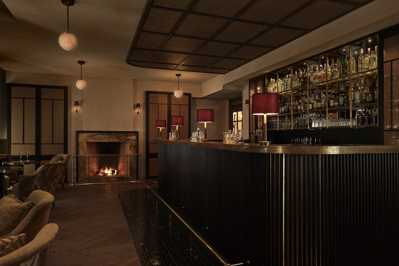
Red velvet curtains and lampshades at Tata, the hotel bar, are a nod to Kolpin's theatre background as well as the neighboring Danish Royal Theatre. Fontanili marble was used for the fireplace surround and Les Ateliers Zelij's floor tiles are around the bar.
