A Family Home In An Oslo Suburb Is Super Modern, Yet Somehow Still Cozy
Welcome to Scandi-land, our week-long celebration of Scandinavian design. To read more, click here.
Before architectural firm Austigard Arkitektur began renovations on a family home in an Oslo suburb, they had to first develop a plan to supply more balance to its interior. "Our biggest challenge was how to create an open space that leaves room for private zones for family members to withdraw to. It's the balance between being alone and being together," says architect Tor O. Austigard who, together with architect Mira Wolden, redesigned the three-bedroom house.
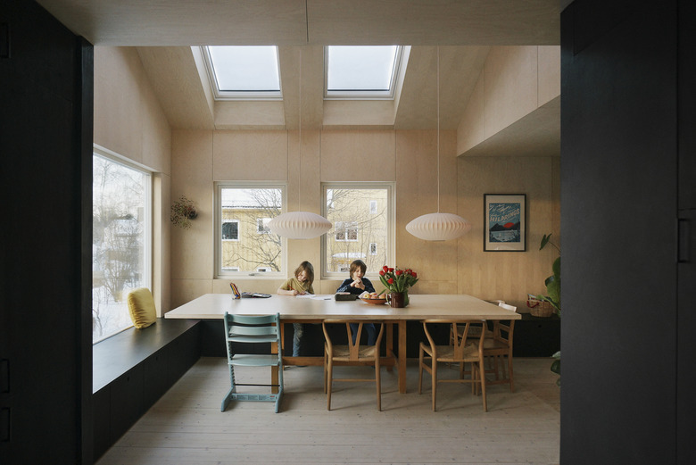
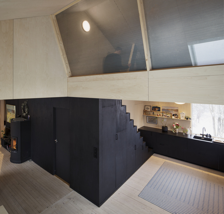
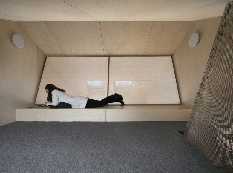
To fit the needs of the family, they created a spot for a large table that will become a focal point for gathering, while a loft-style overhang allows views of the dinner table below. More private areas, including the reading nook, are located upstairs, away from the home's social areas.
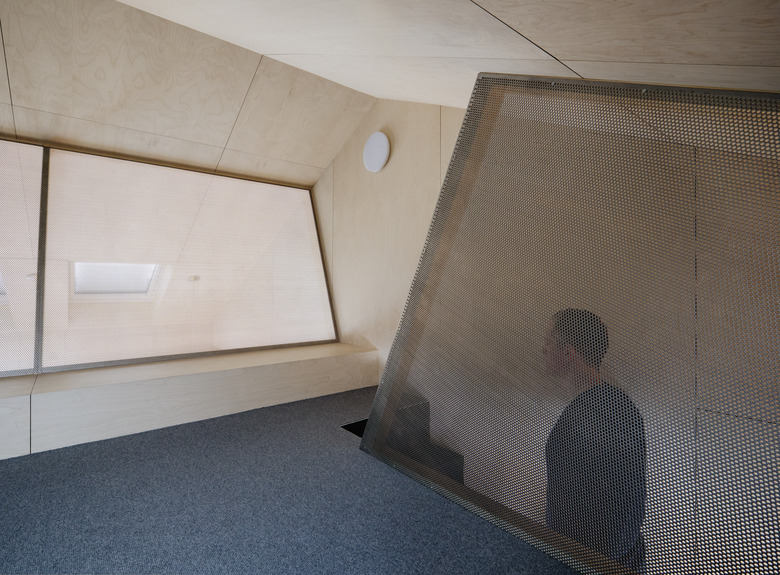
The 860-square-foot house channels plenty of Scandinavian design sensibilities — think light-toned wood and minimalist lines — and incorporates aesthetics that feel outwardly modern like extreme angles, metal mesh details, and black contrasts.
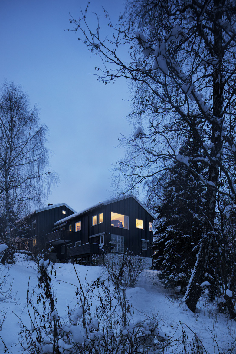
1. Exterior
Scandinavian style can differ in each country, and Norway has its own popular design components. Known for its remarkable landscapes and starry night skies, Norwegian interior design often features an emphasis on light tones and a minimalist approach to historic design elements.
2. Living Room
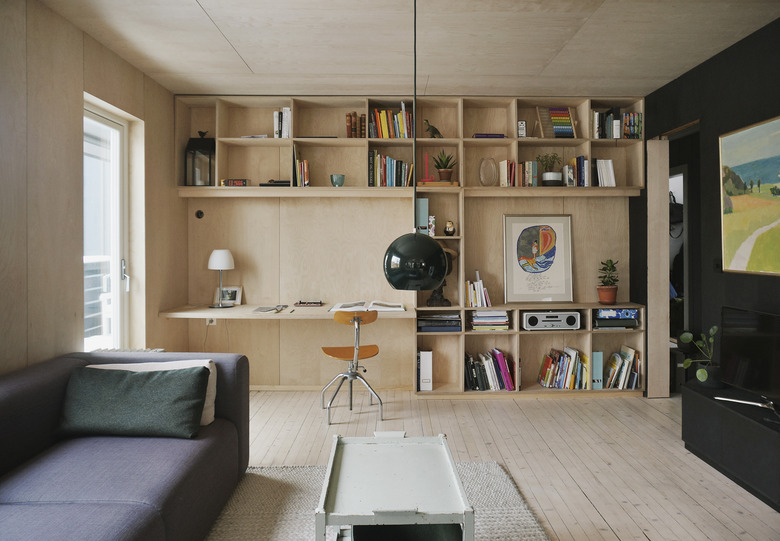
The living room features handmade floor-to-ceiling shelving created with veneer panels.
3. Dining Room
The 5-by-10-foot dining table was made from veneer panels atop an old table. For Austigard, a large table is key for a family home. "A big table allows several people to sit together, but the size means that they can form separate conversations or social situations," says Austigard.
4. Dining Room
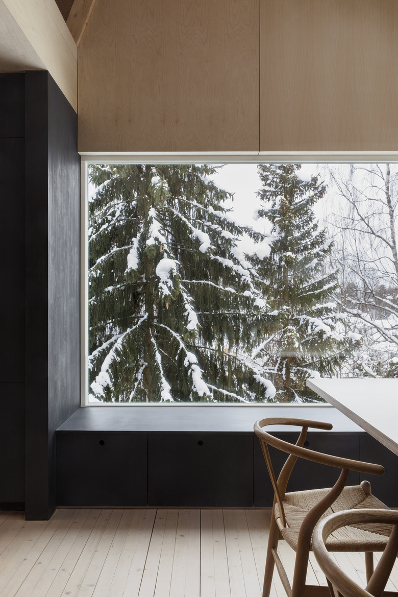
Black-painted wood built-ins and walls are a contrasting theme throughout the home, and in the dining room, it brings even more attention to the gorgeous landscape framed by the picture window.
5. Kitchen
The architectural firm redesigned IKEA kitchen cabinets using handmade external panels. To create a unique dark paint, the team mixed various black paints together, resulting in a hue that feels ultrablack.
6. Kitchen
The existing pine floors were such an essential element to the home's design that the team used the same type of wood for all of the new flooring. An existing fireplace lends coziness to the open concept living area.
7. Upstairs
The reading area is removed from the shared space below by geometric walls that create "nooks."
8. Reading Nook
Proof you don't need tons of flash or ornamentation to make kids feel welcome in a lounge area — in fact, a lack of pizazz makes it easier to concentrate on reading and homework.
9. Reading Nook
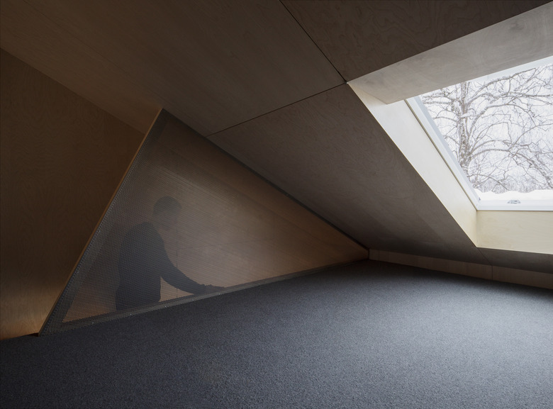
A well-positioned skylight provides the loft area with tons of natural light; at night, it can become a spot for stargazing.
