Blink: You May Not Be Aware Of It, But These 12 Design Tricks Help To Make A Home Look Polished
In Blink: The Power of Thinking Without Thinking, Malcolm Gladwell affirms what we already know: our intuition is a pretty powerful tool. We often make instant judgments or observations that, in the end, turn out to be spot-on.
What does this have to do with design? A lot, actually. Gladwell describes one experiment, where strangers and friends alike were invited into someone's dorm room, and then asked to describe that person. The strangers were actually more accurate, even though they'd never met the person — simply because we are incredibly adept at translating the visual language of someone's personal space.
How do you control what your space says about you, in the blink of an eye? In a word: styling. These expert tips can help you make sure that first impression is polished and put together, whichever way your design tastes leans.
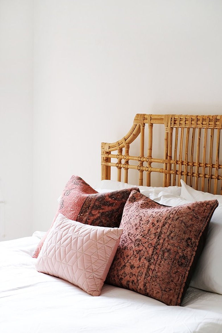
1. Add pillows.
1. Add pillows.
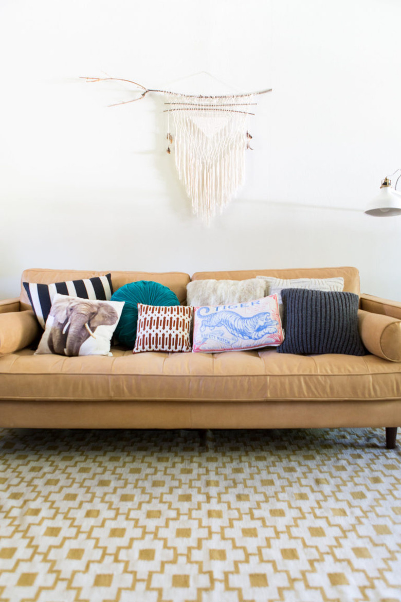
Meghan Hackett-Cassidy and Erin Hackett, of Hackett Interiors in Bronxville, New York, are big believers in the power of pillows. "Without them, it would be difficult for us to tie a scheme together because they are a key source of color and pattern," they say. "Pillows also add so much dimension to a room. They round out your furniture pieces — whether it's your bed or your living room sofa — and make it feel so inviting. They also happen to be super low maintenance and comfy!"
2. Edit relentlessly.
2. Edit relentlessly.
Kristin Gunnette, senior designer at Atelier k in Los Angeles, says, "Edit your accessories to allow the architectural details and finishes be highlighted and complementary to the furnishings. When you take the time to edit, you allow every piece to have value, weight, and focus in an interior space."
3. Remember that less is more.
3. Remember that less is more.
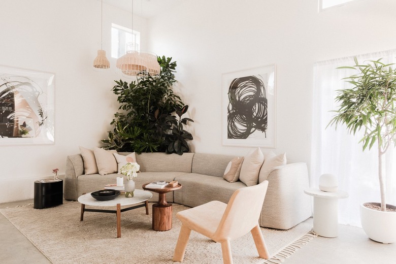
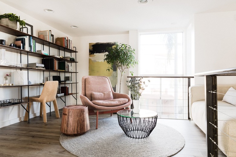
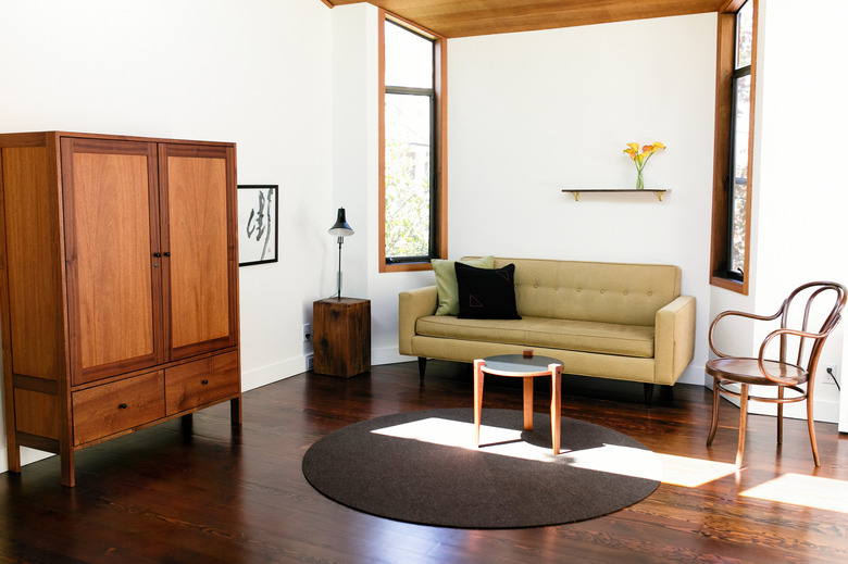
"My go-to trick for making a space look pulled together and polished is editing," says Courtney Thomas of Courtney Thomas Design, in Southern California. "The negative space on a bookshelf is as important as what fills it."
The key is to give the accessories you do want some breathing room. "Accessories can get lost and overlooked when they compete for shelf space," she adds. "Too many pillows can drown out the lines of a sofa. If you stop seeing the surface spaces in your room, consider pulling everything off and starting with a fresh slate. Discard what you don't love and put back only the items you do."
4. Pick a pattern.
4. Pick a pattern.
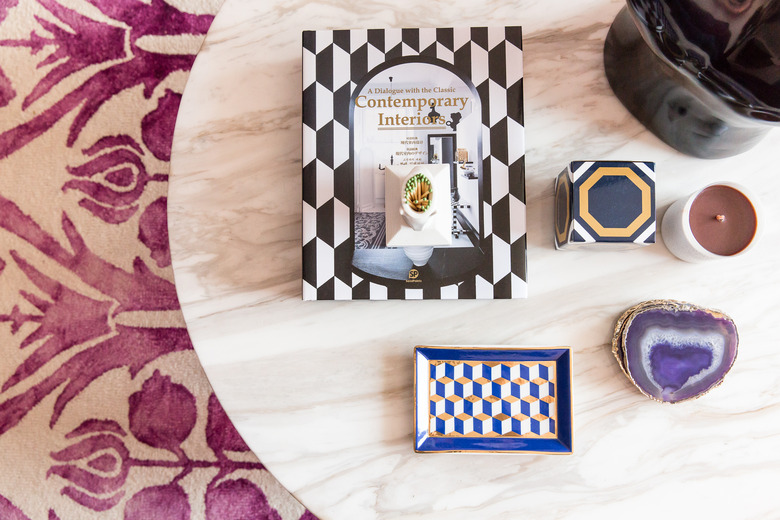
And run with it. In this image, Maureen Stevens, of Maureen Stevens Design, used consistent geometric patterns in the accessories.
5. Go big.
5. Go big.
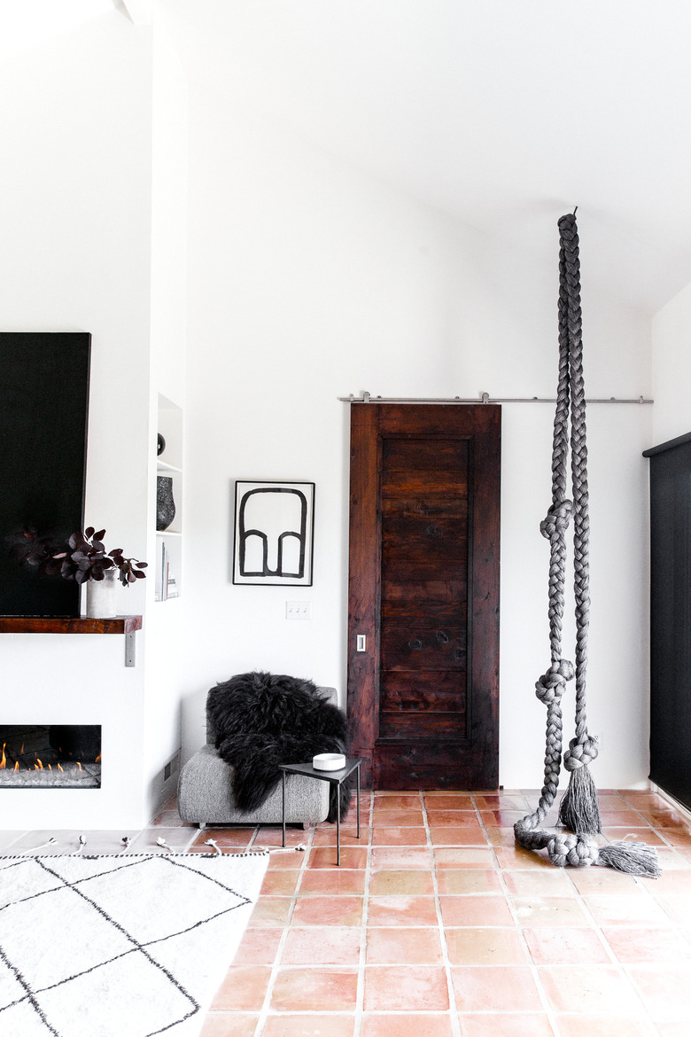
One focal point can pull an entire room together. This giant rope sculpture adds texture and a touch of drama.
6. Use a cohesive palette.
6. Use a cohesive palette.
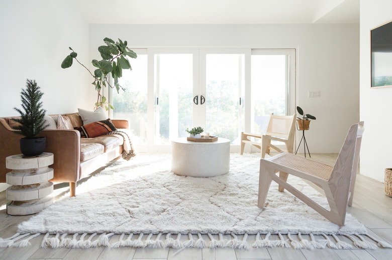
A room doesn't have to be color-blocked in order to make a statement. Here, Amber Thrane, of Dulcet Creative, thoughtfully uses pops of greens within a neutral color scheme that is consistent with the palette of her entire home.
7. Hide your stuff.
7. Hide your stuff.
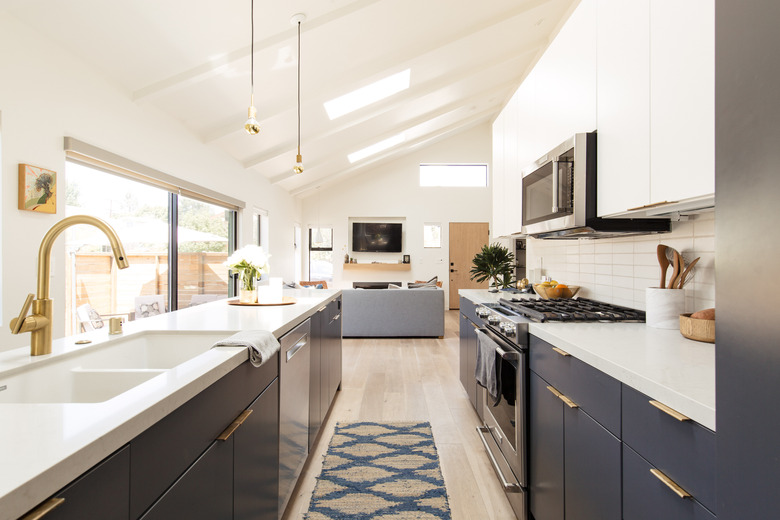
In an article penned for My Domaine, home decor editor Liz Lynch has a very straightforward kitchen styling tip: Put your things away. "If you have the room, declutter busy kitchen counters by storing your toaster, SodaStream, panini maker, rice cooker, and the like in cabinets or an oversized basket in your pantry."
8. Embrace the negative.
8. Embrace the negative.
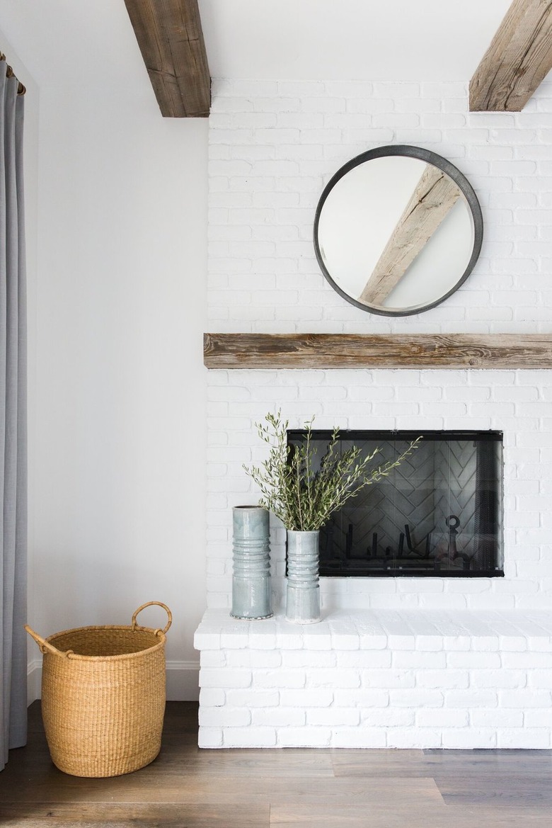
Negative space, that is. The folks at Studio McGee said on their blog that ignoring white space is an all-too-common styling mistake. "White space is crucial if you want your space to feel calm and composed. We love decor, but never aim for an explosion of accessories. If you don't give your eyes a place to rest, your hard work goes unnoticed."
9. Keep things color coded.
9. Keep things color coded.
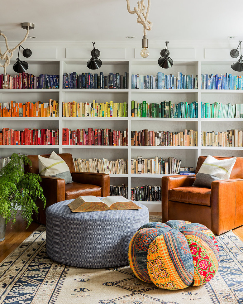
Hilary Walker, a Texas-based stylist, told Design Sponge, "Organizing your library by color can be a visually striking way to arrange objects artfully while also streamlining what can otherwise very easily look cluttered."
10. Embrace sheepskin.
10. Embrace sheepskin.
On the Decorist blog, Julia Millay Walsh says you simply can't have enough sheepskin throws. "There's nothing like a sheepskin throw gently tossed over the back of a dining chair, armchair, or sofa to make your home look like it's just been zhooshed by a professional. The best part? This versatile textile is an affordable home accent that you can pick up at countless retailers. Not to mention, it's a cozy addition to your home — you'll want one in every room!"
11. Be a little odd.
11. Be a little odd.
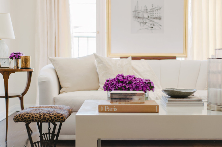
Kirsten Grove, of the blog Simply Grove and author of Simply Styling, is a master stylist. In an interview with Anne Sage, co-founder of Rue Magazine, Grove said, "I prefer styling groupings in odd numbers. Even numbers look too perfect. So instead of placing two pillows on your sofa, place three or five. Instead of displaying four ceramics on the shelf, display three. Styling is all about making something look organic and natural. It starts to become a showroom when something is too perfect. Mess it up a bit!"
12. The final word.
12. The final word.
"Let's just lay this out there: If your space isn't tidy, all of this hard work is for nothing," says Caroline Wilder in The Everygirl.
