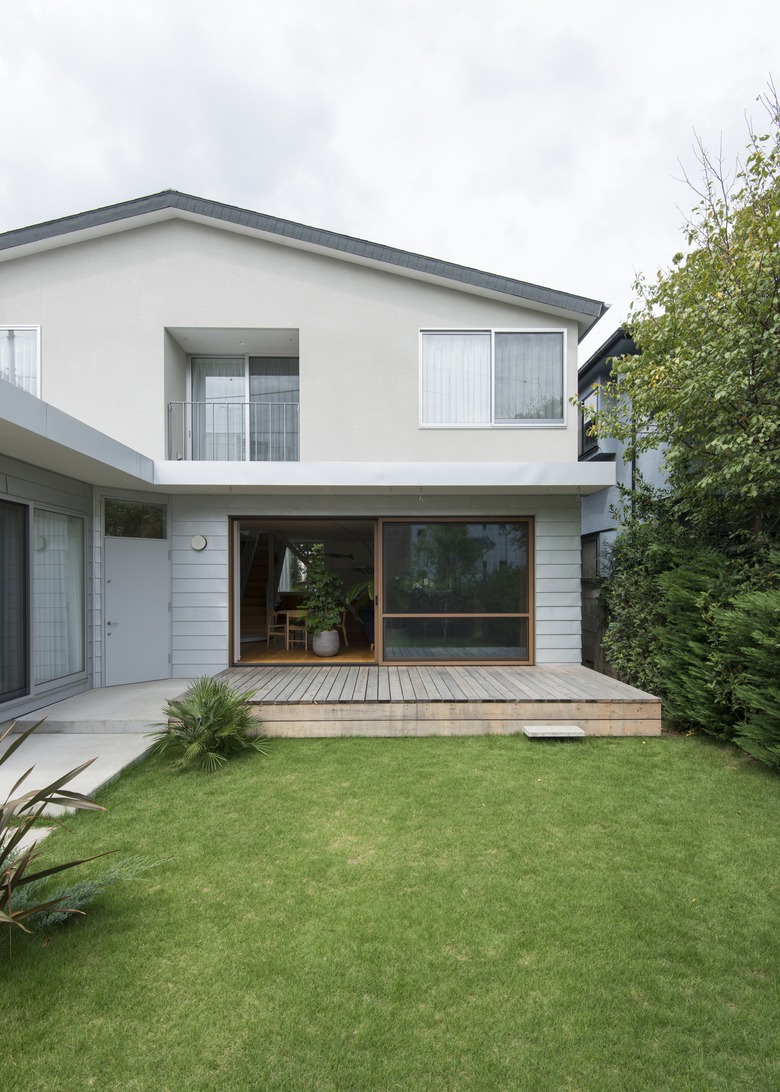
A Tokyo House Makes Linear Minimalism An Easy And Appealing Design Option
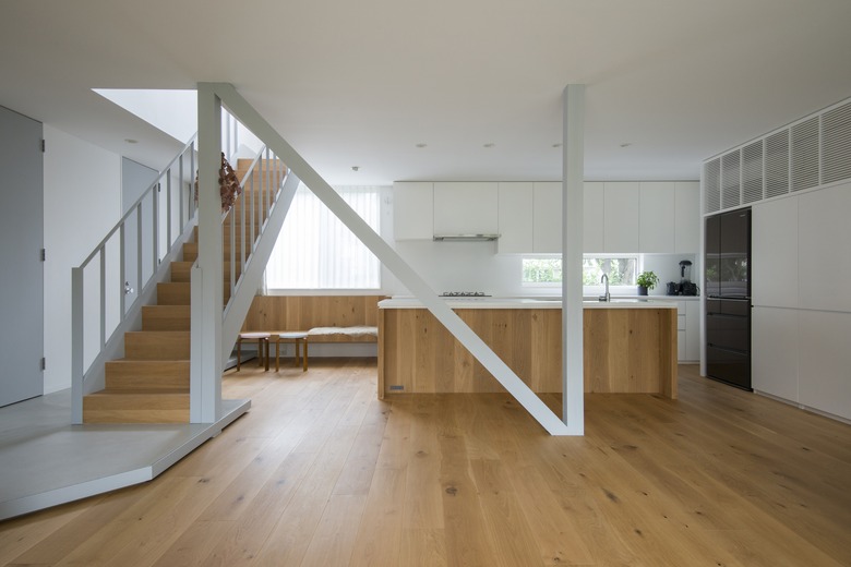
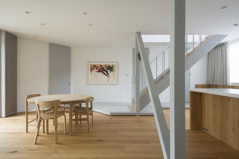
Doing something to the letter doesn't usually result in creativity. But in the case of a spacious Tokyo house designed by CASE-REAL, that phrase takes on new meaning. The design was based on two letter-shaped features: The L-shape of the building, which informed the garden and landscaping (created by GREENETTA) and an N-shaped structural support that defines the open dining and living room.
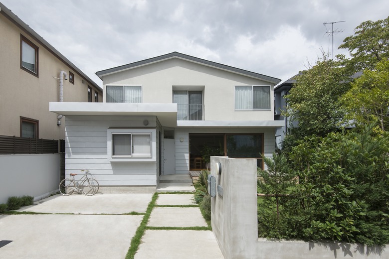
The rest of the house follows this motif that concentrates on hard edges: The front and back facades feature doors wedged at an angle. Wood built-ins accentuate square shapes. A reserved color palette (mostly white, gray, and natural wood tones) creates a sense of serenity, which can be found in both the private and shared rooms. Overall, the 1,900-square-foot residence is a reminder that concentrating on shapes and exercising restraint can create a spacious and relaxing atmosphere.
1. Exterior
Tokyo is a city known for small spaces, so getting extra room is a great thing to work with. The architectural team opted to maximize the already spacious site by considering the shape of the building. The landscape design also mimics the house's series of quadrilateral geometric shapes.
2. Living Area
The N-shaped column also functions as a partition between the kitchen and the other shared spaces. The kitchen is defined by an island that becomes the centerpiece for the area.
3. Living Area
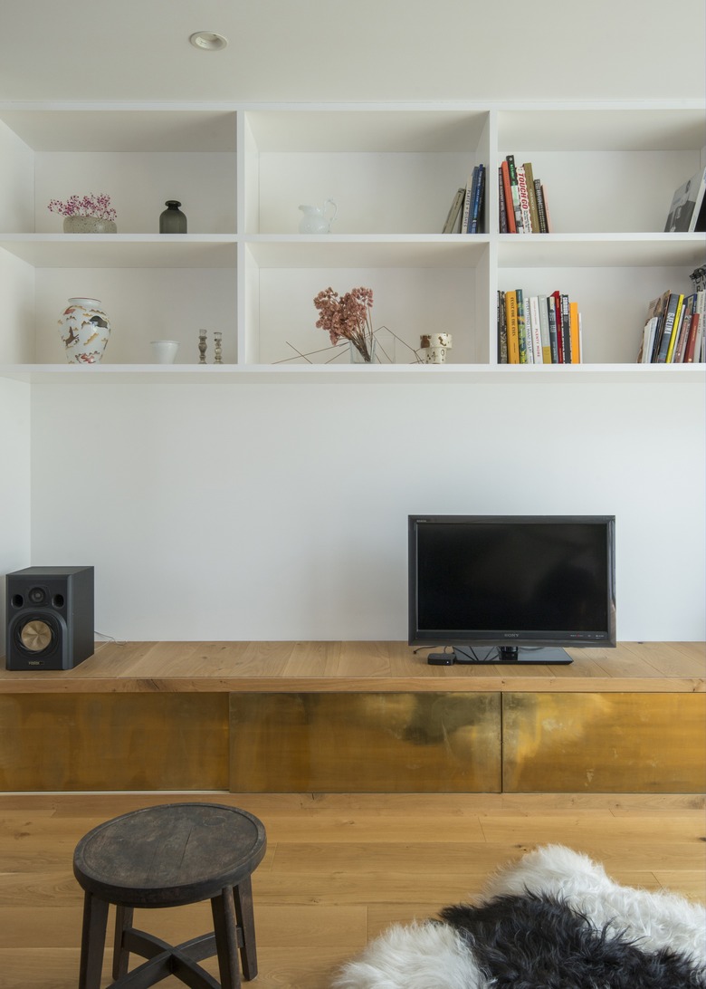
Custom-made shelves installed on the wall are a great way to organize smaller items. The built-in media storage cabinet was given brass paneling to make the minimal design pop.
4. Living Area
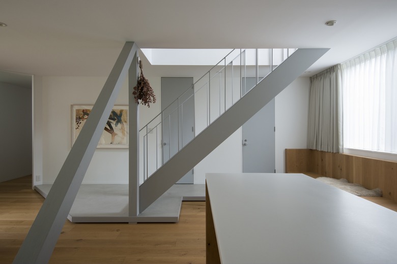
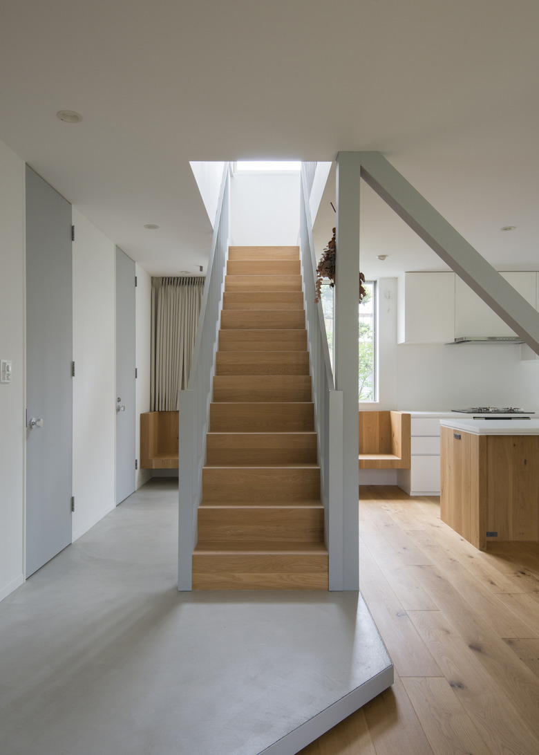
Linear shapes and silhouettes — from the shape of the doors to the bars of the handrail — complement the oak flooring. Clean white surfaces, such as the artificial marble used for the kitchen island countertop and the elevated base of the staircase, create a sense of simplicity.
5. Living Area
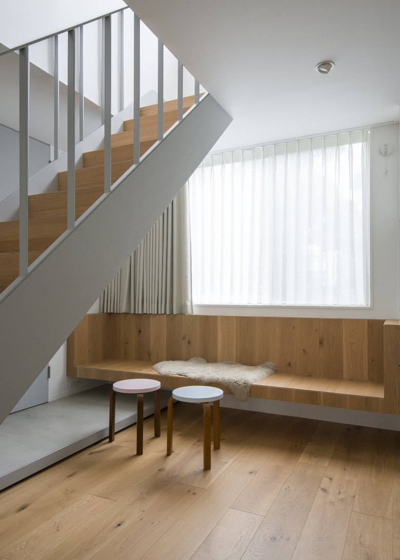
A fixed oak bench is styled with two Artek Stool 60 chairs by Hella Jongerius to create a semi-private sitting place away from the living area.
6. Living Area
A steel flat-bar handrail on the staircase echoes the steel used on the house's exterior.
7. Dining Area
A practical yet sophisticated Hans J. Wegner-designed PP MØBLER dining table is the ideal centerpiece for the open-concept dining area. The surrounding PP70 chairs were also designed by Wegner.
8. Bedroom
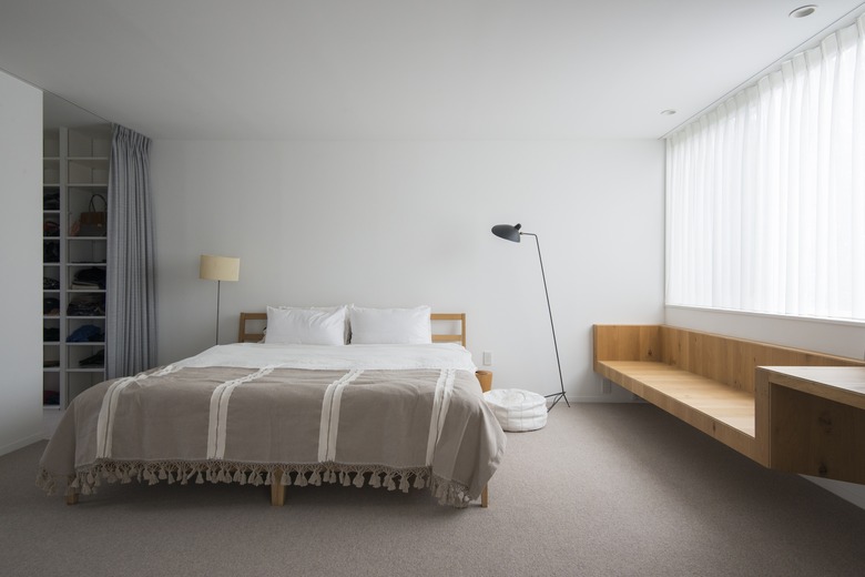
A sibling to the downstairs bench appears in an upstairs bedroom, giving definition to the minimal space.
9. Back Patio
The house's exterior walls are clad in unpainted blue-gray steel plates while the diagonally angled door is painted the same color as the exterior wall details. Large windows on each side of the house provide a view of the surrounding landscape and garden.
