We're Obsessed With Scandifornian Style, An Interior Design Trend You Already Know And Probably Love
There's got to be a German phrase for the moment when you discover that someone else invented a word for a murky concept you've been working over in your mind for months. For me, that word is "Scandifornian," and the moment was last week. I was researching couches — a personal project — and stumbled across a blog post by Natalie Myers of Veneer Designs, featuring her own living room. It was what they call an a-ha moment — Scandifornian! Of course! — and now I can't stop thinking about it.
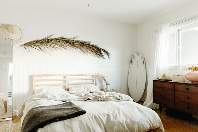
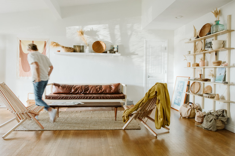
Often cloaked as modern bohemian, or minimal bohemian, Scandifornian is a style you already know and, likely, love. Equal parts Urban Outfitters and CB2, as a shorthand, it's clean, modern, bright, but also warm and vaguely '70s.
Here are a few hallmarks that make Scandifornian a style all its own.
White Walls
White Walls
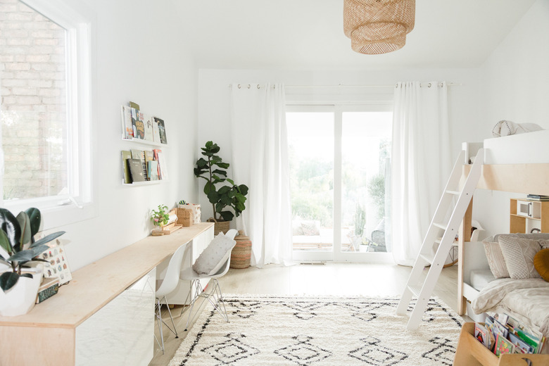
Duh. For Myers, the Scandifornian design formula always begins with a clean, white background. "Start with a white box, take everything out and slowly thoughtfully bring the natural elements back in," she says.
Blonde Wood
Blonde Wood
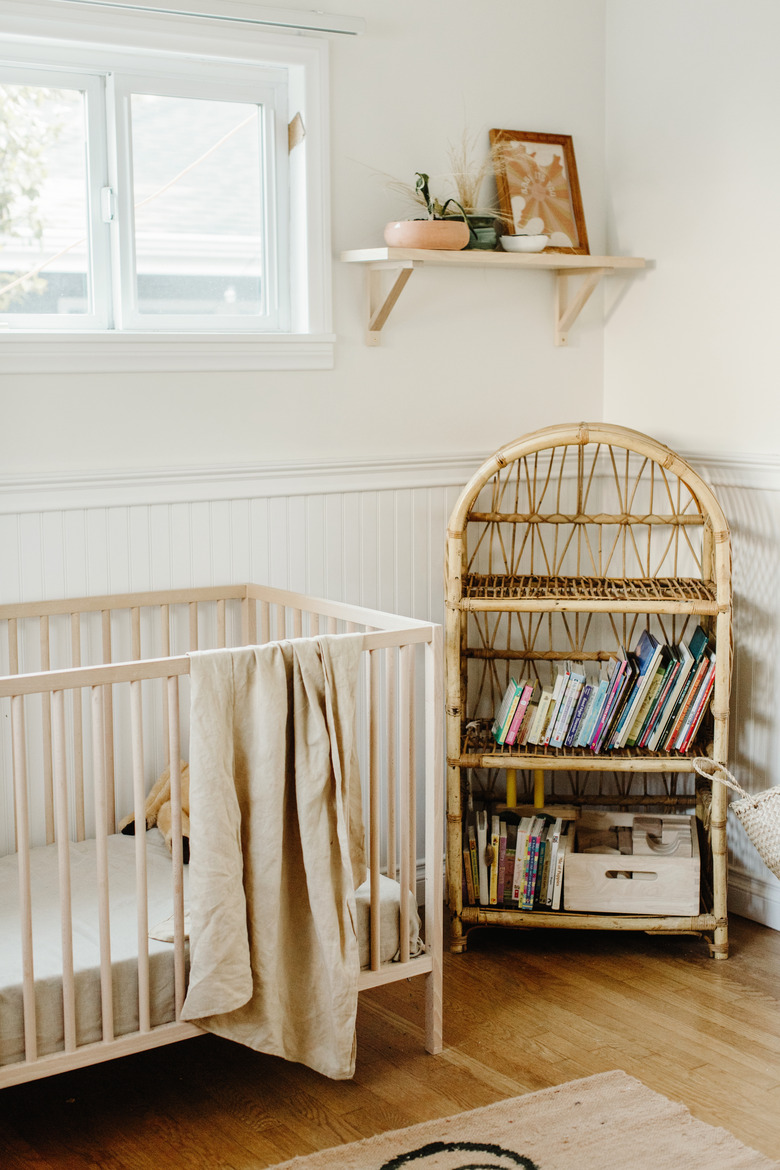
White Oak might be all the rage right now, but for Scandifornian spaces, keep it warm and blonde — from the floors to the furniture.
Clean Lines
Clean Lines
"Some people take it the eclectic, bohemian route," says Myers. But bohemian vibes can quickly tip into clutter — and this is not that. "I like to tone it down — a lot. The more I edit, the closer and closer it looks like a Nordic, minimal space," she says. "That's where the bridge happens."
Classic Midcentury Details
Classic Midcentury Details
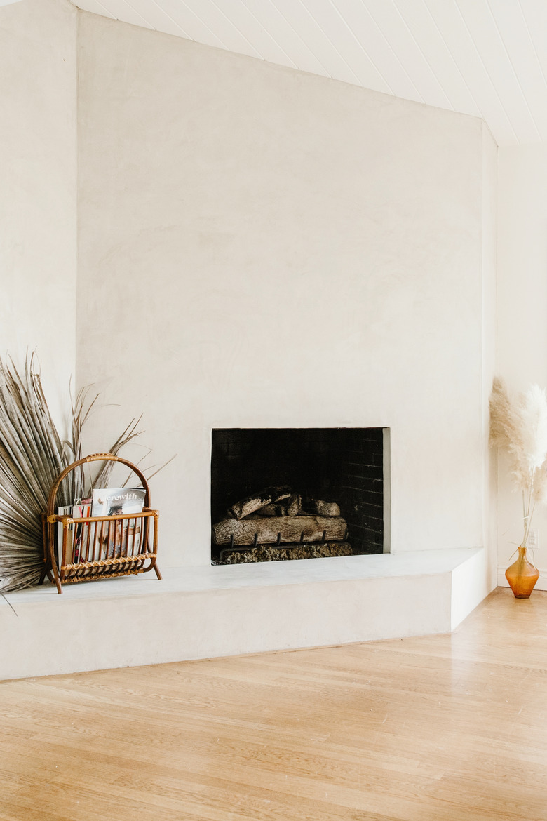
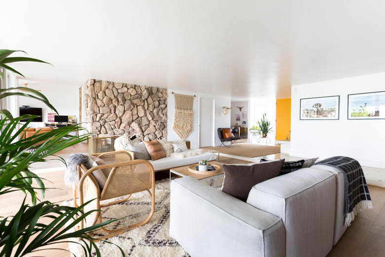
At the heart of most Scandifornian-inspired rooms is that classic midcentury sensibility that originally sprang up in California. Think big windows, open living spaces, wood paneling, and rock fireplaces.
Organic Elements
Organic Elements
With such a minimal or midcentury backdrop, pattern and texture do a lot of the heaving lifting. "In California, we love bright, white, natural, and earthy spaces," says Myers. She loves to include materials like rattan, jute, sisal, or linen to warm things up.
A Restrained Palette
A Restrained Palette
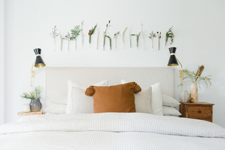
You'll see a lot of black, white, and neutrals, which feel Scandi, but also a richer, warmer, often muted palette. "Right now we're obsessed with mustard and rust; desert colors, which are really not Scandinavian." The point, she adds, is to use color sparingly.
Nature, but Modern
Nature, but Modern
Plants are welcome, but use restraint — or think different. "Large-scale landscape photos or prints bring in nature in a modern way," says Myers.
Gorgeous California Sunshine
Gorgeous California Sunshine
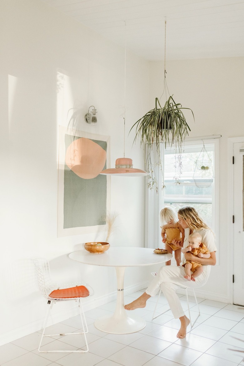
This is the one inimitable design element that you probably won't find in, say, Minnesota, in the middle of winter. "People equate [Nordic design] with wintry environments or a brutal harsh landscape," says Myers. "They don't automatically connect it with sunny California." And yet, here it is — Scandifornian style.
