This "Granny Pad" Uses Plywood And Vintage Touches To Create A Modern Add-On
Three generations living together under one roof has plenty of benefits (hello, live-in babysitter!), but it also has its downsides (goodbye, privacy!). Seattle architecture firm Best Practice came up with a solution for a growing family that wanted to find a home for the grandmother, but couldn't locate anything nearby and didn't have enough room in their own house. The architects converted an existing garage into a complete and comfortable living space nicknamed the Granny Pad.
The garage was transformed into the entry, kitchen, and living area, and they added a second gable-style structure with the bedroom, bathroom, closet, and laundry. The team kept all the living spaces on one level for accessibility and kept the floor plan open, rather than separating the sleeping and living areas into smaller rooms, so they can be rearranged for future needs. The palette of the 571-square-foot living space was kept neutral to let the natural materials, such as pine plywood, shine. The firm was able to turn a garage into a safe and stylish home for the client's mother, with the benefit of having her children and grandchildren close by — but not too close.
1. Exterior
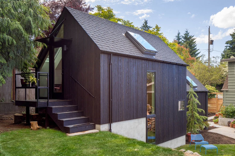
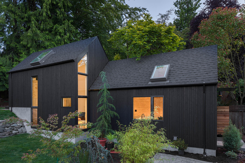
Best Practice used black-stained vertical cedar siding on the exterior. They chose the dark shade to complement Seattle's frequent gray weather.
2. Front Door
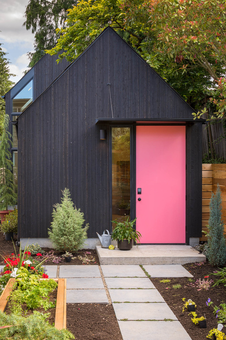
The garage door was removed to create a new facade with a custom door painted in Benjamin Moore's Flamingo's Dream. A powder-coated steel canopy was installed above the front door.
3. Entrance
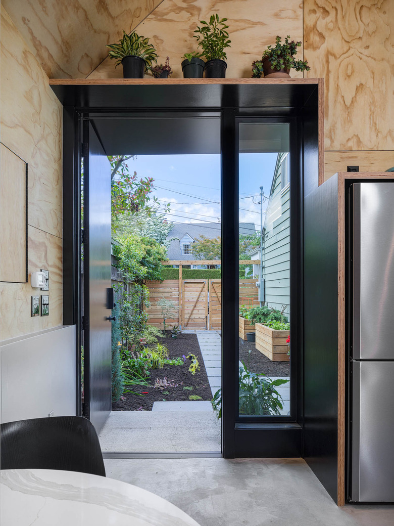
The Granny Pad is steps away from the main house, giving the family both closeness and privacy. A shelf above the front door displays plants, continuing the greenery from the garden outside.
4. Kitchen
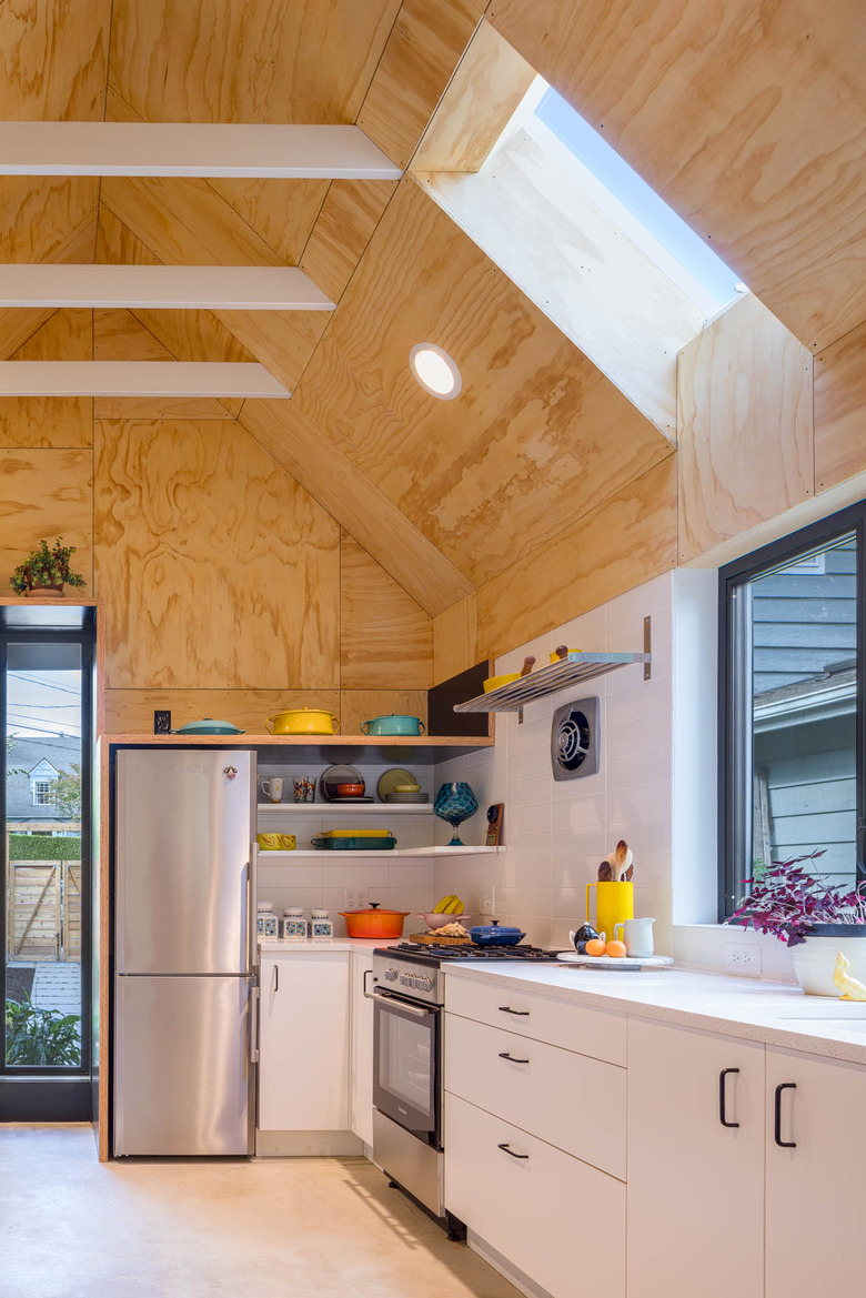
IKEA cabinets and Silestone counters were installed in the kitchen. The rafters were left exposed to make the space feel larger and more open.
5. Living Area
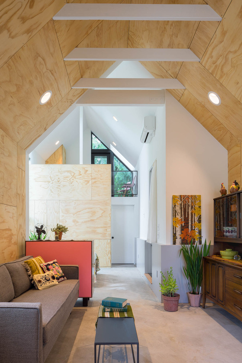
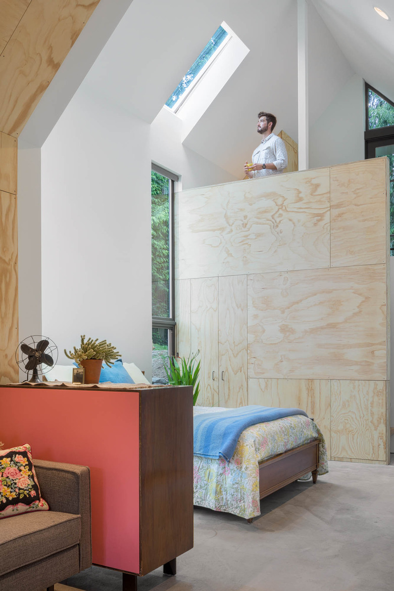
The architects used pine plywood to add warmth and create contrast with the white walls and concrete floors. The plywood was installed in a pattern they called "crazy quilt." A vintage dresser with a vibrant painted back separates the living area from the bedroom.
6. Bedroom
A lofted area above the bathroom is used for storage, but could be converted into an office space or sleeping loft in the future, in case the family wants to use the home as a rental property or studio space.
7. Bathroom
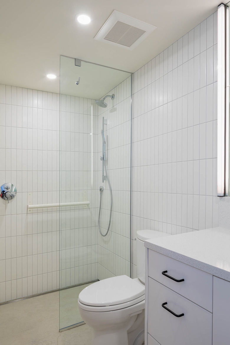
The firm used an IKEA cabinet and a Silestone counter again in the bathroom. White, rectangular tile was installed vertically and the shower was designed for the resident's safety.
8. Exterior
The yard had a natural six-foot elevation, so the structure was built into the hill. A back deck connects to the loft space above the bathroom.
