A Brooklyn Townhouse Nails Colorful, Intellectual Boho Design
An all-white space can feel bright and modern. But, let's face it, it can also feel a little boring. After living in a small, immaculate space in lower Manhattan, an architecture professor was ready to bring color into her next home. An architect by training, she joined forces with MAN Architecture and Hatchet Design Build to make over the new loft in Brooklyn Heights that she shares with her teenage son. "She wanted something that had somewhat of a more Mediterranean feeling," says Hatchet Design Build project manager Eric Springer.
The space itself had amazing period details, but needed some serious reorganization. The firm rearranged the central core of the apartment to create a functional kitchen for the avid cook and entertainer and added storage underneath the staircase. The client picked out cement tile to accompany the custom white cabinets and chose bold wall colors for the bedrooms. "Of all of the clients we've had, she was the most decisive we'd ever experienced when it came to color," says Springer. "Any option we presented to her she knew immediately which direction she wanted us to go. The rules were to remain warm and vibrant, and 'nothing flat and boring."
1. Living Room
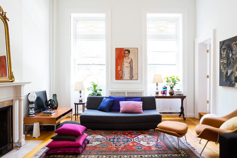
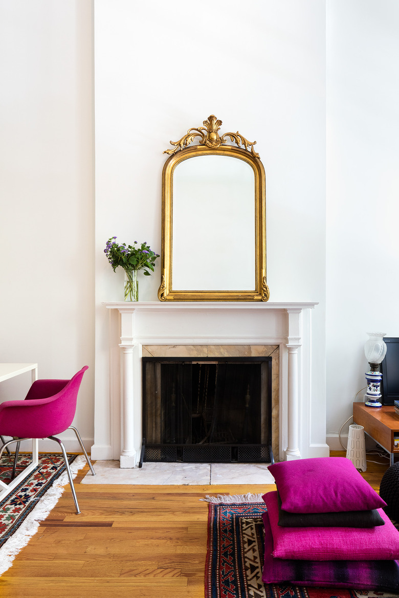
With an antique mirror, colorful accessories, and vintage pieces, the living room features that tough-to-achieve intellectual bohemian mix.
2. Living Room
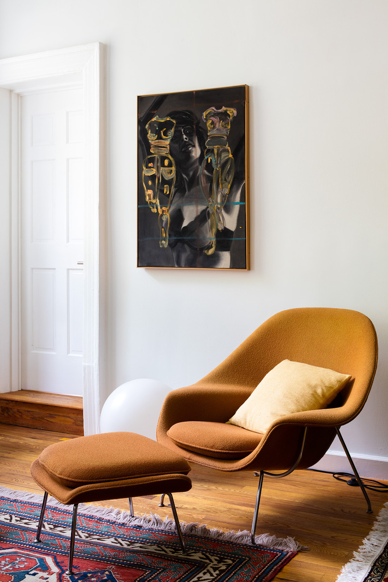
A painting by David Salle from the 1980s is displayed behind a Saarinen Womb chair and ottoman. The client relied on pieces she already owned to furnish the space and incorporated family heirlooms, including antique rugs and a portrait of her mother from the 1960s, to add character.
3. Dining Room
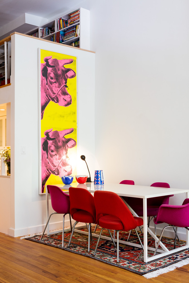
A corner of the main space was used for a dining area, where a mix of midcentury chairs surround a Blu Dot table. A piece of Andy Warhol's "Cow" wallpaper was framed to create a large-scale piece. Above the dining area is a mezzanine office space.
4. Kitchen
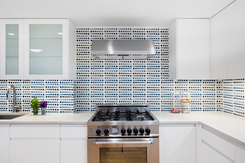
The client and architect Jonathan Man designed the custom cabinets, which were fabricated by Hatchet Design Build. Cement tiles add color and pattern to the bright kitchen.
5. Kitchen
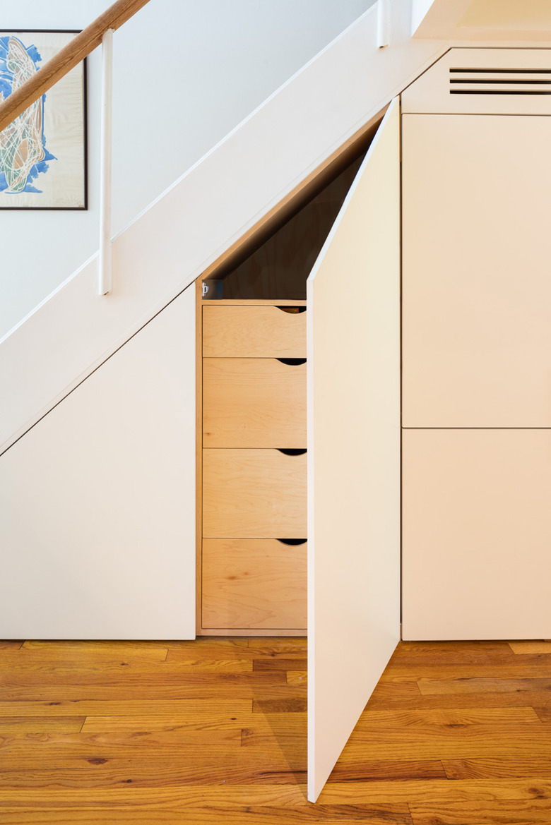
"We ended up doing a major rearrangement of the central core in order to tuck a pantry beneath the stairs, as well as additional built-in storage and the fridge," says Springer. "This ended up turning an active hallway into part of the kitchen. It was a cool move which created a ton of additional space, while allowing for a very utilitarian cooking space."
6. Master Bedroom
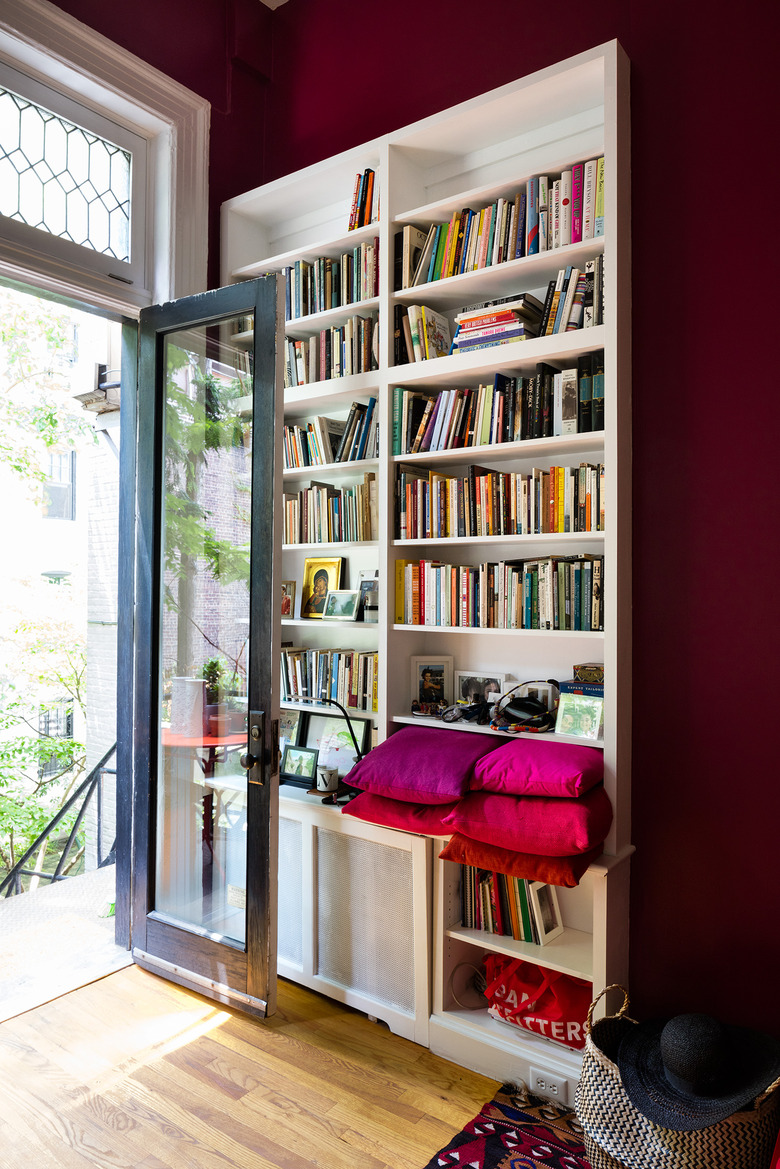
While the walls of the main areas were kept white to take advantage of the abundant light, richer colors, such as this deep maroon, were used in the bedrooms and study. The master bedroom was already outfitted with built-in storage when the client moved in.
7. Terrace
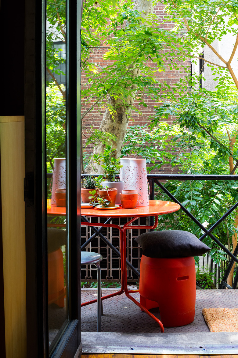
A vibrant orange table and stool sit on a small terrace outside the master bedroom.
8. Bedroom
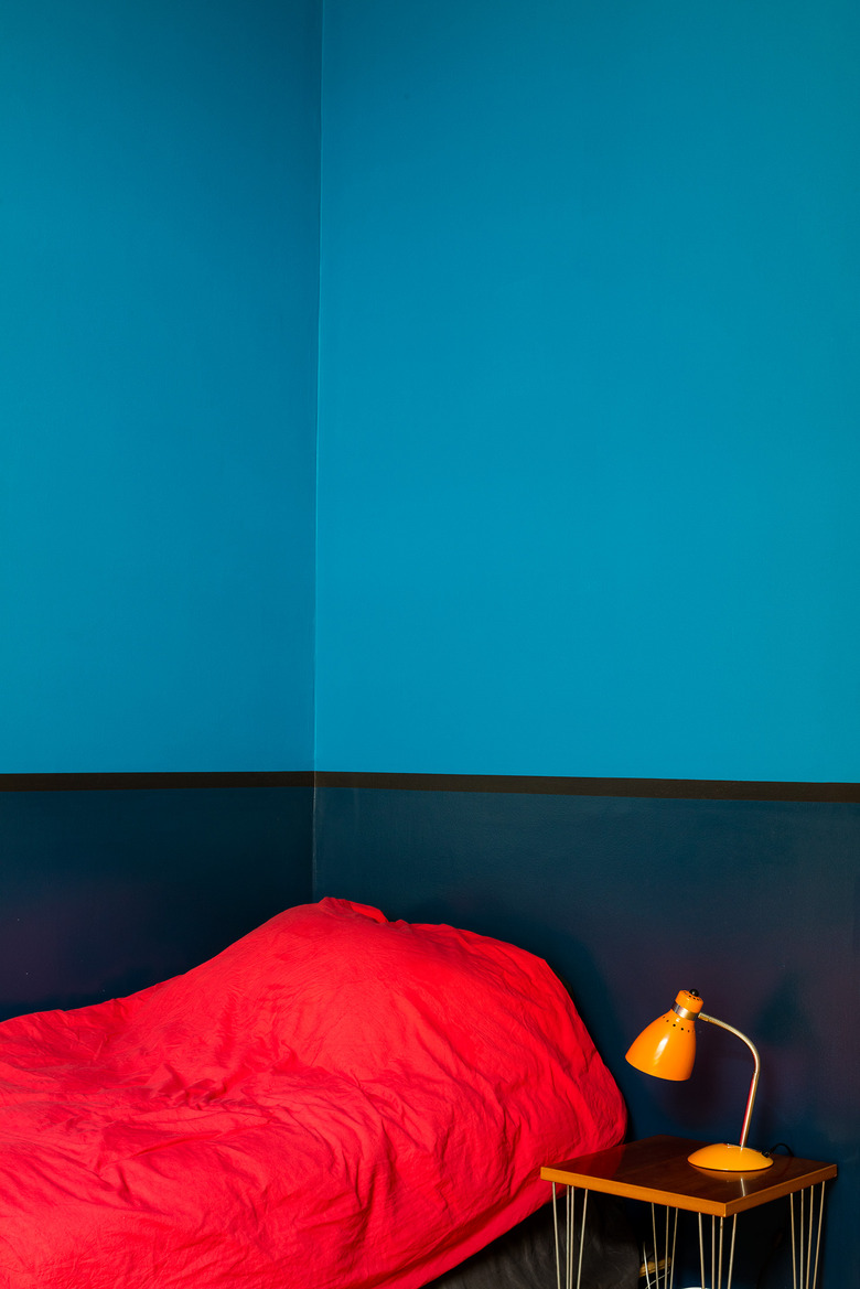
Deep blue hues were used on the walls of the son's bedroom. A red duvet and orange lamp complete the colorful space.
9. Bathroom
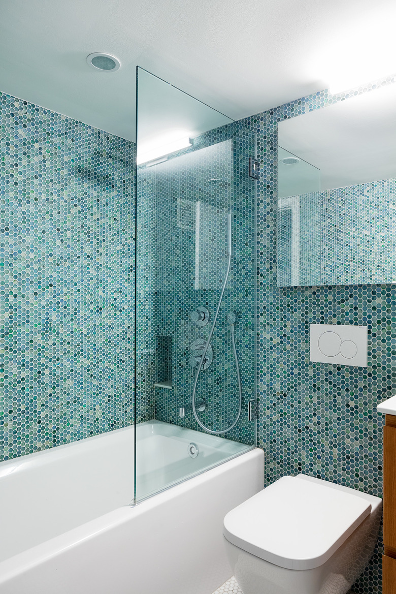
Recycled glass penny tiles in cool ocean hues were installed in the bathroom.
CORRECTION: An earlier version of this story included the client's name. It has since been removed from the piece.
