A Nordic-Inspired Port Washington Farmhouse That's The Epitome Of Warm Minimalism
Welcome to Scandi-land, our week-long celebration of Scandinavian design. To read more, click here.
Minimalism is as essential to Scandinavian design as meatballs are to a trip to IKEA, but too often warmth is the casualty of trying to pull off a less-is-more aesthetic (and no one likes cold meatballs).
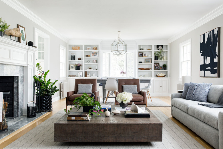
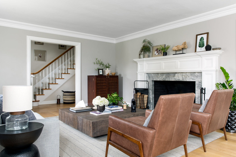
The trick to making sure your minimalist mood still feels homey is infusing the space with warming design elements (especially if you're using a muted color palette), like Becky Shea of BS/D design studio did with this Scandinavian-inspired sanctuary on the North Shore of Long Island.
"Using lots of light tones can sometimes feel stark," Shea says. "Using elements that are warm in substance but light in color (i.e oaks and birch) are key contributors to achieving this airy look."
Shea's directive from the homeowners, who hail from California, was to create a best-of-both-worlds space that combined West Coast calm with East Coast chic. One of the essential first steps to achieving that atmosphere was opening up the previously dark, compartmentalized house—which involved full renovations of the kitchen, bathrooms, and mudroom, plus putting in completely new hardwood floors.
"The light floors were a great way to maintain warm wood vibes, but drastically improve the look and feel of the space," Shea says. Drawing on natural elements inherent to the Nordic regions, the warm, muted shade of the floor (like these options from Bona, the Swedish wood flooring experts) is the grounding foundation for the rest of the peaceful oasis.
Another key to incorporating Scandinavian influences is marrying coziness with practicality, which also happens to be essential when the space is home to a family of five.
"Having three beautiful children [in the home], it was critical to ensure everything was fully functional and durable, while also aesthetically pretty," Shea says.
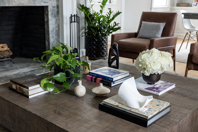
Predicting lots of family time spent in each cozy room, every piece of furniture, rug, and stylish embellishment was hand-picked knowing it could take a beating, i.e. "pillows that could lend themselves to a midday naps and blankets that could snuggle the whole gang," Shea explains.
"The entire space was designed with Scandinavian philosophies," Shea says. "We used simplicity throughout by way of using a consistent color flow that translated in a unique way for each space through personal touches for that particular room, be it accessories or textiles."
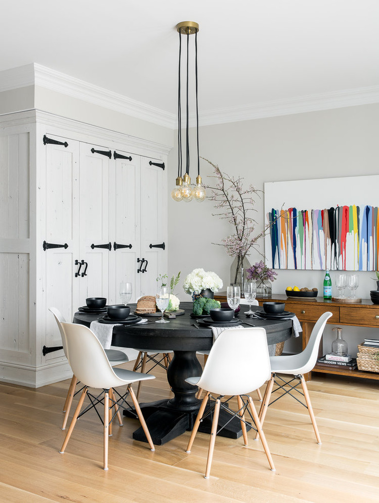
An abstract art piece by John Platt adds some color to the Scandi-influenced breakfast nook.
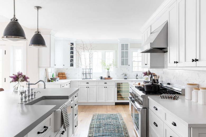
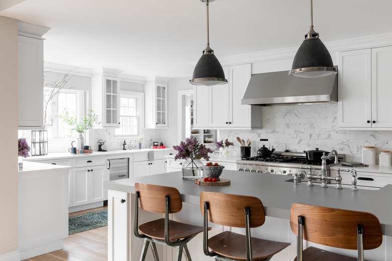
If you ask Shea how she designs homes that have a magnetic quality to them, she'll tell you that besides "the energy of the family" being a huge part of the equation, it's all about the kitchen. "It was designed to be the central hub of the home, with vantage points of the breakfast nook, mudroom, and family room that all play well together," Shea says. "It's a space drenched with layers of warm, neutral tones, so it's really where your heart lands and gives you that never-leaving-this-home feeling."
"Our primary use of functionality as the north star in the process is what made it a truly Scandi design," Shea says. "Every surface area is fully functional (to that point, you can light the island counter on fire and nothing would happen); every drawer and cabinet was thoughtfully laid out to work with the traffic of the room and how the family functions at peak hours."
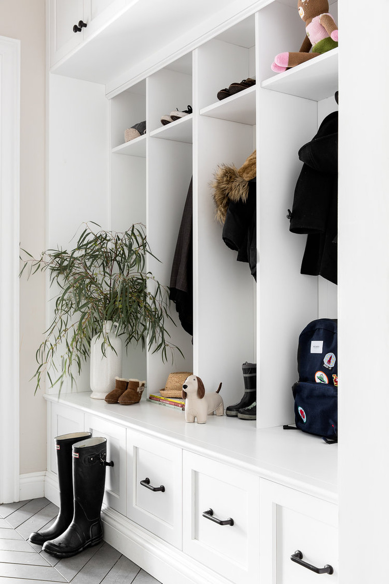
Case in point: Plenty of storage in the entryway by the door means easy exits on hectic mornings.
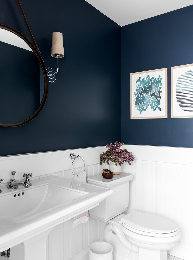
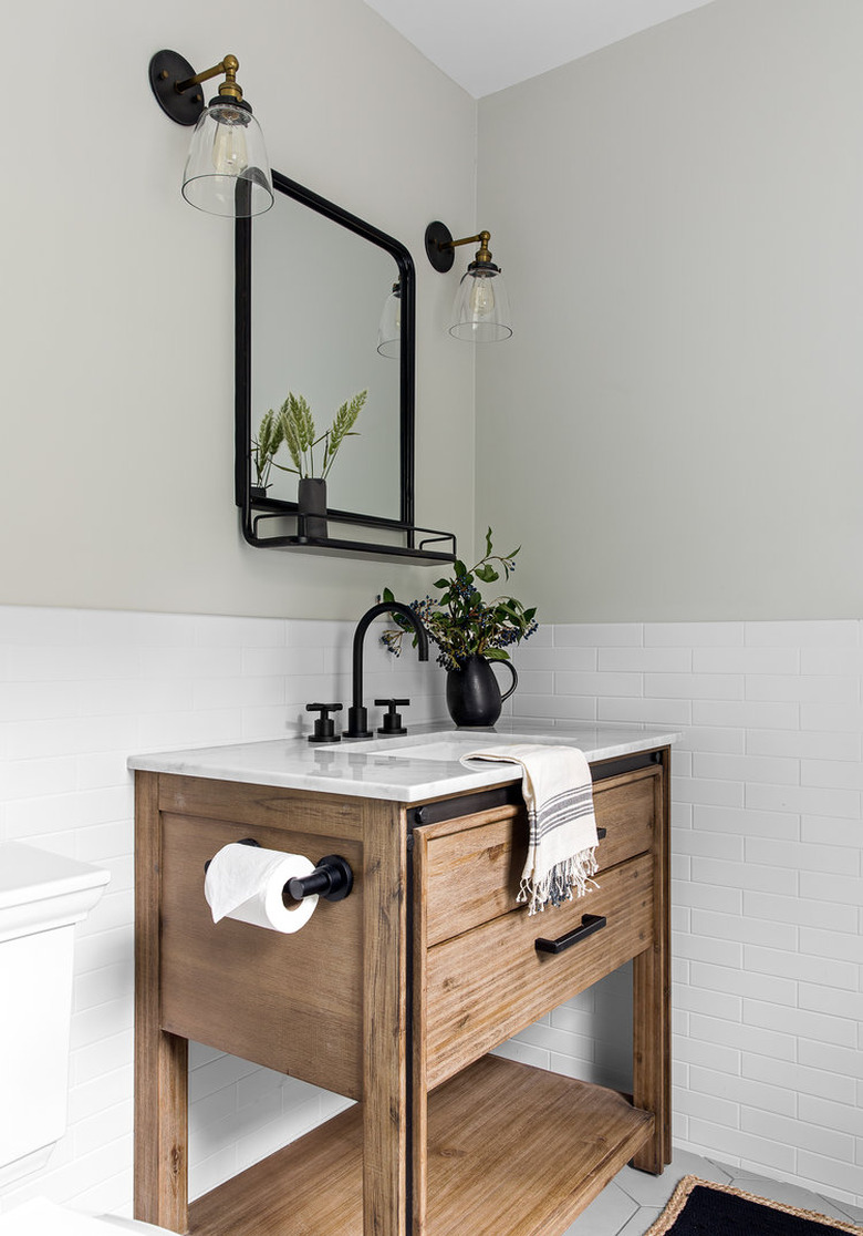
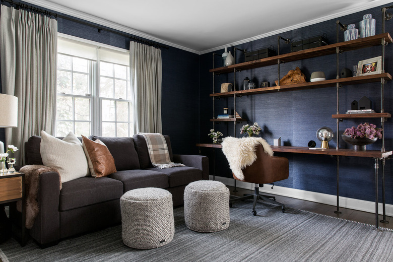
Maximizing the calm functionality of a space means everything in a room is intentional—including the paint. The dramatic navy in the bathroom ties back to two of the bedrooms upstairs. "I like to pick primary and secondary colors that are used throughout the entire home for consistency," Shea says. "It's a formula that allows a space to feel cohesive through and through."
Walking through the sleek space where everything has its place, you'll notice an especially muted color palette. That's because the designers wanted to give the abundance of natural light a canvas to shine. "Since the sun has a tendency to 'destroy' color, it's a perfect opportunity to bring in our lighter palette, knowing it'll stand the test of time against the sun," Shea says.
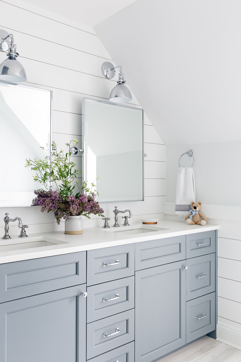
The design team used this dreamy neutral, Stonington Gray by Benjamin Moore, throughout the entire home. "It reads a different tone in each room based on the lighting," Shea says.
As a sustainable designer, Shea's main objective is delivering timeless canvas (so the homeowners won't need to refresh their place every few years). That's why many of her creative interiors are neutral and muted. "We don't integrate color into many of our builds—unless it's a timeless color like blues or greens)—so it's important to us to layer in something bright in a subtle and transient way," Shea says.
Creating an aesthetic that will stand the test of time is another reason Shea likes to use Nordic designs for her inspiration—because they offer minimalist practicality. "If the pieces are functional, practical and beautiful, and you allow them to shine on their own and be free of clutter, those are all the right ingredients to creating a timeless environment," Shea says.
