How Russian Doll's Production Designer Created A Mystery Dripping In Maximalism
If you haven't seen Netflix's new series, Russian Doll, may we kindly suggest that you drop everything and run to your nearest television? The show is dark (like, really dark) with the type of premise that makes you question your own reality: What if you kept dying and had to relive the same day over and over?
That's the sh*tshow Natasha Lyonne's character, Nadia, finds herself in: She's at her birthday party — being thrown in her friend's East Village loft — and runs into one fatal accident after the next, each time finding herself "reborn" in her friend's bathroom.
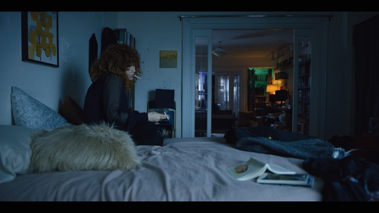
The concept, of course, is nothing without a set that is able to really drive home Nadia's somber situation, especially when her surroundings seem to play such a crucial role in her dilemma. Being decor fiends, we of course couldn't help but obsess over the show's distinctive interiors, which feel really relevant and covetable — but also stocked with mystery. Eager to know all the secrets, we had a chat with production designer Michael Bricker, the brains behind the look of Russian Doll, to find out everything about that amazing green bathroom and delightfully artsy loft.
(Image: Netflix)
Hunker: What attracted you to this project? It seems like the type of piece that would allow for a lot of creativity and rule-breaking ...
Michael Bricker: Yeah, I mean, I was fortunate enough to read the pilot script and sit with the pitch for the job — and you know, as you see now in the series — it just has a sort of magical quality and deep mystery. It was such a tease, in a way, to read the script, because there was no "here's where this should be going, this is what should happen"; it was just the first episode. So you kind of have to invent in your head what could happen, and pitch that way. What was really good for me was kind of building a world that felt very much like New York, but also had the kind of edge of magic to it. That allowed us to break some rules ... even though I didn't know what those rules were yet.
(Image: Netflix)
Hunker: The mirror in Maxine's bathroom is key to the plot. Was there any direction in the script about what it should look like?
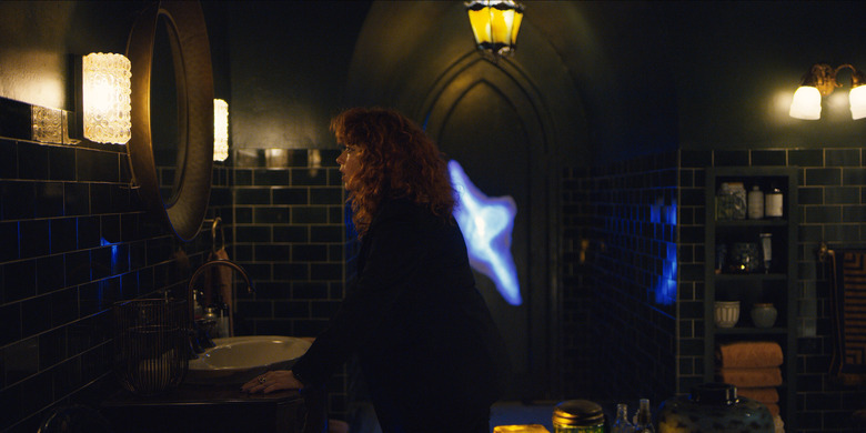
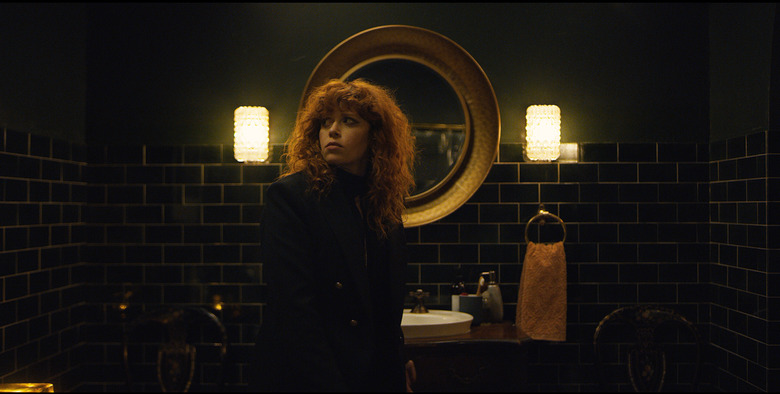
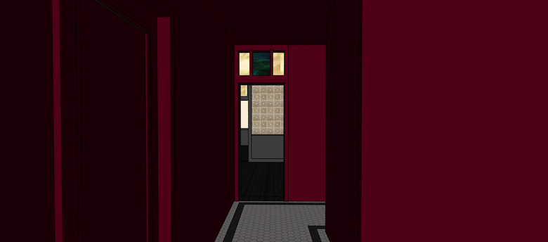
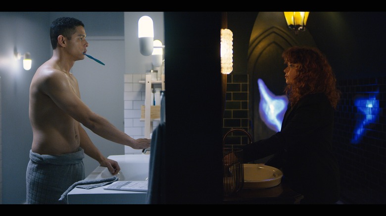
MB: Yes and no. The script definitely said there was a mirror. It also said there was this kind of art piece in the door and the door had a pistol handle ... but to me, the script had these really subtle references to Alice in Wonderland. And that's not to say that the show is a take on that — because I don't think it is — but there was the notion. I took that and ran with that a bit. To me, the mirror and the hallway out of the bathroom are leaving the rabbit hole. So for me, the mirror had to feel round, it had to feel whole, a void ... [Nadia's] touring Wonderland every time she leaves the bathroom. It felt important that it was off the wall and had a fatness to it; that it have this portal quality. And the size of it is always framing her head.
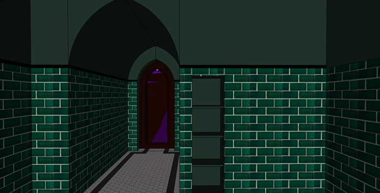
Hunker: I love that the bathroom is green! It's such a trend this year ... although I don't see many bathrooms that are in that really dark green color. Why this color?
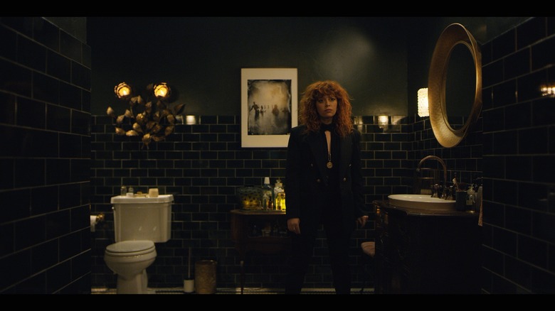
MB: Yeah, the tiles are green, which I picked to contrast with [Natasha Lyonne's] hair ... a lot of the reviewers are calling it black, but I think that's just because the light of the door makes the green look black ... I wanted [the bathroom walls and tiles] to be dark, and honestly that really came as a contrast to [Natasha's] hair. I wanted her to really pop in that bathroom and not in a typical way.
(Image: John Cox)
Hunker: Definitely interested in how the glowing-blue-vaginal-hole thing was created.
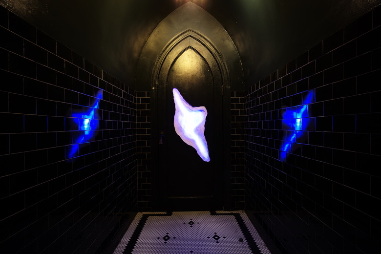
MB: It had to read as an art piece, but we also wanted it to be ominous and just really like, "What??? What is this thing??" The script kind of described it as out of the door, and papier-mâché/crafty. I don't know why I was just drawn to it being more galactic, more space, more void. And there was the challenge logistically: How do you have an operating door that goes deeper than the thickness of the door? And so it was built from scratch ... it's just a bunch of layers of ripped wax paper. It's really simple; it's the reflection off the tile that really makes it amplified.
Hunker: Ha! That's always so funny to hear how things are made on sets, especially when they are so effective. You think, "Wow that must have been really complex, but here you are telling me, 'Yep, it's wax paper and light.'"
MB: I hate to take the magic out of it!
(Images: John Cox)
Hunker: I'm just curious ... Maxine's apartment is in a building that was once a yeshiva. That arched bathroom door feels distinctly Gothic, however. Which is not to say that Jews wouldn't set up a school in a place with architectural details that feel closer to Christianity, but I'm just interested to know if there was any type of intentionality there.
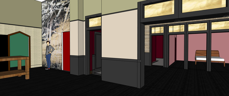
MB: We did the research, and it's not uncommon at all, particularly in New York, to have Gothic architecture within a synagogue. We did triple check in the beginning. The building that is used as the exterior is in that neighborhood [the East Village] and is across the street from a building that is — or used to be — a yeshiva, and that one had arched windows vs. the Gothic windows. But we liked that it would have a religious air to it. Then we built the loft to match the exterior of that building.
(Images: Michael Bricker)
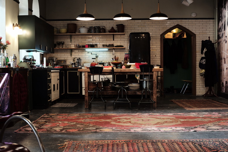
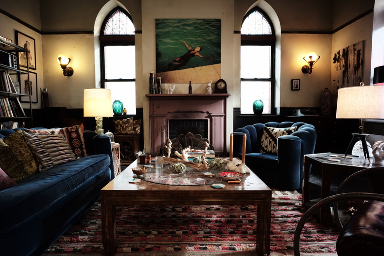
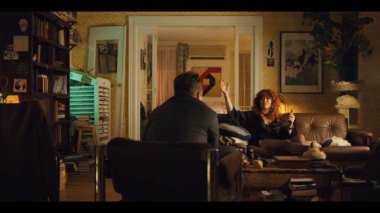
Hunker: I love Maxine's maximalist loft (ha, actually just wondering if a maximalist aesthetic had anything to do with her name); how did you start with the concept there?
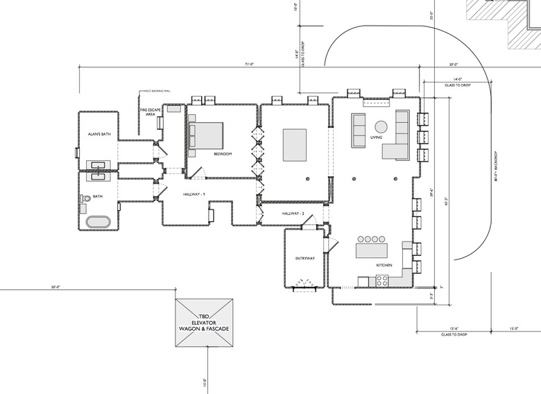
MB: Jessica Petruccelli, the set decorator, was able to take a lot of the [script] references and find real versions of that. I definitely credit her with so much of the set there. But we wanted to make sure [Maxine's loft] felt like a maze ... in the show, there's this notion that [Nadia] could always take a different path, so the layout of the space is actually designed in a set of strict circles, which is also related to a Russian doll.
Hunker: And what about the decor?
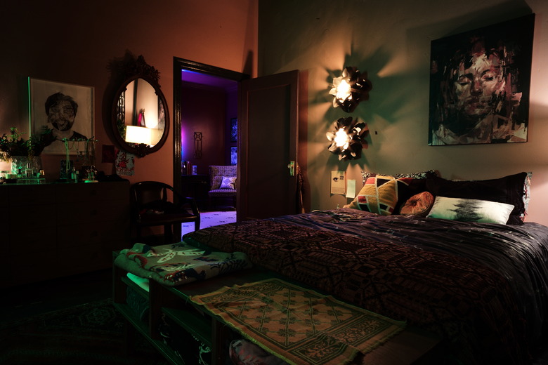
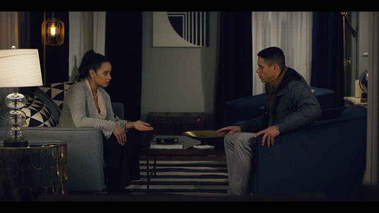
MB: We had this notion that it should feel like it was here for a long time, that it's always been her space. Maxine is an artist and also a collector, and I think we've all been in these apartments in New York where it's just been someone's place forever, and stuff just stacks up. Most of the furniture was found, just by scouring the city. Jessica did such an amazing job finding pieces. The sofa and chair were a huge find. We were finding pieces that were these really, really deep, rich colors. Really rich, dark blues. There are a few new pieces mixed in, but it's mostly vintage or salvaged pieces — like many New Yorkers do!
Hunker: What about the art in the loft? A lot of it seems very symbolic.
MB: It was really important to Natasha to have a lot of artwork. [Ed.: In addition to starring in the show, Natasha Lyonne is also a co-creator and executive producer.] There's two types of artwork [in the loft]. Like, artwork of Maxine's that feel related to the door; her apartment is her studio so we made little artworks to go with the door and she was more architectural. And then, a lot of [the art] has to do with if it looks back, people's faces looking directly back — at Nadia or [designs where] people are looking at each other. My favorite piece is like a puzzle of someone's face ... it looks like a person splitting into two pieces. We tried to find pieces of art that looked like glitching and fracturing as well.
(Image: Netflix)
Hunker: Part B to the art question: I loved the moment where Nadia asks Beatrice, "Where'd you get this art from — is it all Urban Outfitters, or just a couple of the pieces?" and Alan chuckles. So, where did that art come from?
MB: I think that was all rented props. I don't think it was actually from Urban Outfitters. [Laughs.]
Hunker: So what about the concept for Nadia's apartment?
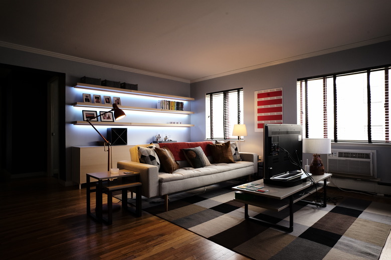
MB: So we had this notion that the loft is the hub of the show and Nadia's world, and the farther away she moves from that space, the less colorful it gets. That's why her office is black and white. Her apartment and Alan's apartment — they actually have similar color palettes. It's a bit of a connection between the two of them. We wanted [her home] to feel comfortable, lived in, and slightly masculine. Not sure if that's the right word for it ... just, less warm ...
(Images: Netflix)
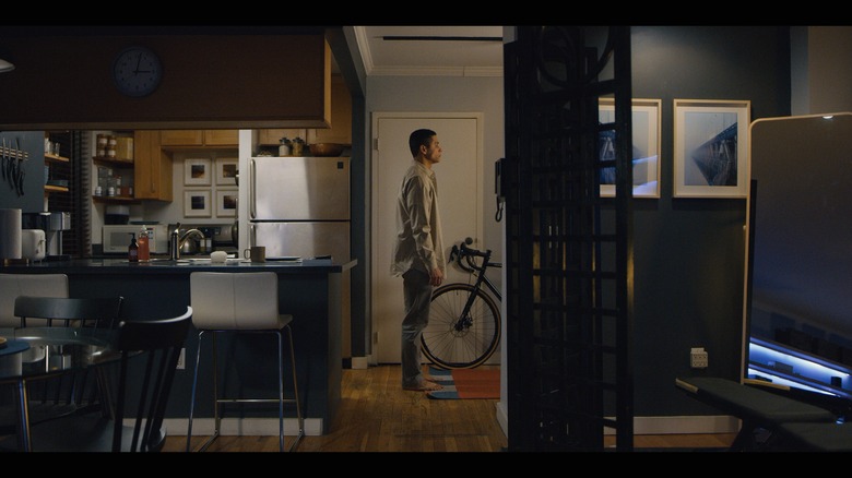
Hunker: Alan's apartment is such a clear reflection of who he is: few embellishments, practical IKEA furniture, organization and order. Is there anything in there that actually might surprise us?
MB: The script was so clear about his character and literally said something like "everything's from IKEA." He's got some Hasami porcelain dishware, but mostly IKEA and rentals. A lot of Alan's apartment was about showing contrasts. Whereas the loft is this cosmic chaos, his [home] is new and the problem with his character is his rigidity.
(Image: Netflix)
Hunker: What about the art in Alan's place? Any significance there?
MB: The idea that both Nadia and Alan were lost and in a void was a visual theme we wanted to convey ... for Alan, this notion of void, or space, is more buttoned-up or stock image. Hence, the NASA color references [Ed.: That's the red stripe poster on the wall] and a few images of Mars and the Moon. We also did a lot with repetition ... he has items always in groupings. Over the course of the series, items from these groupings start to disappear ... a disruption of his imposed order. I saw the NASA print at Best Made while out scavenging for the show, and it seemed like a perfect fit for Alan. Plus, knowing that the camera would often be positioned so that it featured both Alan and the NASA piece, I liked that it was a clear visual representation of his rigidity.
(Image: John Cox)
Hunker: Just curious about your background. You have a master's degree in architecture, and just wondering, is that qualification unusual for a production designer?
MB: It's probably not uncommon. Because when you think about the skill set for design, it's not really a filmmaking skill set, it really is architecture and design. I need to be able to know the difference between, like, Gothic architecture and Victorian, for example. Or knowing what kind of molding would go into a loft of that period.
