7 Tricks To Mixing Patterns Without Making Yourself (And Everyone Else) Dizzy
The trick to mixing different patterns, if there were but one simple rule, is to go with what feels right. Listen to yourself. Trust your intuition. But if the concept was really that easy, there would be no need for an entire multibillion dollar industry built upon interior design (also self-help, hi). And because that little nugget of advice is beyond vague, we've put together a few visual cues that should spark some ideas of your own. Do you consider yourself a maximalist-glamazon? Or do you fall into the category of pared-back-pattern-obsessed? If the answer is yes to either of those questions, keep reading.
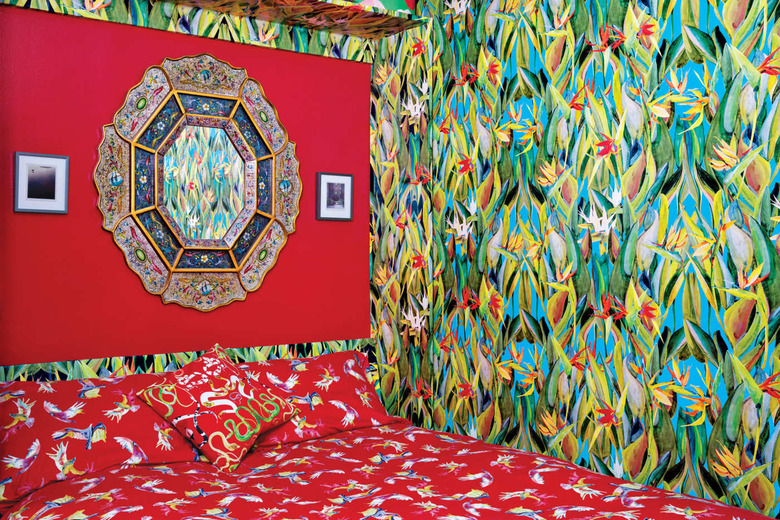
1. Maximize joy.
1. Maximize joy.
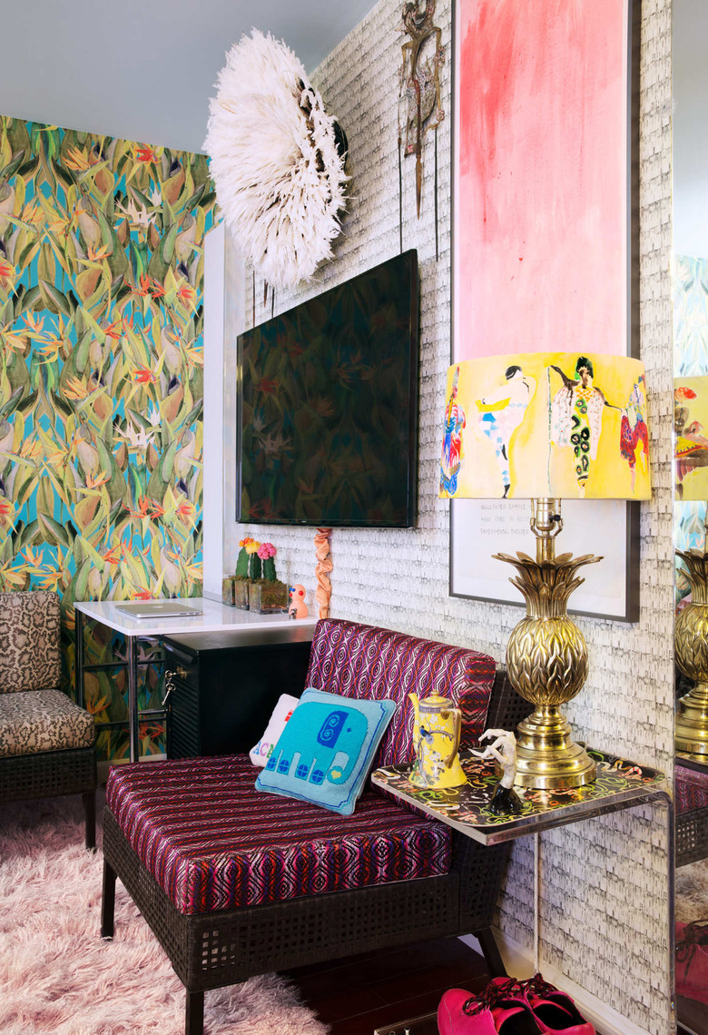
This 275-square-foot Chinatown studio belonging to artist George Venson is absolutely dripping in patterned wallpaper, which features his own hand-painted designs. Here, in the sitting area above the flat-screen TV, a Cameroon Juju hat and two Indonesian theater puppets add texture and a 3D element to the wallpaper design, while the playful yellow lampshade pulls from an adjacent tropical print for a cohesive look.
2. Go full glamazon.
2. Go full glamazon.
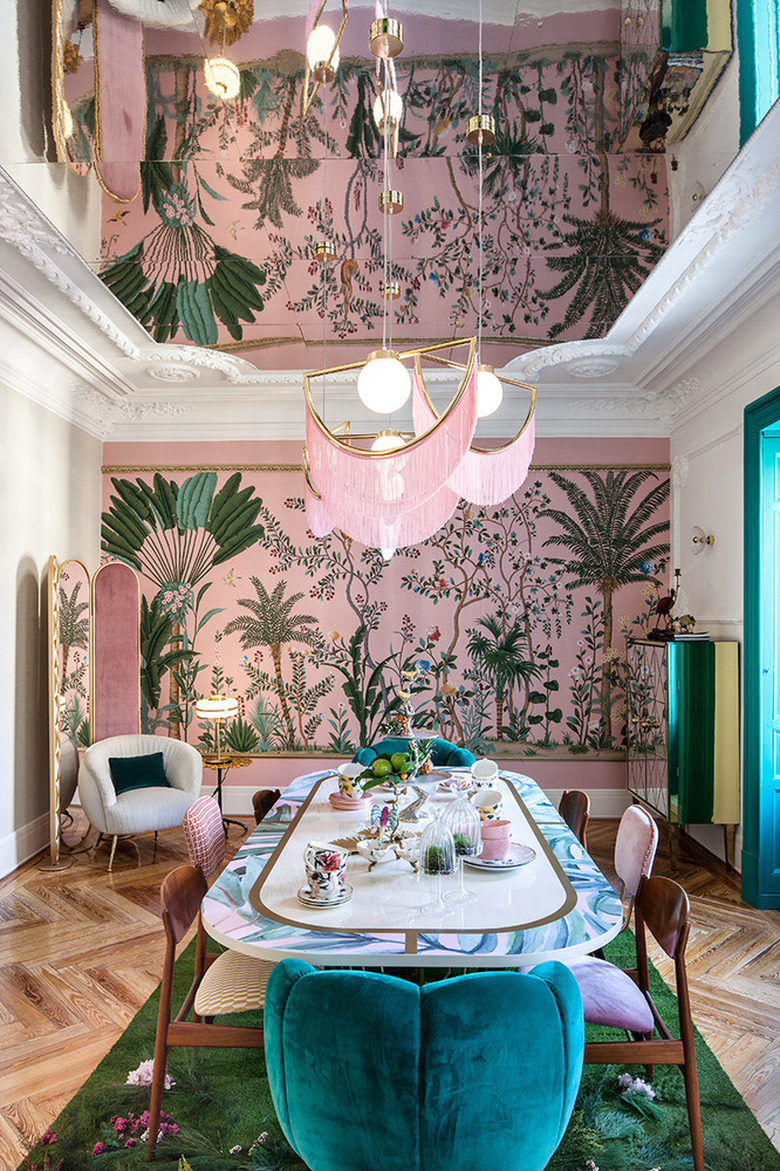
This dining room at Casa Decor in Madrid is a pattern-filled, glamazon paradise designed by Virginia Gasch. She avoided the appearance of a pattern explosion by smartly keeping the color palette limited to three main shades: light pink, blue-green, and white (with brass and wood accents). As a result, her luxurious interpretation remains clean and modern with a hint of old-school flair, which includes a dash of trendy chinoiserie.
3. Add in antiques.
3. Add in antiques.
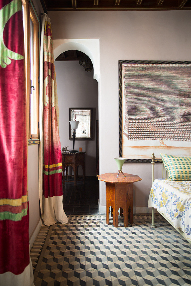
Located in Tangier, a Moroccan port a few miles from the southern coast of Spain, this hotel guest room captured by photographer Brittany Ambridge boasts traditional Islamic architectural details and cleverly uses vintage furniture to echo those shapes. With so many elements going on at once, having some through-lines is important to achieve a sense of calm (also notice the use of sage green throughout to create balance).
4. Use indigo as a neutral.
4. Use indigo as a neutral.
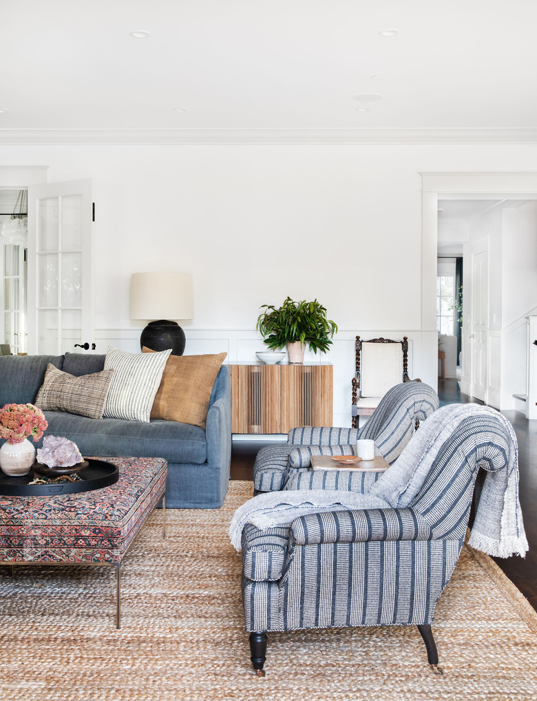
You may have to look closely in this space designed by Amber Lewis for all of the subtle patterns at play here, but trust us when we say they're there. Faded indigo fabric on the sofa meets the striped pattern on the lounge chairs which pulls in the same hue from the Persian ottoman coffee table, tying everything together, and keeping the palette from feeling weighed down.
5. Create organic patterns.
5. Create organic patterns.
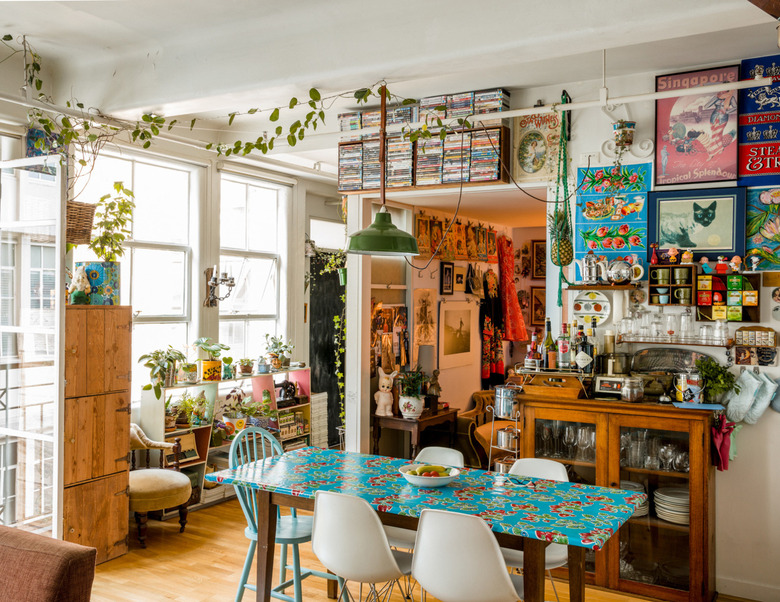
Sure, the art of layering patterned rugs and wallpapers takes a certain eye for design, but so does creating a sense of order from chaos. Take this space, for example, with its only real pattern being a similar teal print on the tabletop, above the bar cabinet, and on the planter near the windows. The other textures and patterns present are created organically with groupings of potted plants, DVDs above the doorway, artwork, and even glassware suspended on the wall.
6. Mix media.
6. Mix media.
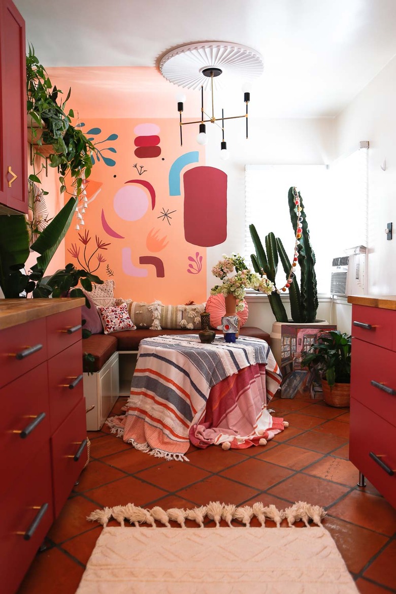
A neutral runner in the kitchen prepares the eye for even more texture and pattern in this built-in dining area belonging to Mila from Jest Cafe. There, a hand-painted mural magnifies and emboldens the colors found in the layered tablecloths, throw pillows, and art. Mila sketched the mural design onto the wall with a pencil and used paint samples to complete her kitchen nook, where mixed media creates a dynamic space as interesting as the person behind it.
7. Embolden bathroom tile.
7. Embolden bathroom tile.
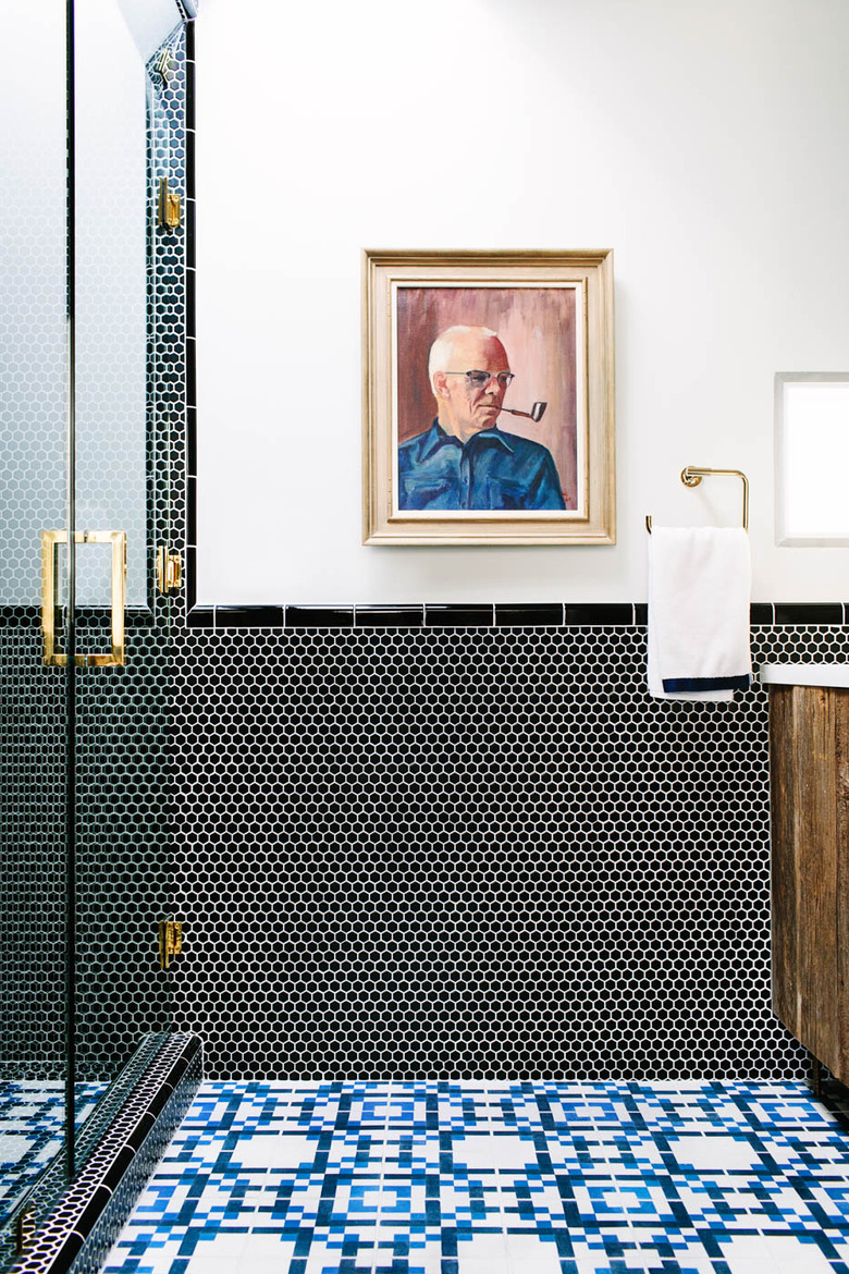
Anchor bold tile with a vintage oil painting, like the one in this bathroom captured by photographer Mary Costa, to achieve a look that is calm, cool, and collected. This design proves that a few graphic patterns can exist in a small space and still end up looking crisp and timeless: down to the perfectly selected hand towel and the reclaimed wood vanity, which creates a rustic pattern all its own.
