3 Interior Photographers On What Makes A Home Feel Polished
Interior photographers take more-or-less ordinary spaces and make them look worthy of a magazine spread. Sure, some of that is just having access to the right equipment and understanding, say, the power of natural light. But I always wonder — what do they see that the rest of us don't?
Here, three photographers share what makes home spaces look inviting, yet aspirational — not just in photos but in your everyday life.
STEPHEN PAUL: First declutter, and then mind the details.
Stephen Paul is a Los Angeles-based home and interiors photographer who shoots a lot for Hunker, in fact. It's a different approach than, say, real estate photography, which is often about making a space feel larger than it is. This more editorial style is often about small moments — and mood.
For Paul, just as any other interior photographer, the first step is to always declutter. But it goes further than you might think. Like soap dispensers that aren't reusable, sponges, drying racks, "anything that doesn't have a sense of design in and of itself," Paul says.
And really, to the trained eye, no detail goes unnoticed. "Another big thing I constantly see is people leaving lamp shades with the seam out," says Paul. "I know that's very specific, but it's turned into a pet peeve."
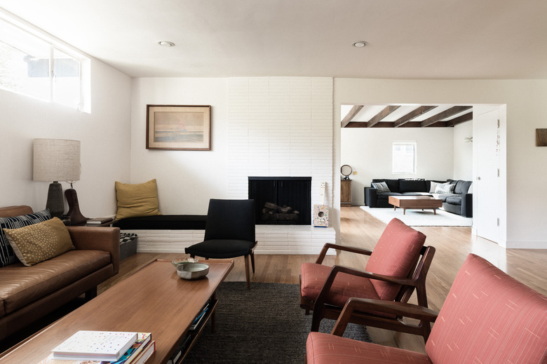
While those precise touches matter, so does overall layout. "Sometimes the way people have their homes laid out, the back of the couch is the first thing you walk into," Paul explains. "You want to be able to walk into a space. You want it to be open."
SANFORD CREATIVE: Showcase your personality. (And don't neglect the bathroom!)
Amanda and Scott Sanford of Sanford Creative, a husband and wife photography team based in Southern California, built their business shooting weddings — but they also do interiors. Their approach to both is rooted in a natural, in-the-moment feel.
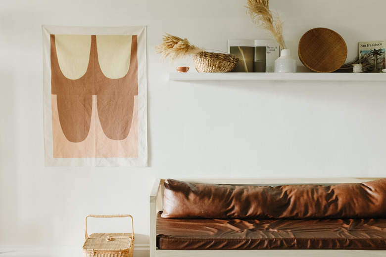
"I personally really love when a space looks lived-in and not so pristine," says Amanda. Of course, she'll hide cords or put away the mail to make an image look better, but the book is still open on the table. "It adds a little bit of character and makes it not so catalog."
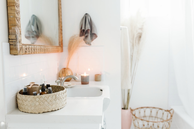
She reminds homeowners not to neglect the bathrooms. "You can have fun in the bathroom," she says. "I've appreciated places where they hang artwork or have collections of books or magazines, any little detail like that can give it personality."
Choices like that, however small, can really make a difference — especially when the accessories are personal. "There's a lot of lost opportunity in those small details," she says. "Some people will just pick up something generic from the store to fill the space, but I love it when homeowners use pieces with a story — like some artwork they bought at the flea market, or a beautiful book they picked up on a trip."
And to her, furniture placement is huge — and nothing to be afraid of. "We move things around a lot," she says. "Growing up my mom rearranged my house every other weekend, so I'm a huge fan of changing things up. Try it all. You won't know until people come over and use the space whether it works for you or not."
KAT ALVES: Texture, scale, and variation are signs of great style.
"I have a background in interior design myself, so I have a bit more of a hands-on approach," says Kat Alves, an interior photographer based in Nevada City, California. When she shoots a project, she already has a sense of what the architect or designer might want to showcase.
Although Alves does do some styling, she doesn't bring many props — it's usually more about taking things away and editing. And thinking about texture.
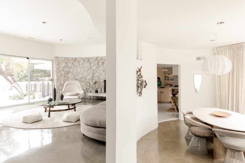
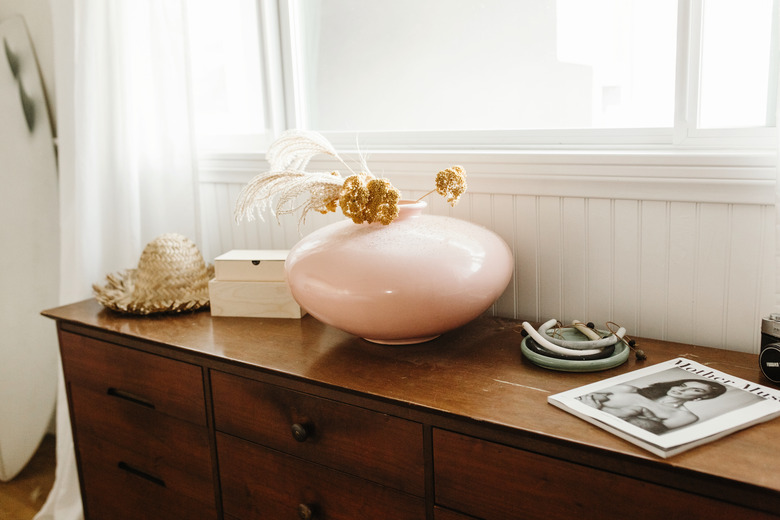
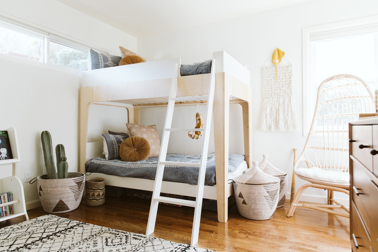
"Color and texture is such a big thing — whether it's flowers or pretty textiles or a cool vase," says Alves. Variation is important as well. "People do a lot of white, but white with a lot of different textures, it can have such a lush feeling." What's one secret weapon? Sheepskin, she says. "It looks really great, it's soft, inviting — and it covers any cat problems."
Alves also likes to step back, and suggests that homeowners really think about the composition of a room, and the movement between items. Ask yourself, "Where are the resting areas and where is the negative space?"
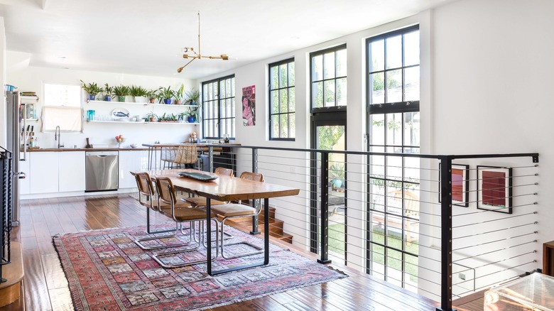
And then, she says, great style is really about scale. "A lot of people make the same mistake, to have lots of small things. In general, larger statement pieces do better. The bigger pieces open it up, make the room feel bigger — and it photographs better."
