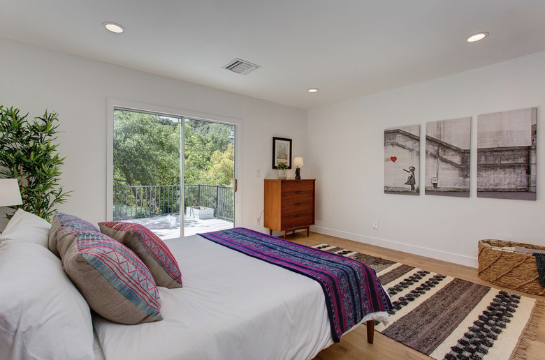
9 Staging Ideas To Help A Home Seem More Appealing
Staging a home (in order to help it sell) and interior design are different beasts — related, but not the same. Sure, staging experts mix and match furniture and accessories, hang art and layer textiles, as any designer would. But staging is not about everyday life. The goal is more immediate than that: It's about creating that one moment to spark a feeling of Yes, I can imagine myself here — forever.
"It was natural for me," says Isabelle Dahlin, the Swedish-born interior designer and owner of deKor, a beloved Los Angeles-based interiors concept store with outposts in Atwater Village and Ojai, as well as a 5,000-square-foot warehouse brimming with one-of-a-kind finds and custom furniture in Frogtown, a little nook of a neighborhood next to the L.A. River. Dahlin opened deKor in 2011 and began staging homes about five years ago, informally, at the behest of a customer with a place to sell. Demand grew enough that she brought in Ruby Wendell to manage that part of the business.
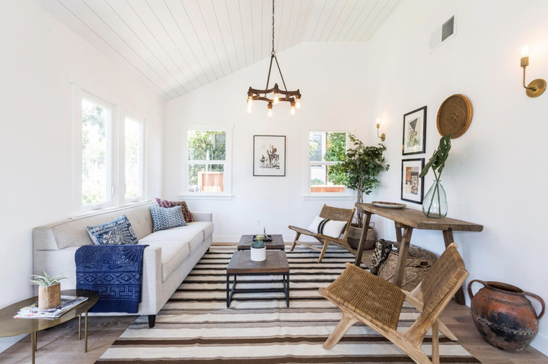
Together, Dahlin and Wendell leverage the unique mix of furniture and accessories that deKor is known for — European antiques, handmade chairs from Nicaragua, and textile art from Sweden — in homes for sale across greater L.A., and while no two homes they've staged are alike, the look and feel of their touch is familiar — it's aspirational, yet accessible, a blend of vintage, modern, and global that exudes warmth. There are lessons that any of us can learn from seeing their work. That's why we asked Dahlin and Wendell to share staging insights that can work in everyday homes.
1. Emotion is key.
1. Emotion is key.
"When I stage — I don't know how anyone else works — but I walk into that house as a buyer," Dahlin says. "I remember, with any house I ever bought, walking in and feeling, I want this so bad. I know exactly how to do that. It's an emotional thing to walk into a house and fall in love."
2. Blend and mix styles.
2. Blend and mix styles.
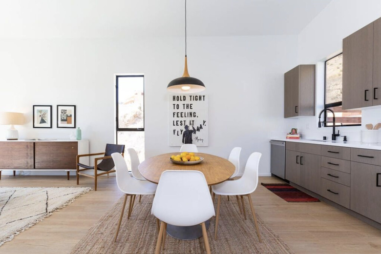
"I think it's nice to have an eclectic vibe, which is what we do," Wendell says. "We don't just use midcentury and bohemian pieces. We blend it with contemporary to warm it up. We keep it happy."
3. Leave some room.
3. Leave some room.
"We definitely do a lot of less is more," Wendell says. "Izzy will come and take something away and it'll be like, Oh, that's perfect." It's not just editing. Dahlin and Wendell leave room on shelves, and not every surface is occupied. "It's different from interior design," Wendell says. "You want people to feel like they have enough room for their stuff."
4. Don't just hang any art.
5. Move things around.
5. Move things around.
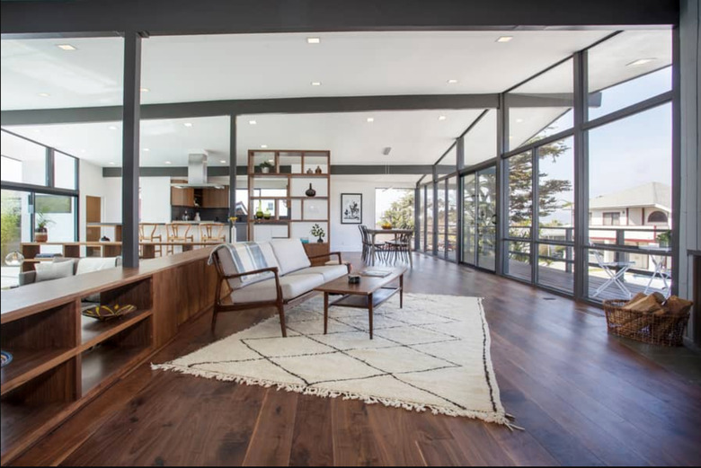
"Even if you're not staging a place to sell, you can always rearrange the furniture," Dahlin says. "You can float a sofa. People don't think about that."
6. With rugs, bigger is better.
6. With rugs, bigger is better.
"People have no idea how to use rugs," Dahlin says. "They put tiny rugs in a large space." She says if you are going to spend money on just one thing, buy a larger rug for a room. "The space will feel bigger. It feels better. It anchors space."
7. Frame it.
7. Frame it.
"If you frame anything well, it will look amazing. So splurge a little bit on framing. People don't want to spend the money on it — but that cheap piece of art from the flea market, the frame will take care of it."
8. Add three-dimensional objects to walls.
8. Add three-dimensional objects to walls.
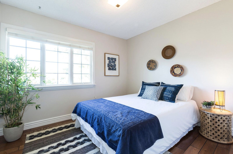
"We hang baskets on the wall a lot, along with art. When I'm looking at a room, I don't want to have graphic art, graphic art, graphic art," Wendell explains. Baskets — and other natural, three-dimensional objects — can add variety to walls. Plus, they are light and easy to both hang and remove, which is key for staging.
9. Use textiles.
9. Use textiles.
Dahlin says, "We always use something like a beautiful vintage fabric. It's not a bedspread, it's just to be pretty. I do it at home, too, and up in my Ojai house."
In the end, it's a mix of art and science. "Anyone can buy furniture and put it in a room. Anyone can buy art and put it on a wall," Wendell says. "The hard part is putting the right pieces together."
