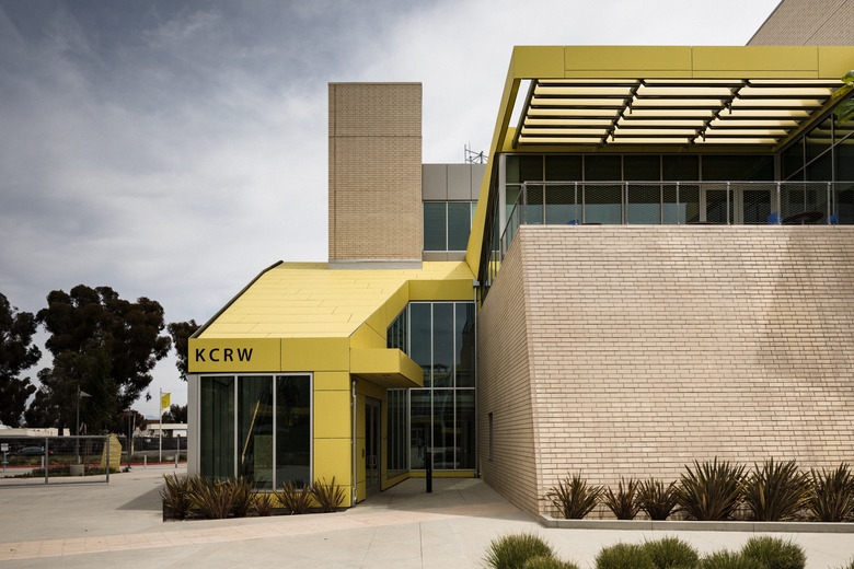
Renowned LA Public Radio Station KCRW Finally Has A Sleek New Building
"From the basement studios of KCRW ... " was a common phrase heard on air by millions of listeners of the Santa Monica-based NPR station over the last three decades.
In that time, the station's literal underground status in the cafeteria building of Santa Monica College developed its own special allure, attracting numerous personalities and emerging and legendary bands alike to make the journey to the beachside city and down the stark stairway into KCRW's no-frills but much-heralded studios. Hundreds of volunteers were also regular visitors, answering phones during pledge drives to keep the lights on and cement KCRW's reputation as an independent, member-supported media force in Southern California. Many would also snap the prerequisite photo in the stacks of the famed KCRW music library.
Packed tightly into a subterranean maze of rooms, scattered in four other crowded spaces on campus may have challenged the 100-plus KCRW staff but never prevented them from producing some of the best music, culture, and news programming in the country. Daily music show Morning Becomes Eclectic with Jason Bentley, the weekend culinary show Good Food on the Road with Evan Kleiman and the late Pulitzer Prize-winning food critic Jonathan Gold, and the weekly news and public affairs show To the Point with Warren Olney are among the original programs that have made 89.9 a popular destination on the FM radio dial and kcrw.com a favorite site for streaming, especially now that it hosts numerous original podcasts for people's listening pleasure 24/7.
But some of the biggest news to come out of the station in recent months is their own: KCRW has left the basement.
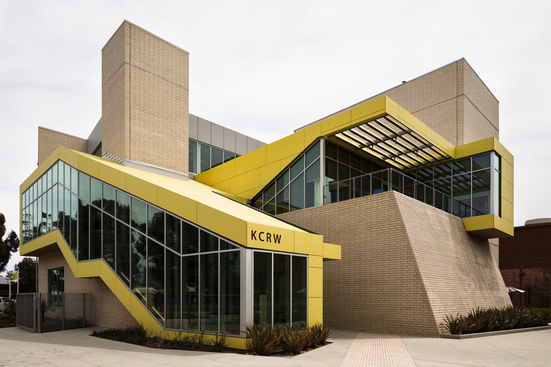
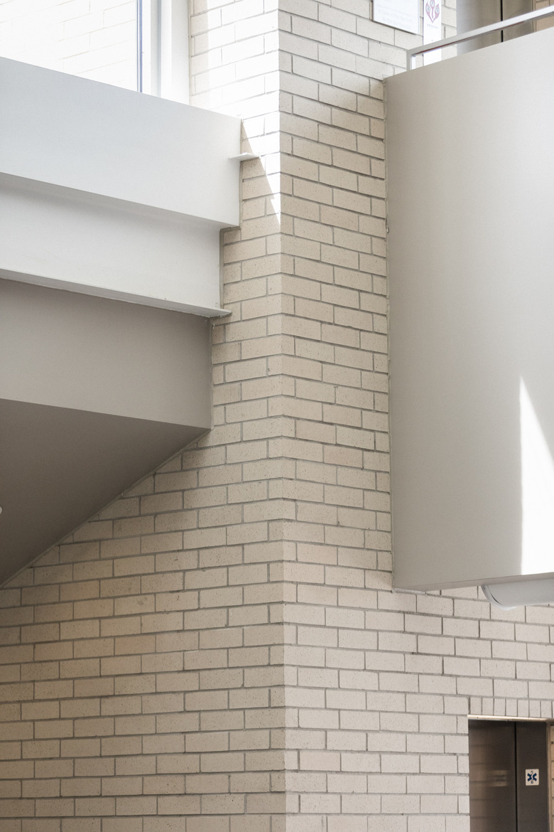
The majority of its operations and staff are now above ground, in the brand-new 35,000-square-foot, three-story KCRW Media Center on Stewart Street, one of three buildings that make up Santa Monica College's Center for Media and Design by architect Clive Wilkinson, known for his innovative workplace and educational institution designs for FIDM, UCLA, TBWA\CHIAT\DAY, and Google.
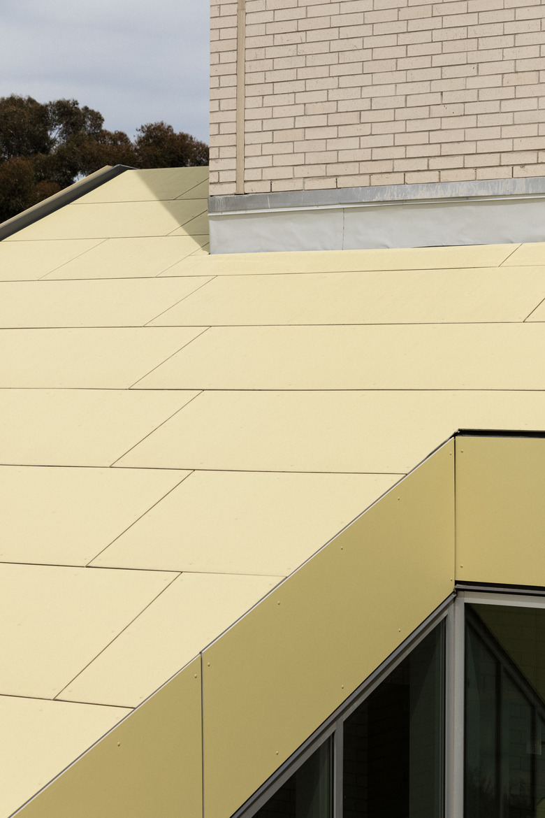
The building's exterior is a dynamic display of intersecting angles and varied shapes, with strips of yellow carried throughout the structures of the satellite campus. "He loves neutral spaces with big pops of color," says Jill Smayo, the chief operating officer of KCRW. "It's very much a part of his design."
The station's former basement location (and circuitous route to get there) meant many students were likely unaware that below the cafeteria, breaking news was being reported or music icons were performing, while the location and architecture of KCRW's new HQ clearly states: Exciting things are happening in here.
One recognizable voice greets visitors upon entering the glass doors: that of longtime listener and filmmaker David Lynch in the form of a freestanding, glass-encased print with his handwriting and drawings. They were reproduced from his foreword to KCRW's 2016 coffee-table book, From the Basement, and includes the lines "KCRW is a Radio STATION . . . it is SoOOO interesting to hear – to learn and KNOW . . . what kind of a fantastic tHiNG is this?! some woRds come to Mind – tRust – information – humor – emotion – community – hiP – hope – indie – thrill – news . . ."
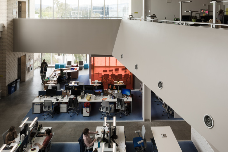
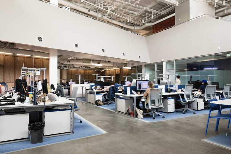
Next to it is a grand staircase that leads to the second-floor reception desk and a massive open work area. Here, Wilkinson's interplay of angles, materials, and colors resumes and is amplified — with all the exposed ceiling pipes and vents, light fixtures, and office furniture in play — and perhaps the most welcome guest of all, natural light.
"The building's soaring space and light pouring in from three sides and skylights give it a sense of grandeur and ambition," says DnA: Design and Architecture host Frances Anderton, who has followed Wilkinson's work since they both lived in London in the late 1980s. "Yet it is not pretentious or overly luxurious, which would not have suited KCRW, thanks to a fairly basic palette of materials and furniture."
The light gray and blue workspace seating and white sit-stand tables and work stations are from Haworth, with some furniture custom-built for the studios, and additional pieces in the building sourced from various companies: Global Industrial heavy-duty tables, Herman Miller loveseats, Hightower stools, Moroso low tables, and Quinze & Milan reception seating, which are definitely conversation pieces.
The stiff-looking turquoise blocks and geometric gray chairs provide insight into Wilkinson's design philosophy from the get-go. They are no doubt visually interesting but do not appear comfortable at first glance. "We strongly believe that workspaces should not be too comfortable," shares the architect via email, "but should be reflective of creative activity and therefore somewhat provocative." He certainly succeeded. The pieces, which are actually made of foam, are memorable.
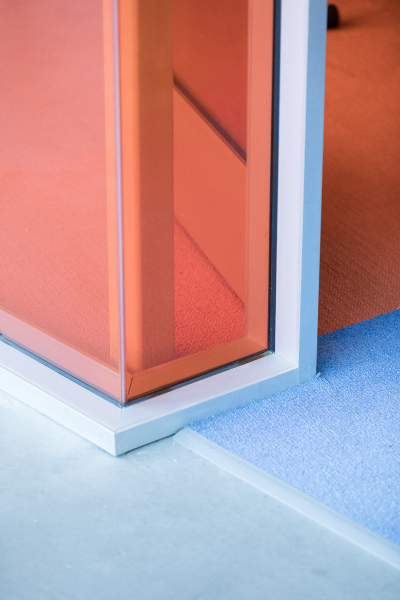
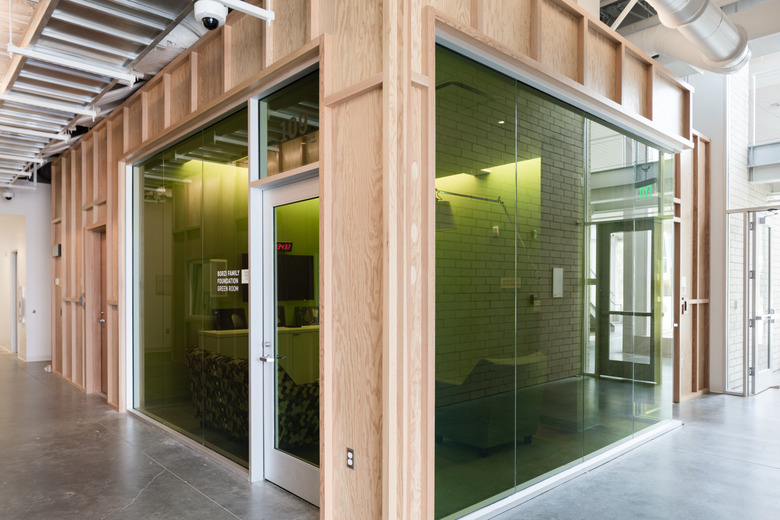
Wilkinson's overall design of the interiors has received positive reviews from the staff so far, giving them everything the basement didn't, including flexible workspaces, multiple meeting areas, ergonomic chairs, motion-sensor desk lighting, and dedicated indoor-outdoor eating areas. He also provided visual cues that make it easy to navigate the space: where there are wood facades, you find studios; glass signals conference rooms.
While desks are assigned and the bright-orange and highlighter green conference rooms have to be booked, there are plenty of places all staff are welcome to use throughout the day: open-collaboration nooks can be found on every floor, low and tall tables for solo work and casual interactions, private phone booths for important calls, as well as unassigned standing desks.
It may take time for some staff to adjust to being in a large shared space versus grouped in separate rooms — there is a debate over how productive open office plans are — but Anderton finds it invigorating. "The open, multilevel, nonhierarchical open-plan interior means you can see colleagues and visitors walking across the room, working at their desks and going up and down stairs," she notes. "So the space feels animated and theatrical, appropriate to a place that is about performance."
Anderton also points out that the entry staircase is a great precursor to what lies ahead, "walled in glass and quite a workout to ascend, is a stairway to heaven. It adds drama to the procession to the KCRW office floor and a sense of reaching great heights, hopefully a metaphor for the station itself as it enters a new phase."
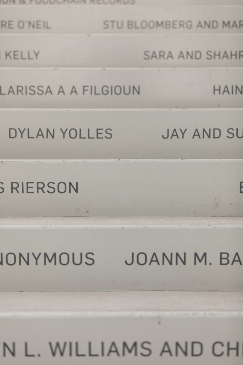
On the vertical face of the stairs are all the names of the major donors of the capital campaign who raised funds for the media center's construction. Says Smayo, "They are literally the names of people who helped us emerge from the basement."
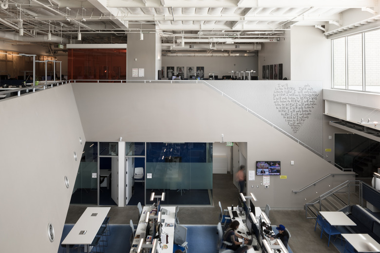
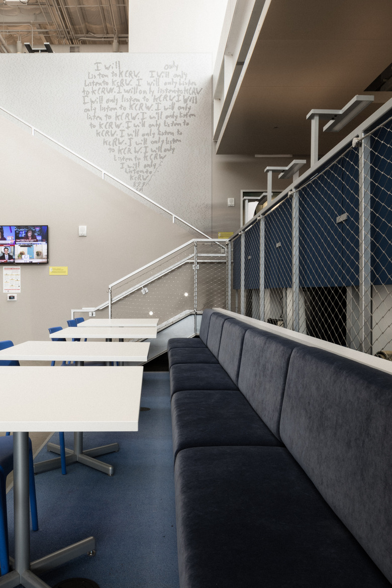
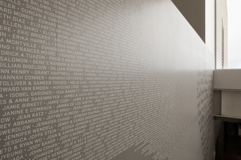
Many areas in the building acknowledge the people and foundations that made it possible, with some spaces named after them, such as the Rosemary Kraemer Raitt Foundation Music Library and the Borzi Family Foundation Green Room. But by far the most striking display at KCRW, as a member-supported radio station, is what graces the wall of the far staircase connecting the second and third floors: a large "I will only listen to KCRW" heart graphic by Mr. Brainwash embedded with the 5,466 names of those who contributed a dollar or more to the capital campaign. The heart was originally from an old pledge drive T-shirt, and KCRW worked with Denton-Cardew Design to produce the wall and other interior graphics.
If you were to ascend the stairway onto the third floor and lean over the steel railing while looking out the windows, you may catch a nautical vibe — and it's intended. The floor juts out over the main work area at an angle, much like a cruise ship's outlook deck. And it's not the only place that mimics an adventurous setting. "We use the fabric of the building to weave a language that suggests themes like nautical, spaceship, mountain/grotto, and so on," says Wilkinson, who also notes this wasn't a formal design request by the radio station. "KCRW's needs were really very modest in keeping with their culture."
The architect asked the staff early in the design process, "Hey, what's your dream?" They had but one simple request.
"Everyone's answer was 'a sink in the kitchen to wash my coffee mug,'" shares Smayo. In the basement, their kitchen was a repurposed storage closet that just had a coffee maker and a small fridge, so staff had to go to the bathroom or the mechanical room to wash out their mugs.
When Wilkinson asked what else they wanted, the staff said, "That's it." Now they have a spacious kitchen with a sink (that even has a garbage disposal), a large fridge, endless counter space, and its own flat-screen TV. Now that's an upgrade.
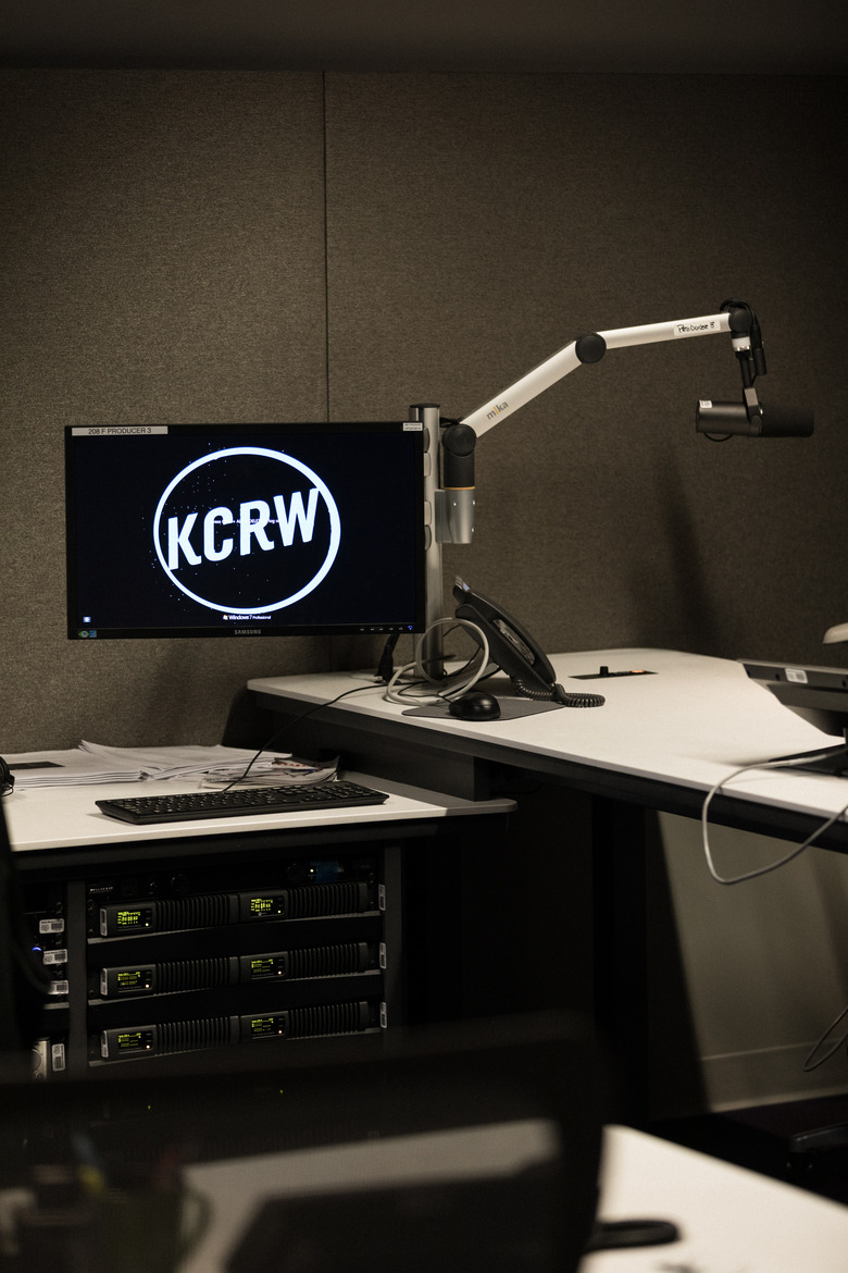
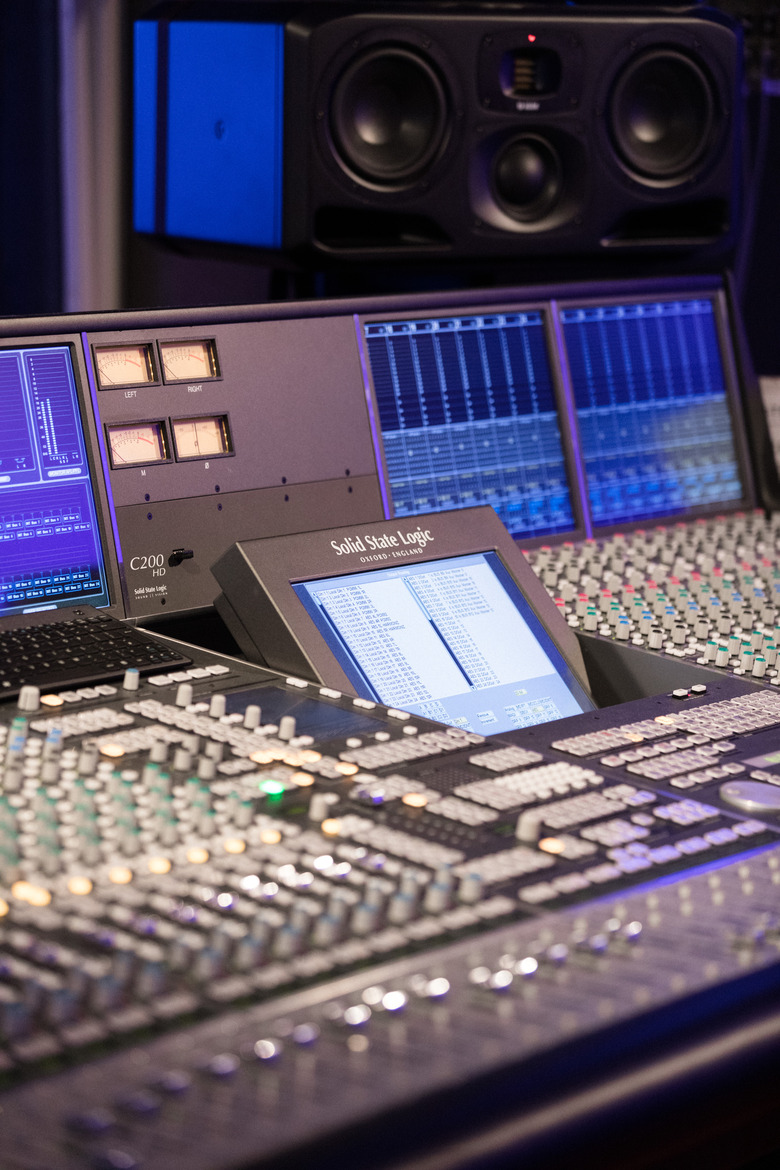
And KCRW hosts feel the same way about their state-of-the-art new studios. "I actually have sight lines to see my producers," says Madeleine Brand of the daily news and culture show Press Play. "I used to only be able to see one. I often had no idea who was in the [control] room." Regarding the whole building design, she adds, "Aesthetically, it's gorgeous, I love being here every day."
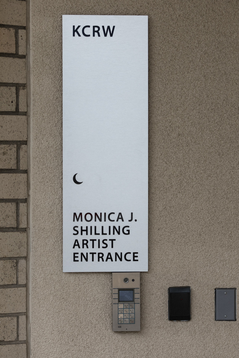
Guests to the studios may also appreciate some of the architectural features added specifically for them. For one, there is a tour bus-friendly parking space in the loading dock, which made sense for the station as it hosts bands three days a week. "They can unload and then it's a straight shot for them into the performance studio," says Smayo. "That's actually revolutionary to our operations, and it's a huge advantage to musicians and their roadies."
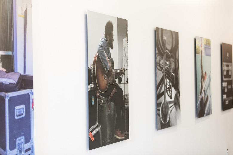
And as the performers proceed through the special "Artist Entrance" double doors, they are treated to a visual history of those who came before them, with portraits of artists loading into the former basement studio lining the walls. Such special touches remind people of the rich legacy of KCRW.
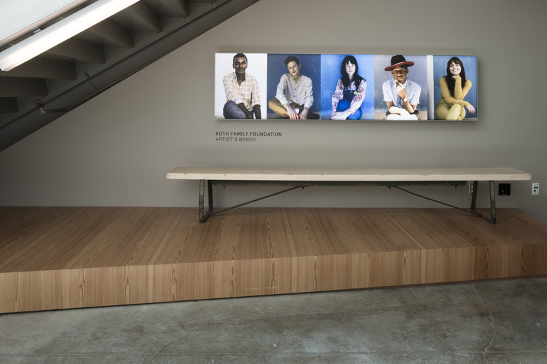
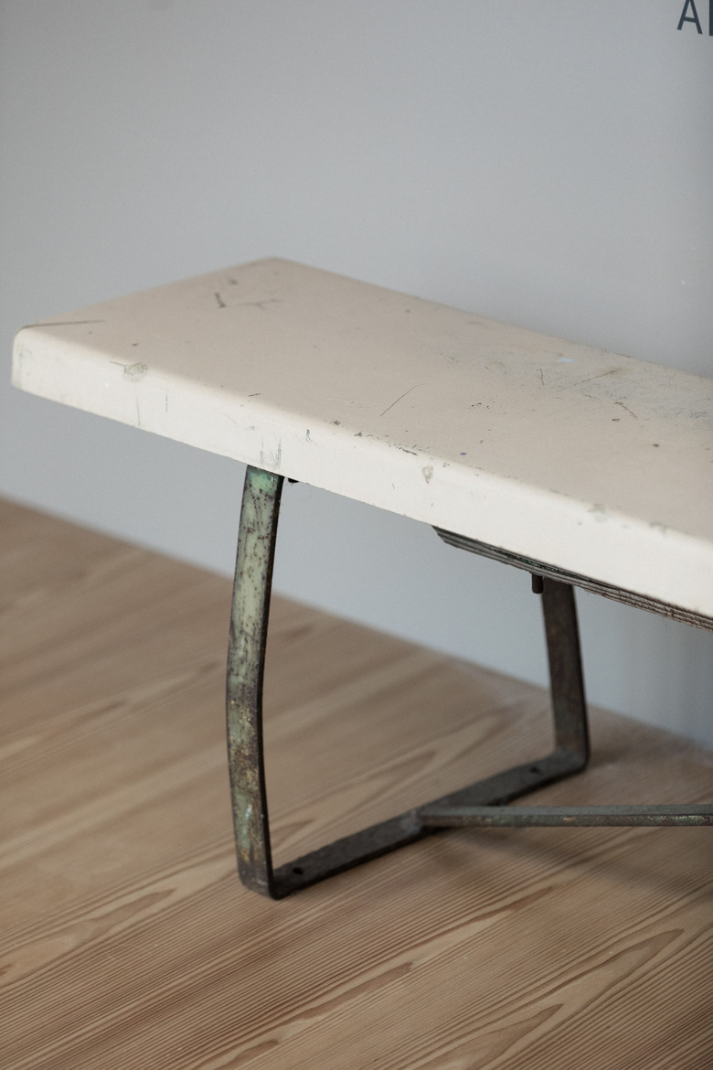
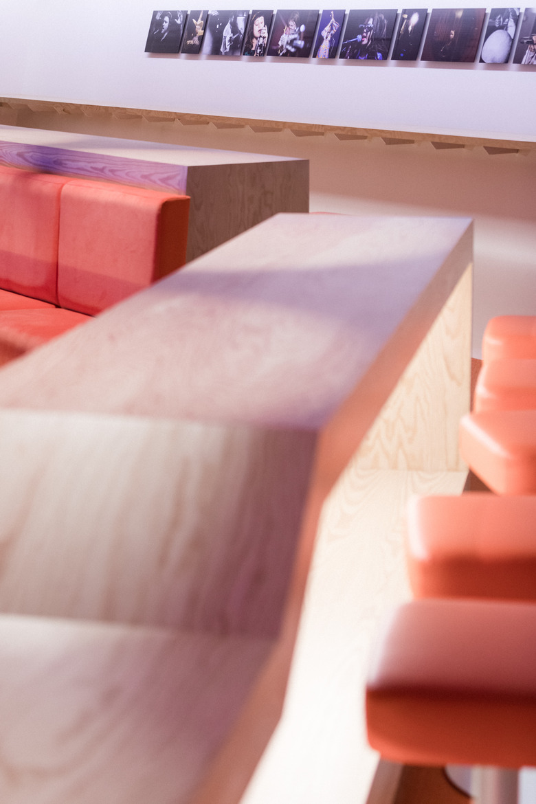
Other photo arrays of past guests are placed throughout the building, including one over a piece of important furniture from their former home: a seemingly nondescript bench. "This is a cafeteria bench that's been outside the basement studio for 30 or 40 years," Smayo explains. "We have so many images of artists sitting on the bench. We've taken on that bench as a piece of art." Its new home is under the entryway staircase "so we don't forget where we came from." There are plans to also frame a piece of the carpet from the basement with an anecdote about it, to add more "storytelling pieces to the space."
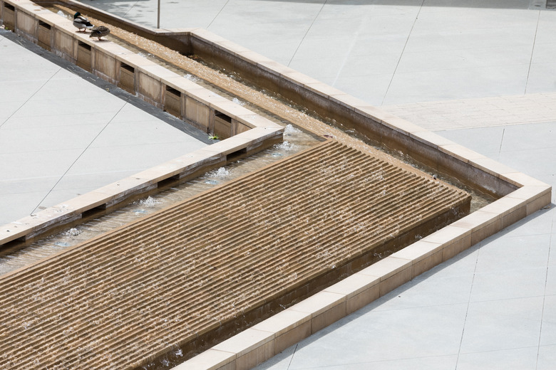
Another welcome addition in the new headquarters is the outdoor courtyard, with its raised, V-shaped water feature that actually serves as the foot of a stage. "We needed to examine all the different activities that [the courtyard] could possibly host," Wilkinson says. "Of those activities, speakers and band performers would need a stage, so we wanted to design one that would look [like] part of the courtyard landscape when not in use." The station already put it to use last year when they hosted three of its Summer Nights and will be doing it again this summer.
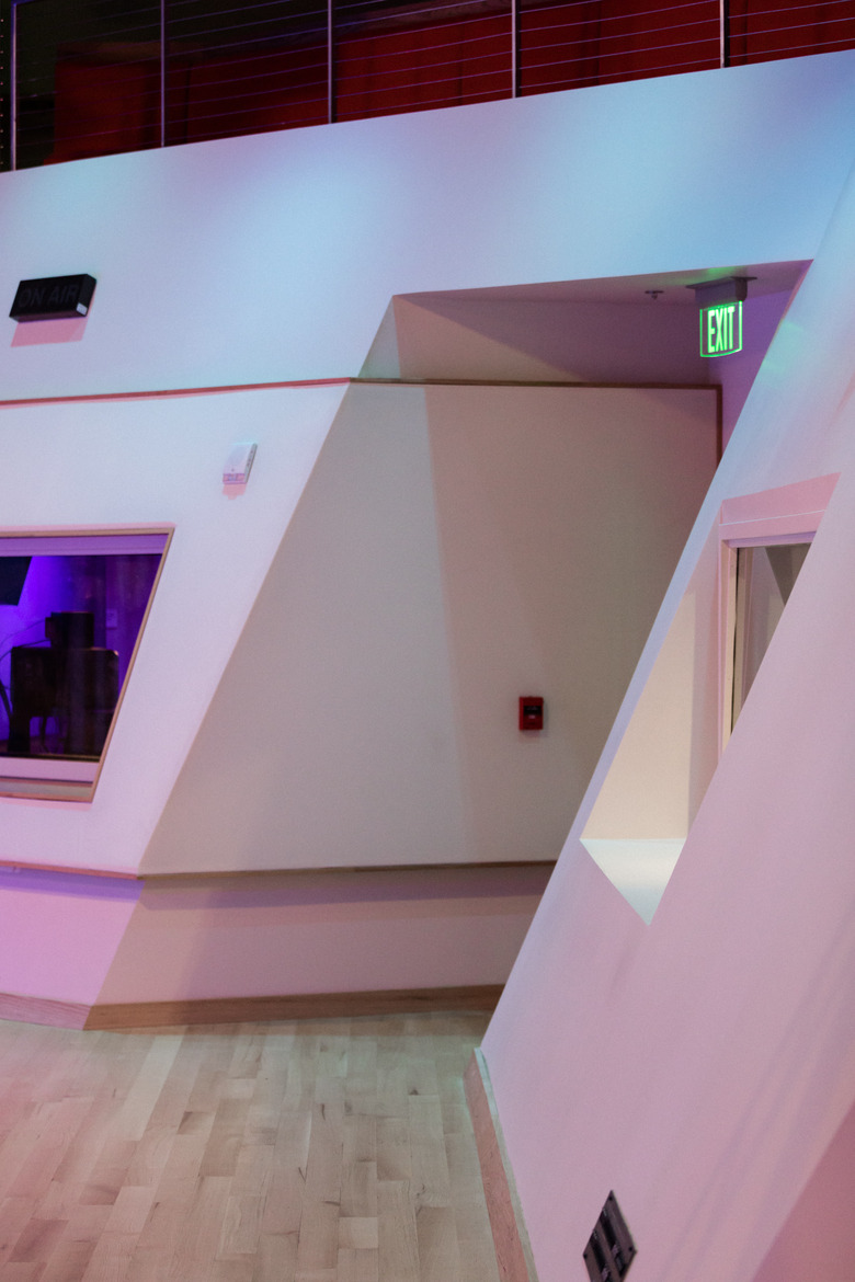
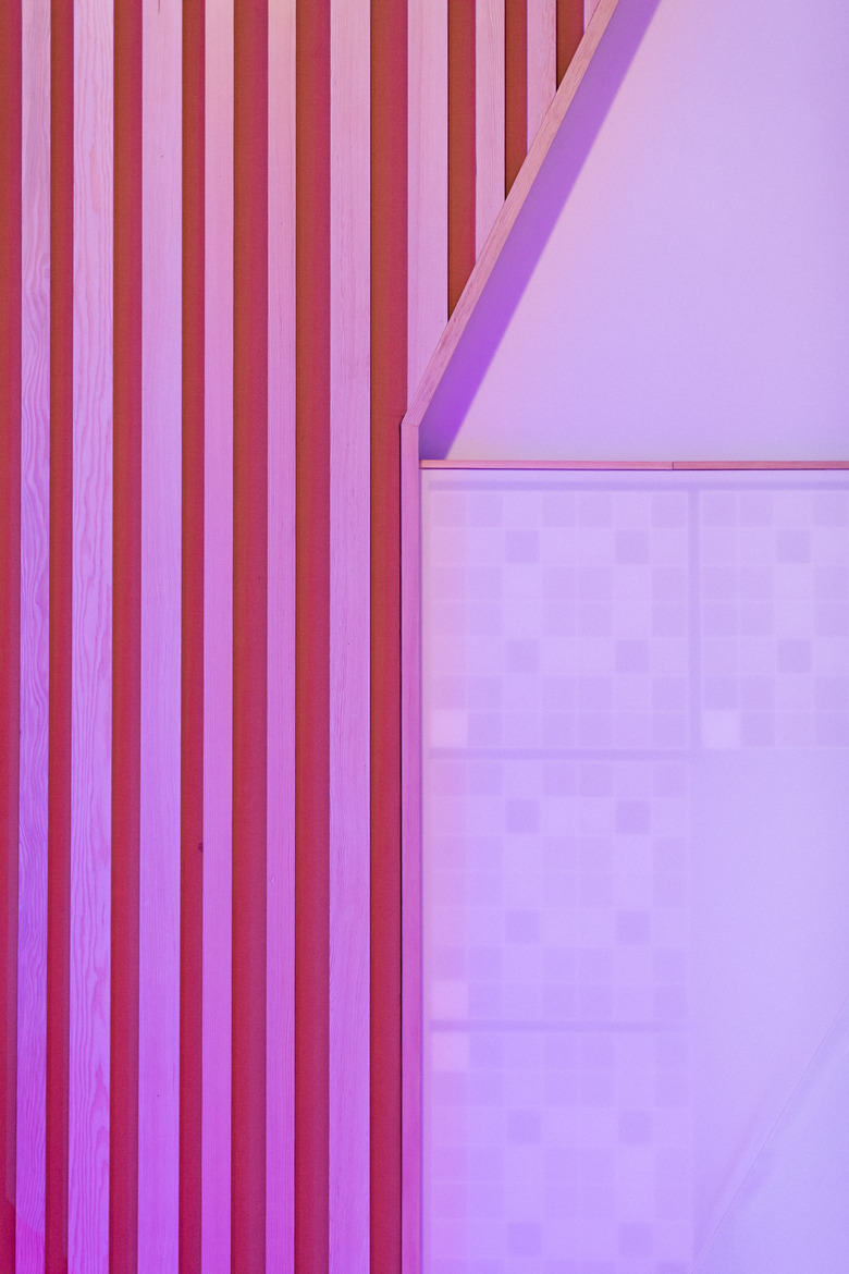
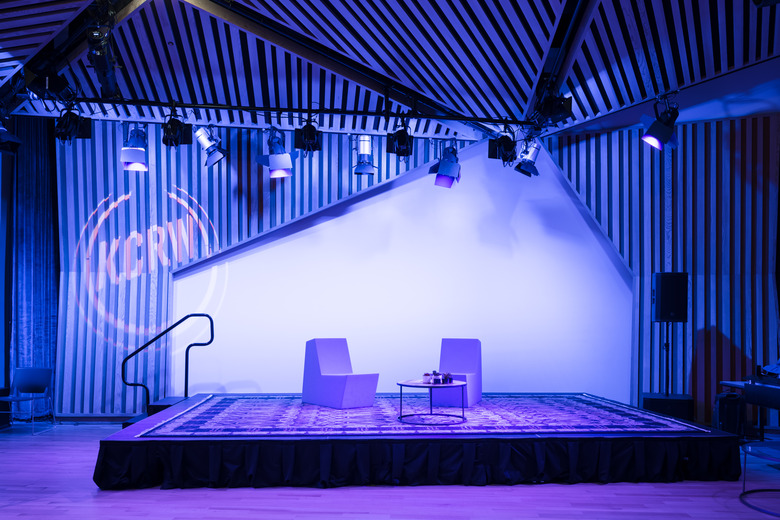
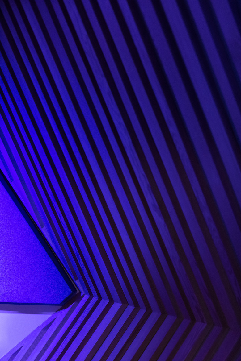
But the most stunning room in the building is definitely KCRW's performance space, what Smayo calls "the crown jewel of the project," with its fragmented wood beam-striped panels, wrapping the room in a dramatic puzzle-like fashion that, when lit, is as captivating a spot as any of the top venues in the city. Its noticeable lack of parallel walls actually serves the space visually and acoustically.
Here, KCRW hosts music and news guests in front of a live audience. Up to 90 people can sit comfortably on chairs set out on the floor and another 40 in the ultramodern mezzanine balcony, which features sleek, long wooden bars and matching seating and carpet. Another Wilkinson exclamation mark that exciting things are happening here.
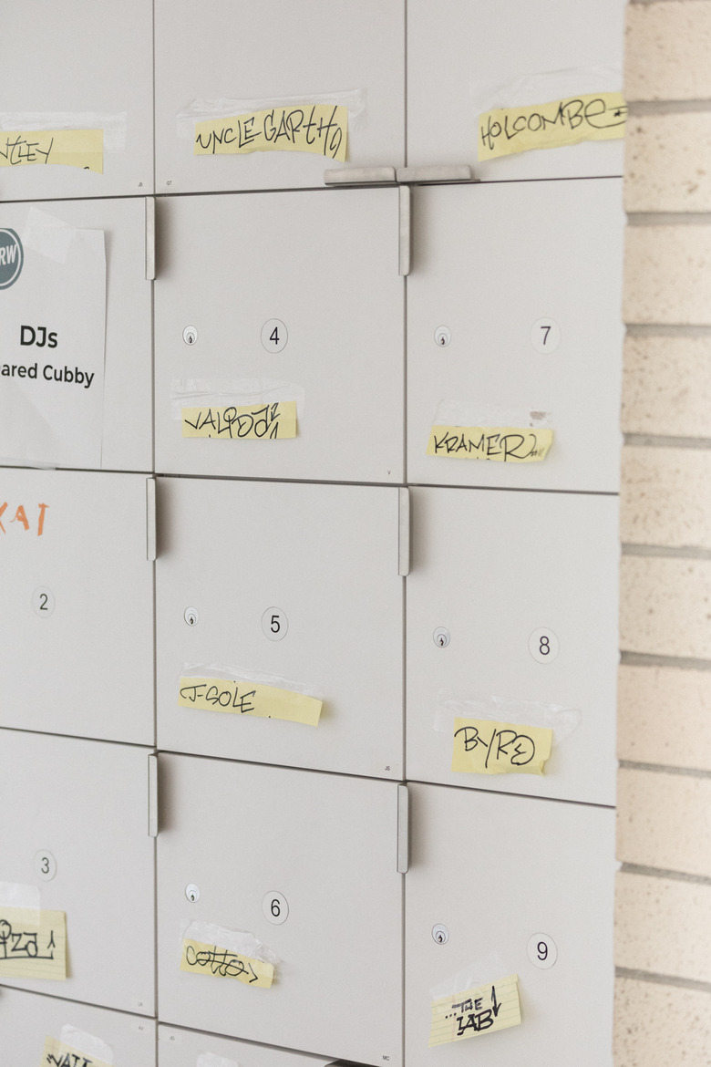
The bottom floor of the building is primarily dedicated to music and is still in transition: KCRW's extensive music library of vinyl and CDs will be housed in neighboring rooms once the shelving design is done. Where a staff member personalized the deejay lockers with taped-on name labels, as people still learn their locker numbers, likely name plaques will be placed. And the empty space next to the Green Room will soon be a DJ lounge. "We're gonna keep flexible furniture in here," mentions Smayo, "so people can meet in groups, hang out, listen to music."
The possibilities are endless in a building of this size and the staff at KCRW realizes this — and they hope to take full advantage.
"It allows us to explore and to highlight the creativity that makes up this place: the people," says host Steve Chiotakis. "The very talented people who are part of this operation every day are able to do the things they are best at in a place like this. We had limitations in the basement, we didn't have enough studio space, people were climbing over each other, and now we have more breathing room to do the work that our listeners and members demand."
While KCRW's reputation has long been built on the quality of its programming and not the size of its space, its more than half a million weekly listeners can't wait to see how the staff adapts and grows into their new media center, and the media landscape as a whole.
Sincerely,
One of the 5,466 individuals who supported it
Words: Teena Apeles
Images: Stephen Paul
