A Modern Dog House Was The Inspiration Behind This Minimalist Abode
Renovating can be a slippery slope — but a good one. Take the case of a Toronto home handled by StudioAC: The client wanted a place to tuck away a dog bed ... which evolved into a complete gut redesign.
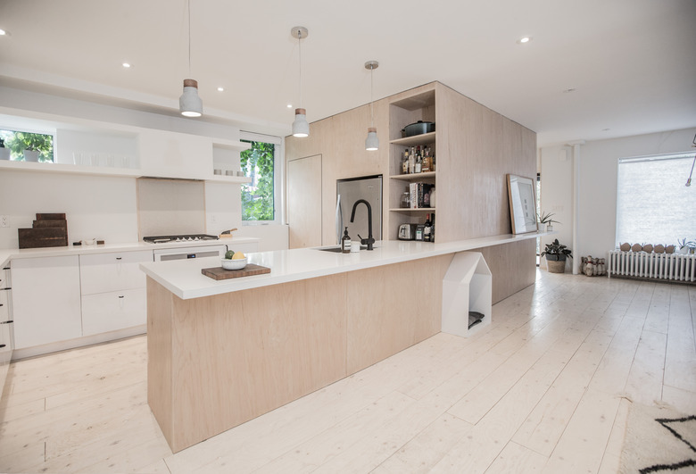
What was StudioAC's idea? Creating what they dubbed "the mass," a multipurpose storage unit that ended up completely defining the structure of the living areas, as well as the tone of the three-bedroom home. Before the renovation, the house, located in the Dundas West neighborhood of Toronto, was dark, cramped, and broken up into separate rooms. Owned by a contractor who also acted as a consultant on the project, the 1,500-square-foot space was cleared out to create a sense of openness.
Because the design team was on a budget, they opted for inexpensive materials, incorporating elements from IKEA and cladding "the mass" with plywood from Home Depot for a sleek look. The team also got creative by using plywood boards for the flooring. By rearranging the layout, the house has transformed into an airy, open space complete with a playful home for Rusty the dog.
1. Kitchen
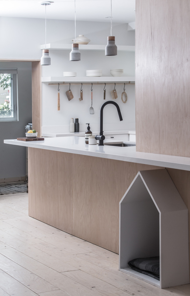
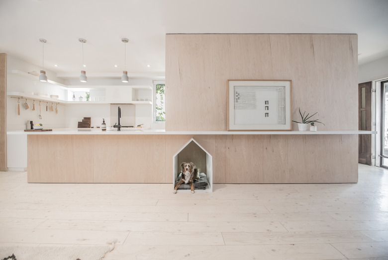
In order to open up the space, the team created the uniting plywood mass that functions as a kitchen setup, storage space, and doghouse. The large plywood box also provides a closet underneath the stairs.
2. Kitchen
Joel Barkin, the homeowner and a contractor (his business is called JoelDidThis), helped bring the ideas to life.
3. Kitchen
Wood flooring is expensive. In order to stay within the allotted $200,000 budget, the team devised a "hack" that consisted of cutting up 6-inch plywood boards to arrange and install.
4. Kitchen
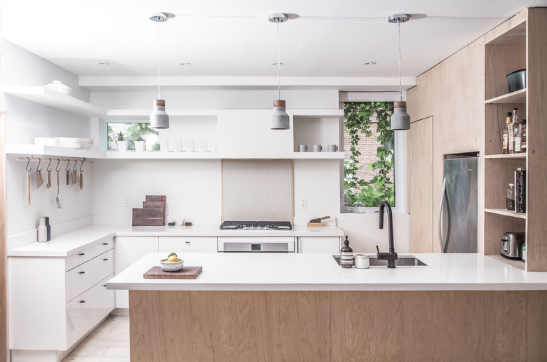
Kitchen cabinets from IKEA blend with the plywood mass created by the design team. Ceasarstone counters stretch past the plywood box to lengthen the shared area.
5. Kitchen
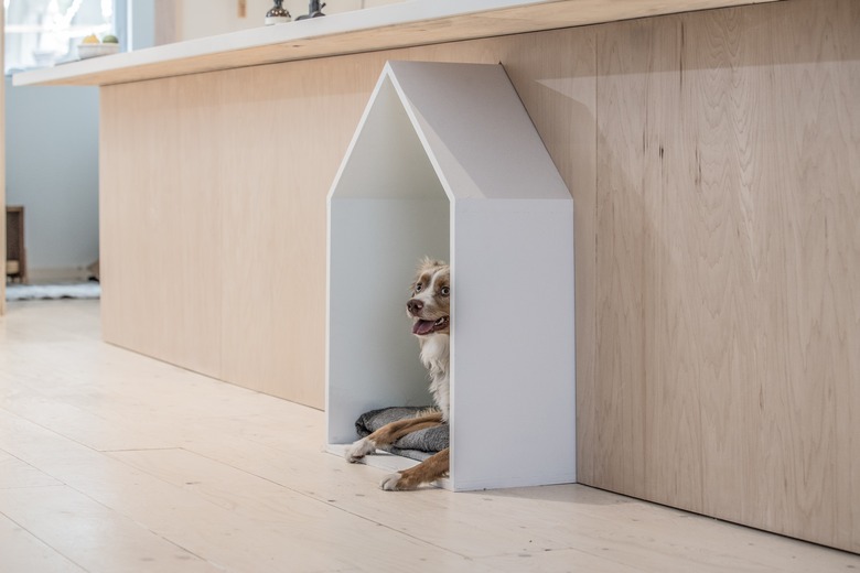
The doghouse came about because of a single line in the brief where the clients requested a storage space for their dog bed. To make the geometric doghouse pop against the plywood background, it was painted white.
6. Dining Room
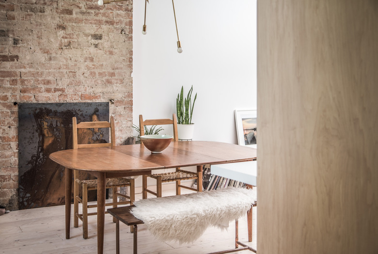
The dining table and chairs were part of the client's collection. The original fireplace was modified slightly with a steel plate in order to close off the old opening.
7. Upstairs
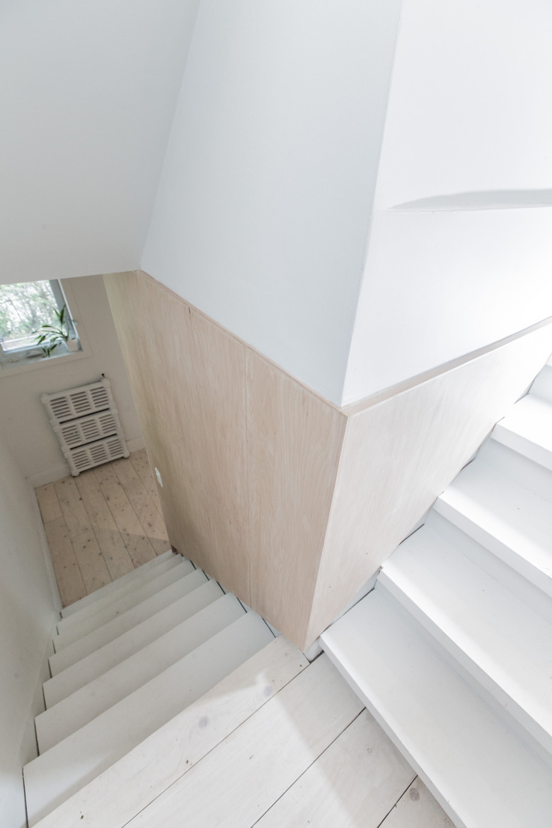
For the staircase, the design team used plywood paneling on the walls and painted the steps white for a clean and light-filled appearance.
8. Bedroom
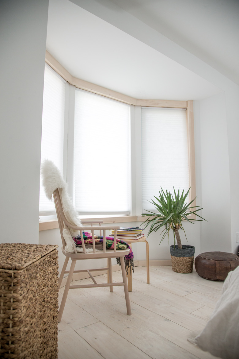
The design team installed new windows and added wood trim.
9. Bathroom
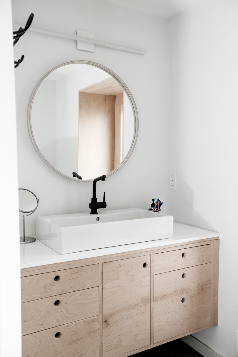
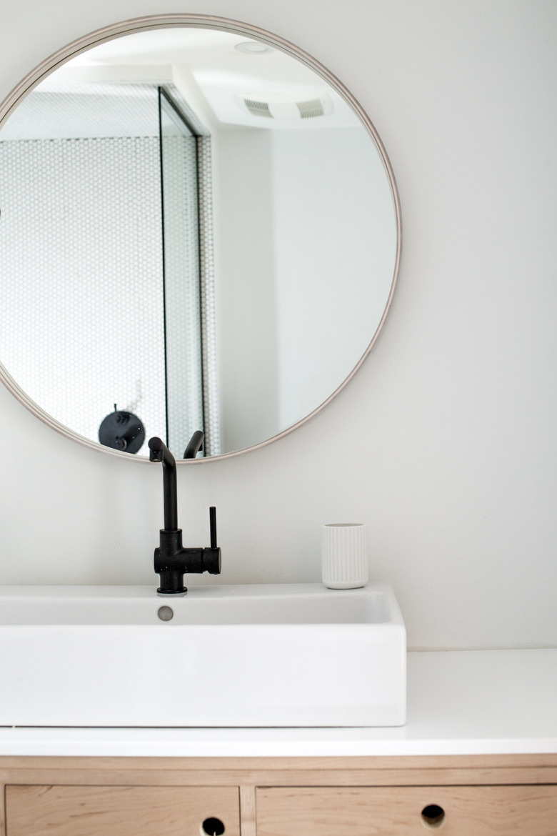
The bathroom cabinet space was custom built by Barkin. The cabinet is topped with Ceasarstone countertops and a faucet from IKEA.
10. Bathroom
A circular mirror from IKEA is a fun way to break up the square cabinet design.
