12 Living Room Layout Ideas That Always Work
Aside from selecting furniture, nothing poses quite the same design challenge as determining the layout of a room. Though bedrooms and kitchens clearly present their own set of unique conundrums, we'd make the case that achieving a well-appointed living room is the trickiest of them all. With open-concept floor plans, awkwardly positioned windows, and seemingly endless seating options to consider, figuring out the perfect arrangement for a living room is no easy feat, whether you have 150 square feet or 1,500.
For intel on foolproof living room layouts, we reached out to several designers to spill their secret tips and tricks. Spanning brilliant ways to maximize seating in an elongated footprint to classic arrangements ideal for entertaining, here are ingenious living room layout ideas that the pros swear by.
1. Account for multiple entry points.
1. Account for multiple entry points.
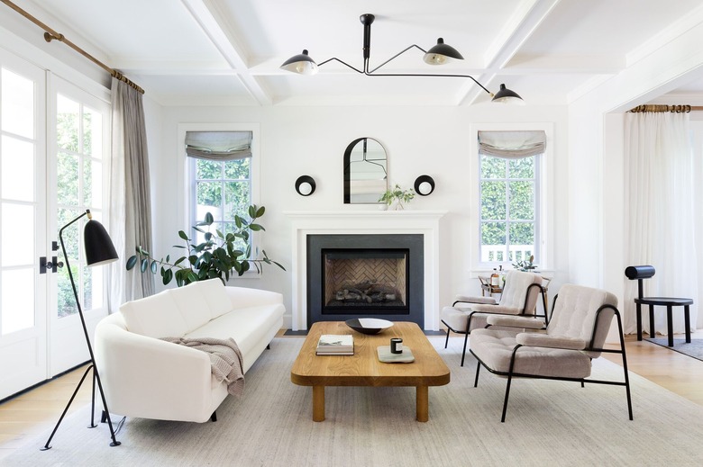
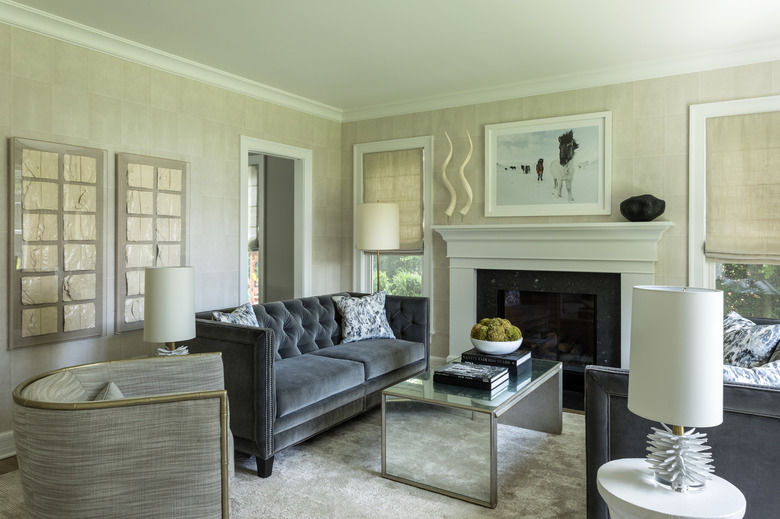
When arranging furniture in a living room, don't forget to take flow into consideration, cautions Courtney Nye of Courtney Nye Design. "Laying out a living room that has more than one entry point can be a little tricky," the interior designer says. "I like to keep the main path of travel into the room clear from the backs of furniture, which helps the room feel larger and more inviting."
"Then any secondary entry point (in the living room pictured here this would be the dining room to the right of the lounge chairs) has a chair setup, versus a sofa, so it's less closed off," Nye adds. "The two matching chairs help balance out the sofa and maintain circulation. I also select chairs that have interesting-looking back details since you will see [them] from all sides."
2. Arrange seating around a focal point.
2. Arrange seating around a focal point.
"So many people have open-concept floor plans nowadays, and I find that they struggle to lay out furniture in their living and dining areas in a way that flows well and looks pretty," notes Shannon Claire Smith of Shannon Claire Interiors. "Once you decide the purpose of the space (lounging, entertaining, etc.), center the seating around the focal point."
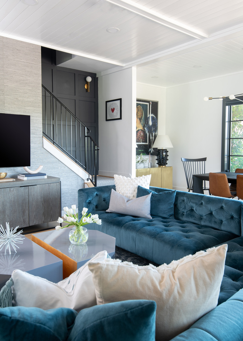
"In most living rooms, it's usually the TV, but we don't want all of the attention to be on the TV itself," the interior designer says. "I like to surround the focal point with soft, symmetrical seating like a sectional sofa. Modular tables that can reach every angle and spot on the couch make it incredibly functional, and the back of the sofa creates a zone to break up one large room without being too visually heavy."
3. Create an asymmetrical composition.
3. Create an asymmetrical composition.
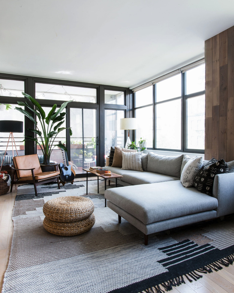
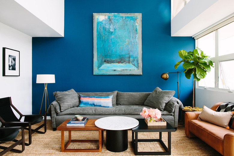
A visually asymmetrical composition can make a living room look and feel more casual and comfortable, according to Anna Filippova of Hyphen & Co. In this setup, the interior designer balances a sectional sofa with a statement chair and unique coffee table, adding a set of woven poufs for flexible seating. "To visually elevate the space, floor and table lamps were alternated with plants to form visual height variations," says Filippova. "This layout works great in apartments without overcrowding them."
4. Or, opt for symmetrical seating instead.
4. Or, opt for symmetrical seating instead.
When in doubt, a symmetrical living room layout idea will almost always work. "In this smaller-size living room with a fireplace, we faced two sofas in the center of the space and placed two chairs and side tables at one end to create and close the conversation area, while still allowing access to the space," explains Jess Blumberg of Dale Blumberg Interiors. "This classic mirrored living room layout is perfect for intimate entertaining."
5. Consider multifunctional options.
5. Consider multifunctional options.
As people move away from formal living room layout ideas, a lot of clients are asking for spaces that serve two functions: TV watching and conversation having, explains Jennifer Vaquero of September Workshop. "I always think about the orientation of the furniture in the room, and if it promotes both."
"For example, a sofa with a chaise facing a TV promotes only screen time, whereas an L-shaped sofa facing a pair of chairs has seating directed at both the screen and people that might be sitting across the room," she notes. "Another great way to achieve this, as we did in this living room of our Santa Monica project, is a standard sofa flanked by a smaller settee and two chairs."
6. Include extra seating.
6. Include extra seating.
Here's proof that a long rectangular living room can actually be a design advantage. "At times, something that starts out as a problem can become an interesting design detail," offers Stefani Stein. "For rooms that are elongated, have an attached nook or other non-standard feature, I like to incorporate a secondary seating area," she explains. "It helps bring a sense of flow to the space without drawing attention to areas that might feel awkward if trying to approach the room with a single sitting area."
7. Prioritize the television.
7. Prioritize the television.
It may be your first instinct to hide the TV in your living room design, but if you spend most of your time curled up on the sofa for movie nights and binge-watching sessions, then embrace it. "Creating a layout centered around the TV isn't always popular, but if your TV doubles as a custom piece of art, the space can easily transition from lounging to entertaining," says Abbe Fenimore, Founder & Principal Designer of Studio Ten 25.
For a true TV-turned-art situation, consider The Frame television by Samsung. It can display art when you're not watching it, and comes with a customizable frame that can be mounted flush to the wall.
8. Employ an oversize sectional sofa.
8. Employ an oversize sectional sofa.
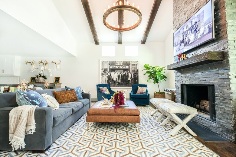
Andi Morse, founder and principal of Morse Design, created this sleek living room around one critical piece of furniture. "The perfect sofa is pivotal to any living room," she says. If you're trying to create quality family time in your [space], an oversize sectional is the way to go: it's ultra-plush, there's room for everybody to relax comfortably, and [it] works no matter the occasion, whether you're gathering around the TV or catching up on each others' days.
"I love to add a sectional in a family room to create a relaxing atmosphere that's conducive for entertaining, watching TV, or enjoying the space as a family. Not only is it comfortable, but it provides plenty of seating and can be sized for just about any room," Morse says.
9. Play with scale.
9. Play with scale.
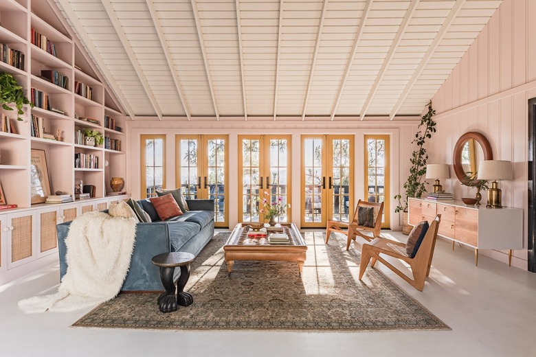
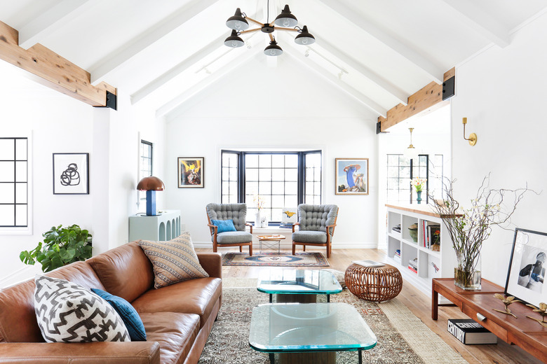
The living room in this midcentury home in Silver Lake, where we can definitely see ourselves enjoying a leisurely Sunday afternoon reading, is the perfect example of experimenting with scale. The low-profile furniture allows the sloped ceiling and custom built-in bookcase to feel all the more grand. The low-backed sofa and coffee table that's barely off the ground, juxtaposed with a tall potted plant that reaches for the ceiling, creates balance. Having the furniture layout face inward draws the eye toward the center of the room, even though there are glorious details to discover in every corner.
10. Arrange lounge chairs face-to-face in front of the fireplace.
10. Arrange lounge chairs face-to-face in front of the fireplace.
If you're not convinced of this face-to-face furniture arrangement, let Janelle Burns of Maestri Studio convince you. (She opted for the same layout in her own living room.) "I prefer face-to-face seating at the fireplace for two key reasons," she says. "One, you still have full view of the fireplace, even though you aren't literally placing the chair towards the firebox. It invites connection to the other person or people we share a space with." The second reason? "Placing the chairs this way keeps the layout open — you aren't looking at a wall of chair backs which feels like a blockage to an important focal point of a room."
This layout trick works especially well for large living rooms where you may have a primary seating arrangement elsewhere, and still have space by the fireplace itself. Chairs are more inviting than a bench or stools, says Burns, so this is a solution that will get a lot of use.
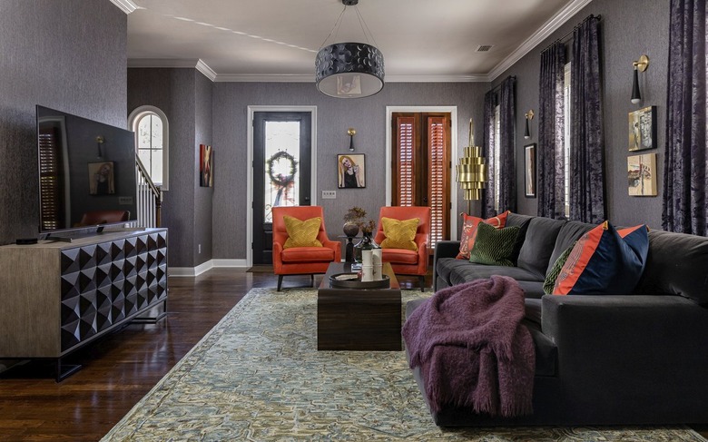
11. If you're lacking a foyer, use furniture to define the boundary of the living space.
11. If you're lacking a foyer, use furniture to define the boundary of the living space.
In a home without a foyer, Cleryl Kees Clendenon, president and creative director of In Detail Interiors, recommends defining the primary living space with furnishings. "We do not want a barrier that impedes traffic, but rather provides delineation of the 'entry,'" she says. The trick? "Make sure the social grouping of furnishings is close enough to each other to facilitate conversation and out of the way. By doing this, the chairs, in this case, are far enough into the room to not restrict movement to the stairs."
Her rule of thumb is to allow six to seven feet from the front door to the back of whatever you are using to create the definition of the room — a couch, bench, or chair.
12. Keep it casual by mixing and matching different types of furnishings.
12. Keep it casual by mixing and matching different types of furnishings.
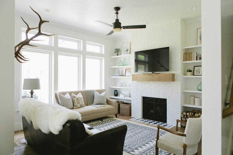
House of Jade Interiors designed this small living room with two functions in mind: it needed to be a casual space for the family to gather and also a space for entertaining. By keeping it simple, with beautiful built-in shelving and a fireplace as a focal point, anyone would want to cozy up here, from family members to dinner guests. The mix and match furniture approach adds a bit of variety — not to mention plenty of room to relax with a movie or catch up over a glass of wine — without overwhelming the space.
