A Modern Oregon Cabin Is Inspired By Old And New Dutch Design
Move over hygge, here comes gezellig. The Dutch phrase encompasses coziness, fun, and conviviality — all qualities a couple with two children wanted in their second home near Mount Hood in Oregon. Along with designer Casey Keasler of Portland interiors firm Casework, they settled on alpine, funk, and gezellig as the three words that would be touchstones for the interior of the cabin, which was designed by Blane Skowhede of Keystone Architecture and built by Ethan Beck Homes.
Keasler pulled together a high-contrast color scheme anchored by a custom shade of black. "The palette was inspired by the family's three year stint living in Amsterdam," Keasler says. "The high-contrast scheme is composed of two simple elements: white walls and black trim. It's common in the Netherlands to have high-gloss paint for your trim."
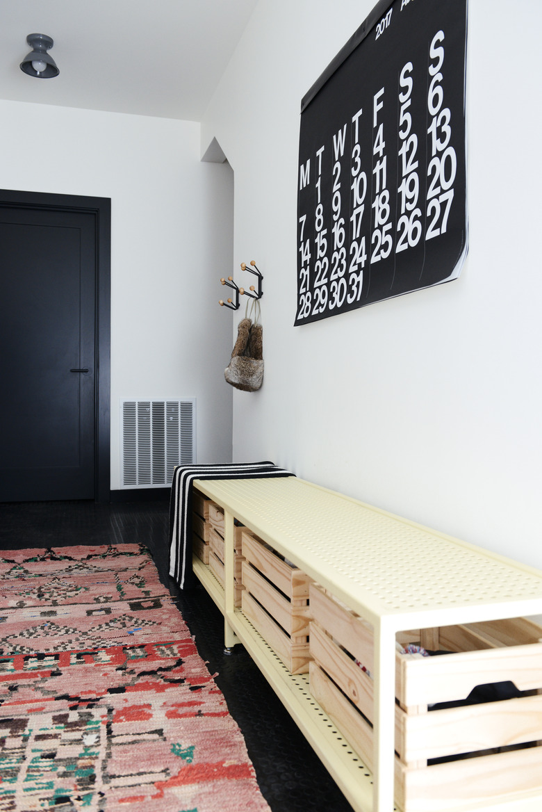
1. Entry
You'd never guess that the entry is lined with hospital-grade, slip resistant rubber floors — a big help during the snowy winter months. A Stendig calendar hangs above a custom bench and a runner from Kat + Maouche.
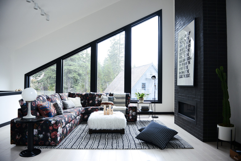
2. Living Room
The couple wanted to incorporate Jan Davidsz. de Heem's Still Life with Flowers into the design, so Keasler downloaded the digital file offered by Rijksmuseum and turned it into a pattern that could be printed on fabric. She then used the fabric to cover an IKEA sectional. Keasler brought in a faux fur-covered ottoman for texture and the rug and pillows, from Schoolhouse, for an extra burst of pattern.
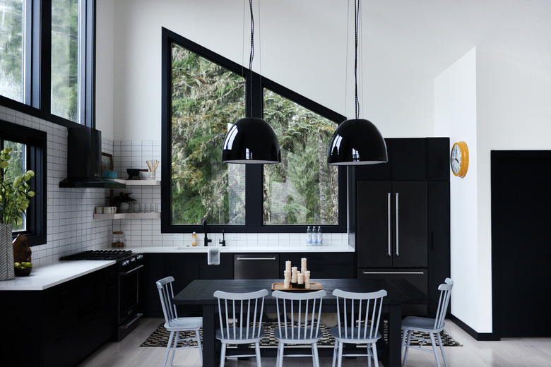
3. Kitchen
The black-and-white palette continues in the graphic kitchen, where black Wilsonart cabinets and Kitchenaid appliances contrast with the white Daltile backsplash and quartz counters. The Design Within Reach chairs and Kat + Maouche rug break up the two-tone design.
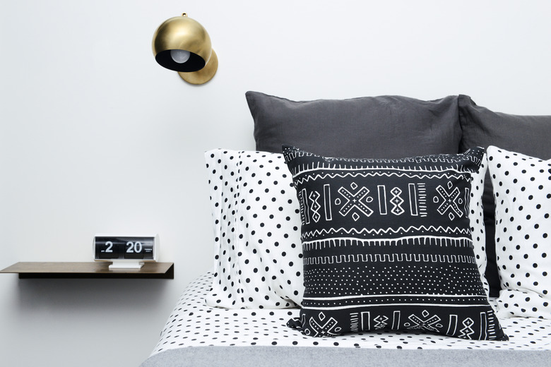
4. Bedroom
Since this is a second home, the bedroom furnishings were kept to a minimum. Instead of full nightstands and lamps, Keasler opted for sleek Schoolhouse shelves and sconces.
5. Bunk Room
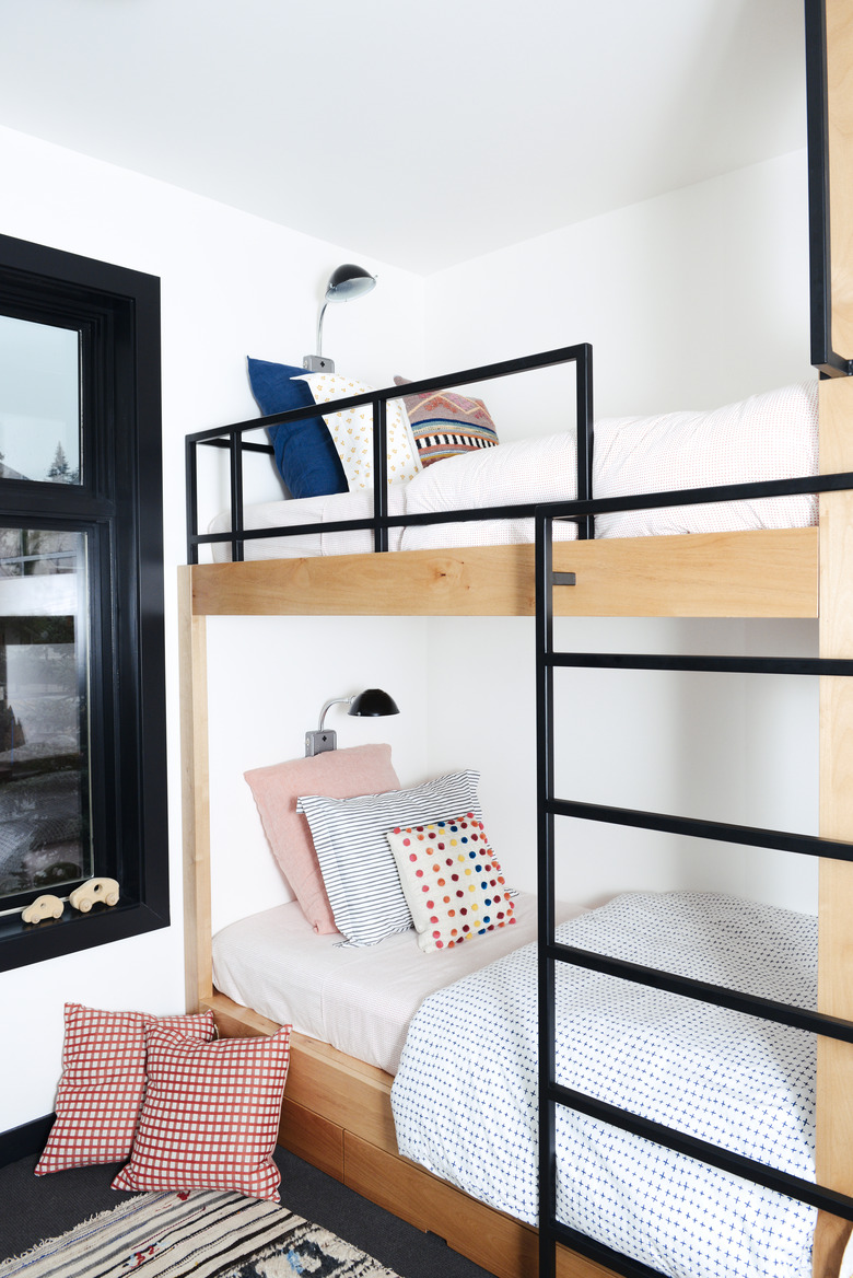
The couple's two children can camp out in the bunk room, which is outfitted with custom beds dressed in Schoolhouse bedding. Each bunk has a Schoolhouse wall light for late-night reading sessions.
6. Bathroom
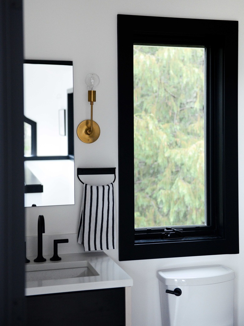
Even the powder room has views of nature. A Schoolhouse sconce was installed above an Amigo Modern towel holder.
7. Porch
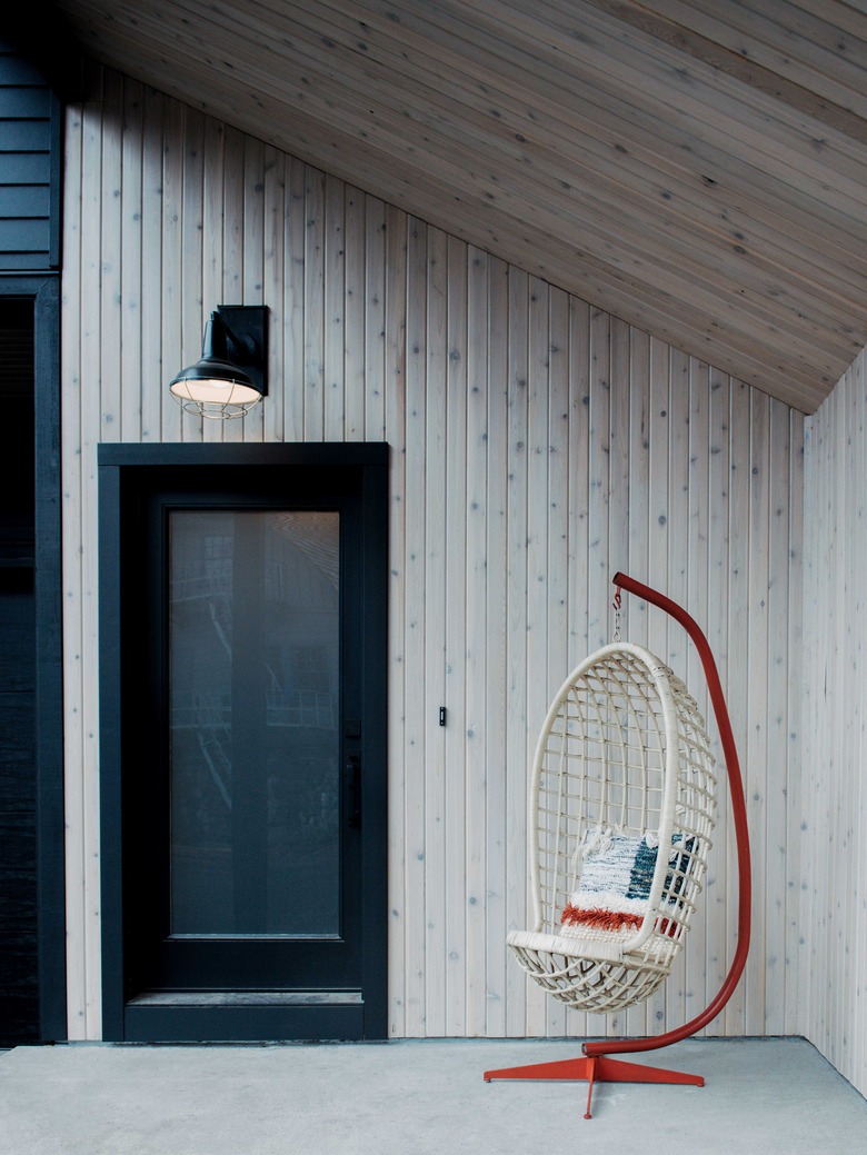
A vintage chair sits by the entrance. The house was designed without outdoor living spaces so the owners wouldn't need to worry about snow removal during the winter.

