Check Out Hunker House's Colorful Revamp
When we opened Hunker House in January of this year, we went in with the intention of creating a space that would constantly change and evolve.
Well, maybe not constantly (we do have day jobs). Still, we figured as we bring in more voices and members of our community, the more we'd be inspired to shake things up.
Following Scandi-land, our celebration of Scandinavian design, we decided to go full on #scandichic with the help of our friends at Danish Design Store, who also own Design Public.
"This quarter, we decided to bring more color into the house, inspired by some of the more moody Scandinavian aesthetics we've been seeing a lot of," says Paul Anderson, our creative director who led the makeover. "Our initial design was very clean and neutral. Hunker House 2.0 is now more about rich, jewel tones and spaces that feel a bit more stylized."
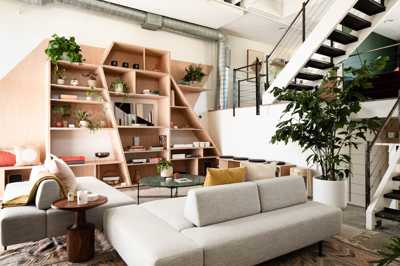
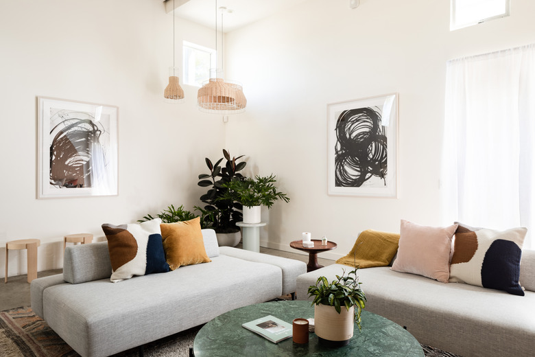
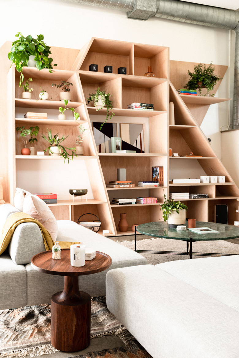
And, as we've had a few months of programming in the House (hosting panels, parties, and workshops), we realized the main space needed a more dynamic setup. "I wanted to turn the main floor into the ultimate conversation pit with a variety of seating vignettes that are separate but somehow connected," Anderson explains. "The sectional sofa from Article was a really creative solution because the backrests are actually placed in the middle of the sofa, allowing for seating on both sides."
A green marble coffee table by Danish brand Gubi anchors the space while pillows by Ferm and Hawkins add subtle pops of color.
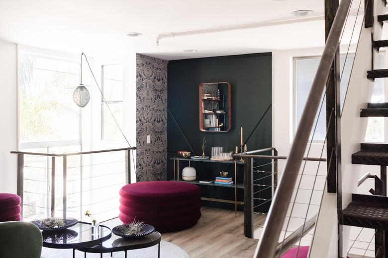
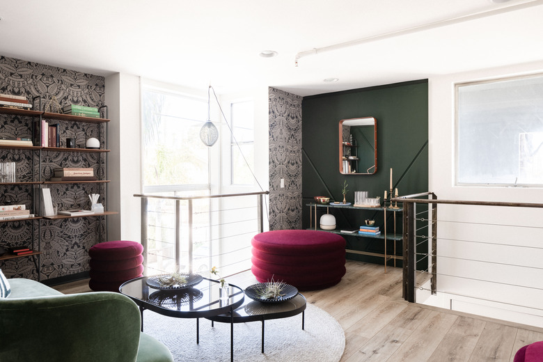
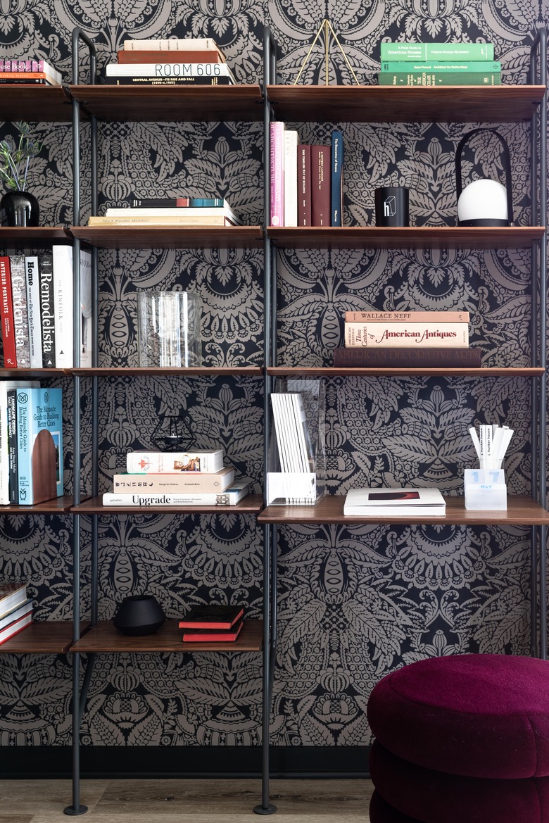
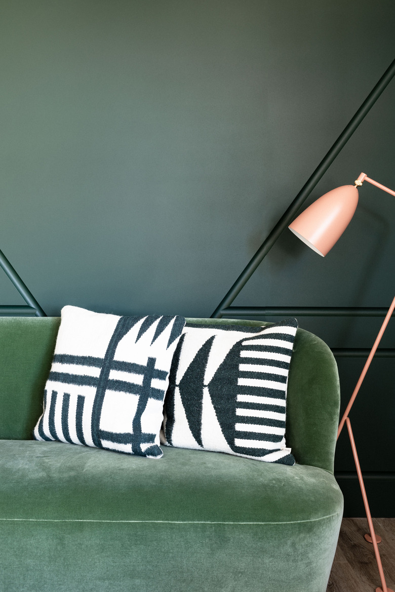
The biggest refresh was in our mezzanine library, where we sought to layer in some old-world elements — the milled paneled wall was custom created and complemented by ornate wallpaper by Farrow & Ball. "We brought in contemporary pieces from Menu, Ferm, and Gubi to modernize the overall feel," Anderson says.
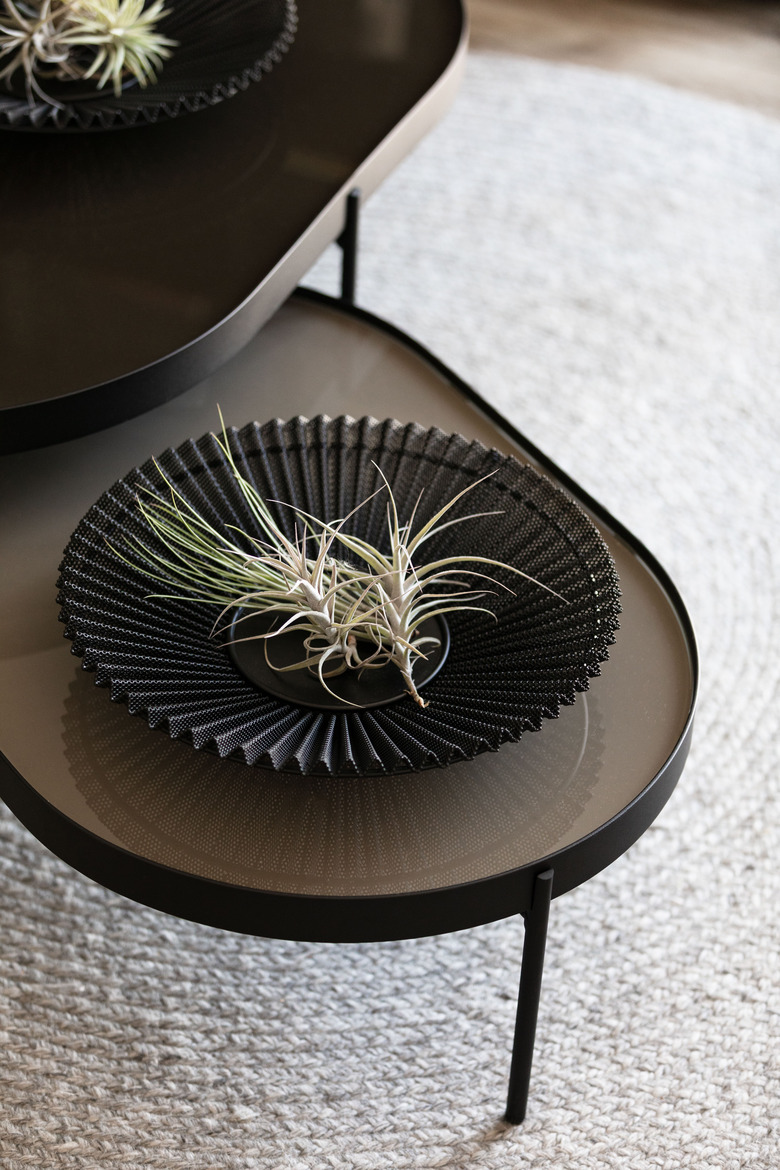
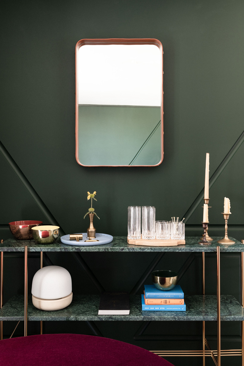
Get the library look: Velvet burgundy poufs by Ferm Living, green velvet "Stay" sofa by Gubi, "NoNo" coffee table by Menu, green marble console table by Gubi, pink floor lamp by Gubi, black fan fruit bowl by Gubi, "Adnet" mirror by Gubi, portable LED lamp by Menu (on bookshelf). (If you want to get 15 percent off any of the wares from our library look, head on over to Danish Design Store.)
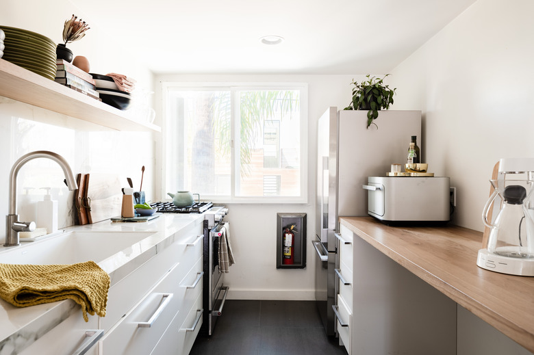
We left the kitchen largely untouched, but had one major upgrade thanks to our friends at East Fork, who offered up their hand-glazed bowls and plates. (Their colorful vases can also be found throughout the House.)
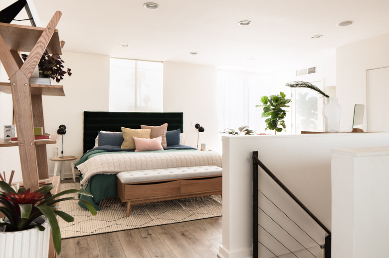
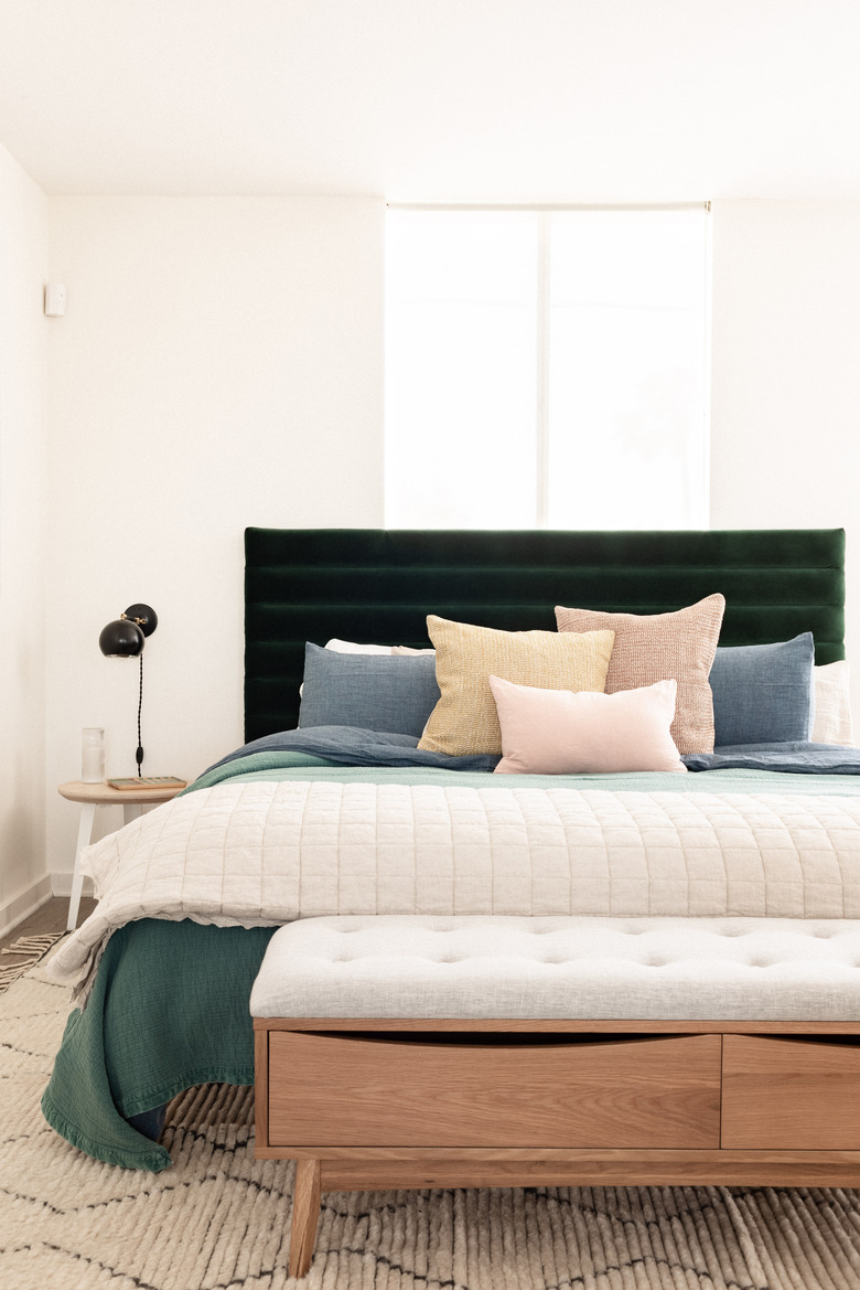
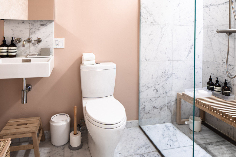
Upstairs in our bedroom suite, where we host creatives for weekend stays, we infused the floor with more personality, adding diverse textures (more wood, more velvet) and surprising colors (a muted coral in the bathroom). "I wanted to brighten this area up and layer in the subtle accommodation details that would make our guests feel inspired and like they're in an apartment that they never want to leave," Anderson says.
