These 5 Kitchen Lighting Ideas Will Make Your Rental Look Brand Spankin' New
At one time or another, most of us will have the opportunity to live in an apartment or rental home. Some of these pads come with everything you could ever need along with a few features you never dreamed of. And other times ... well ... let's just say rentals leave something to be desired. Rental kitchens in particular can be tricky. Maybe it's not your ideal layout, or it's a bit dark and closed-in. Never fear — there are some creative workarounds that can give your kitchen a big aesthetic boost.
One of those tricks: kitchen lighting. You can either work with what you've got (Enter: the dreaded boob light!), or you can replace the lighting completely with fixtures that can easily be swapped in and out.
If you're on the lookout for ways to (vastly) improve your rental kitchen lighting, take a look at these five culinary designs. They are proof positive that a rental cook space can look beautiful, and even chic, thanks to new-and-improved lighting.
1. Punch up the lighting that comes with your kitchen.
1. Punch up the lighting that comes with your kitchen.
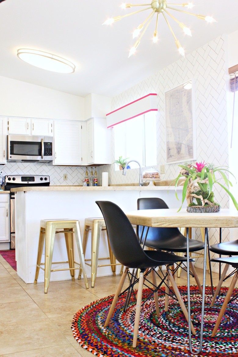
When Mallory of Classy Clutter moved into her rental, she inherited an elongated flush-mount ceiling fixture in the kitchen. Instead of simply accepting her lighting fate, she gave her new space a major upgrade by also hanging a midcentury chandelier. It complements the existing kitchen light and brings tons of visual interest into the nearby dining area.
2. Go beyond recessed lighting.
2. Go beyond recessed lighting.
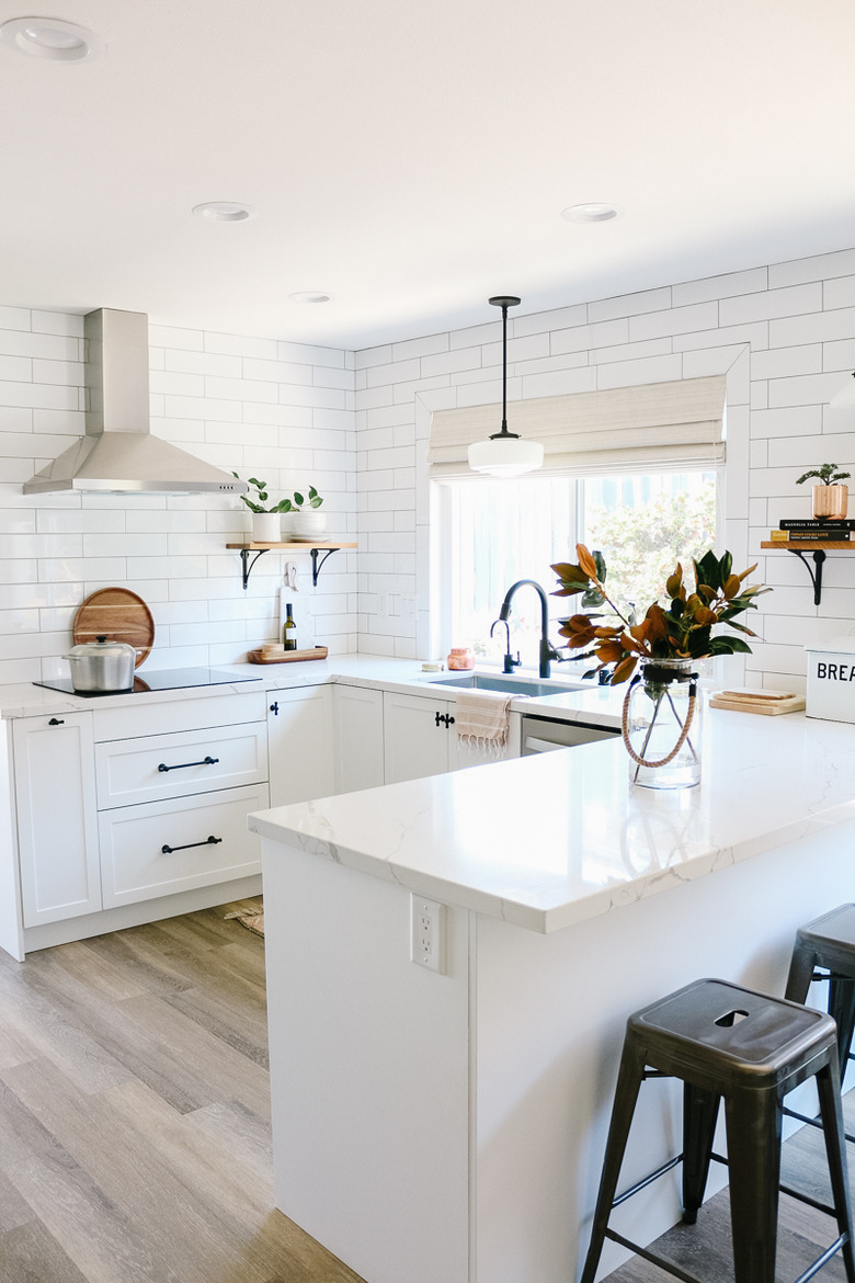
Recessed lighting is definitely practical, which is why an overwhelming percentage of rental kitchens feature them. But you don't have to settle for utilitarian lighting that doesn't offer a lot of personality. Using a conversion kit, swap one or two of your can lights for pendant lights to enhance your design and further illuminate the space. That's what Beth from 1111 Light Lane did in her parents' kitchen.
3. Work around your kitchen's features.
3. Work around your kitchen's features.
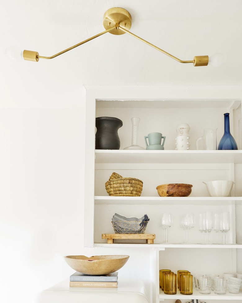
A rental kitchen typically comes with features you just can't change (or else you'll have to deal with a less-than-pleased landlord). When installing lighting, try to work around those elements. For instance, when Emily Henderson's senior market editor Jess Bunge set out to refresh her rental kitchen, she had to work around built-in shelves. The solution was going with a modern flush mount instead of a hanging light so it wouldn't block the shelving.
4. Create contrast in an all-white space.
4. Create contrast in an all-white space.
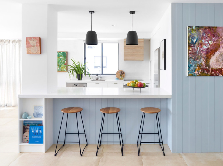
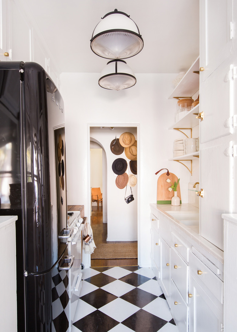
Most rental kitchens are white and for good reason. White is a perfect, goes-with-anything neutral, and we do love the look of a white kitchen. But if you want to kick your lighting up a notch, may we suggest choosing black fixtures? They'll create instant contrast in your ivory cook space, as witnessed here in this kitchen designed by the team at Claire Stevens Interior Design.
5. Swap out the old lighting for new fixtures.
5. Swap out the old lighting for new fixtures.
This kitchen belonging to Brady Tolbert came with its own lights, but they just didn't have the vibe that he was going for. So, he put the old lighting in storage and replaced them with these modern-meets-vintage, semi-flush mount fixtures. When you move into a rental, don't feel like you're married to the lighting that's already there. Instead, stash them in storage and install something you truly love.

