30 Subway Tile Kitchen Backsplash Ideas That'll Work In Any Space
When it comes to kitchen design, subway tile is easily one of the quickest ways to give your cook space a classic look. Plus, it acts as a great backsplash, reducing costs while remaining functional. The price of subway tile ranges from as low as $6.86 per square foot to as high as $13 per square foot, and even though installation is generally done by a professional, that cost is usually on the lower end, too. However, if you feel up to a DIY challenge, you could always save a few pennies and do the work yourself.
And what about maintenance? Fortunately, since subway tile is typically glazed, the cleaning process is relatively simple and straightforward. If you're interested, you can read all about how to clean your subway tile in this step-by-step guide. Now, onto the fun part. Here are 30 beautiful subway tile kitchen backsplash ideas to inspire your dream culinary reno.
1. Go for a traditional layout.
1. Go for a traditional layout.
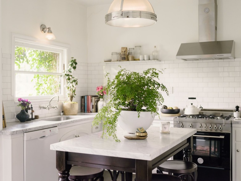
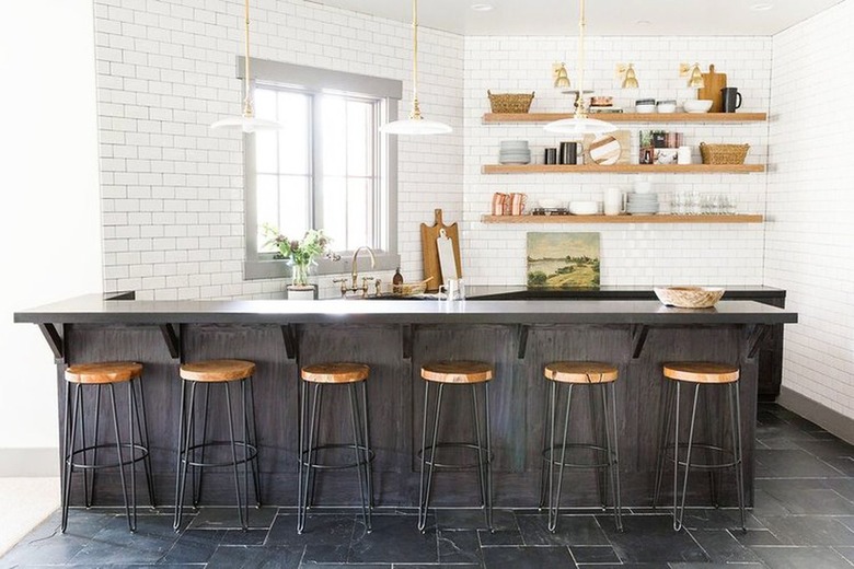
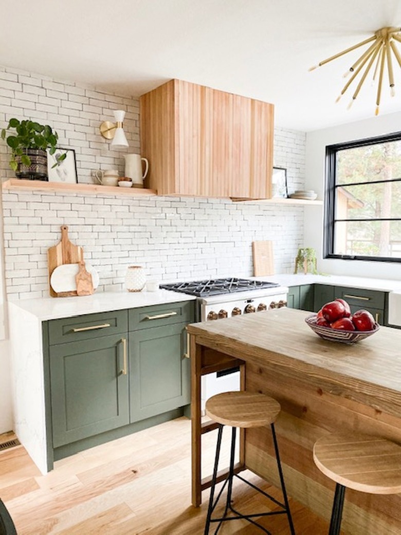
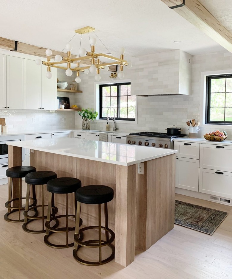
Standard subway tile is always a winner, especially when a more classic (running bond) layout is used. Simply offset each row of tile and voilà! Danica of Nadine Stay went this route when she opted to continue her white subway tile backsplash from the countertop up to the ceiling, instead of using upper cabinets. The look helped to save money and brighten up her cook space.
2. Or, keep it straight.
2. Or, keep it straight.
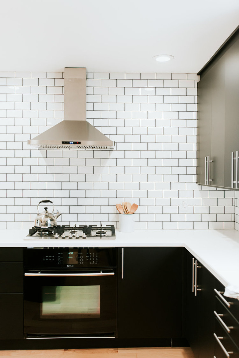
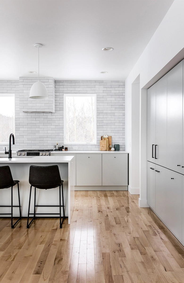
A subway tile kitchen backsplash can look pretty contemporary when considered carefully. Instead of offsetting the tile, install it in a straight line or stack bond format. The end result will be a clean and graphic look, as demonstrated in this all-white setup designed by Mandi from Making Nice in the Midwest.
3. Lay them vertically.
3. Lay them vertically.
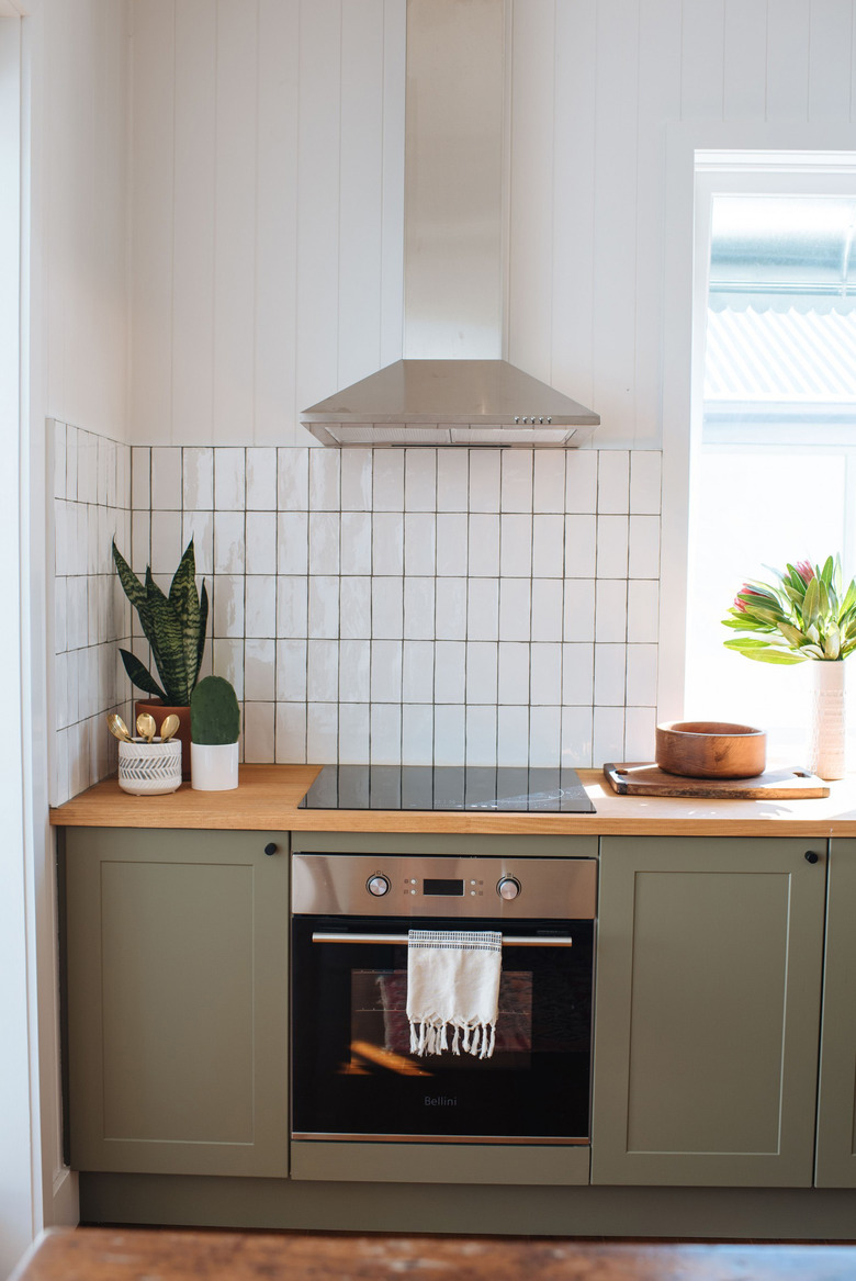
If you like the stack bond look but still want something a little bit different, try laying your tiles vertically, also known as the vertical stack bond. Geneva from Collective Gen nailed the subway tile kitchen backsplash idea perfectly in her culinary design, completing the look with green cabinets and wood countertops to boot!
4. Create a herringbone effect.
4. Create a herringbone effect.
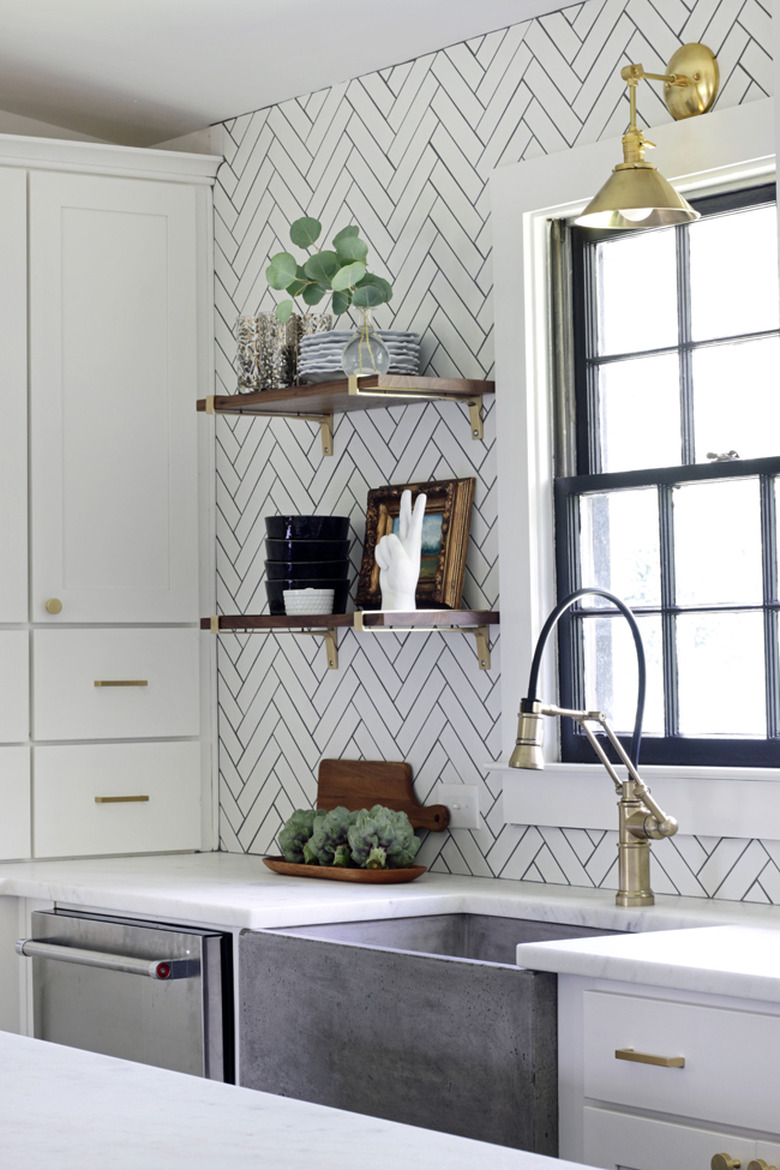
A herringbone layout, in which the tiles are laid in "L" shapes, is another classic option for a subway tile kitchen backsplash. Kristin from Hunted Interior opted for matte white tile with gray charcoal grout for this modern cook space, which plays off of the gray concrete farmhouse sink beautifully.
5. Mix and match backsplash materials.
5. Mix and match backsplash materials.
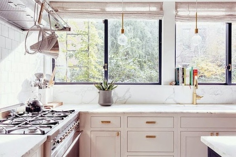
Rules are made to be broken, so go ahead and mix and match your backsplash materials. This airy kitchen on Lark & Linen features traditional white subway tile on one side and a slab of marble on the other. The end result is culinary genius.
6. Mix and match the layout.
6. Mix and match the layout.
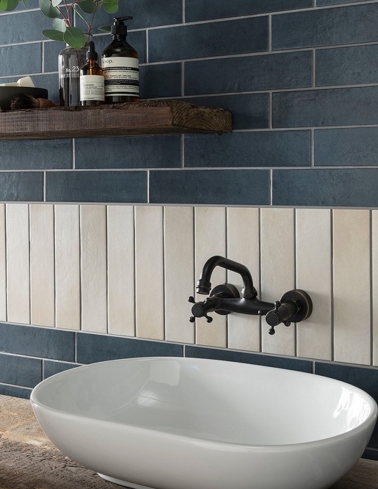
As above, mixing and matching is a brilliant way to bring a little extra va va voom to your kitchen backsplash. Create a visual treat with your tiling by opting for two different sets of subway tile, laying one set vertically and the other in a traditional running bond. Simple yet effective.
7. Think geometric.
7. Think geometric.
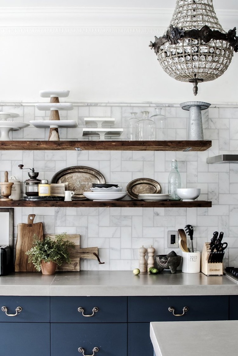
If you're feeling a bit more adventurous, consider laying out your kitchen backsplash tile in a geometric pattern, as seen in this design captured by Bespoke Only. This layout, also known as straight herringbone, is especially beautiful with marble tile. The navy blue cabinets, wood shelving, and crystal chandelier complement the tall backsplash beautifully.
8. Make magic with marble.
8. Make magic with marble.
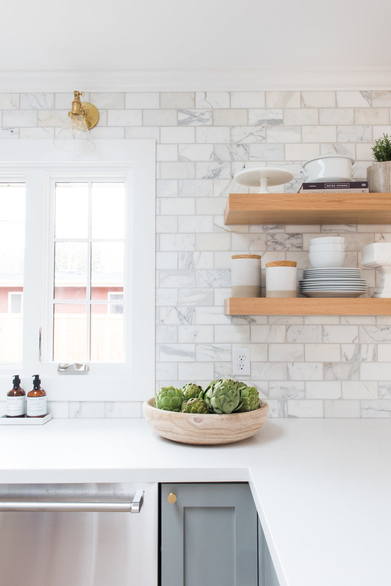
Speaking of marble, if you're a fan of the natural stone, tile is a great way to get the luxe look on a budget. We love this kitchen makeover from Studio McGee, who matched the subway tile kitchen backsplash with gray veining, gray cabinets, and white countertops.
9. Use colored grout.
9. Use colored grout.
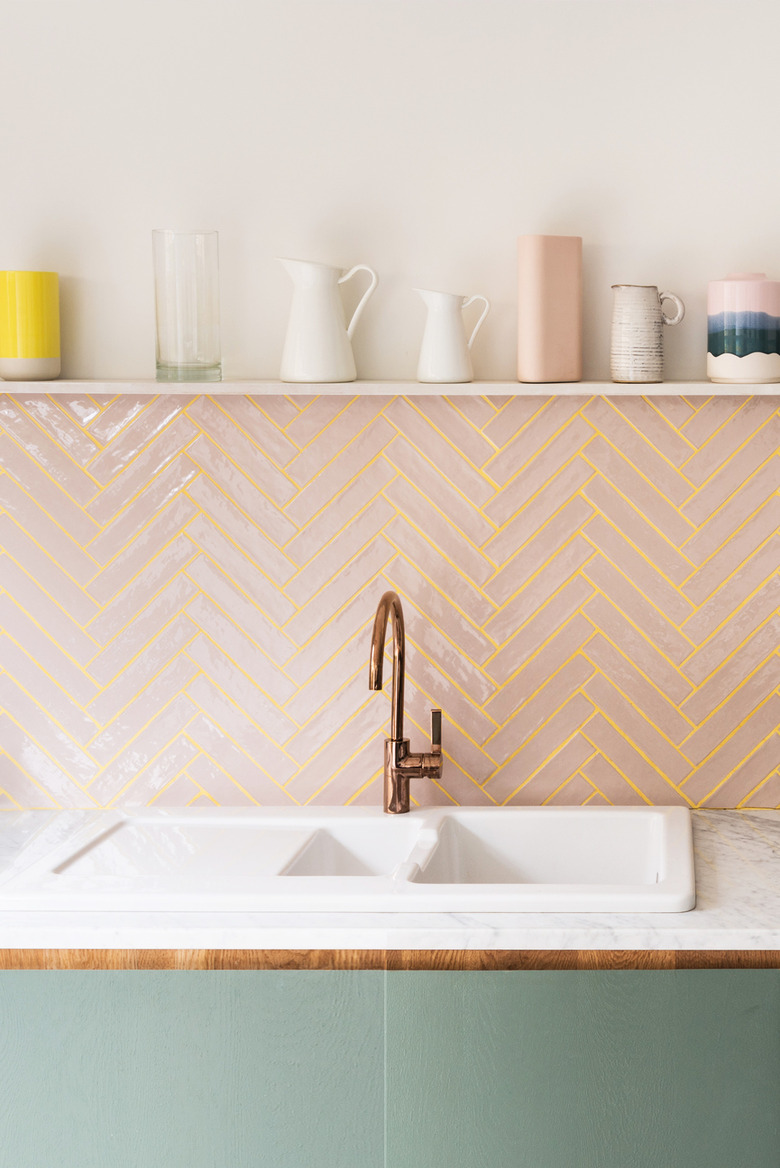
If there's one interior design trend that we can definitely get on board with, it's using colored grout. Office S&M chose a yellow grout color to offset the pink subway tile used in this herringbone backsplash. Paired with green cabinets featuring copper trim, the result is truly stunning.
10. Let it shine.
10. Let it shine.
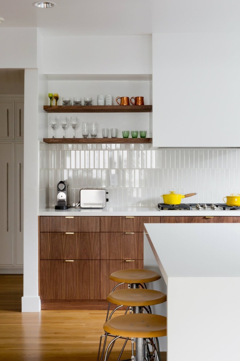
High gloss tile looks sublime in kitchens with loads of natural light, and the backsplash in this cook space by Veneer Designs does not disappoint. The pearlescent quality of the tile is the perfect complement to the custom walnut cabinetry and open shelving, keeping the overall scheme feeling warm and inviting.
11. Don’t shy away from color.
11. Don't shy away from color.
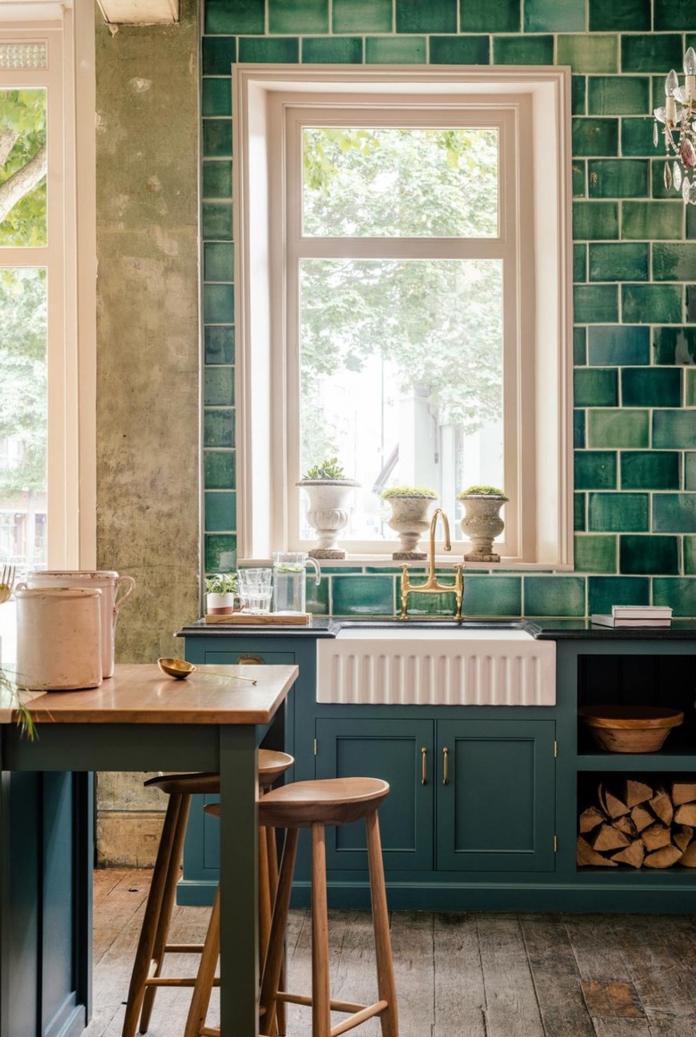
Even though everyone associates subway tile with white, you should know that there are a lot of colors out there to choose from. For instance, what about the gorgeous blue-green tile and contrasting white grout combination used in this space by deVOL Kitchens?
12. Welcome black and white visuals.
12. Welcome black and white visuals.
White subway tile gives you an opportunity to go a bit moodier with your cabinetry or island. For example, you can amp up the drama with an ebony hue to instantly create a cool black and white palette, à la this kitchen design by Shea of Studio McGee.
13. Be playful.
13. Be playful.
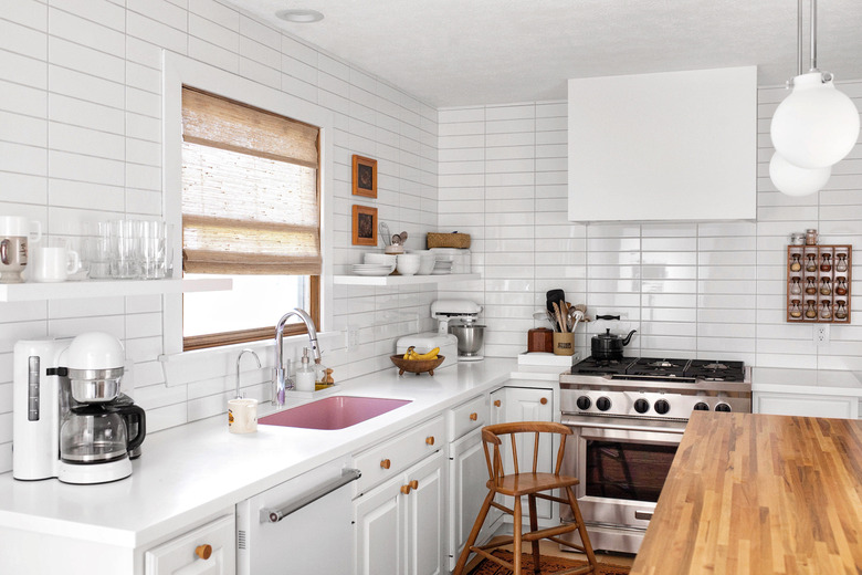
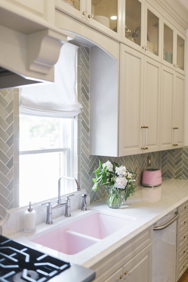
Subway tile doesn't have to be all business. Follow the lead of Leslie from The Leslie Style and incorporate some lighthearted playfulness into your kitchen. She paired minty green subway tile with a pink sink and marble countertops for a unique cook space that inspires creativity.
14. Pair with antique brass.
14. Pair with antique brass.
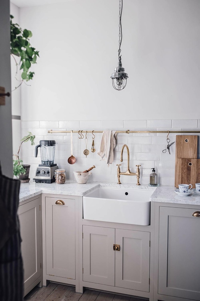
If you're searching for the ideal metal finish to pair with your subway tile backsplash, you should know that you can't go wrong with anything in antique brass. That's what deVOL Kitchens used in this cook space, marrying a lustrous utility rod with a matching gooseneck faucet and drawer pulls. The end result is timeless with a bit of old-world flair.
15. Opt for some texture.
15. Opt for some texture.
Subway tile doesn't have to be flawless, shiny, and white. To craft some visual interest, choose an option that's textured and imperfect. The one-of-a-kind look is stylish and adds an organic quality to this kitchen by Andrea West Design.
16. Embrace each and every flaw.
16. Embrace each and every flaw.
Perhaps the idea of that "perfect" farmhouse kitchen just doesn't appeal to you. Instead, opt for something a little more rustic. In this cook space by Girl & Grey, the grout lines are uneven, resulting in a perfectly imperfect look that feels relaxed and inviting.
17. Add subway tile to the range hood.
17. Add subway tile to the range hood.
The range hood in your kitchen can serve as its very own design accent as proven by this bright and airy culinary makeover by Megan of Fresh Exchange. She took her subway tile backsplash up and over the range hood, making for a sleek and cohesive finish.
18. Cover your shelving.
18. Cover your shelving.
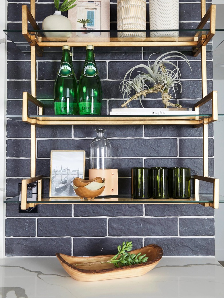
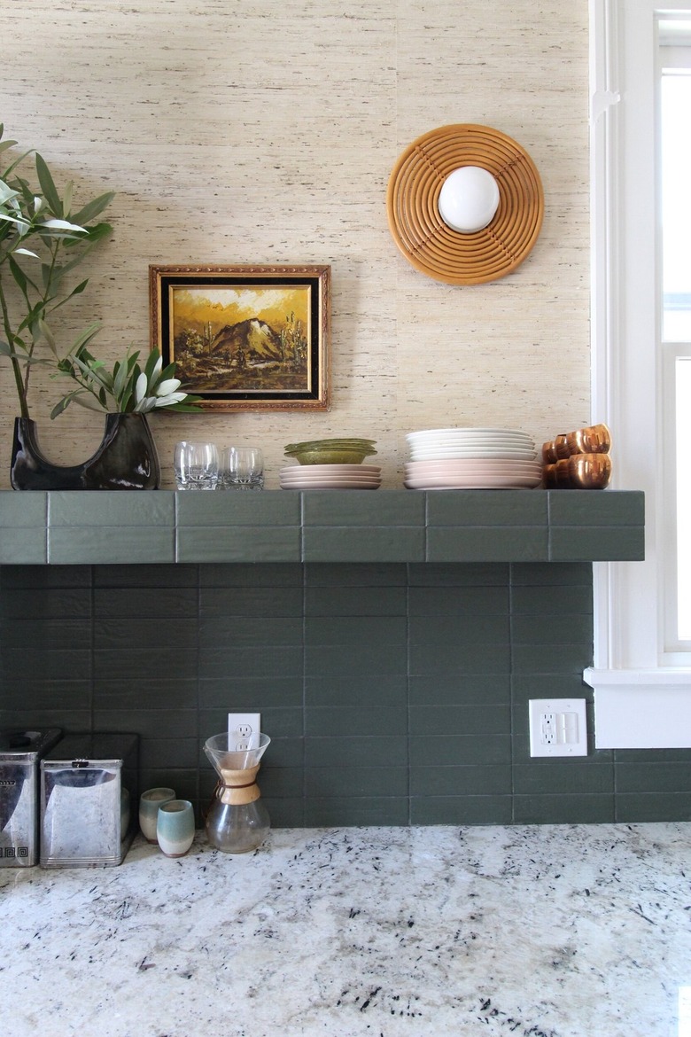
Subway tile doesn't have to stop at the backsplash. Let your open shelving get in on the fun, too. We'd recommend dark tile in a down-to-earth color with very thin grout lines in a similar hue. Liz Kamarul went this route in her culinary space and we wholeheartedly approve.
19. Cover all of the walls.
19. Cover all of the walls.
Tile doesn't need to be limited to a small section of wall behind the sink or the stove. Maximize all of the blank wall space in your kitchen by covering every square inch with subway tile, something that interior designer Emily Henderson pulled off in this delightful culinary design.
20. Make the grout lines nearly invisible.
20. Make the grout lines nearly invisible.
For an aesthetic that's a little sleeker and more modern, use thin grout lines in a matching color so they seemingly disappear. Take a cue from Chris Loves Julia and choose tiles in varying hues for a bit of eye-catching appeal.
21. Partner subway tile with brick.
21. Partner subway tile with brick.
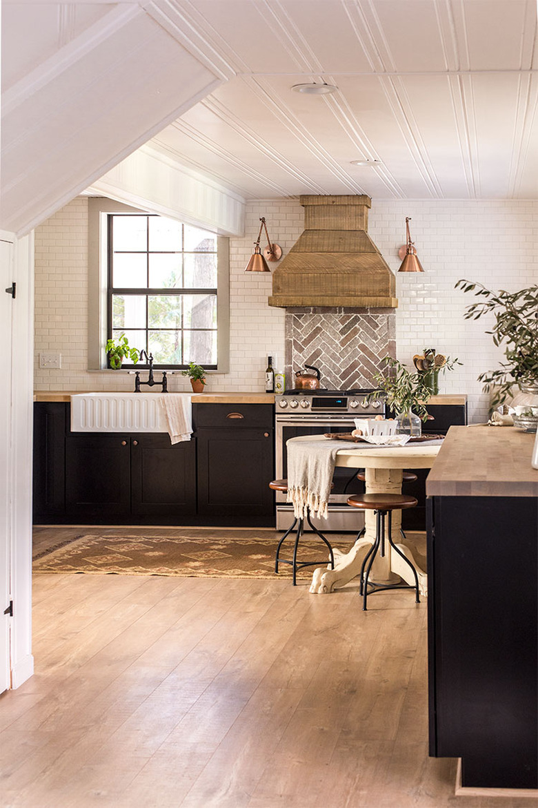
To create some interesting tension and set a rustic tone in your kitchen, don't stop at a subway tile backsplash — pair it with some brick. The combo looks like a match made in design heaven and steals the show in this cook space by Jenna Sue Design Co.
22. Ponder a tonal look.
22. Ponder a tonal look.
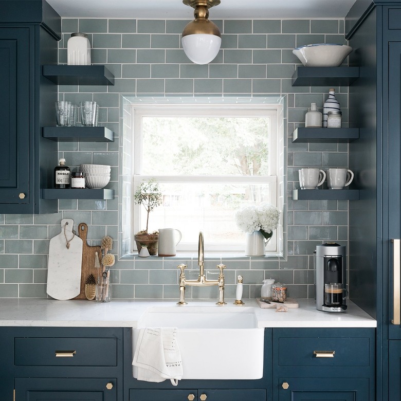
Your cabinets can make a big impact on your kitchen design, and a subway tile backsplash can do the same. For a monochromatic appearance, partner dark-hued cabinets with a backsplash in a slightly lighter shade. Will of Bright Bazaar shows us how it's done using the tonal approach to create this top-to-bottom blue kitchen.
23. Make it a bohemian moment.
23. Make it a bohemian moment.
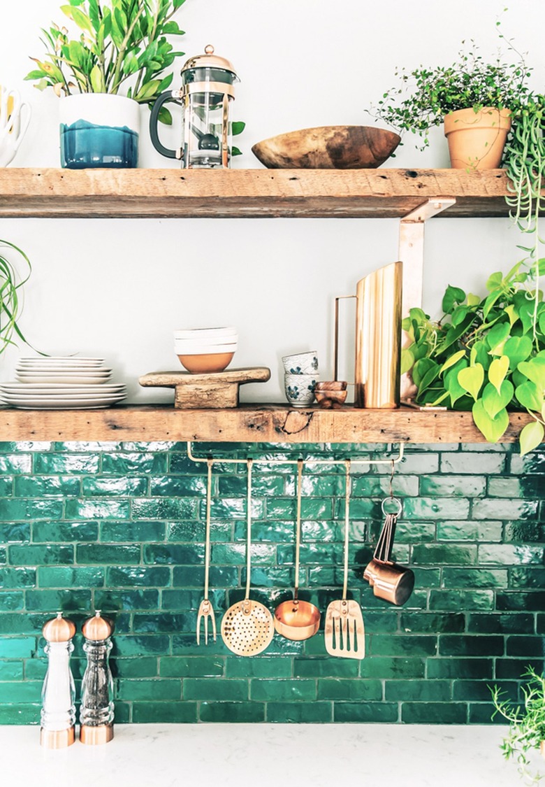
The nice thing about ceramic subway tile is that it looks great with a variety of design styles, from modern to traditional to bohemian, even. It's a fact that's evident in Justina Blakeney's kitchen. The verdant green subway tile looks amazing with reclaimed wood shelves. The tile would pair equally well with wood cabinets, too.
24. Include geometric shapes.
24. Include geometric shapes.
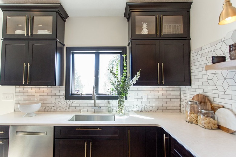
You don't have to stick to a horizontal or vertical layout when it comes to your subway tile backsplash. Instead, take notes from this kitchen by Jamie and Morgan of Construction2Style and interrupt a classic pattern with some geometric shapes — creating an artistic moment in the middle of your backsplash. Use dark grout to make the unique design stand out.
25. Frame the windows.
25. Frame the windows.
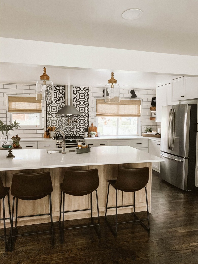
If you're lucky enough to have multiple windows in your kitchen, offering lots of natural light, consider using your subway tile backsplash to really tie them into your design scheme. Clark + Aldine cut subway tile to craft "frames" for each window and paired it with black grout for a modern touch that complements the patterned tile behind the stove.
26. Craft a unique color palette.
26. Craft a unique color palette.
Rely upon your subway tile backsplash to drive the color palette for your entire kitchen. For example, Emily Henderson meshed periwinkle blue cabinets with a patterned floor tile, and used gray backsplash tile to tie the whole look together.
27. Try a neutral other than white.
27. Try a neutral other than white.
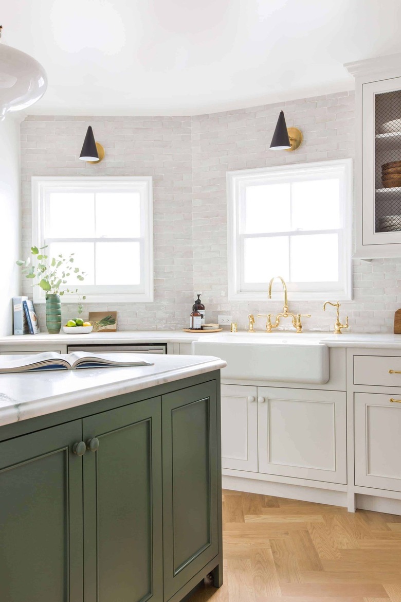
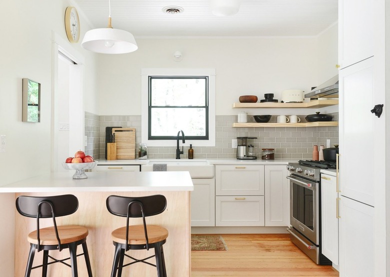
Perhaps you're dedicated to neutrals in your kitchen. Sure, you could go with white subway tile, but for a bit more interest, why not try a different color, like gray or beige? Kim and Scott of Yellow Brick Home demonstrated the idea perfectly in this kitchen renovation.
28. Complement subway tile with a tiled island back panel.
28. Complement subway tile with a tiled island back panel.
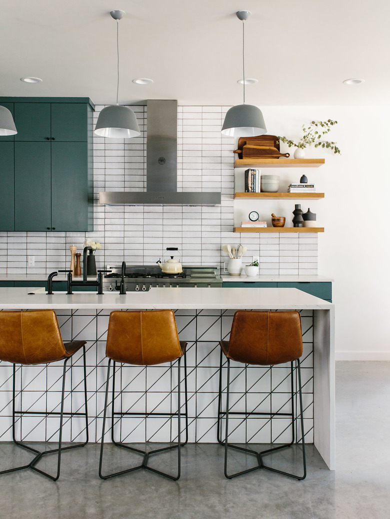
Since a subway tile backsplash is naturally linear, put this concept to work in your modern kitchen. Echoing the grout lines seen in the backsplash, Jen of The Effortless Chic pushed the linear look even further with a tiled island back panel, streamlined cabinetry, and slick barstools.
29. Include some artwork.
29. Include some artwork.
A subway tile backsplash doesn't have to stand completely on its own. If you prefer your tile to be served with a side of art, hang a painting on your backsplash along with a picture light. Allow Erin Kestenbaum's kitchen to inspire you.
30. Consider a beveled edge.
30. Consider a beveled edge.
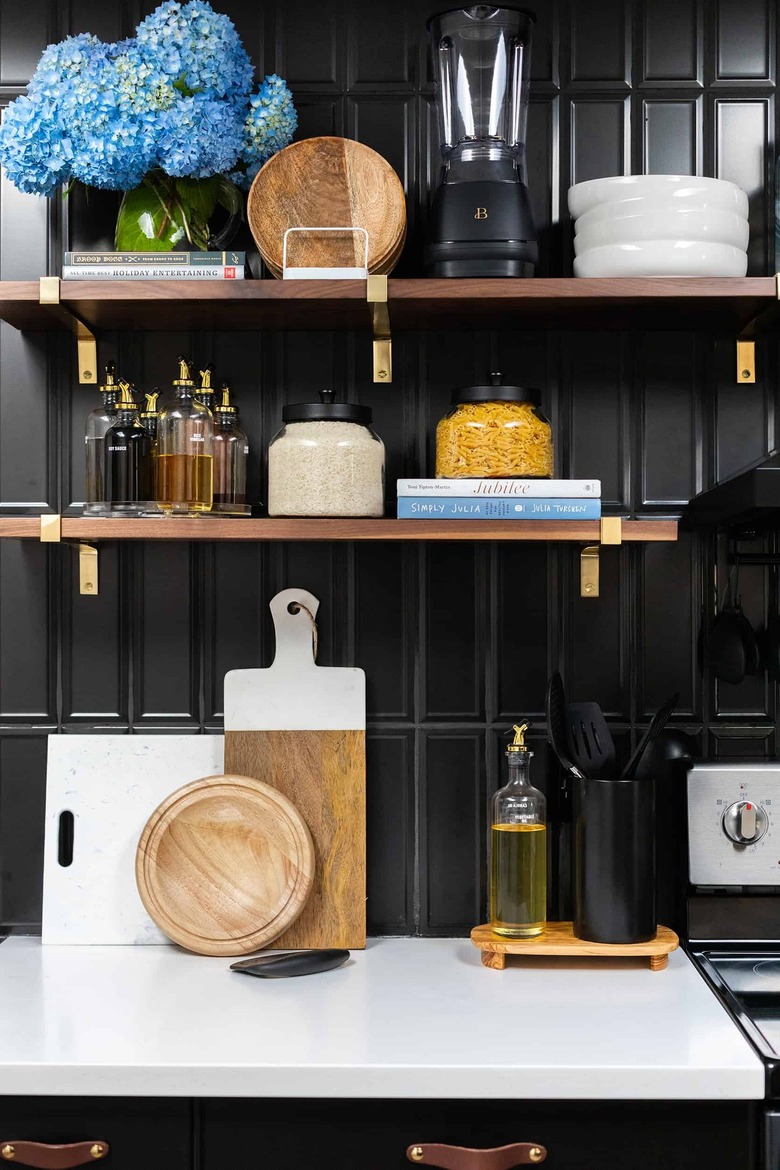
A beveled edge is a guaranteed way to set your subway tile backsplash apart from the rest. There's something glamorous about a beveled edge, even more so when it shows up in black. We love the oh-so-glam look paired with rich wood and brass accents in Albie K. Buabeng's kitchen, as showcased by Emily Henderson.
Where to Buy Subway Tile for the Kitchen
Where to Buy Subway Tile for the Kitchen
Looking for the perfect subway tile for your kitchen backsplash? Here are a few of our favorite brands to shop.
Fireclay Tile's renowned 3x12 tile is cut to order in California and is at home with both traditional and modern styles. The large subway tile can be arranged in half offset, ¼ offset, straight-set, herringbone, and parquet tile patterns. They're available in a range of contemporary colors, too.
Heath Ceramics' Classic Field collection offers 18 shapes and sizes. Depending on context and choice of pattern, glaze, and grout, the look can range from quiet and meditative to dynamic and vibrant.
Arizona Tile is a great pitstop if you're looking for something a little different. The family-run business deals with porcelain and glass tile, but also granite, marble, limestone, travertine, slate, and onyx slabs if you're looking to mix and match!
