A Kid-Friendly Craftsman That Still Feels Cool And Polished
A couple's home in Oak Bay, a historic residential neighborhood in Victoria, British Columbia, had plenty of room for a family of five, but the space was better suited for previous generations. They needed to update the house to suit their lifestyle and reflect their personalities without losing the home's original character and charm. The couple teamed up with design firm Bidgood + Co to tackle the renovation and redesign. The firm first focused on improving the flow of the main floor with a new open kitchen and dining area and making the rest of the space more functional by adding storage and repurposing an awkward powder room under the stairs as a workspace. "Every detail, down to exposed beams and the original floor inlay, had to be taken into account," says interior designer Kyla Bidgood. "The changes worked out flawlessly as if the house had always existed that way."
Bidgood infused a handmade feel into every space, from the ceramic pendant lights in the kitchen to the hand-painted tile in the master bathroom. She also chose a nature-inspired palette. "This family loves the outdoors, so the palette was driven from the rustic west coast; [there are] cool blues, greens and grays balanced with warm wood tones and black accents." The entire space is stylish, kid-friendly, and, just as they wanted, very full of personality.
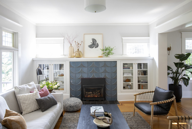
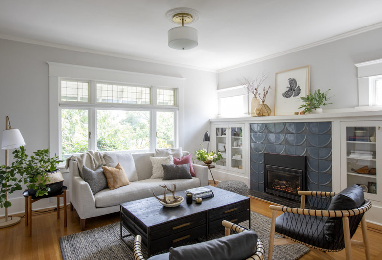
1. Living room
The living room retains its original Craftsman charm, including the leaded-glass windows and built-in bookcases, but the fireplace received a makeover with blue-glazed Ann Sacks tiles. "The heritage and character of the home was a big player in the design," says Bidgood. "We wanted to create something that would suit this young, modern, active family, but also fit into the existing architecture seamlessly."
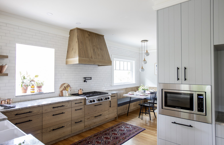
2. Kitchen
The original kitchen was small and closed-off. "The kitchen desperately needed more counter space and storage," says Bidgood. "We achieved this by designing floor-to-ceiling built-ins along the interior walls to house most of their appliances including the refrigerator, beverage drawers, double wall oven, coffee station, baking mixer, and dry storage. The lower millwork contains spice drawers, large pot drawers, recycling, compost, and trash pullouts, and a magic corner unit."
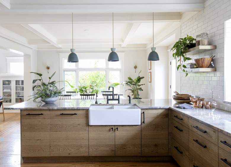
3. Kitchen
The kitchen is now open to the dining area and the counter is lined with stools for casual dining. Keeping the storage confined to the opposite wall and lower cabinets kept the wall above the counter open. Fireclay Tile was installed to the ceiling to bring in a rustic feel.
4. Breakfast Nook
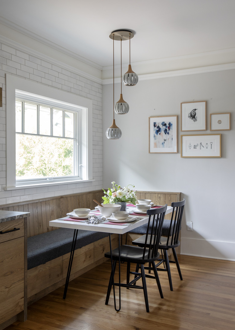
Lights by Rachel Saunders hang above the kitchen's eating nook. The banquette is made of the same half-sawn oak as the lower kitchen cabinets.
5. Staircase
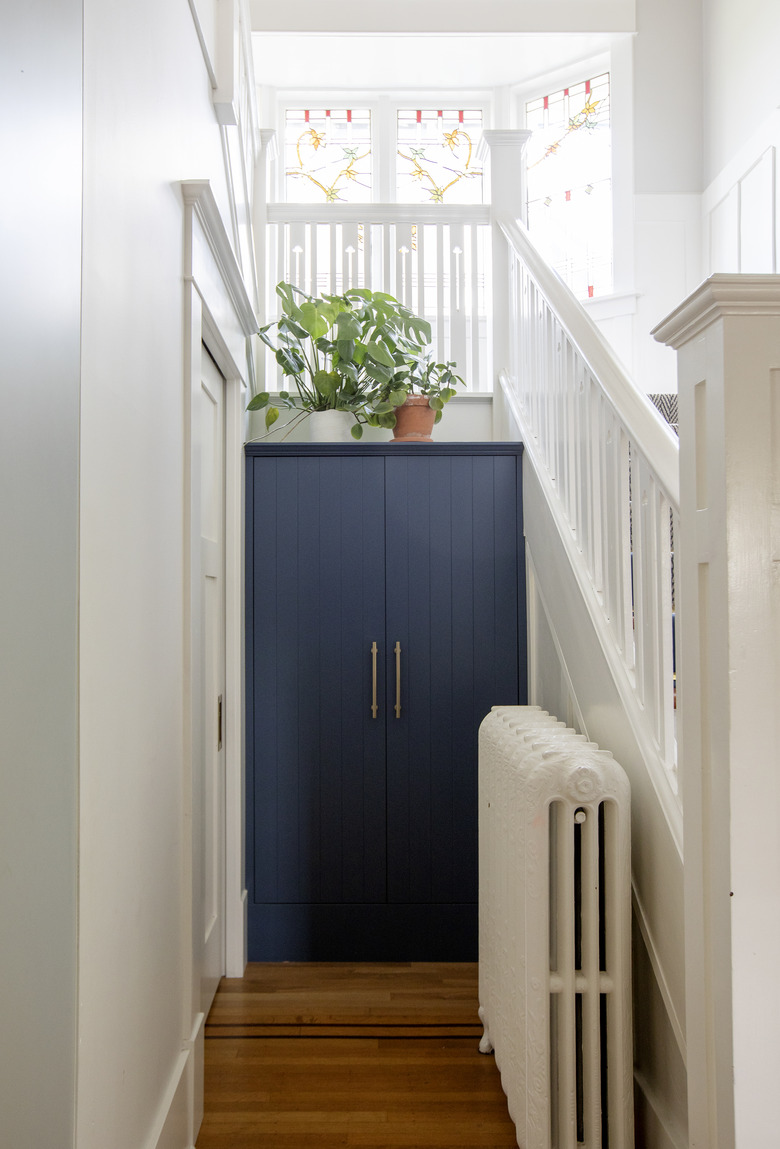
"The entrance needed enough room for everyone to come and go fluidly, with space to unload and be the working cog of the home," says Bidgood. "We added custom millwork, including cubbies for each kid and closed storage for seasonal items."
6. Bedroom
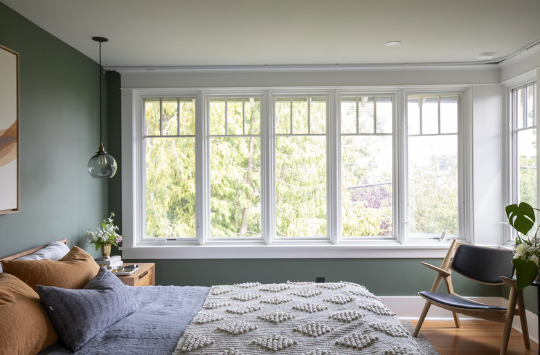
Natural hues create a calming atmosphere in the master bedroom. A throw from The Citizenry and linen bedding add texture.
7. Bedroom
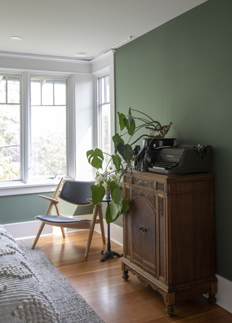
Walls painted in Benjamin Moore's Cushing Green serve as a moody backdrop for vintage pieces in the master bedroom.
8. Nursery
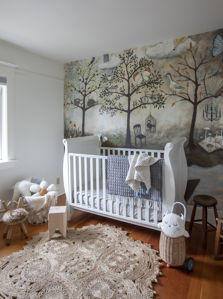
A mural of an enchanted forest from Anthropologie adds whimsy to a daughter's bedroom.
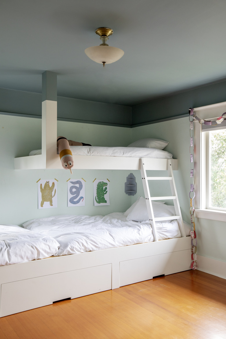
9. Kid's Room
"Their kids that are close in age wanted to have a shared room they could all hang out in, and the wife wanted a place where everyone could curl up and read stories together," says Bidgood. "We had a custom bunk bed built in with space for all three and storage below for toy and linen pullouts." The two-tone walls and ceiling are painted in Benjamin Moore's Sea Foam and Sea Star.
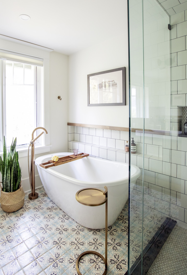
10. Bathroom
The couple wanted a soaking tub and steam shower for the master en suite bath. The wife also wanted windows by the tub, for the feeling of bathing al fresco. The walls and shower are lined in tile from Daltile and the floor tiles are by Ann Sacks.
