A Colorful And Compact Victorian Row House In SF Is A Small Space Dream
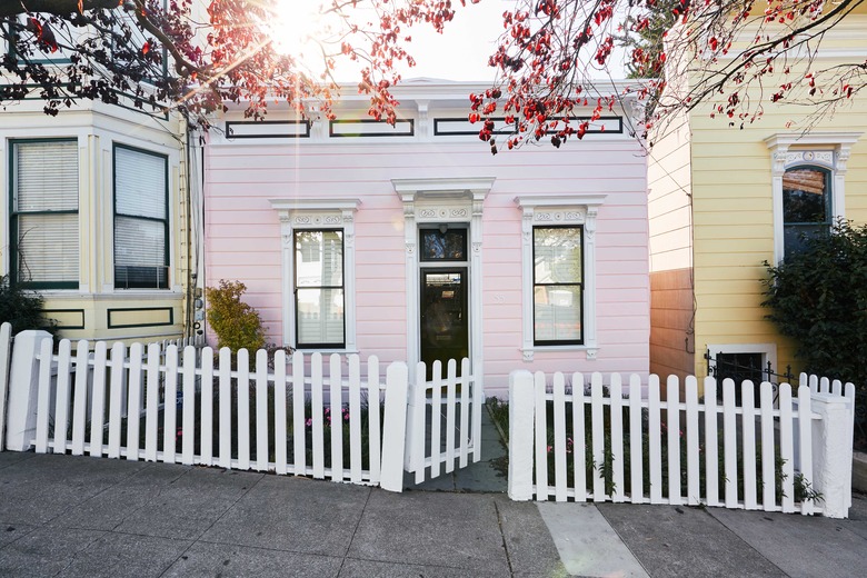
San Francisco is known for its "painted ladies," which are towering Victorian row houses sporting saturated shades. So it seems only natural that a color-loving couple in San Francisco's Noe Valley would take a bit of that inspiration for their own home. Their charming 900-square-foot Victorian may not have the height of the famous painted ladies, but with its new pink exterior, it certainly has the charm. Leading the couple on this vibrant project was Clara Jung, owner of design firm Banner Day. "There are many original Victorians in this neighborhood although, I have to say, this house stands out," says Jung, who worked with the couple on their previous home as well.
Jung's main objectives were to make the small space livable for the clan of three and to showcase the family's art collection. She paid close attention to scale, making sure that the artwork, furnishings, and accessories didn't overpower the space. Jung also made the interior as colorful as the exterior with vibrant seating and fun, patterned wallpapers. "The clients were not afraid of an abundance of color, which made the design process all that much more fun," she says.
1. Living Room
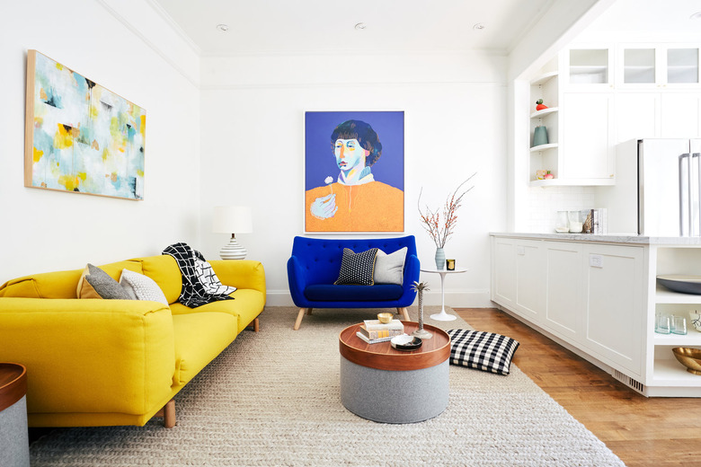
The couple's vibrant artwork set the tone for the design of the living room. "The purple and orange in the portrait painting was an extremely colorful combination," says Jung. "Instead of trying to soften the rest of the living room palette to a neutral scheme, we fully embraced the bold colors by installing a complementary and equally bold yellow sofa."
2. Dining Room
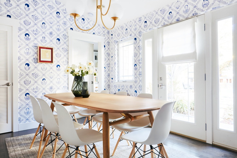
The dining room celebrates San Francisco with Flavor Paper's Bay Area Toile wallpaper and a table by local artisan Dave Ball of Jacob May.
3. Kitchen
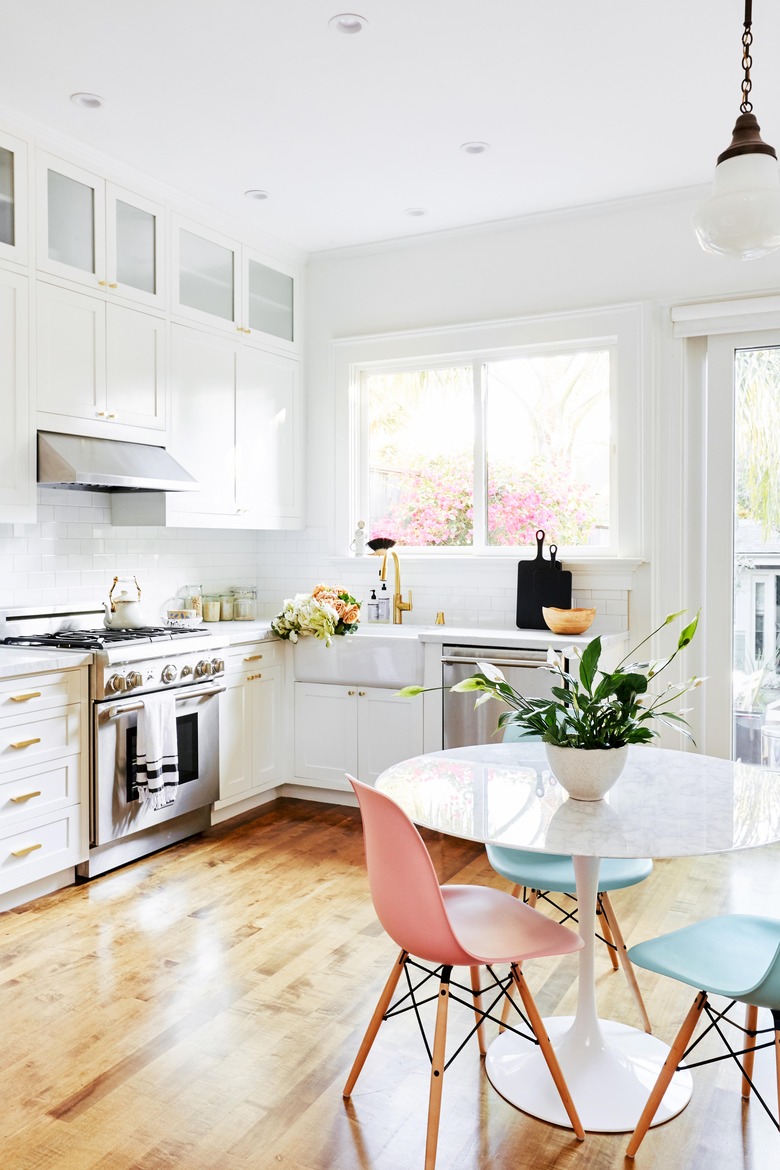
"Although we made sure all the finishes and fixtures we chose were durable, the primary focus was on sourcing materials the clients loved," says Jung. "For example, many families shy away from marble, but we installed marble countertops in the kitchen, knowing that the patina from use was something that suited the age of the home."
4. Kitchen
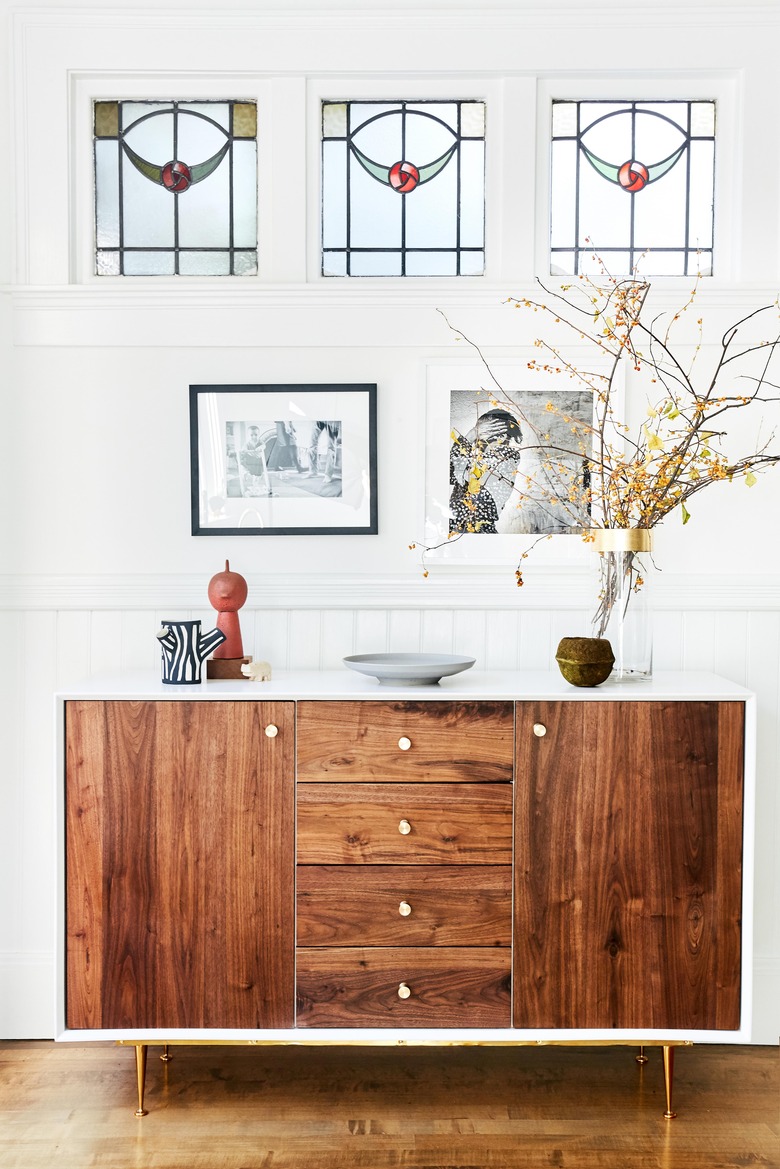
A credenza by Organic Modern adds extra storage in the kitchen.
5. Library
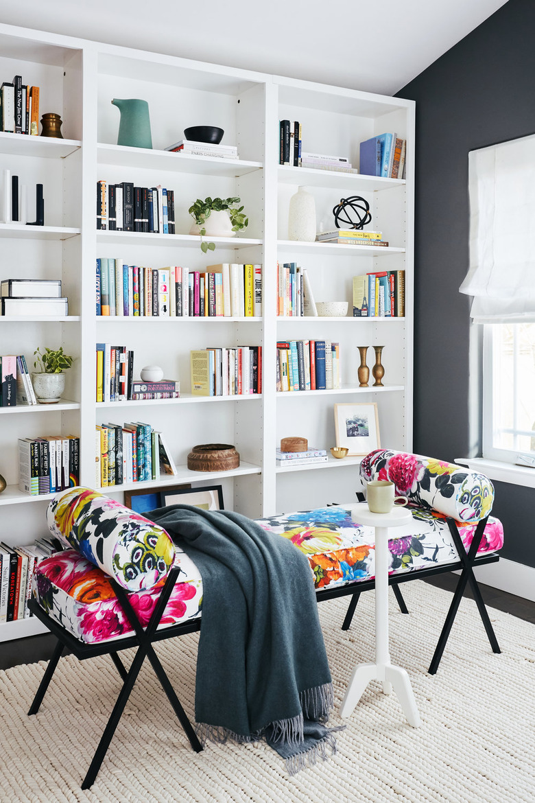
The clients requested a reading room, so Jung installed custom bookcases and added a colorful bench by Katy Skelton.
6. Playroom
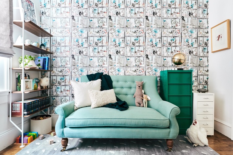
The playroom was outfitted with whimsical wallpaper and colorful seating. Jung added plenty of storage for toys and books.
7. Bathroom
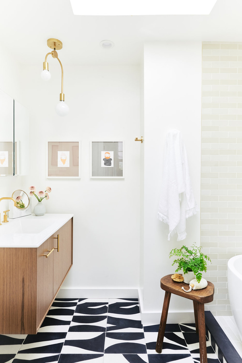
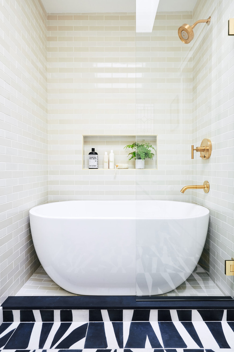
Black-and-white Popham Design tile brings a graphic touch to the bathroom. The floating vanity helps the small space feel more open.
8. Bathroom
Rather than choose between a soaking tub or a shower, Jung put both in the same space, which is lined with Heath Ceramics tile.
