A Prague Flat Proves You Can Display Lots Of Stuff In A Way That Feels Minimalist
In a city celebrated for its architecture, Prague's Žižkov district is one of the more exciting areas. There, you'll find the famous Žižkov Television Tower, adorned with surrealist art, alongside a Baroque 17th century church built during the throes of the plague epidemic. One Žižkov couple hired the architectural firm DDAANN to transform their flat situated inside a house from the 1930s.
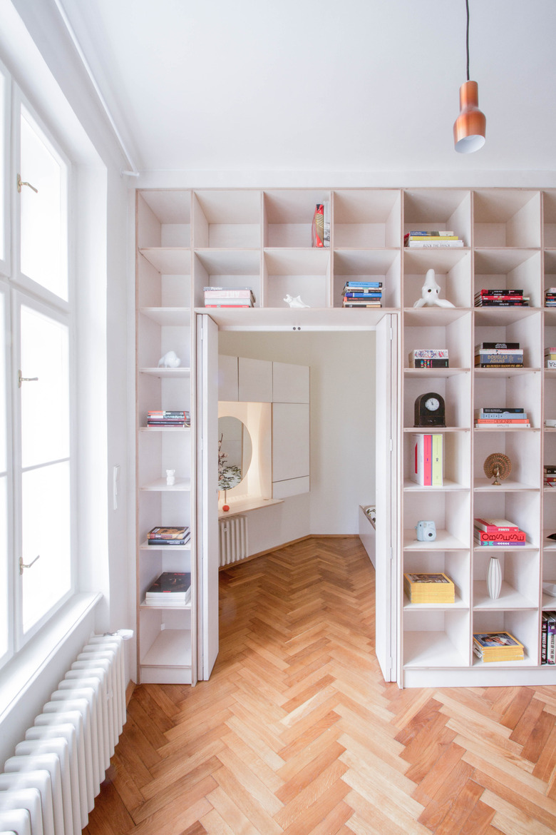
The concept, to create a more connected space full of light, was approached by rearranging the apartment to fit the needs of two people rather than one. Balancing privacy with ample shared space was a challenge the team at DDAANN overcame by creating doors in the entrance hall leading to the more private areas of the house, a dressing room, a half-bathroom, and a separate bedroom.
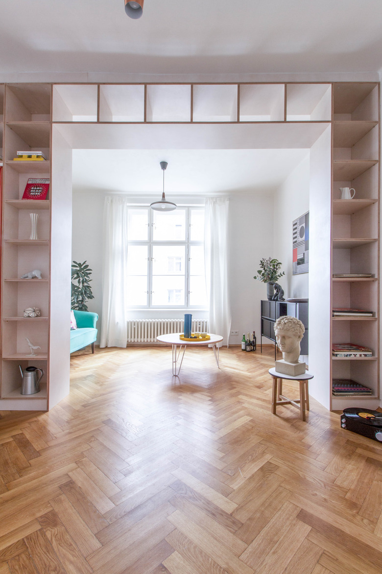
But what we love most is DDAANN's creative use of storage —the bookshelf built-ins throughout allow the couple to use books and objects to create their decorative aesthetic without it getting messy.
1. Living Room
The firm's use of shelving proves that you can still have a lot of stuff but achieve a streamlined, almost minimalist aesthetic.
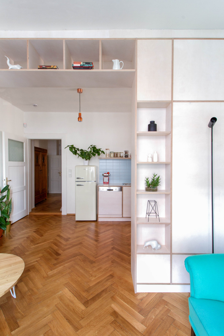
2. Kitchen/Living Area
The shelves display the clients' porcelain art collection made by Czech artists, dating from the 1920s to the 1970s. Many smaller accessories throughout the rest of the apartment were purchased from Shit Happens Porcelain Studio and Shop, a sister shop of Bisqit Ceramics in Prague.
3. Kitchen
In the galley kitchen, the team makes effective use of space by turning part of the bookcase into bench seating.
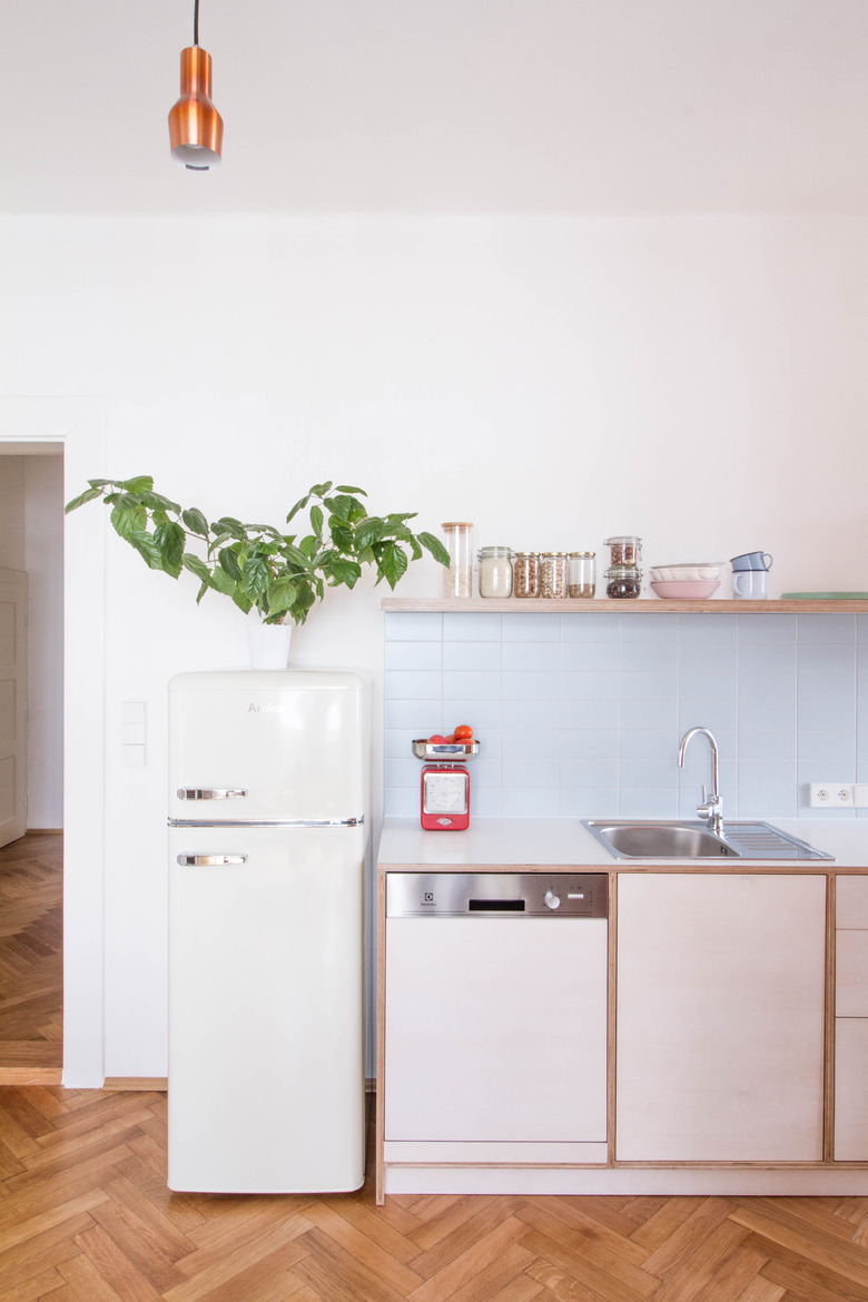
4. Kitchen
In the kitchen, you especially feel the team's subtle yet clever blending of past and present. The restored parquet floors and retro fridge evoke more vintage vibes, while the custom cabinetry feels distinctly modern.
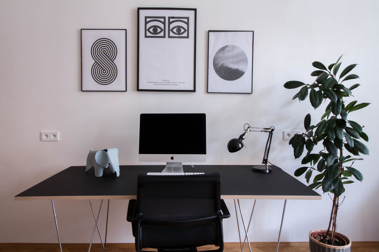
5. Home Office
The office space features black and white art by illustrator Bal Inku. The decorative elephant is from Vitra; the desk lamp is from IKEA.
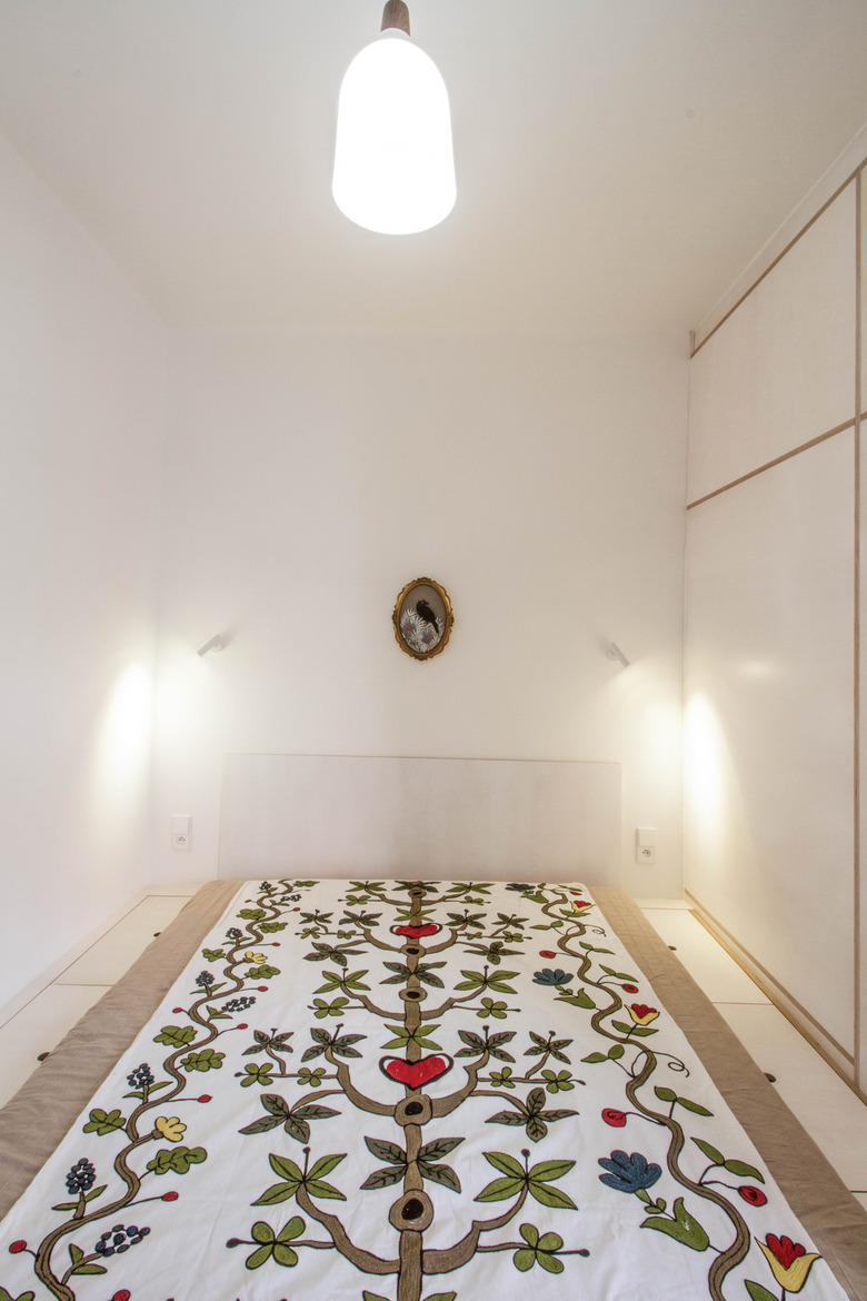
6. Bedroom
A custom headboard in the bedroom was also made from bleached plywood. Lighting from Nordlux contrasts well with the more traditional motifs.
7. Bedroom
A custom vanity design doesn't take up too much space in the bedroom.
8. Bathroom
Here's an awesome effect for a simple, yet striking bathroom: a frameless, backlit mirror.
