30 Minimalist Kitchen Design Ideas To Free Up Space
Minimalism is not a new design style but it has been gaining quite a bit of steam in recent years. In today's jam-packed world (accompanied by crazy schedules and overflowing closets), the "less is more" aesthetic is a breath of fresh air, especially when it comes to our homes. The streamlined approach forces homeowners to edit their belongings down, keeping only the things that are truly essential or cherished. Marie Kondo refers to these pieces as items that "spark joy."
A minimalist lifestyle can be especially impactful in a kitchen, where rarely-used items tend to pile up in dusty cabinets and fill every inch of counter space. Minimalist kitchens are free of countertop clutter, rarely-used kitchen appliances, and over-the-top decor. Instead, they embrace clean lines, simple, natural materials, and oftentimes, neutral hues.
Take a look around. If your culinary headquarters is feeling a tad bit cluttered and chaotic, it might be time to embrace a more pared-down aesthetic. Ahead you'll find 30 minimalist design ideas that just might inspire you to move ahead with your kitchen remodel.
1. Incorporate storage in a seamless way.
1. Incorporate storage in a seamless way.
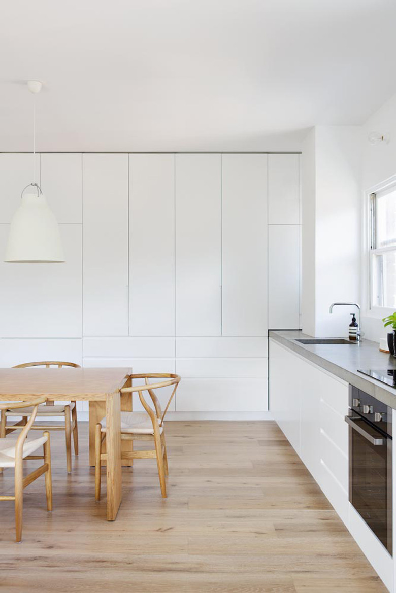
Instead of installing banks of cabinets (complete with decorative hardware and detailing), why not go with an understated storage solution that blends right in with the rest of your kitchen design? In this minimalist setup by Rachel Hudson Architecture, built-in white cabinets sans hardware quietly exist, foregoing any fussy details.
2. Ditch the upper cabinets in favor of open shelving.
2. Ditch the upper cabinets in favor of open shelving.
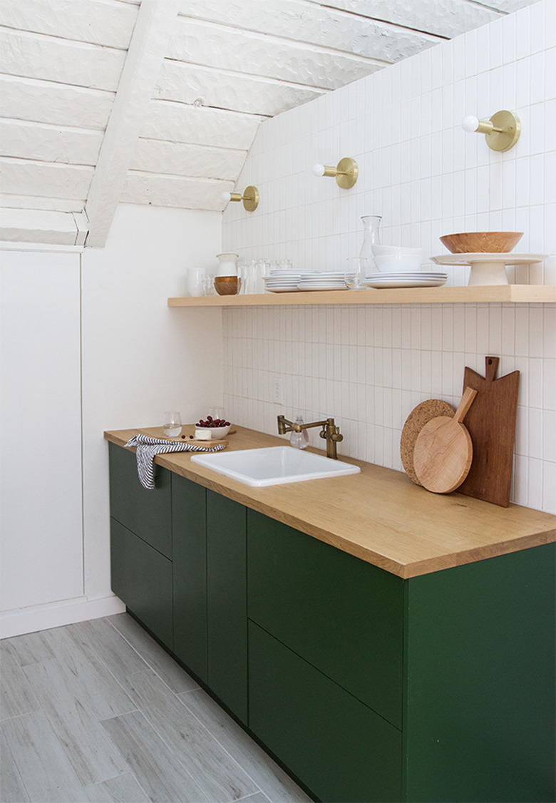
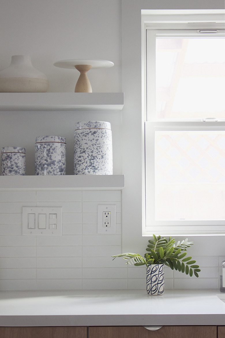
There are times, especially in small kitchens, when too many cabinets can make a space feel closed in. Consider removing the upper set of cabinets during your remodel, and replacing it with open shelving like this petite kitchenette by Sarah Sherman Samuel. This one change will completely transform the look and feel of your space, resulting in an open and airy vibe that is much more in line with your minimalist aesthetic.
3. Install an undermount sink.
3. Install an undermount sink.
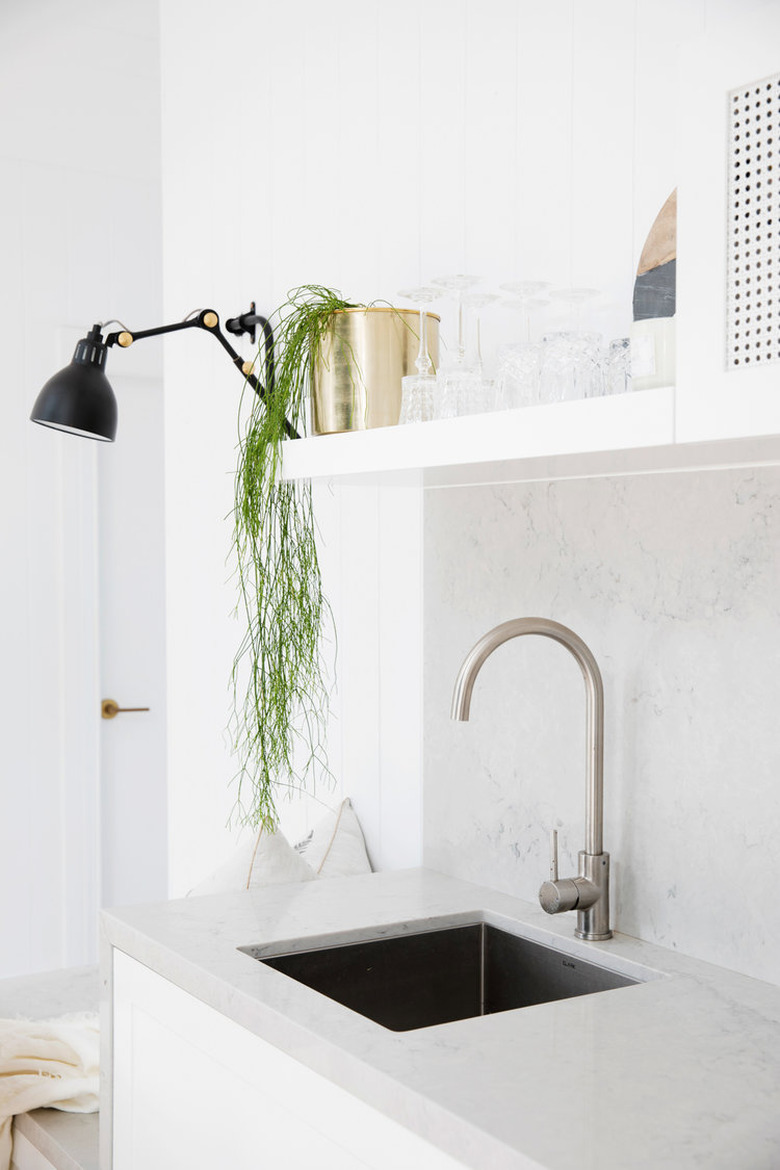
Minimalist kitchens and undermount sinks go hand in hand. Since they're installed below the countertop, there's no visible lip to interrupt or compete with the other details within the space. Bonnie, Lana, and Erin of Three Birds Renovations chose a sleek, square stainless steel basin and paired it with a modern gooseneck faucet to complete the look.
4. Be picky with your decor.
4. Be picky with your decor.
Minimalists are extremely selective when it comes to their decor. In your new kitchen, only display accents that serve the dual purpose of being functional (and/or having a special meaning to you) and looking good. In this culinary space belonging to Molly of Almost Makes Perfect, the curated objects displayed on the open shelving and countertops are all practical, yet they add style as well.
5. Simple lighting is better.
5. Simple lighting is better.
In a minimalist kitchen design, simple lighting makes the most sense. Sure, we love intricate and artistic fixtures as much as the next person, but when you're looking to pare things down, unadorned options work best. Skip ornate details and fussy lampshades and opt for a streamlined look, like the track lighting in this kitchen crafted by Cantilever Interiors.
6. Go for linear design details.
6. Go for linear design details.
Minimalist kitchens look their most sophisticated and current when they showcase clean lines. Sure, curved silhouettes are popular, too, but there's something about linear design that instantly uncomplicates things — as proven by this contemporary cook space styled by Lucy Bock Design Studio.
7. Weave in a neutral color palette.
7. Weave in a neutral color palette.
In the land of minimalism, you won't find a lot of vibrant colors. Instead, the visuals are awash in more neutral shades of white, beige, gray, green, brown, and blue, not unlike the hues you would find outdoors. We are particularly loving the scheme in this minimalist kitchen design by Catherine of The Stables.
8. Only display the essentials on your kitchen counters.
8. Only display the essentials on your kitchen counters.
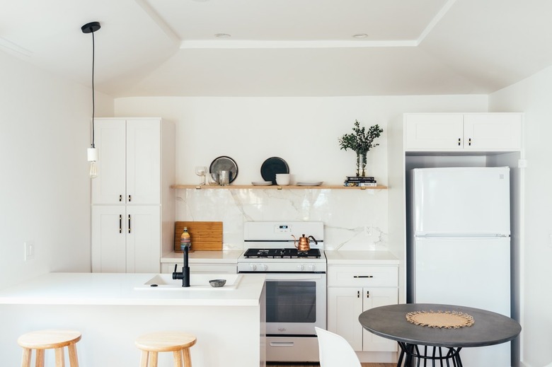
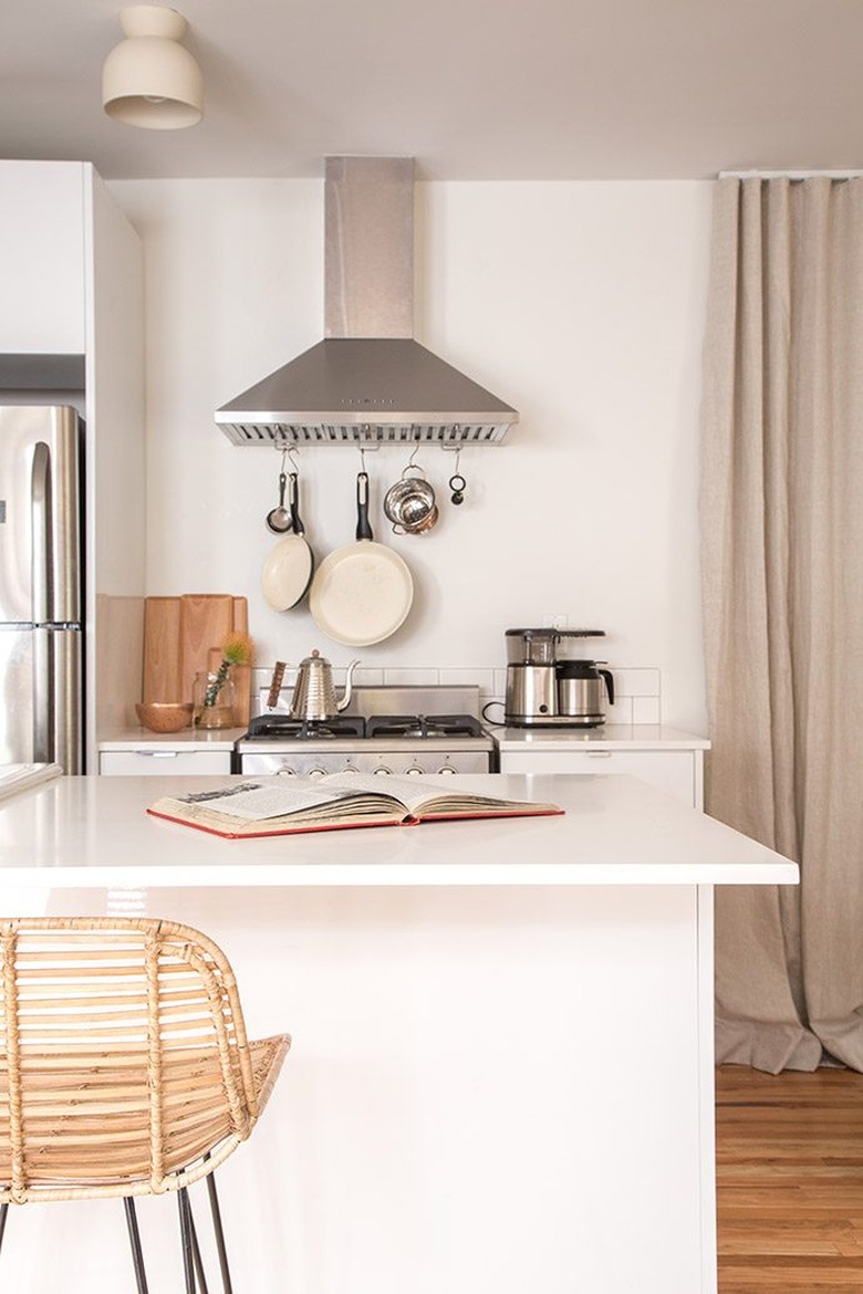
Ponder the small kitchen gadgets and tools that you use the most and give those pieces the honor to be within arm's reach. Stash away (or give away) things you haven't used in a while. Paige Geffen shows us how it's done in her neutral space, by having a carefully edited collection of pots and pans, cutting boards, and other culinary essentials on display at all times.
9. Include simple wall sconces.
9. Include simple wall sconces.
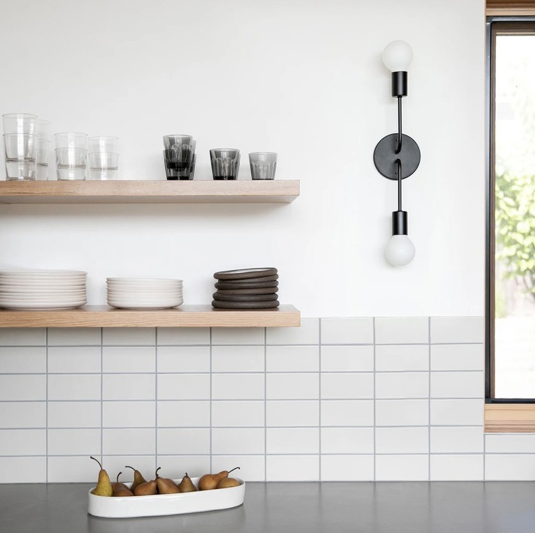
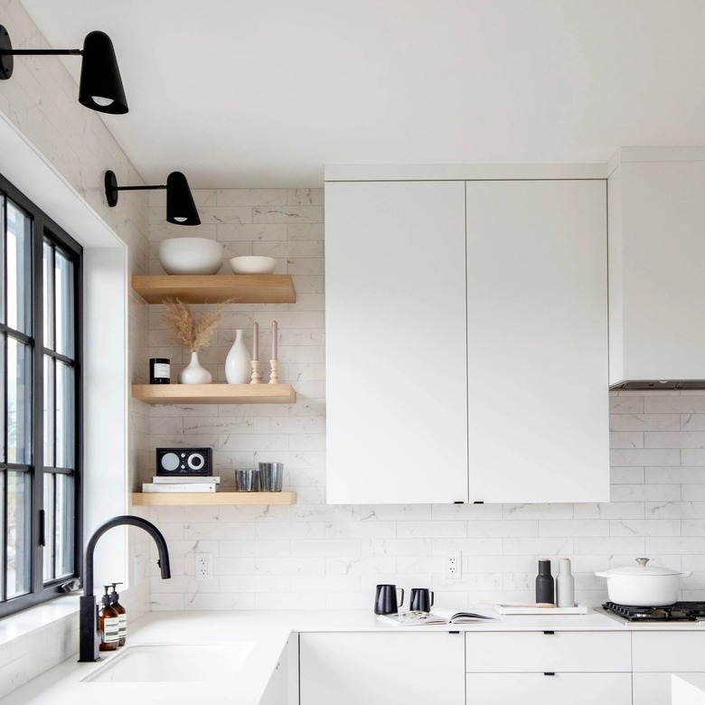
While some wall sconces can get pretty ornate at times, in your minimalist kitchen design, you'll want to select fixtures that are sleek, polished, and simple, like the two-arm option, featured in this culinary space by Schoolhouse.
10. Play it safe in all-white.
10. Play it safe in all-white.
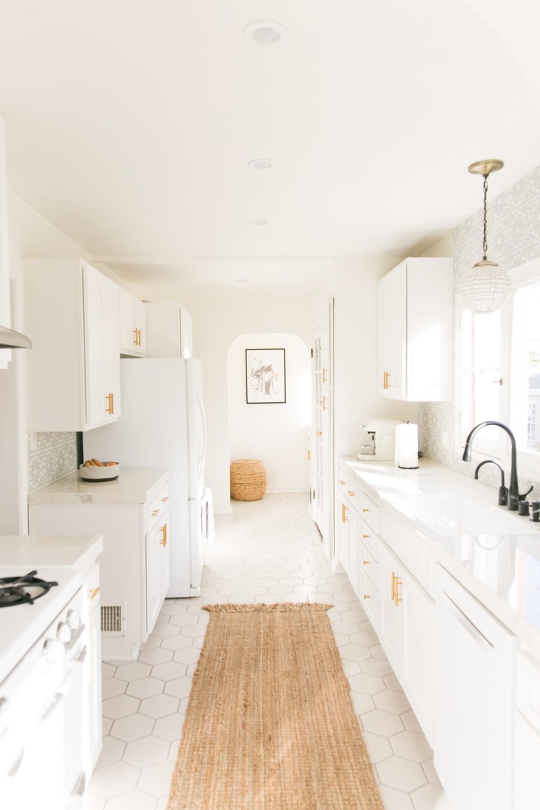
If you're looking for a timeless color palette for any aesthetic, you can't go wrong with an all-white kitchen. And since the classic color is bright and clean, it's an ideal fit in a minimalist setting. Kate of Mr. Kate has a particularly lovely all-white minimalist kitchen, in our opinion.
11. Opt for uncomplicated hardware.
11. Opt for uncomplicated hardware.
Instead of choosing cabinet hardware with patterns or intricate details, select an option that's as simple as they come, like the streamlined pulls spotted in this kitchen, perfected by Mollie of Design Loves Detail.
12. Integrate appliances into the cabinetry.
12. Integrate appliances into the cabinetry.
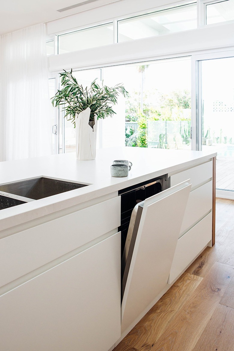
Current kitchens have plenty of "what will they think of next?" moments, such as integrated appliances. Built right into the cabinetry, you can have all the functionality of your convenient appliances (like a dishwasher), without the visual clutter interrupting the flow of your design. It's something that Kyal & Kara took full advantage of in this seamless setup.
13. Bring in subway tile for a timeless look.
13. Bring in subway tile for a timeless look.
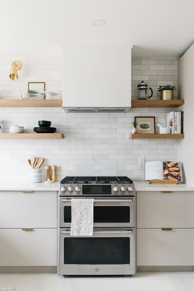
A backsplash in a minimalist kitchen should always be effortless and understated, and subway tile fits that description to a T. Framing the stovetop and acting as a backdrop for open shelves, the classic wall tile in this kitchen design by Kresswell Interiors is perfection.
14. Anchor the space with black kitchen cabinets.
14. Anchor the space with black kitchen cabinets.
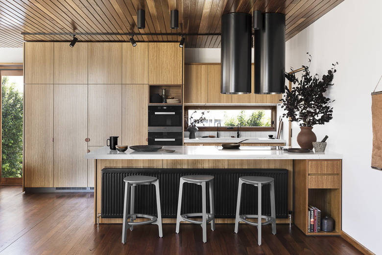
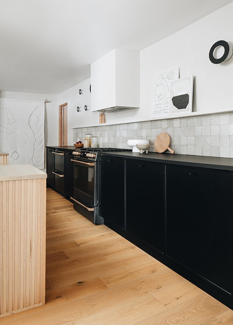
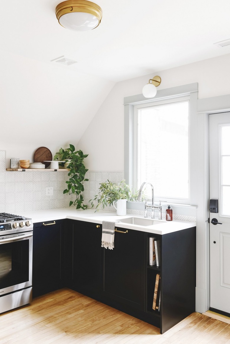
Although white tends to be the color of choice in minimalist kitchens, we happen to think that black looks right at home as well. In fact, it can help anchor the visuals and provide some eye-catching juxtaposition, as proven by this kitchen designed by Sarah Sherman Samuel.
15. Invest in simple barstools.
15. Invest in simple barstools.
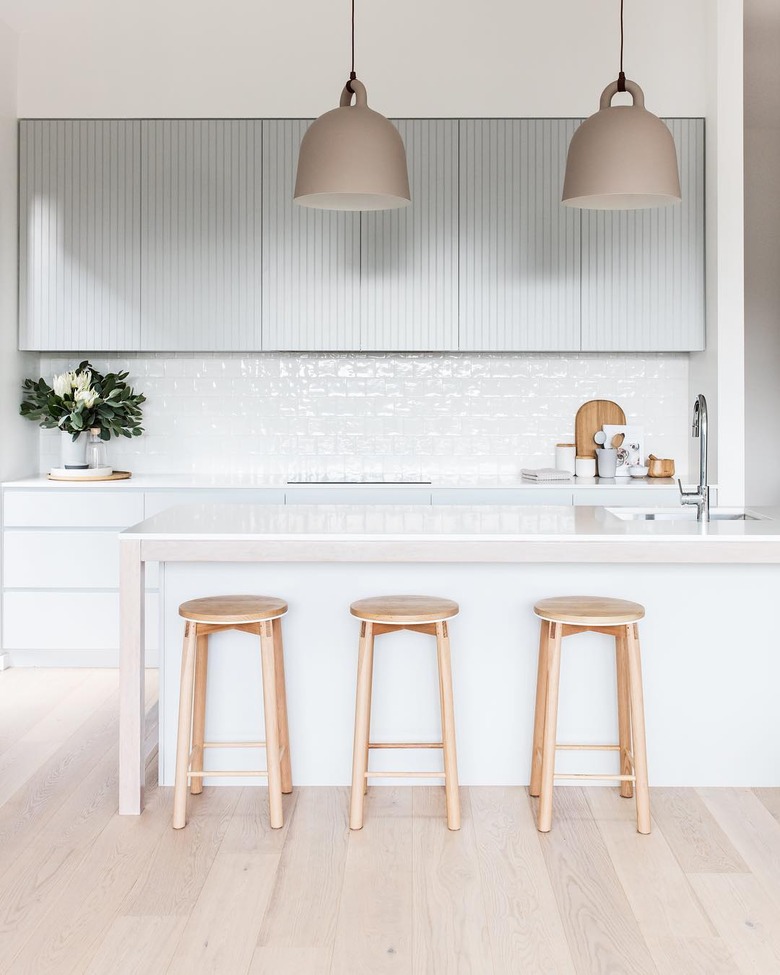
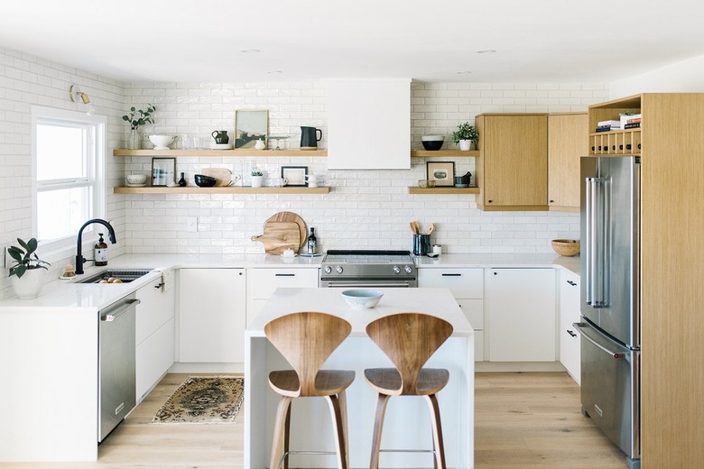
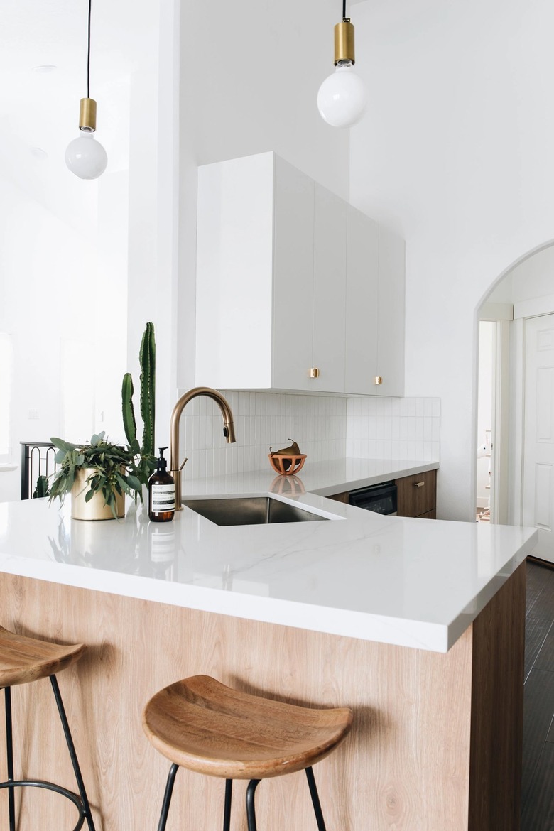
In a minimalist kitchen, you could certainly forgo barstools in the name of less is more. But, if you can't live without kitchen seating, look for options with simple silhouettes and natural materials. The midcentury-inspired wood stools showcased in this small kitchen by Kristina Lynne will do the trick.
16. Flat panel cabinets are a minimalist win.
16. Flat panel cabinets are a minimalist win.
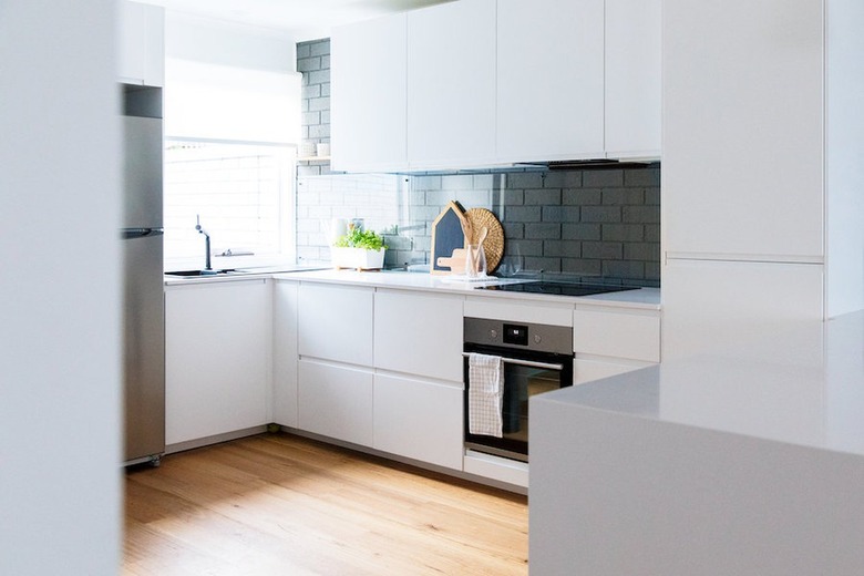
Shaker cabinets are a popular classic but for a minimalist kitchen, opt for flat-panel cabinets instead. Skip traditional hardware, and go with integrated pulls à la this refreshing and airy setup by Style Curator.
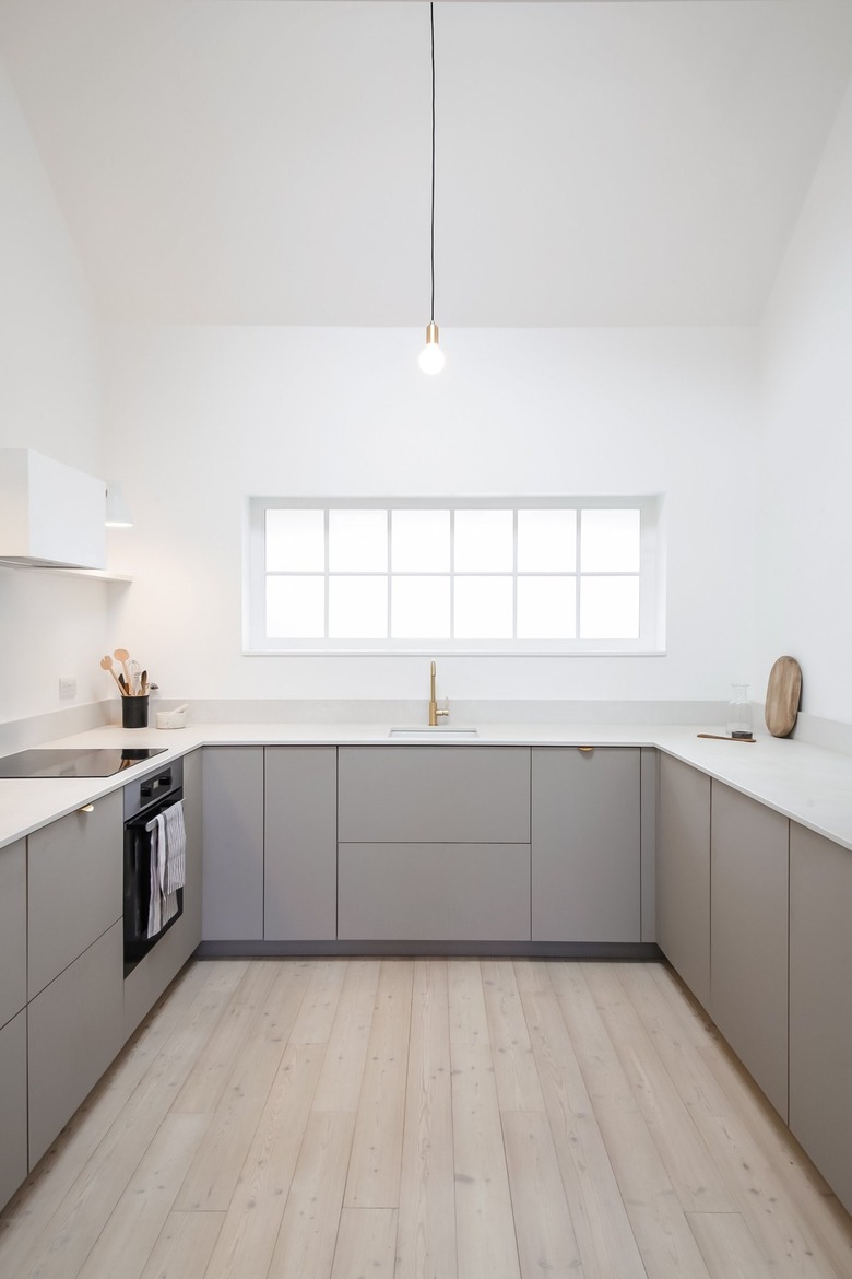
17. Consider gray cabinetry.
17. Consider gray cabinetry.
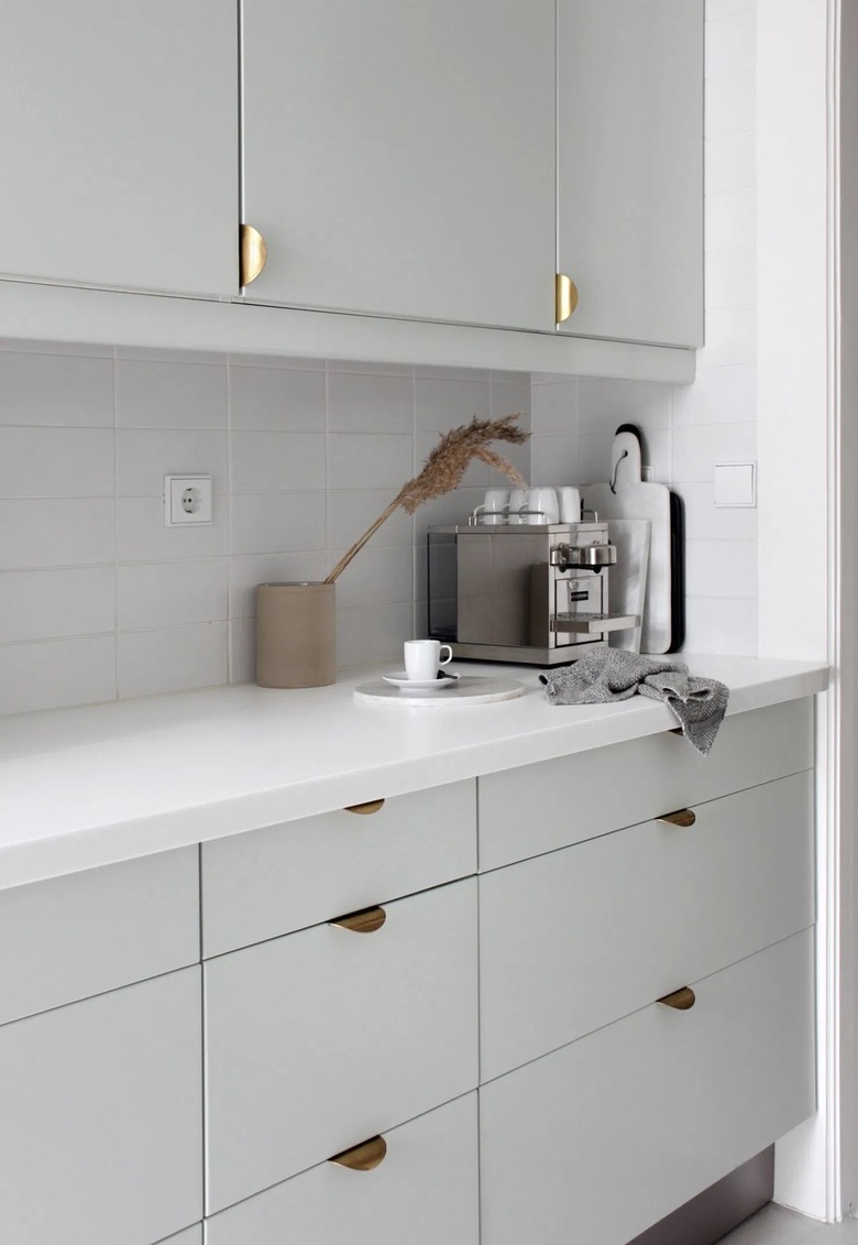
We've covered minimalist kitchens with white and black cabinets, but what about gray cabinets? The answer is "YES!" The dreamy hue in this Scandinavian kitchen, spotted on These Four Walls, fits right into the calm and serene vibe, while the half-moon-shaped brass hardware adds a hint of glam.
18. Or, how about green?
18. Or, how about green?
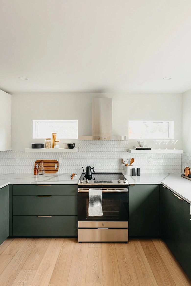
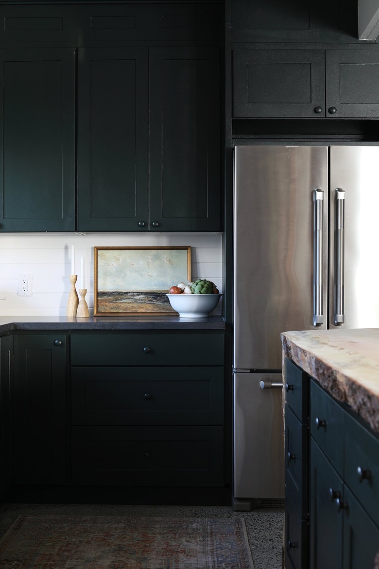
Shades of white, black, and gray not really your thing? In this case, a muted shade of green might be just the solution you were looking for. It isn't too overpowering and it adds a nice sense of depth, as proven by this kitchen design from the team at Copeland + Co. Interiors.
19. Embrace a bright white countertop.
19. Embrace a bright white countertop.
While granite and marble are both timeless kitchen countertop materials, they can often feel busy and run the risk of overwhelming the design. In a minimalist cook space, you want the counters to do the exact opposite. Look for high-quality white marble or quartz with very little veining or detailing, something that's witnessed in this kitchen spotlighted by Semihandmade.
20. Add some interest with marble tile.
20. Add some interest with marble tile.
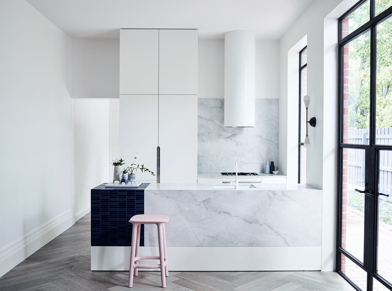
A little marble is okay in a minimalist kitchen, as long as it isn't too dark or busy. In fact, it can provide subtle visual interest in an otherwise pared-down space. Follow the lead of this bright culinary space shared by Cedar & Moss and limit the natural stone to backsplash tile.
21. Include textural elements.
21. Include textural elements.
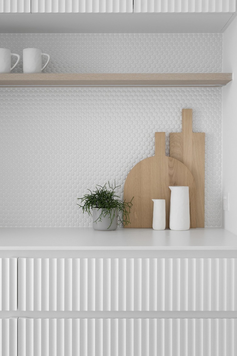
You've been dreaming of a top-to-bottom white, minimalist kitchen, right? Well, don't forget to include some texture! It's a surefire way to make your cook space look a lot more unique and interesting, as proven by the penny tile backsplash and fluted cabinetry in this setup, spotted on Style Curator.
22. Use a dark wood finish to create depth.
22. Use a dark wood finish to create depth.
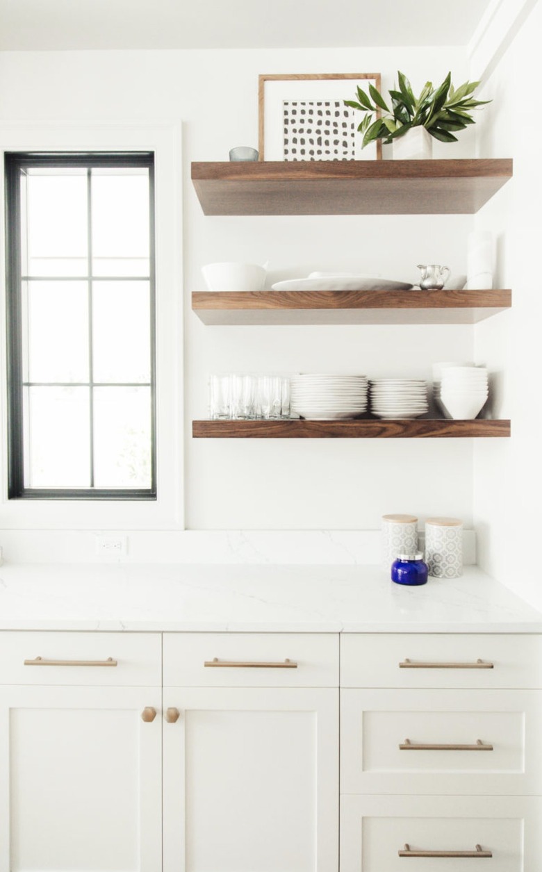
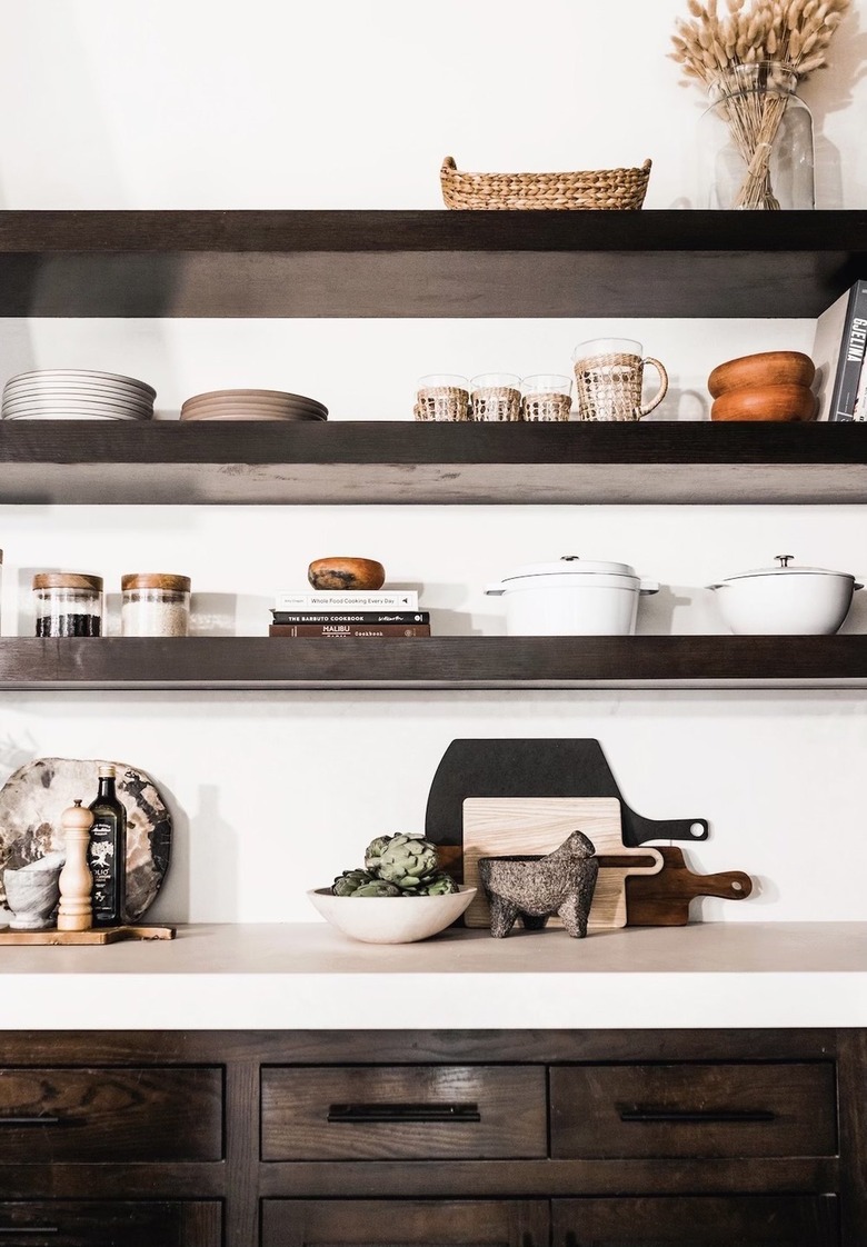
Yes, it's true — most minimalist kitchens are swathed in shades of white or the very lightest of wood finishes. And while this makes for an airy look, you might want to add a touch of drama to your cook space. If this sounds like you, consider dark wood finishes, like walnut or mahogany, for your shelving and cabinetry. It's what Camille Styles did in her kitchen and the result is striking.
23. Farmhouse kitchens can be minimalist, too.
23. Farmhouse kitchens can be minimalist, too.
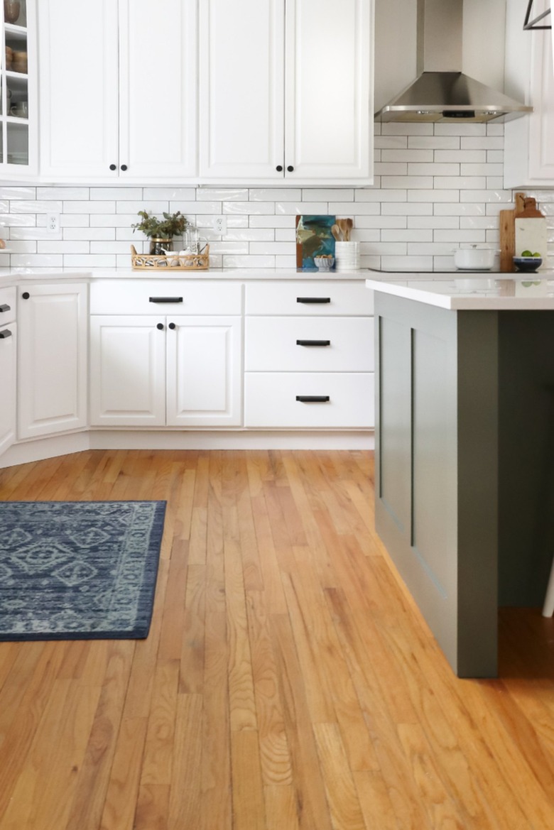
Farmhouse kitchens are often marked for their copious flea market finds and ornate details like curled corbels. While that's all well and good for some, that might not totally appeal to you — but you'll be happy to know that you can go the minimalist route with your country design. Jen of City Farmhouse did just that by choosing a simple subway tile backsplash, keeping the lines clean throughout, and forgoing heaps of fussy decor.
24. Include a rug for added visual appeal.
24. Include a rug for added visual appeal.
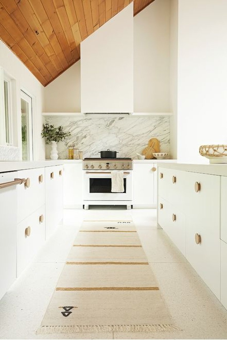
If you scroll through kitchen ideas on your social media feeds, you'll begin to notice a popular trend: rugs in the kitchen. The good news is that a decorative runner doesn't need to be kaleidoscopic or exceedingly patterned — it can be unassuming and cool like this one designed by Sarah Sherman Samuel for Lulu and Georgia.
25. Go dark and moody.
25. Go dark and moody.
You can still go unfussy and straightforward with your visuals and integrate some dark-hued cabinets as well, a fact that's confirmed through this minimalist kitchen designed by Garrett and Cathy of The Grit and Polish.
26. Add greenery.
26. Add greenery.
A minimalist kitchen doesn't mean you have to get rid of your plant babies. Quite the contrary: Lush greenery is the perfect complement to your streamlined design. The verdant leaves bring an added pop of color and an organic element that is always welcome. Kim and Scott of Yellow Brick Home clearly have the right idea.
27. Hang straightforward pendants.
27. Hang straightforward pendants.
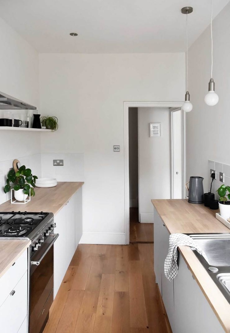
The good news is that you don't have to spend tons of money on a grand, intricate chandelier for your minimalist kitchen. The clean aesthetic favors lighting without a lot of bells and whistles. So feel free to pick the simplest pendants around — bulbs hanging from covered wires — and you will still have a kitchen that's just as stylish as the one that belongs to Abi of These Four Walls.
28. Welcome natural light.
28. Welcome natural light.
If your minimalist kitchen is going to be draped in neutrals galore, you'll greatly benefit from natural light that can make your space look even airier. If the budget allows, install a large window, or if you already have a window, invest in a top-down bottom-up shade that will allow you to block out the sun while still taking advantage of the light. Or, you can ditch the window treatments altogether like Helen of Design Hunter chose to do in this modern kitchen.
29. Splurge on stainless steel appliances.
29. Splurge on stainless steel appliances.
Unless you go with integrated appliances, big-ticket items (like the range and refrigerator) are going to play a role in the overall look of your minimalist kitchen design. With that in mind, stainless steel is always a good choice that never goes out of style. Plus, the surface will reflect light, making your cook space look that much brighter.
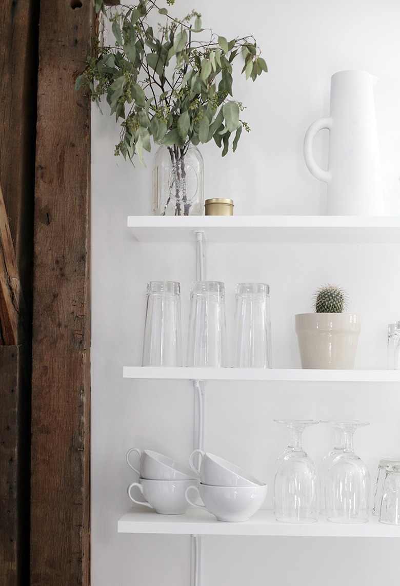
30. Display clear and white glassware.
30. Display clear and white glassware.
To keep your glassware collection within reach and still continue the minimalist theme, put only your white and clear mugs and tumblers out on display like Caitlin of The Merrythought did in this kitchen. She managed to artfully showcase her wares on a trio of open shelves and the result is simply beautiful.
