This Eclectic Seattle Colonial Will Make You Reconsider All-White Walls
Tons of bright white paint was the first step to updating a classic Colonial for a modern family in Seattle's Montlake neighborhood.
How do you score that idyllic balance between preserving a historic home and making it family friendly? When a Seattle couple with a growing family approached Portland designer Casey Keasler, she answered with a spacious new footprint and a light, neutral palette that draws attention to the Colonial's original character. From its coved ceilings to its cherished leaded glass windows, the details are what made the couple fall for the home, says Keasler. "I wanted to balance the seriousness and symmetry of the Colonial with relaxed northwest vibes."
When the couple purchased the home it was compartmentalized and outdated, says the designer. To lend it function, the plan called for an additional 500 square feet, with an end game of going from four bedrooms and one and a half baths to three bedrooms and two and a half baths. The existing kitchen and powder bath were demoed and expanded, creating a much larger, more open kitchen and breakfast nook with mudroom, pantry, and another half bath. The four bedrooms were condensed into one bedroom for the girls, a guest bedroom, and a master suite with a walk-in closet and bath.
From the onset of each project, Keasler works with clients to develop three keywords along with a complete style guide. In this instance, the words were: layered, cozy, and family.
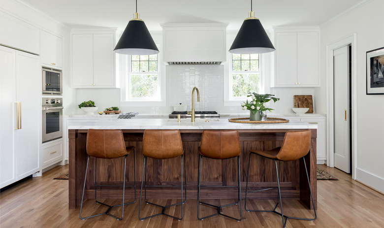
The homeowners wanted to bring in walnut accents to warm up the palette, including the striking island in the kitchen. "We felt it would be the perfect contrast to the classic all-white cabinets," Keasler says.
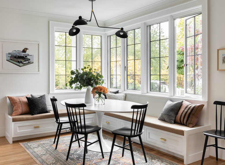
The layout of the adjacent dining space was begging for a built-in banquette. The upholstered benches make it a cozy spot for reading and eating breakfast yet it's spacious enough to host dinner parties, too. Keasler chose a pedestal base, which she says is a must with built-in benches. "The Saarinen is a classic and looks just as good in a modern home as it does in the Colonial. It's also kid-friendly, with its soft edges, the girls can slide around in the banquette and not worry about bumping on a corner, and the laminate top is very durable."
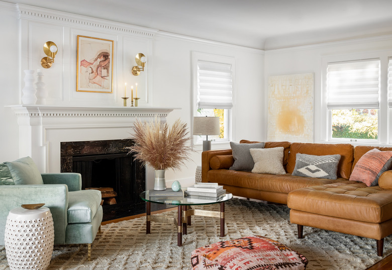
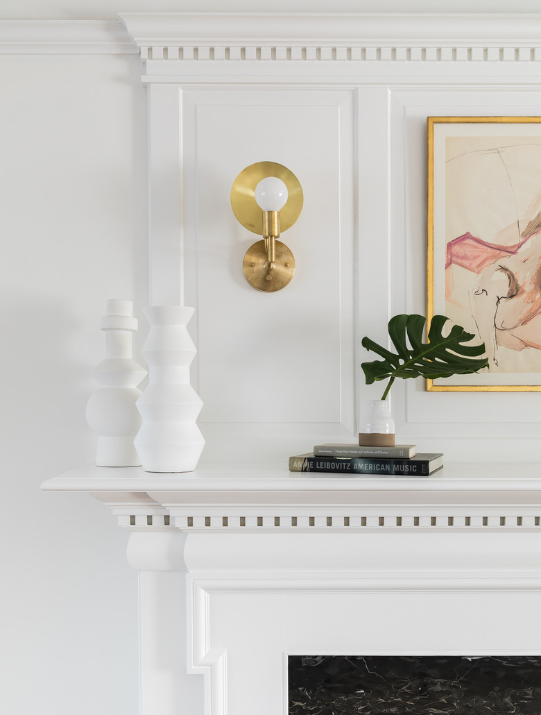
In the living room, the contractor removed and refinished the original mantel and all of the crown molding, then gave it a fresh coat of bright white paint. "They use this space to hang out with friends and family," says Keasler. "They didn't want a television in this room, so the focus was on conversation, lounging, and reading."
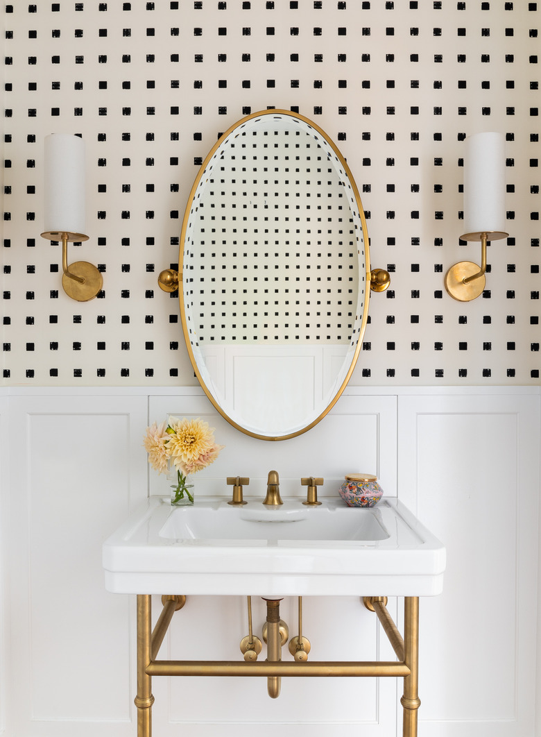
In the bathroom, Keasler selected graphic black and ivory Kelly Wearstler wallpaper, which pops against a backdrop of white and brass.
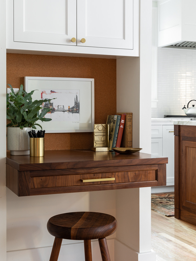
While the couple didn't require a home office, they did need a landing spot for dropping mail, stashing stamps, and the like. To help minimize the desk's footprint, Keasler opted for a stool to tuck beneath the counter.
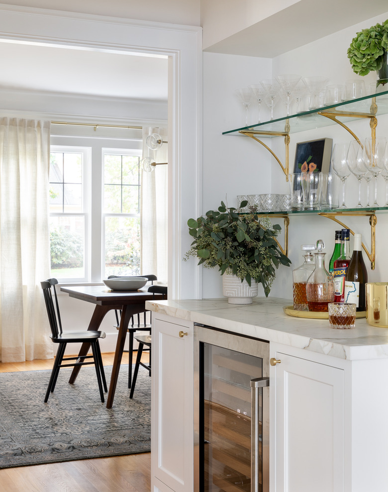
For the bar, Keasler chose glass shelves with brass brackets to house the couple's cocktail glasses. The white cabinets and marble countertops are identical to the kitchen, adding to the home's overall cohesive feel.
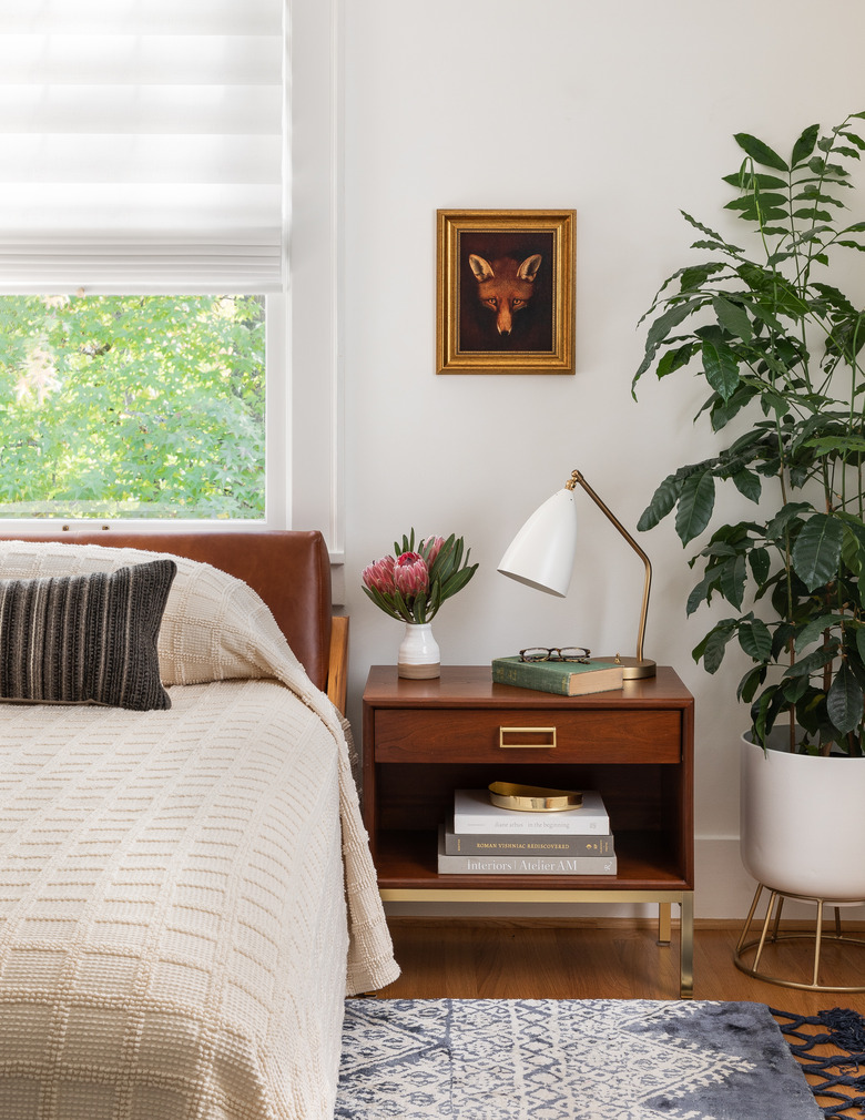
The simple color story isn't limited to whites, blacks, and walnut finishes. In the master bedroom, a textural cream quilt and leather headboard accentuate their down-to-earth style.
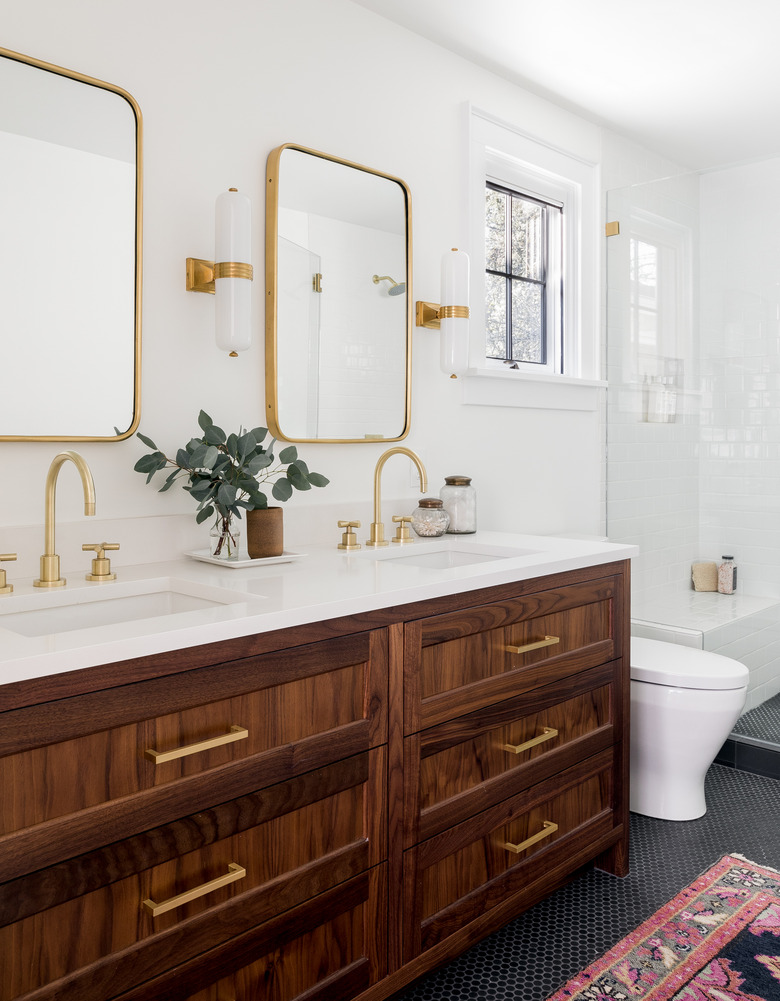
In the adjoining master bath, a double walnut vanity (paired with plenty of brass accents) sets off the bright white walls and classic black hex tile floor.
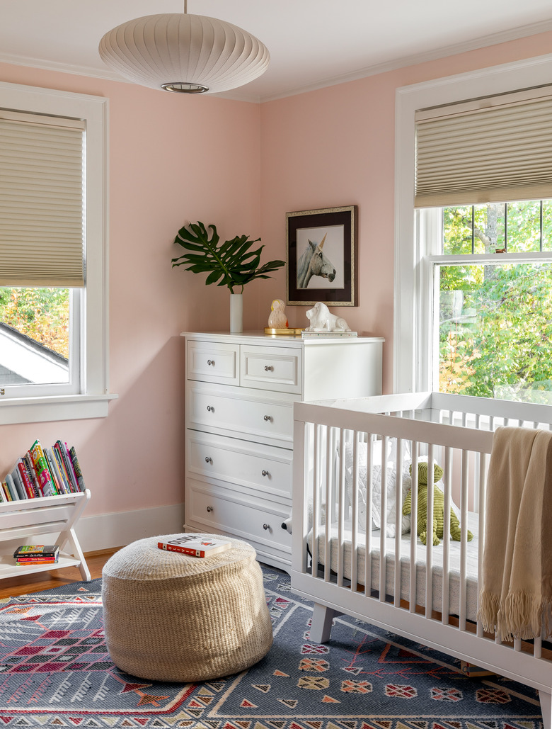
There's one room in the house where the family happily diverged from their staple palette. The girls' shared bedroom was treated to a lick of muted bubblegum pink. "Everything was so neutral in the house, we wanted to bring in something fun and more playful for the girls in a very subtle way."
