These 8 Entryways Had Us Longing To See More
You know that moment you visited a friend's home for the first time? Or even the first time you visited your current home? There's so much emphasis on curb appeal for homeowners (and sellers), but people's first impression of a home really starts with the moment they walk inside. It's all about the entryway. It's the scene we all wait for on any home design show. And fortunately (or unfortunately), you can see guests' reactions the moment they step inside.
These eight entryway ideas captured our attention immediately. From bold pattern plays to earthy palettes and exquisite furniture choices, these first impressions had us excited to update our own.
1. Be Memorable by Mixing Patterns
1. Be Memorable by Mixing Patterns
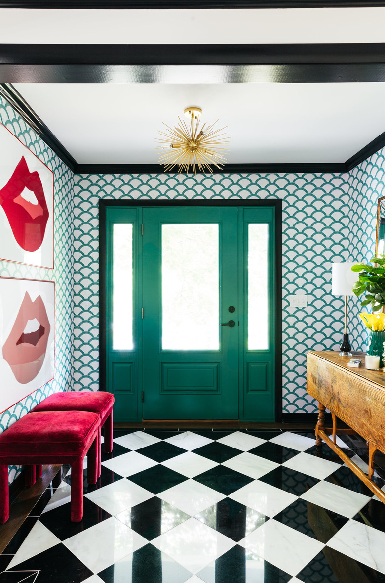
Talk about pop . . . is there such a thing as a dreary day when you have an entryway that constantly smiles back at you? The Art Deco wallpaper with a checkerboard marble floor is pure fun. Designer Diane Rath selected the wallpaper from Tempaper to match the door and chose black crown molding to help tie the entryway together. Even when mixing patterns, using one consistent element in a space, such as a color or material, is a subtle way to bring harmony to seemingly opposing styles.
2. Pair a Narrow Floating Shelf with a Mirror in Small Spaces
2. Pair a Narrow Floating Shelf with a Mirror in Small Spaces
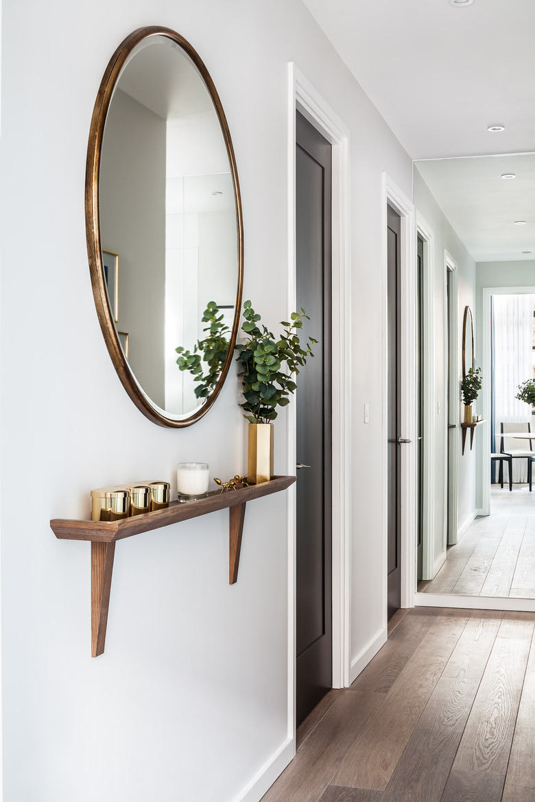
Of course, not all of us have spacious entryways, which is why the London-based design firm Gordon-Duff & Linton have been outfitting many of their clients' narrow foyers or hallways with a floating bespoke shelf (available to you too upon request) and a mirror to make the area appear more spacious. It's a tried and true pairing for smaller entryways, and it offers ample space for items you use often such as keys and sunglasses. The addition of a plant in a decorative vase and your favorite candle are nice touches that can be as bold or subdued as you wish.
3. Use Gold or Brass Accents for an Upscale Look
3. Use Gold or Brass Accents for an Upscale Look
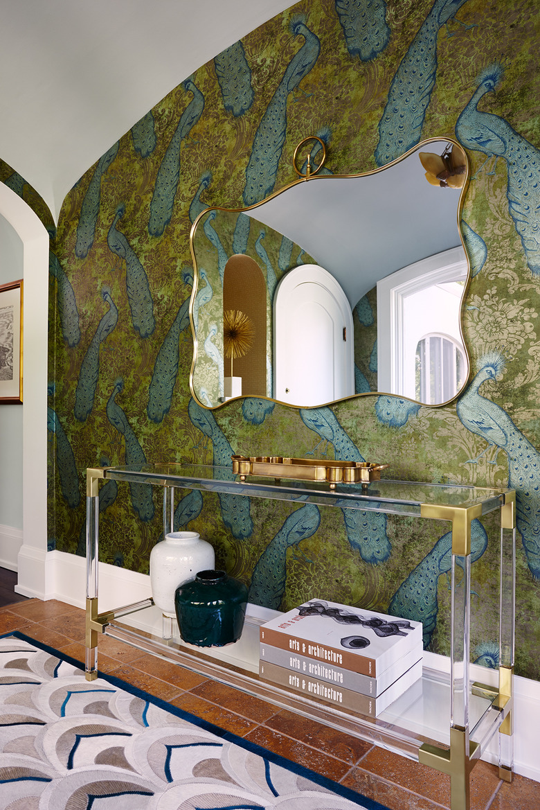
If you want to make a posh opening statement, this entryway from Fiddlehead Design Group is pretty much a master class in luxury. With the stunning peacock wallpaper, they aren't even playing fair. So let's check off the basics: a rich patterned or colored wallpaper, gold- or brass-accent furniture and items (especially a statement mirror), a collection of stacked or standing coffee table design books, and a couple ceramic pieces. The elegant rug and stone-tile flooring are the cherries on top here. But what really sets this design apart from others is how they included a narrow strip of wallpaper to frame the adjacent archway. Brilliant.
4. Place Items Strategically from Wall to Floor
4. Place Items Strategically from Wall to Floor
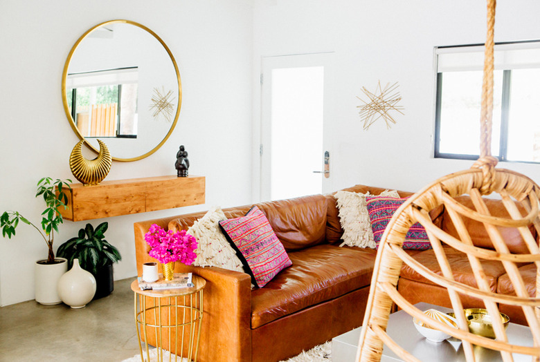
The Palm Springs home entryway of photographers Sarah and Lou Mora of A House in the Hills is an example of more laid-back elegance, in line with their Southern California lifestyle. A white entry wall dressed up with just over a handful of simple elements — one large round mirror, floating wood cabinet with small art pieces, and potted plants or ceramics on the floor — deliver in style and function . . . and are completely doable on a small budget.
5. Consider Items of Different Textures and Sizes for Interest
5. Consider Items of Different Textures and Sizes for Interest
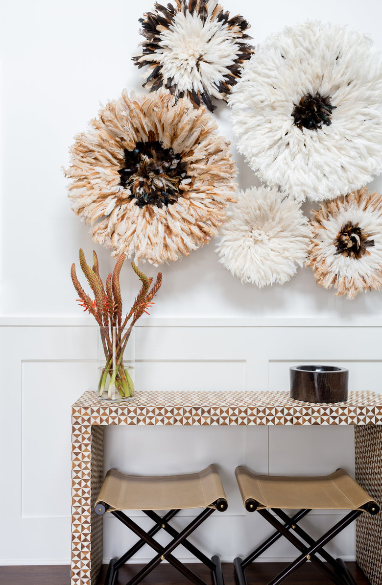
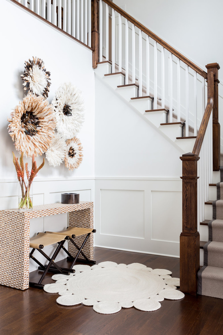
There's such beauty created by the composition of elements in this stairway-adjacent entryway by Brooklyn-based Chango & Co. While the color scheme is quite neutral, the different sized floral art and patterned console provide the drama. Grouping art of various sizes or colors — or personal items, such as hats or bags — on your entryway wall is a wonderful way to express your personality.
6. Make Both Sides Functional with Smart Furnishings
6. Make Both Sides Functional with Smart Furnishings
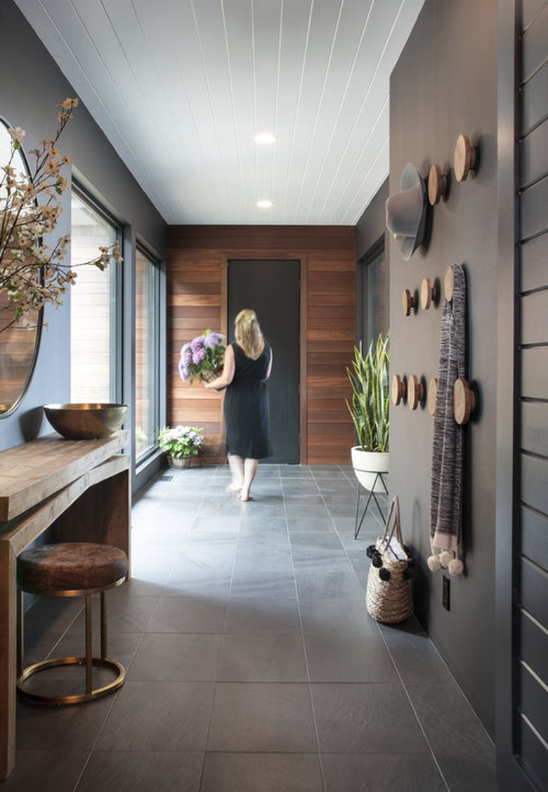
Dichotomy Interiors chose wood accents to contrast the dark wall treatment for a California residence, and the effect is a modern and inviting entryway that's easy to fall for. We especially appreciate the large mirror with seating for a quick freshen-up before leaving the home. It also brings more light into the entryway. What's not pictured but is present is a vial filled with aromatherapy reed diffusers that literally keeps the space fresh in more ways than one. In addition, the oversized dot coat hooks are visually appealing on their own and worth experimenting with on any wall of the home.
7. Refresh Existing Pieces with Fun Hardware and Paint
7. Refresh Existing Pieces with Fun Hardware and Paint
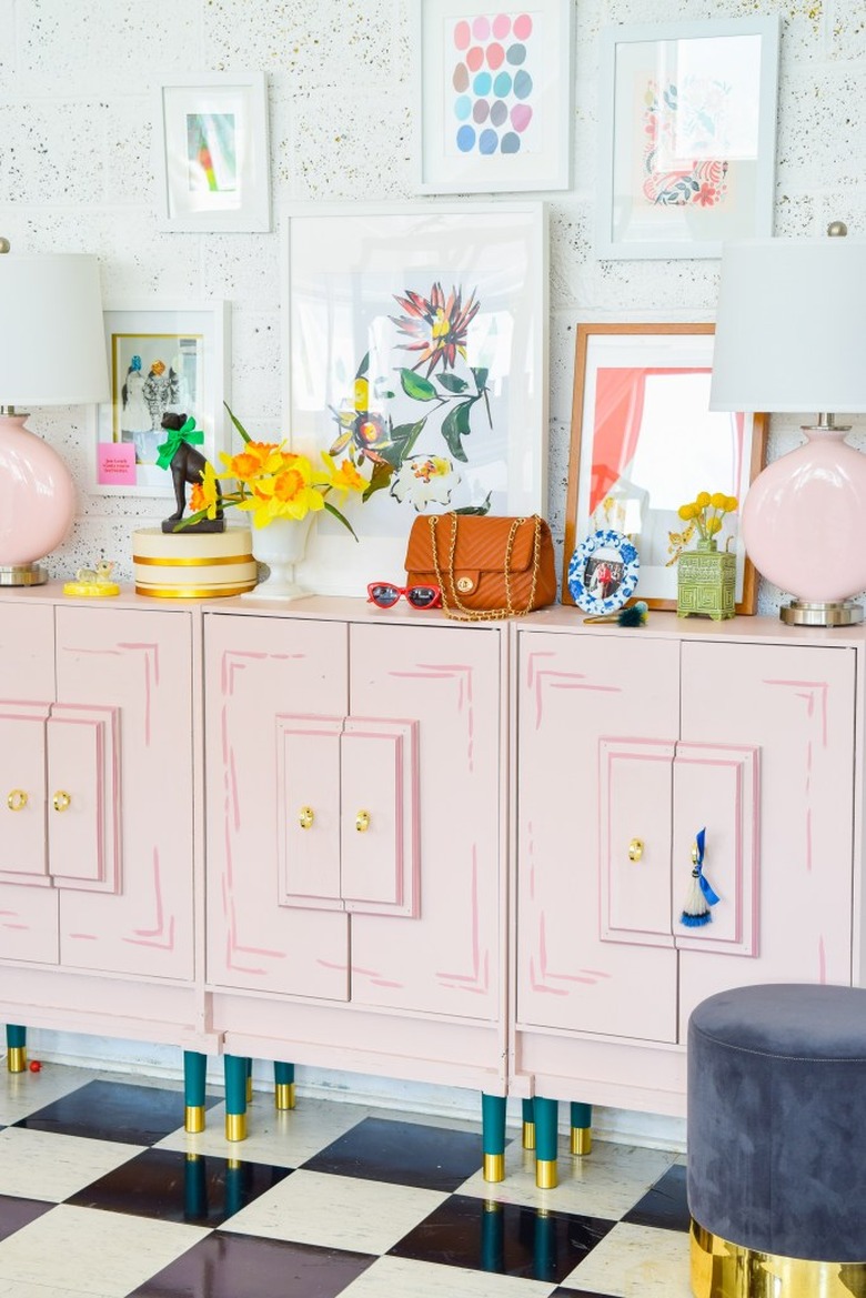
Ariel of PMQ for Two is an expert at bringing the whimsy to every project she takes on, and her use of cheery colors and a checkerboard floor in her own entryway is a prime example. Of course, the real star here is her DIY Wes Anderson–inspired console that she hand-painted in two shades of pink to give some dimension to the flat doors. She also added sets of Pretty Pegs green legs and brass knobs to really transform what was otherwise a plain white cabinet. If you have existing entryway furniture that needs a refresh, consider following suit by swapping out the hardware or adding a flourish to the doors.
8. Embrace Earth Tones for Rustic Appeal
8. Embrace Earth Tones for Rustic Appeal
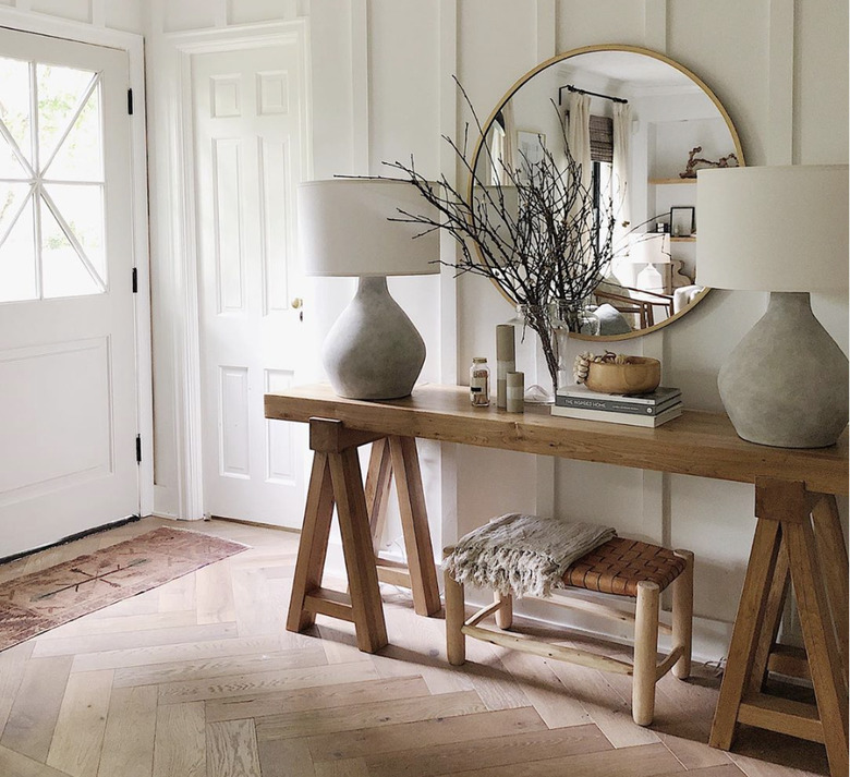
If a rustic theme is more your style, House Seven's entryway has you covered. Natural or naturally colored elements blend together seamlessly to create a relaxed mood. This concept checks off a lot of the boxes people want from an entryway: the popular round mirror (extra points if you noticed how many times one appeared in this article), a long table, a curated set of ceramics, a small container for items, books that reflect one's good taste, and a seating option. The shawl or throw blanket warms our hearts just looking at it. If cozy is the feeling you want from your entryway, this nails it.
