This Cool-Couple S.F. Apartment Balances Moody Spaces With Neutral Ones — And It Works
Moving in with a romantic partner is a huge step. But it's a tricky one if one of you is moving into the others' existing home. So when Kristen Peña of K Interiors was brought on to make over a young couple's San Francisco apartment, she knew the result had to reflect both of their styles.
The designer wanted the Telegraph Hill home to be able to grow with the couple, so she chose materials and hues that wouldn't feel dated by the time they walked down the aisle. "We wanted to use deep saturated colors in the home that felt bold and moody, but also timeless," she says of the palette of rust, forest green, and indigo. She also chose materials like brass and marble that would patina overtime, rather than ones that would need constant upkeep. (Who has time for a high-maintenance faucet?)
Peña picked furniture that felt casual but polished and added color and texture with rugs, pillows, and other textiles. She also made sure the home's newest resident moved into a space that already felt like it was hers. "[We] made it a point to incorporate layers of texture and personal touches to make her truly feel at home in San Francisco," she says.
1. Living Room
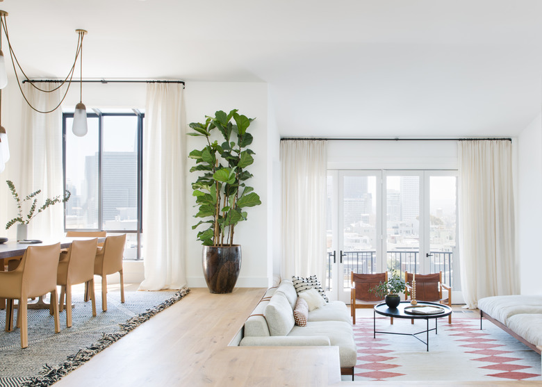
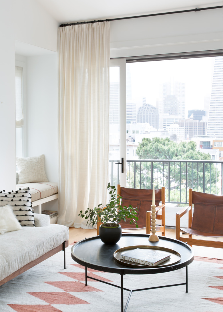
"The overall style for the space is timeless with a global flair," the designer says. "Each furniture piece was curated to stand the test of time while rugs, art, and accessories add color and texture, representing the couples' diverse cultural background." She paired vintage leather lounge chairs with a coffee table from Croft House and a custom rug from Pampa.
2. Dining Room
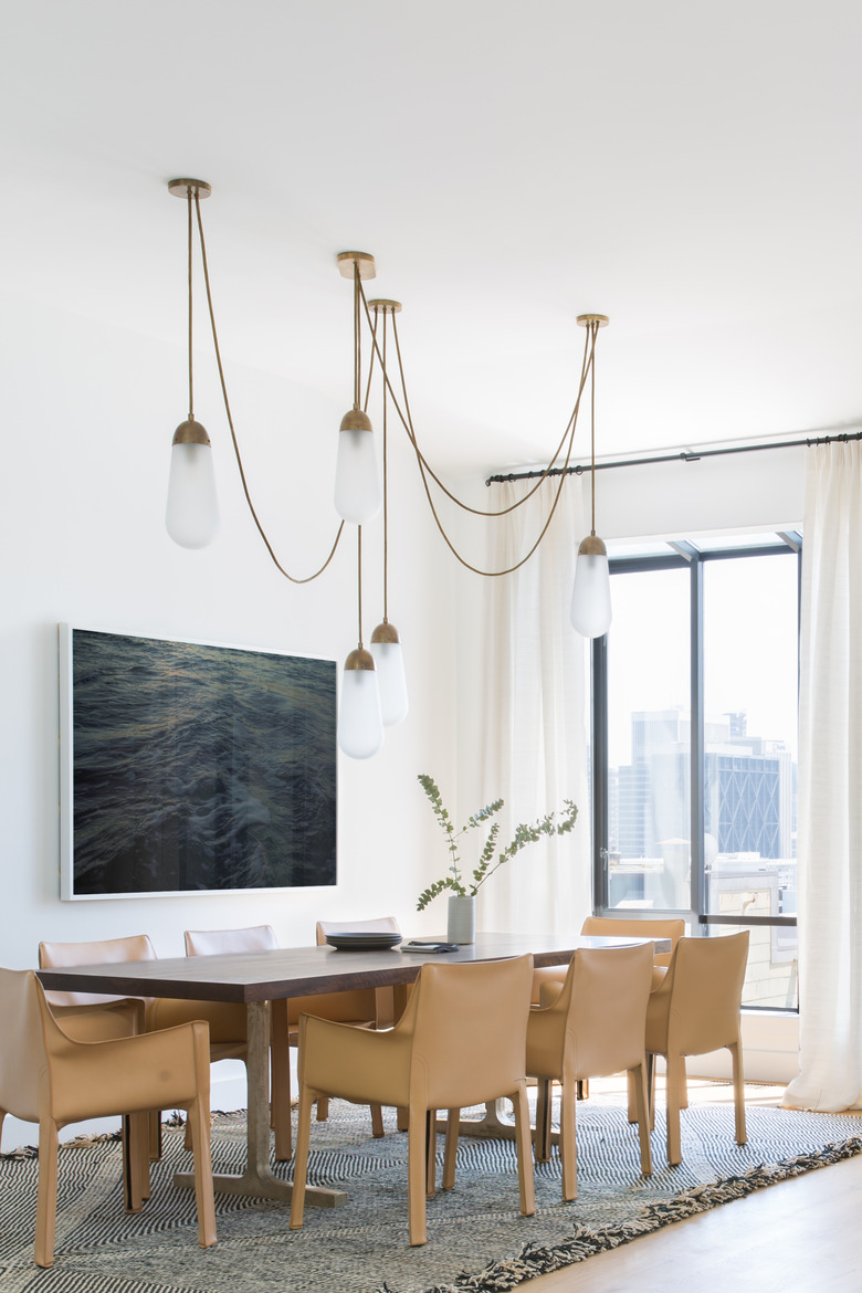
"The couple likes to entertain and their guest room is occupied more often than not," says Peña. "With that in mind, a lot of thought went into the kitchen and dining spaces where they would primarily host intimate dinner parties." She chose an eye-catching light fixture by Apparatus and neutral furnishings that wouldn't compete with the home's killer views.
3. Kitchen
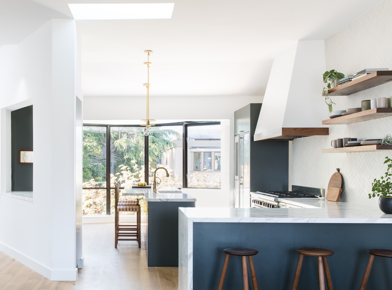
"Our clients did not want to fully renovate the kitchen, however the flow was a little challenging," says Peña. The firm switched up the arrangement of the cabinets to improve the layout and redid all the surfaces to give the couple a new kitchen without a gut reno.
4. Office
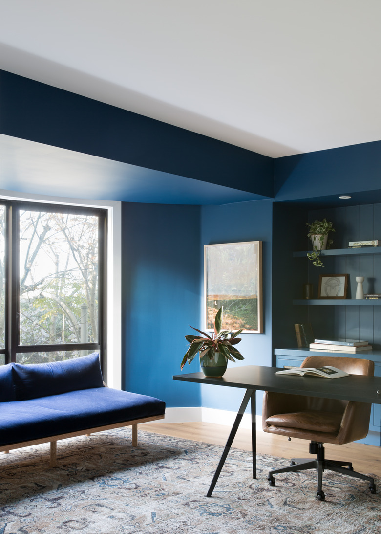
Moody indigo walls make the home office feel like a jewel box.
5. Office
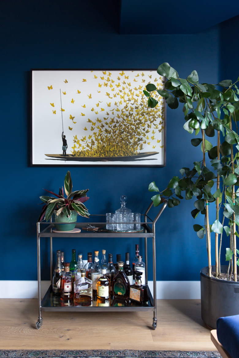
Every home office should be equipped with a well-stocked bar — or at least, that's how we feel after seeing this one. A painting by Pedro Ruiz hangs above the bar cart.
6. Master Bedroom
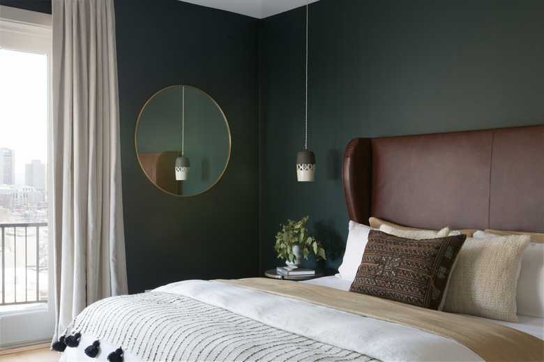
The master bedroom is filled with nature-inspired hues, from the walls, which are painted in Benjamin Moore's Salamander, to the earth-toned textiles and custom leather bed.
7. Guest Room
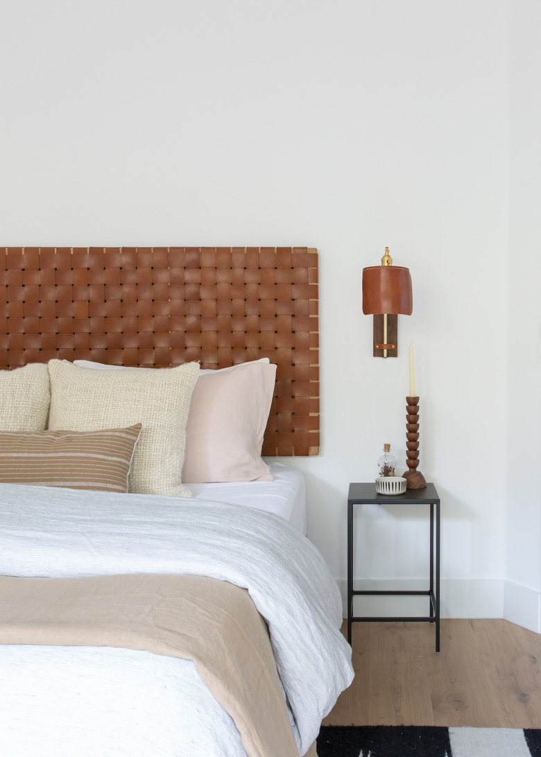
In the guest room, Peña added warm leather accents, including a custom headboard by Josh Podoll and the sconce by Lostine.
8. Patio
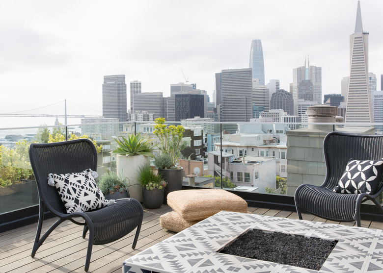
The patio has incredible views of the city but was one of the biggest challenges for the designer. "The home is on a walking-only street and spans six stories with a small elevator and a sharp turns in the stairway," she says. "Imagine the size of the crane needed to place the fire pit on the rooftop!"
