This Portland Colonial Once Had A Fainting Room — Now It's A Colorful, Boho Home
Designer Jessica Hansen isn't one to shy away from a historic house — just look at the amazing renovation of her own midcentury modern home in Santa Monica. For her latest transformation, she brought a 100-year-old house in Portland's Mount Tabor neighborhood into the 21st-century. She and her team at Tandem Design wanted to modernize the Colonial home while staying true to its original aesthetic. "I drew inspiration from the time I spent living in San Francisco, where there are tons of Victorian and Edwardian period houses and flats," says Hansen.
Hansen kept many of the period details, including the ornate light fixtures and the pillbox toilet and cast-iron tub in an upstairs bath, while repurposing unused space to modernize the layout. One of the master bedroom's large closets was turned into a master bath with a shower and double vanity, while the fainting room (yes, the fainting room) was converted into functional storage space.
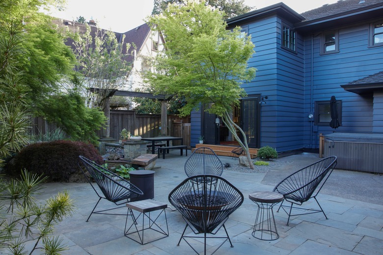
The outside also got a bold makeover, thanks in part to Hansen's five-year-old son. "He commented that I was always painting houses gray and white and black, and that I should paint this one a color," says Hansen. "I asked him what color he thought we should paint the house and he said blue. Boy was he right!"
1. Living Room
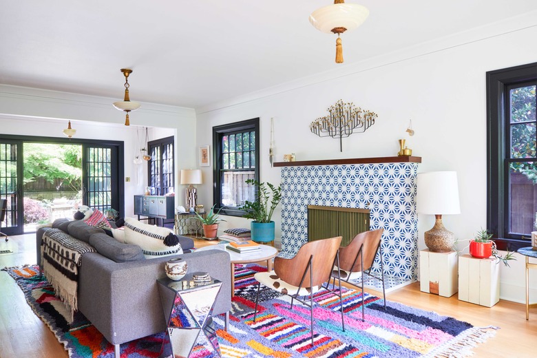
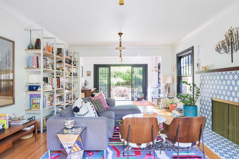
Hansen modernized the living room by installing open shelving and covering the fireplace with tile by Cemento Collection. She opened up the wall between the living room and sunroom, bringing in more light and connecting both spaces to the backyard.
2. Dining Room
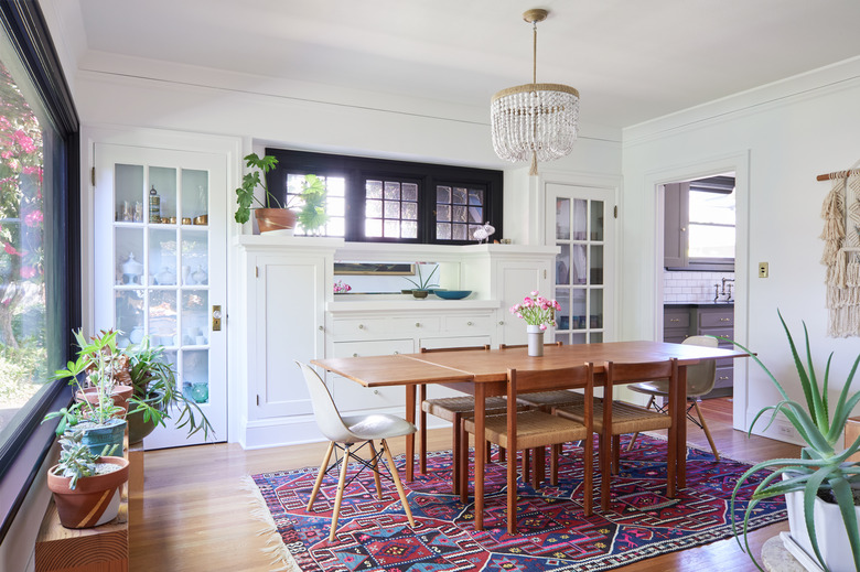
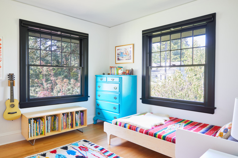
The entire interior got a fresh coat of paint. "You can never underestimate the transformative power of a fresh coat of paint," says the designer. "We chose a cool white for all the interior walls and did bold black paint on the large trim around all the windows." She chose a Serena & Lily chandelier — the only non-period light fixture in the house — to pair with a vintage teak dining table and a mix of Eames chairs from Design Within Reach and vintage woven chairs.
3. Kitchen
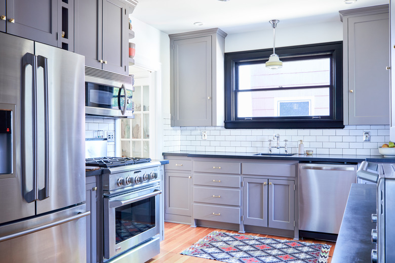
The kitchen was updated with white subway tile, gray cabinets, and black granite countertops. "Originally the cabinets had two tilt-forward bins that would have been used for potato and onion storage back in the day," says Hansen. "Although it may have been useful back then, those bins took up a lot of cabinetry space and don't provide usable storage for a modern life. We converted them into two large drawers perfect for pots and pans."
4. Breakfast Area
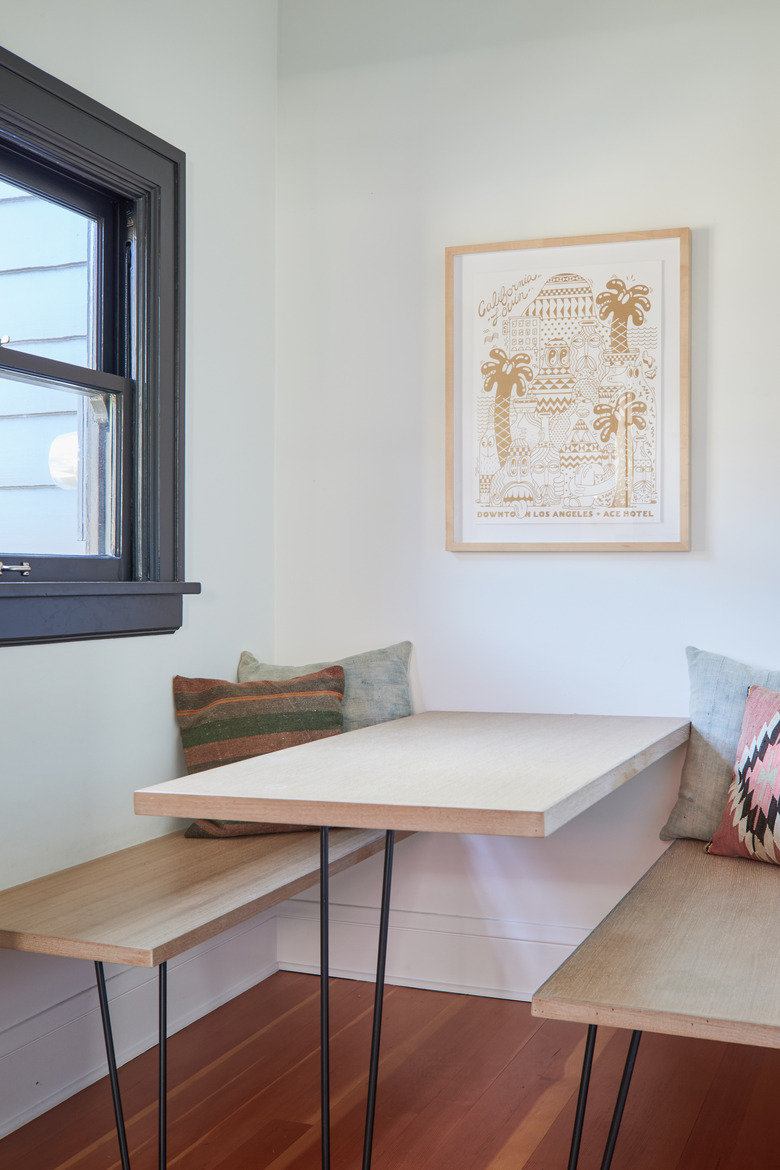
A custom built-in white oak table and benches create a streamlined breakfast nook.
5. Staircase
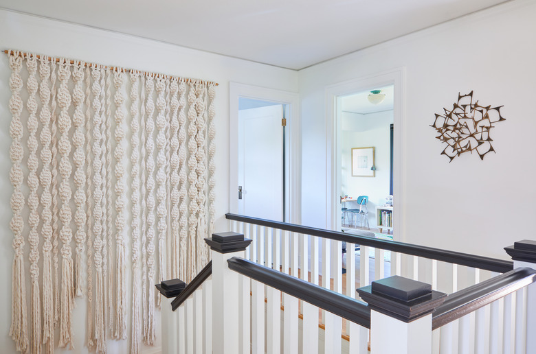
A large macrame wall piece hangs in the staircase, creating a boho contrast to the period architecture.
6. Bedroom
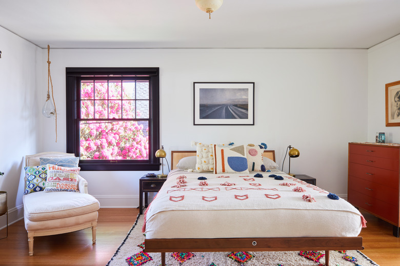
The master bedroom is a mix of periods and textures. Hansen topped a vintage chaise with Jonathan Adler pillows and dressed the Nelson bed with a blanket and pillows from Ink & Peat.
7. Bathroom
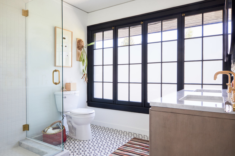
The new master bathroom was outfitted with cement tile by Clé. Hansen chose a black-and-white pattern to fit with the color palette of the home. "This allowed us to edge the tile design to a more modern place while still feeling consistent with the rest of the house," she says.
8. Kid's Room
Hansen infused color into one kid's room by repainting a vintage dresser in a vibrant blue and adding cheery textiles.
9. Kid's bedroom
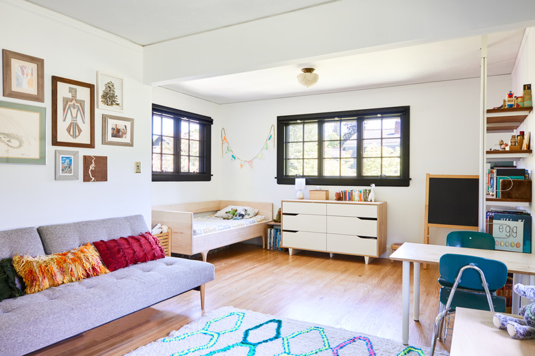
Hansen created a play station in another child's room with chairs from a school supply store and a table she made out of plywood and legs from IKEA.
10. Patio
"The backyard also needed quite a bit of work," says Hansen. "We knocked down a man-cave that consumed half of the existing yard — this opened up the yard and let more light into the house." Hansen customized the patio tables by adding purpleheart wood tops to Target bases.
