23 Penny Tile Bathroom Ideas That Make An Unforgettable Statement
Ah, the humble penny tile. Diminutive and round and more than a century old, this little tile isn't a trendy newcomer stealing headlines in the world of interior design. But what it is, is a go-to tile choice that will satisfy budget, practicality, and style.
The benefits of penny tile are plentiful: It's classic, versatile, inexpensive, and one of the easiest types of tile to install. It's a fairly common option that homeowners consider for the bathroom floor, because it's a grout-heavy tile and therefore has great grip. But we also love to see it used for backsplashes and shower walls.
Designer Breegan Jane is a big fan. "I love using penny round tile in bathrooms," she says. "They come in a variety of colors and finishes, so there's truly something for everyone! They also pair really well with other surface materials, so you can easily use penny round tile for one area and stone slab for another without the fear of clashing."
Whether you're designing a personal oasis with antique style, midcentury modern flair, or boho vibes, penny tile can cater to most any aesthetic. But one note of caution: Penny tile's blessing is also kind of its curse. "One of the biggest downsides is oddly enough one of the reasons I love it. It's the grout," says Jane. "Grout in any area can be a pain to clean! So, consider that before installing."
Now it's time for the fun stuff. Ahead, we're sharing some of our favorite bathroom ideas, from colorful to muted. Fair warning: One look and you might be tempted to make over your own space.
23 Penny Tile Bathroom Ideas
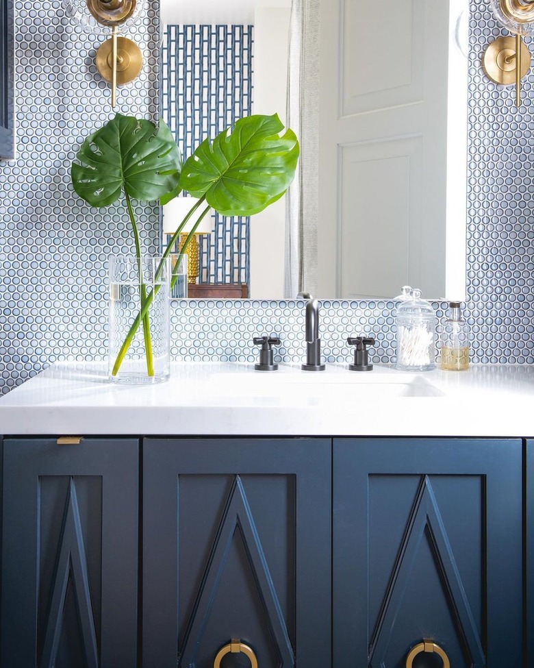
1. Consider classic navy blue.
This tonal bathroom by Studio Thomas James is a bit transitional, a bit coastal, and a bit glam. Several elements help unify the look, one of which is the classic yet crisp color palette of blue, white, and gold. The glossy light blue penny tile backsplash creates a luxe layer of pattern and texture that pairs beautifully with the darker navy vanity cabinet.
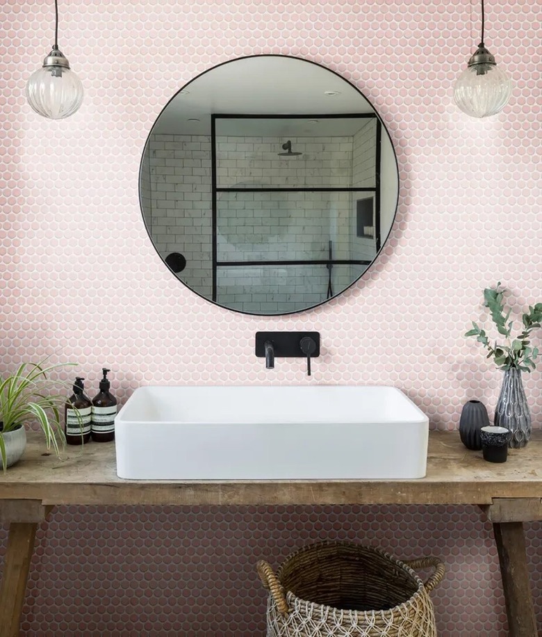
2. Go a little bit rustic.
We can't resist an eclectic mix of design influences. In this bathroom spotted on Artisans of Devizes, the pretty blush penny tile backsplash is balanced perfectly by a rustic wood countertop, romantic mini pendants, and a modern vessel sink. Greenery and flowers further soften industrial accents, such as the matte black faucet and mirror plus the steel framed shower screen reflected in the mirror.
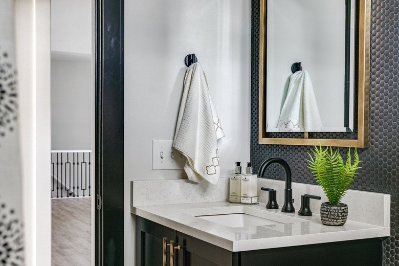
3. Amp up the drama with black penny tile.
This sleek bathroom by Flourish Interiors packs a bold bunch with a matte black penny tile backsplash layered with a cutout gold–framed vanity mirror. To bring this look into your own space, be sure to pair the ebony tile with black grout for a dramatic and seamless effect.
4. Go white-on-white.
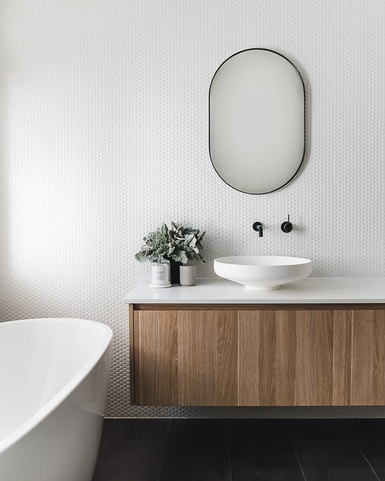
Speaking of tone-on-tone tile ideas, we love this minimalist situ by My Little Empire. Here, white penny rounds are showcased with matching white grout, of course, creating a pristine backdrop for a slim-framed oval-shaped mirror, matte black hardware, a modern vessel sink, and a wall-mounted vanity cabinet flaunting a warm wood finish. Ooh la la!
5. Or, try a contrasting grout.
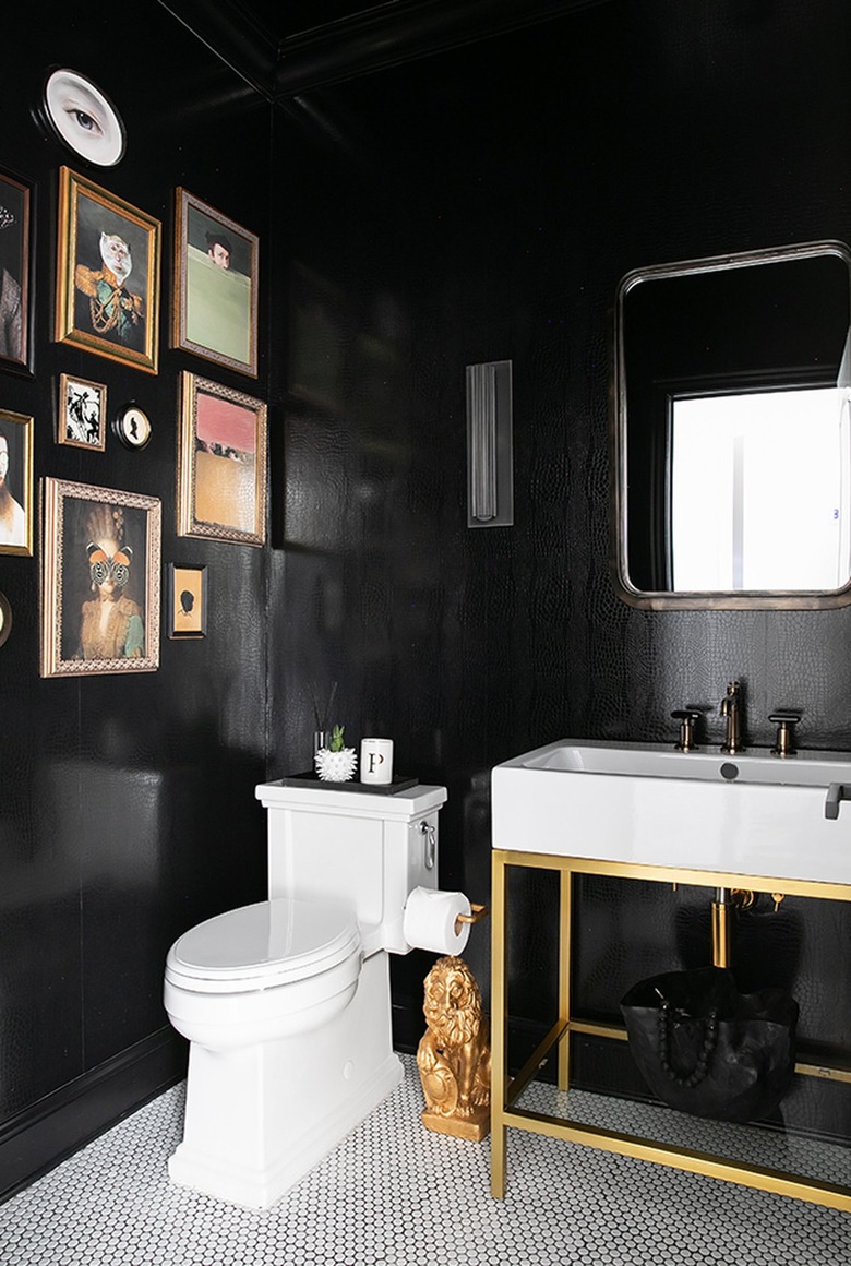
Designer Breegan Jane embraces regency glam in this bathroom design, filling it with sumptuous brass touches — including a lion statue — and shiny black crocodile-embossed wallpaper. And while it may seem rather simple, her choice of white penny tile flooring with contrasting black grout feels very intentional here. That's because, for one, this black and white combo is one of the more traditional ways penny rounds are used — very appropriate in a bathroom giving a nod to the past.
6. Have fun with a bright color.
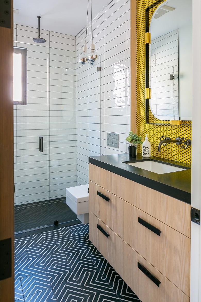
Penny tile may be rooted in the past, but this bathroom by Erica Bryen Design shows how relevant and contemporary it can be by playing with contrasting shapes and colors. The yellow penny tile with black grout contrasts sharply with the long white rectangular shower tiles and the black-and-white geometric floor tiles, creating just the right mix of tension and cohesion.
7. Add a decorative border.
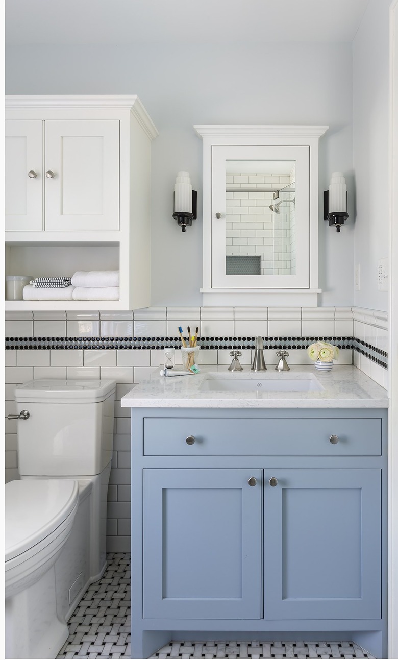
If you analyze this bathroom by i.d. Interior Design, you'll note it has a lot of right angles — in the form of both squares and rectangles. So it makes sense that the designer broke up the hard lines with a decorative penny tile border. It's an appealing addition that literally softens the abundance of hard edges. (As do the sconces and the pale blue shade showcased on the vanity, btw.)
8. Go with a traditional pattern.
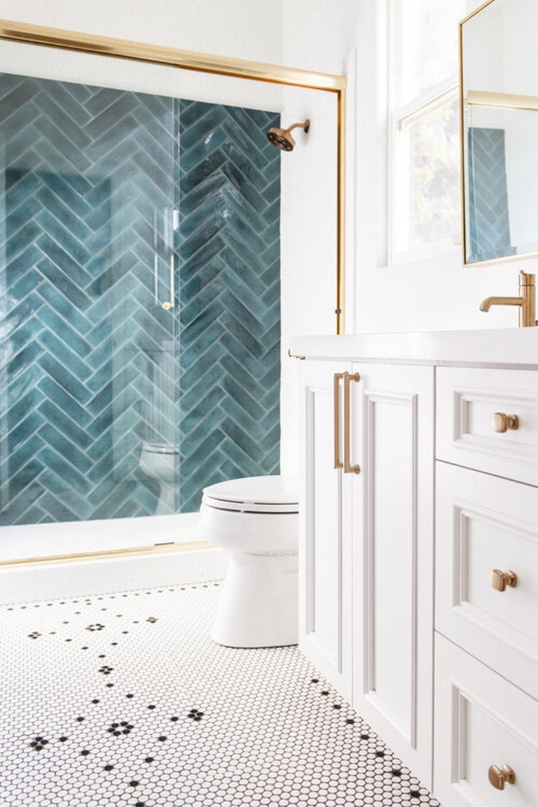
A traditional black and white pattern is about as classic as you can get with penny tile. In this bathroom by Savvy Interiors, its simplicity and use of negative space creates nice contrast alongside the bolder teal herringbone tile accent wall. Complementary brass accents add a touch of warmth.
9. Create a decorative arch out of tile.
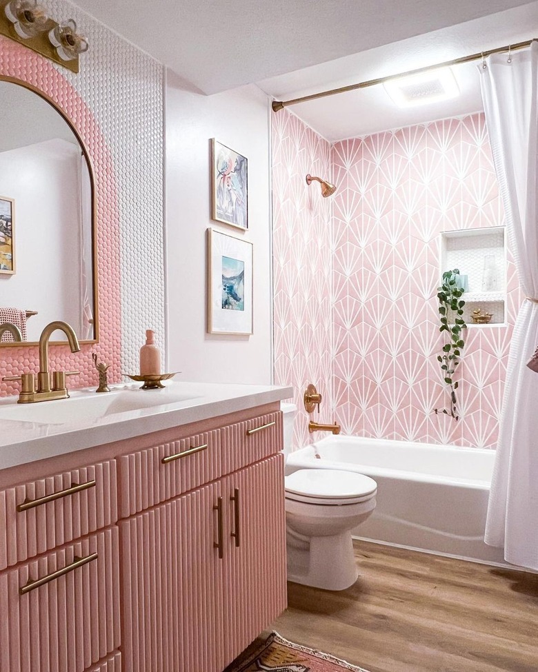
One of the best things about penny tile is its versatility, which is on full display in this bathroom remodel by Laurel Harry of @thehousethatdiybuilt. It's clear that a lot of love went into this DIY makeover, which she aptly described as "pretty in pink." The penny tile arch is a real highlight, and it should be noted that while she painted the arch onto white tiles, a professional likely could have installed pink tiles with pink grout to achieve the same look.
10. Incorporate a monogram.
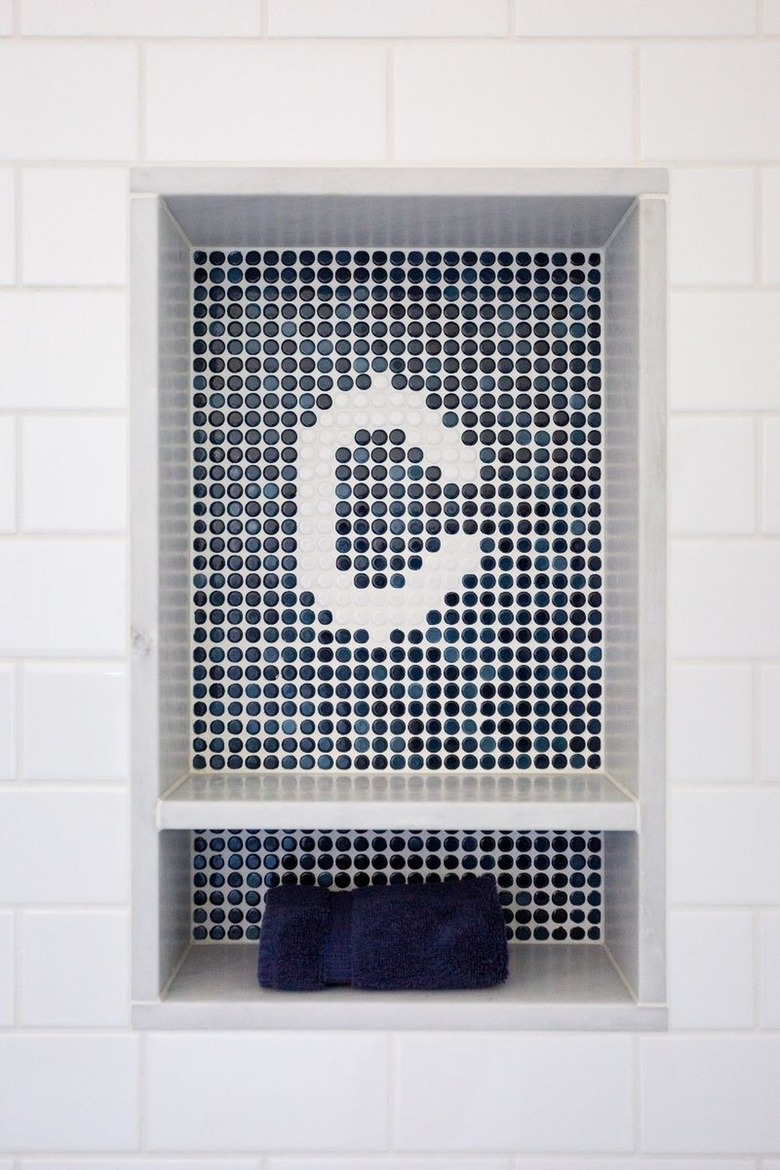
Customizing your penny tile mosaic with an entire word or phrase took off as an Instagram trend not too long ago. A similar way to go is with a simple monogram. We love the idea of adding this little polished detail to a tiled bathroom niche. The folded hand towel tucked underneath completes the look.
11. Use multicolored penny tile.
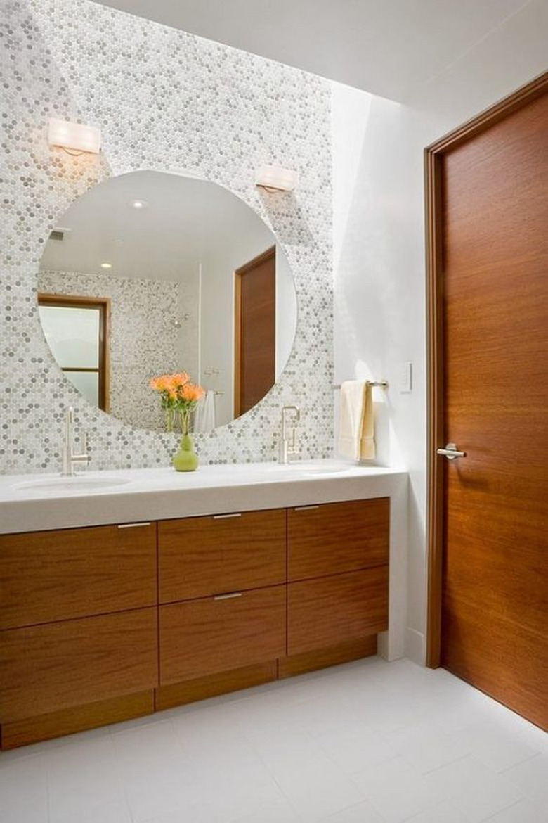
If you're worried that your penny tile backsplash might look flat, consider a multicolored option. The color variation will offer just enough visual interest without overwhelming your space. For example, this washroom designed by William Duff Architects showcases a backsplash — comprised of white and varying shades of gray — that's eye-catching yet not distracting or busy. Complete the sophisticated look with an oversize, frameless mirror and a waterfall-style countertop.
12. Incorporate a pretty border on the floor.
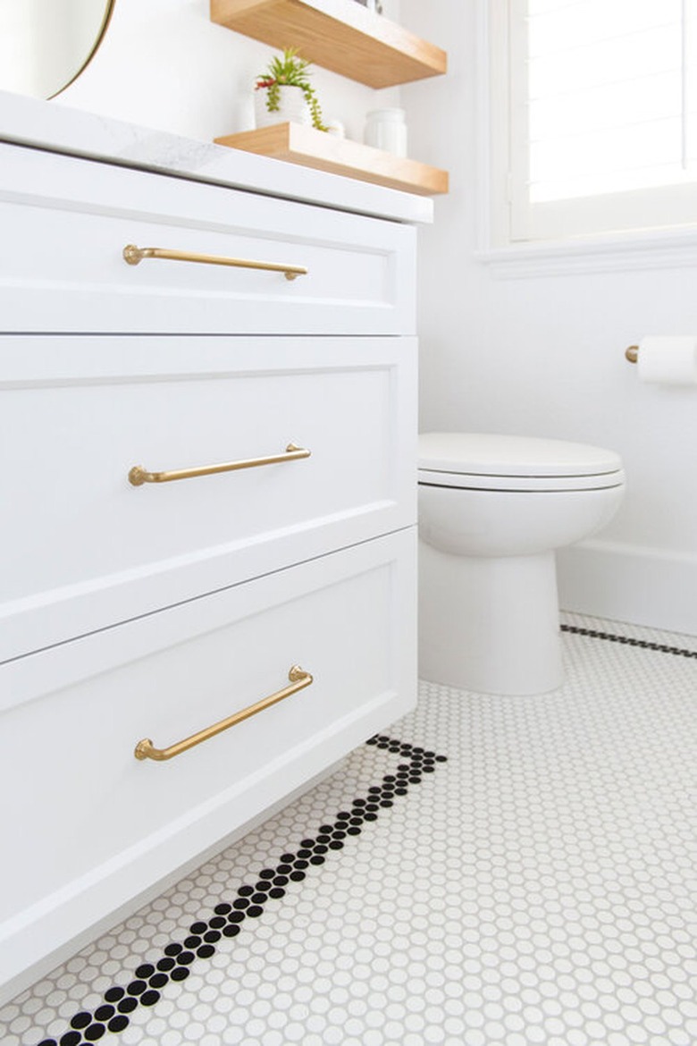
If your goal is a bright, white bathroom with a little something special, this design by Savvy Interiors might be the perfect solution for your space. The designer's choice of white grout with white tile feels especially au courant, as does the simplicity of the black penny tile border. The wood shelving and brass accents inject a hint of warmth.
13. Embrace a geometric pattern.
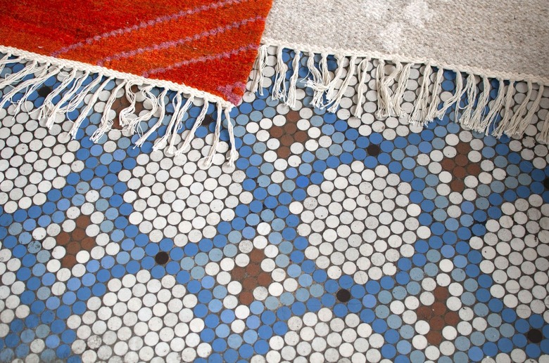
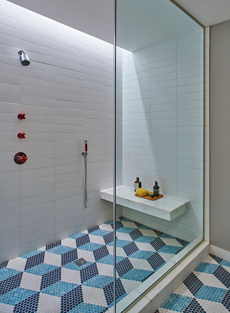
We love a good floor tile pattern, but this geometric design by Studio Gild takes the cake. The combination of light and navy blue plus white, gives the illusion of depth, so it almost looks three dimensional. The rest of the space is kept neutral to balance the graphic element.
14. Try cabana stripes in the shower.
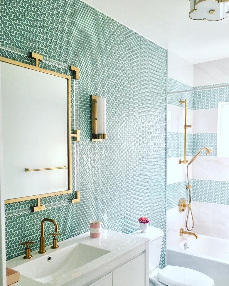
Mint green penny tiles meet regency glam in this bathroom by Vi Design, and it's good for many reasons. Beyond the lovely blue-green and gold color scheme, this space also works so well because the shower and sink areas are visually defined by different tile designs. The backsplash behind the sink and vanity receives top-to-bottom green penny tile, while the shower flaunts playful green and white cabana stripes.
15. Use the same tile for the entire bathroom.
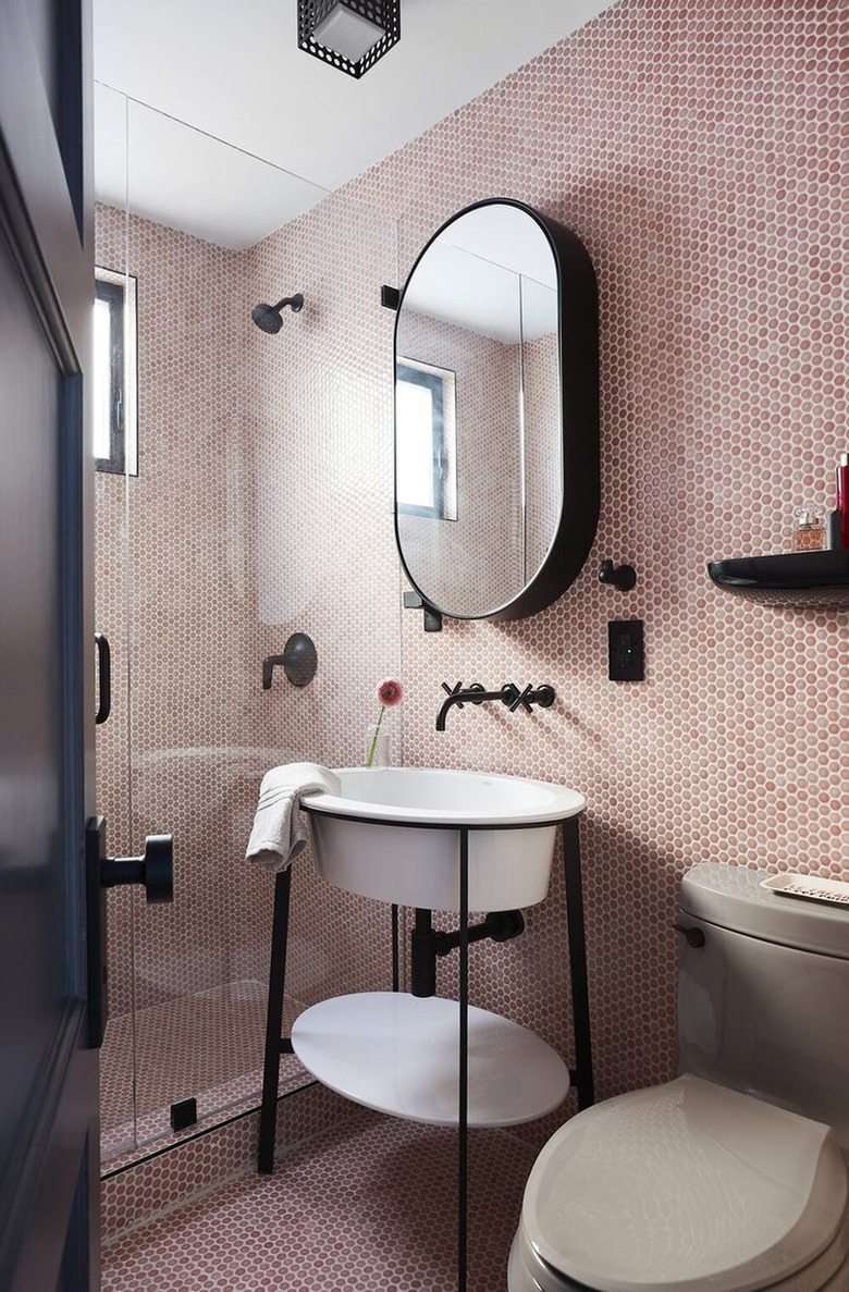
There's something so luxurious about a fully tiled bathroom. Not to mention, the choice can also make a small space feel larger, as demonstrated by this penny tile-clad setup from Black Lacquer Design. The use of the same material on the walls and floor provides a seamless and uninterrupted finish that really opens up the space — as does the frameless glass shower door and sleek console sink.
16. Mix and match different shapes of tile in the same color scheme.
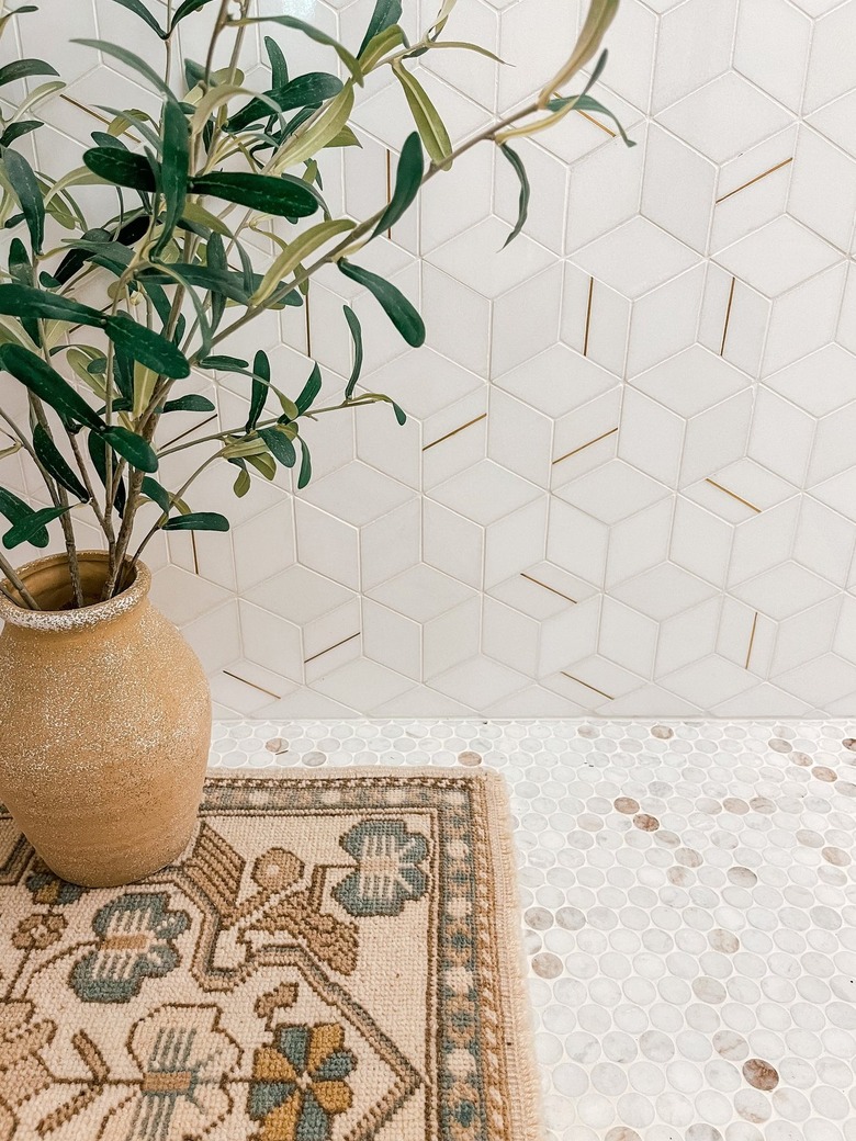
If your bathroom design already has wall tile that you love, consider doubling down on that feature by selecting penny tile for the floor in the same color. Sarah from Sarah Rineer Living shows us how it's done in this setup with hexagonal tile on the walls and multicolored penny tile on the floor that flaunt the same neutral hues. The end result is a bath that feels cohesive and interesting.
17. Experiment with tan-colored grout.
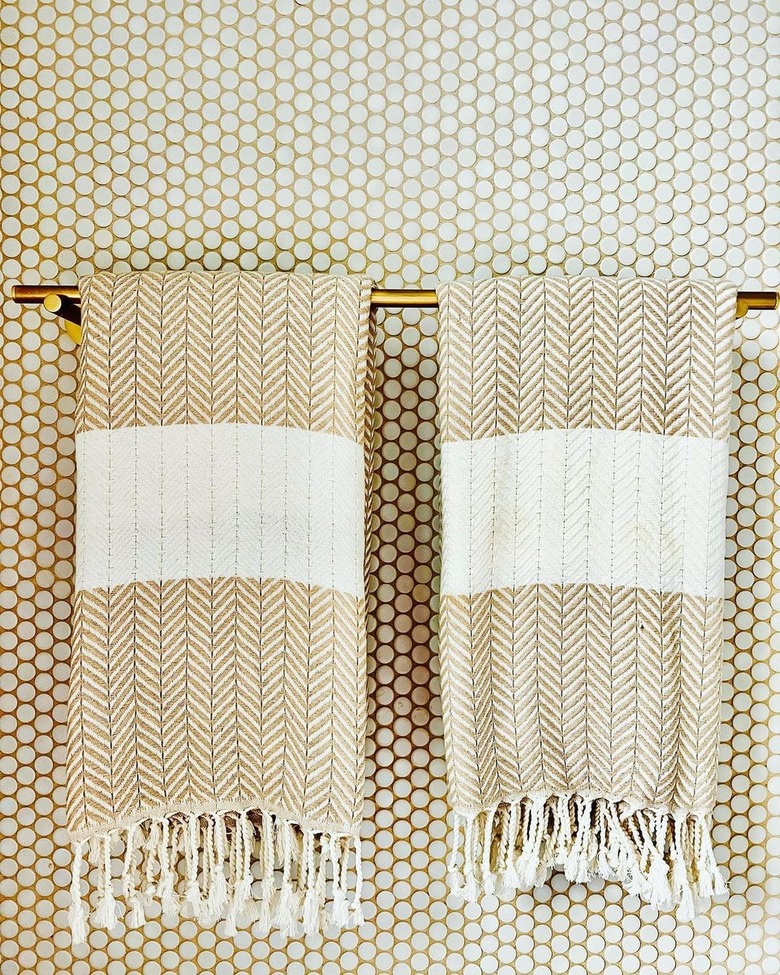
We've discussed white and black grout already, but there are a whole host of other options on the the market. Case in point, this bathroom from @theneighborhoodcottages. The sand-colored and white penny tile combo is a lovely choice, and is quite fitting for a Hamptons beach cottage. Complete the scene with a stylish brass towel bar and a pair of Turkish hand towels.
18. Up the ante with blue grout.
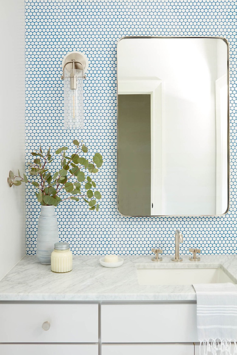
If you're feeling a little bold, take your grout game to the next level with a bolder color. This bathroom by Carrie Parker Interiors makes a convincing argument for a bright shade of blue. Temper the vibrant choice with white penny tile and neutral decor.
19. Create visual interest with a zigzag motif.
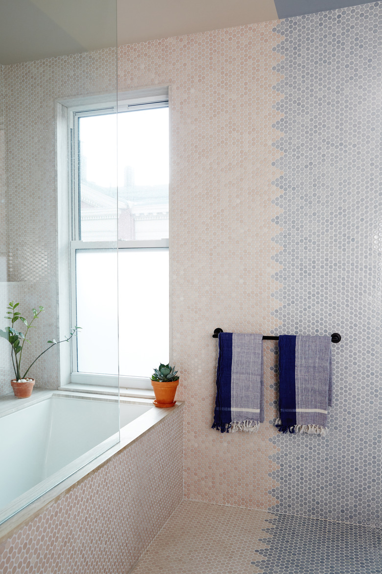
Beige and blue wall tile merge in a vertical zigzag line in this bathroom by GRT Architects. It's a novel take on color blocking that adds a little extra oomph in a room that's otherwise pretty pared down. We also love the flanking of the twin decorative towels over the zigzag divide.
20. Opt for warm tones.
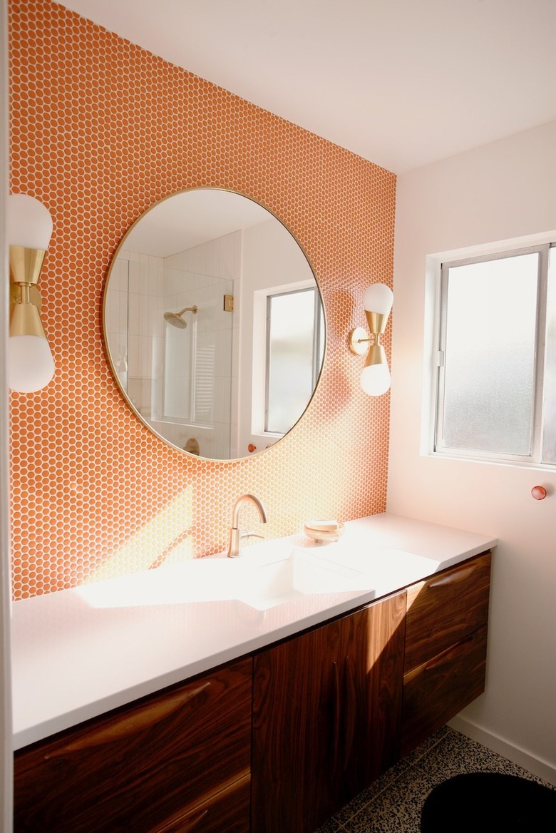
This bathroom design in a sunny 1960s California ranch home has such great midcentury vibes thanks to Jenny James. While the orange penny tile-clad wall was the first feature to grab our attention, the dark wood vanity cabinet topped with a white counter was a close second. The retro brass sconces with frosted glass shades complete the scene.
21. Tile your floor in nautical blues.
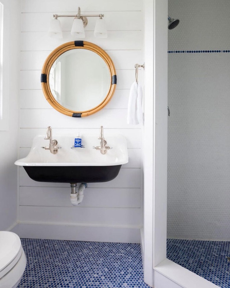
There are a few special touches in this bathroom by Gaelle Dudley of GLDESIGN that make it stand out from the crowd, but the floor tile is our fave. The multicolor blue and white mosaic continues both inside and outside of the shower, making the space feel a tad bit bigger than it is. A slim line of blue tile along the top of the shower wall draws the eye upward and ties the scheme together.
22. Match the tile to the wallpaper.
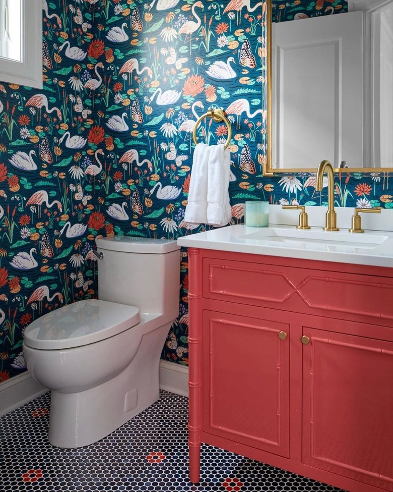
The bathroom is the perfect place to experiment with a bold wallpaper, as demonstrated by this powder room from Cory Connor Designs. But just as important are the elements that complement and balance out the statement walls. The red lacquer vanity, the blue and red penny tiles on the floor, and the brass and white accents, all work in concert to bring everything into equilibrium.
23. Create a hex pattern.
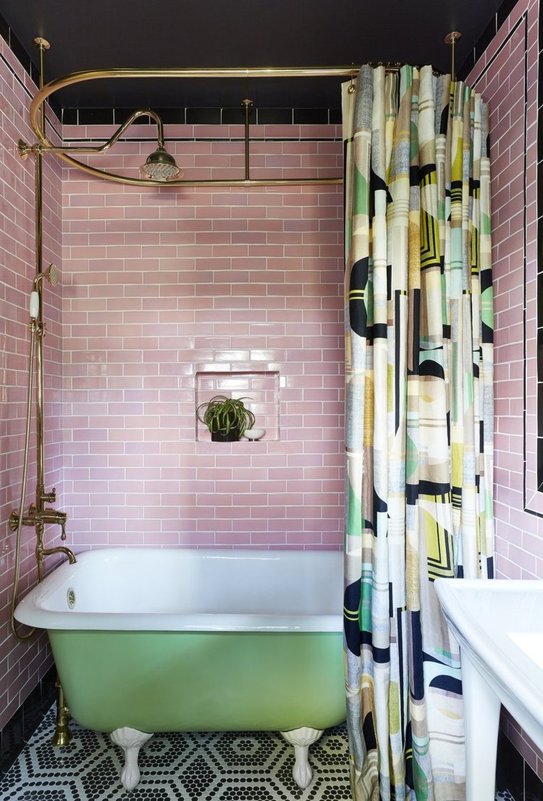
It's not easy to pull off a vintage look and still have it feel fresh, but that's one of Black Lacquer Design's specialities. One trick to take note of: mixing pastels with black, for a bit of edge. In this bathroom, pink subway tile complements a green clawfoot tub, and a graphic hexagon mosaic of white and black penny tiles keeps it all from feeling too sweet. Finally, the patterned shower curtain unifies all the colors in the room.
