30 Two-Color Kitchen Cabinet Ideas That'll Inspire A Culinary Makeover
It's highly likely that you've noticed two-tone kitchen cabinetry is a hot trend in the culinary world right now. So, what's all the fuss about? The simple technique makes use of two accent colors and usually sees a different one used on the upper and lower cabinetry. However, homeowners and designers alike are constantly coming up with new ways to re-imagine the two-tone kitchen color idea and take it to the next level.
While we've referred to this idea as something quite trend-led, there is actually rhyme and reason to using the technique, and TBH, we don't see it going out of style anytime soon. Thanks to its versatility, it can certainly be integrated with any interior design style. And depending on your space, you can use it to make ceilings look taller, to make rooms look brighter, or just to add a splash of color without going overboard. You just need to carefully select your palette and plan where you're going to apply each hue.
If by some small chance you need more convincing, here are 30 two-tone kitchen cabinet ideas that will have you reaching for, well, more than one paintbrush.
1. Work with white.
1. Work with white.
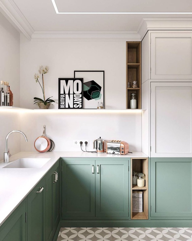
White paint needn't be boring, and this kitchen by Cartelle Design is here to prove it. The white walls, upper cabinets, open shelving, and countertops are the perfect juxtaposition to the lower sage-colored cabinets and patterned tile. The finished look is clean, airy, and wonderfully graphic.
2. Put your walls to work.
2. Put your walls to work.
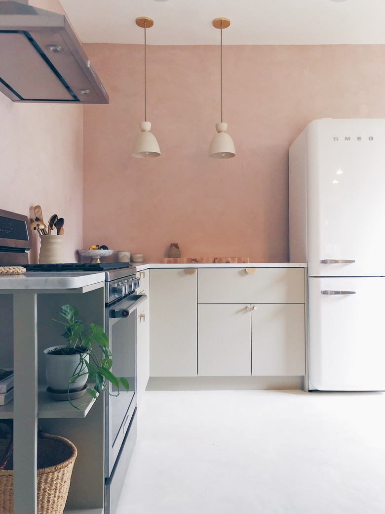
If you're after a two-color kitchen cabinet idea but don't have upper cabinets, use the wall instead. Think about adding texture to the walls and perhaps even opting out of a backsplash. The ballet-shoe pink Venetian plaster finish in this cook space by Wu Haus is the perfect match to the muted greige cabinets.
3. Mix and match cabinetry.
3. Mix and match cabinetry.
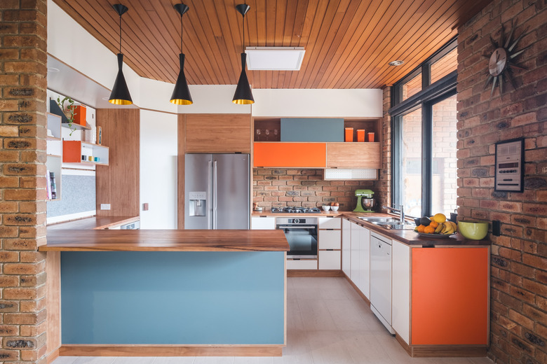
You've probably seen the revival of two-tone cabinetry where the top and bottom sets are typically complementary hues, but we love the random approach seen in this design by Woodbeast. Pops of blue and orange occur on random cabinets, including the island, resulting in a fun and funky midcentury feel.
4. Embrace a lustrous finish.
4. Embrace a lustrous finish.
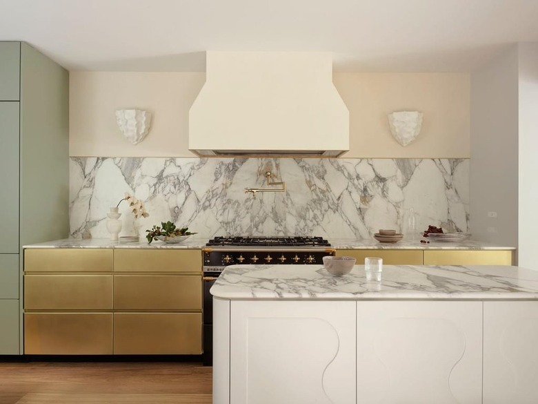
The team over at Arent & Pyke is ticking all of the style boxes with mint green and brass cabinetry in this swanky kitchen. Follow their lead and splurge on luxe materials and finishes for your culinary makeover.
5. Invite forest green.
5. Invite forest green.
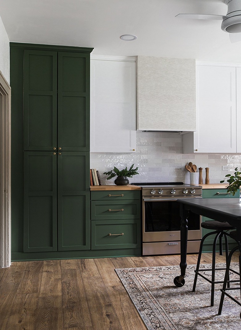
Worried about the two-tone kitchen going out of fashion? This classic design by Jenna Sue proves there's little chance of that happening, and the color combo even works to make the room feel bigger. The white upper cabinets blend beautifully into the background while the forest green cabinetry comes to the forefront. It's a timeless look that is sure to last for years to come.
6. Go neutral.
6. Go neutral.
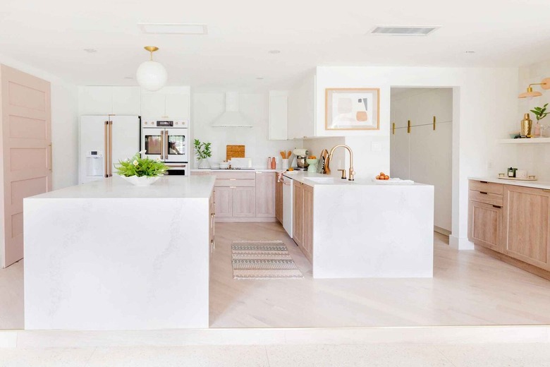
Two-tone kitchens don't have to be dramatic. This space by Sugar & Cloth utilizes a white backdrop (even the appliances got the white memo) and oak cabinetry to create a subtle take on the trend. The neutral setup features Chris Loves Julia cove shaker cabinet fronts from Semihandmade surrounded by a sea of white walls and matching waterfall countertops. The white fridge and range hood seamlessly blend into the background.
7. Showcase navy blue.
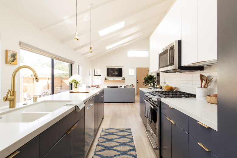
We've fallen head over heels for this refreshing white and navy blue kitchen design — just look at that light. Plus, it's an interesting spin on a two-tone color idea. Instead of having a dark color on top and dramatic hue is flaunted on the bottom cabinets, keeping the focus on the lower half of the room.
8. Contrast dark with light.
8. Contrast dark with light.
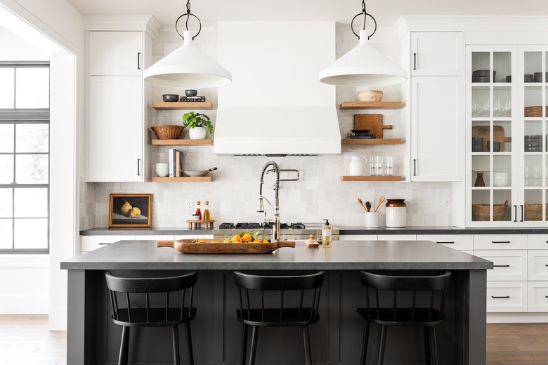
At Hunker HQ, we love a light and airy kitchen but sometimes adding a little contrast can make all the difference. Take this transitional design by Studio McGee — the open-concept design pairs white cabinetry with dark countertops and a matching island. It's a monochromatic take on the color idea that works beautifully.
9. Be mindful of your countertops.
9. Be mindful of your countertops.
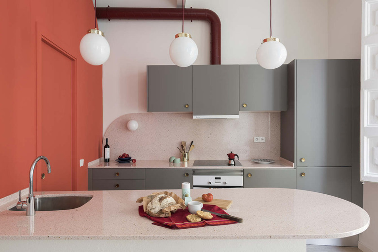
The open-concept kitchen in this family home designed by Barcelona-based Colombo and Serboli Architecture is a fresh take on Scandinavian style. Warm gray cabinets have been matched with a bright burst of coral, and the hues are further complemented by the terrazzo countertop and backsplash. Cue oohs and ahhs all around.
10. Tie in the flooring.
10. Tie in the flooring.
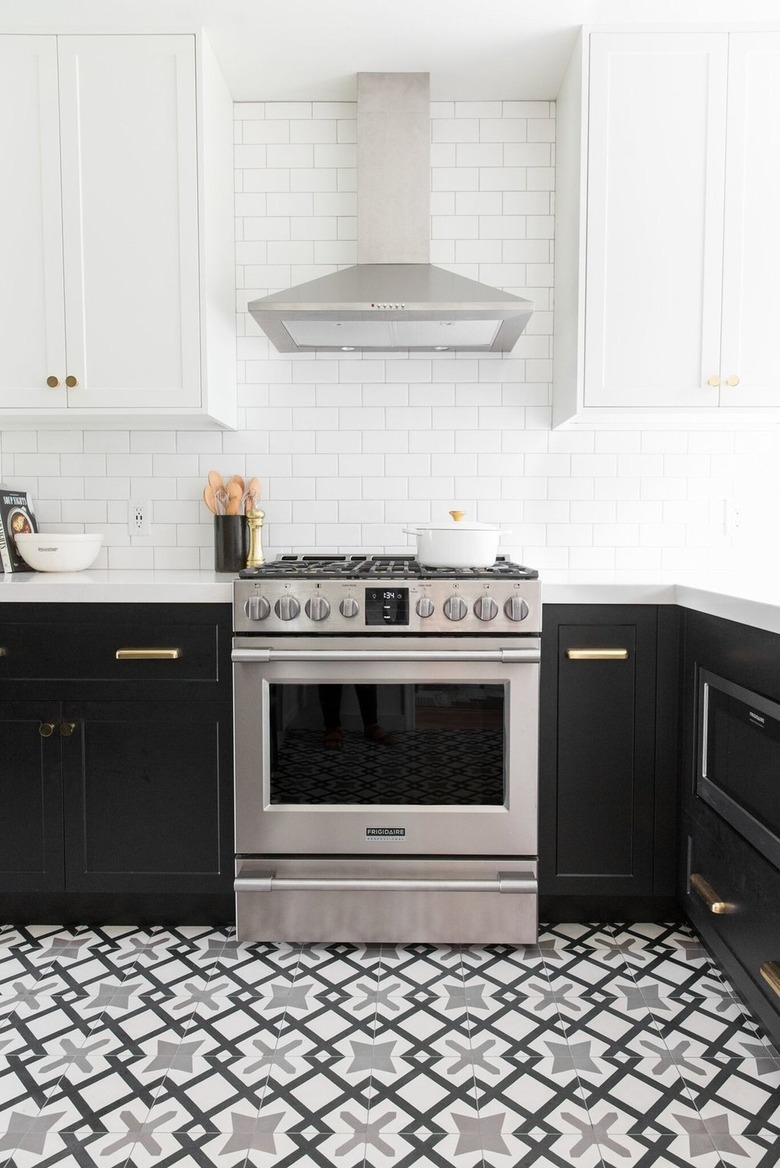
Go the whole way with your two-tone kitchen color idea and get your hands on a floor tile that combines both shades. The team over at Studio McGee clearly got the memo with this black and white culinary space, which features a geometric floor tile that ties the whole look together seamlessly.
11. Consider primary colors.
11. Consider primary colors.
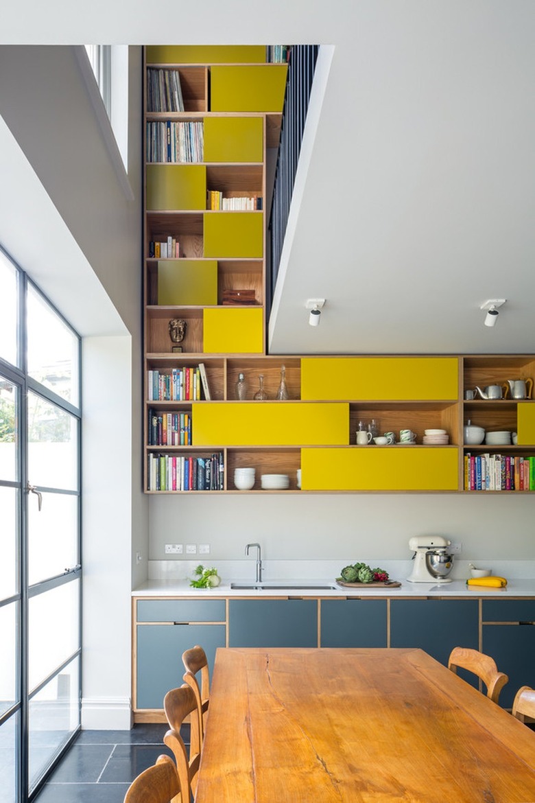
This open kitchen design by Uncommon Projects goes up, up, and away with bold features and interesting details. Making use of a muted blue on the bottom cabinetry, the uppers are painted in a canary-yellow shade that's made to wow. The modern open shelving even continues up the wall to the mezzanine level above, offering ample storage space.
12. Incorporate organic shapes.
12. Incorporate organic shapes.
If you have your heart set on two-color kitchen cabinets, you might as well have some fun with the idea. We love the way Office S&M gave this quirky kitchen some added flair by incorporating additional hues and organic shapes. The tone-on-tone approach keeps the space from feeling too busy without taking anything away from the unique design.
13. Use traditional elements.
13. Use traditional elements.
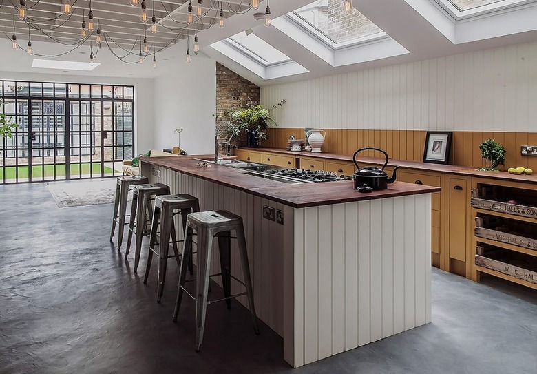
Blending traditional English country style with a modern open layout, this kitchen with cabinetry by British Standard Cupboards offers a new take on a two-tone cook space. The gray concrete floor and greige island contrast with the warmth of the mustard-painted wood cabinets and paneled backsplash. We adore!
14. Try a minimal look.
14. Try a minimal look.
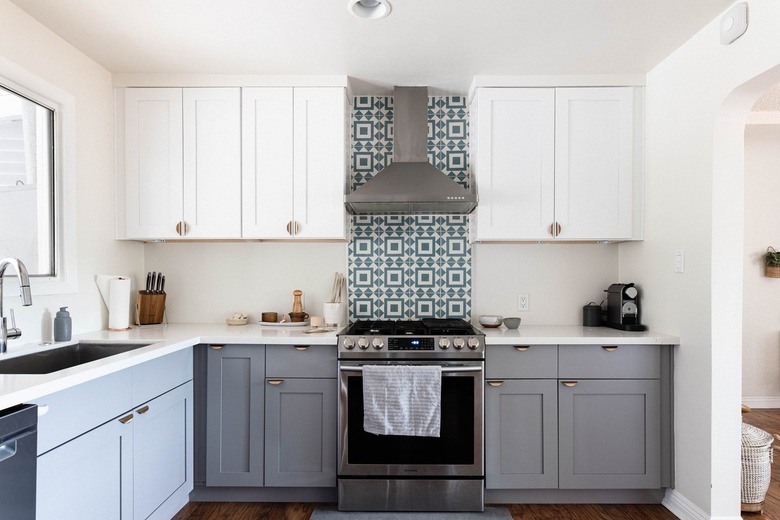
Sometimes, gray and white are all you need to create a functional kitchen with a two-tone aesthetic. This minimalist setup in Stephanie Chang's home makes use of gray lower cabinetry and white upper cabinetry brought together with a tile backsplash. It's simple, but it works.
15. Combine pink and teal.
15. Combine pink and teal.
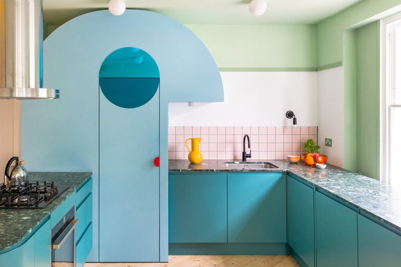
Fancy a très chic kitchen with a twist? Let us introduce you to this minimal yet eclectic design by Heju Studio. The large space is broken up with super-light pink upper cabinetry and teal on the lower half. The terrazzo countertop combines both colors to tie the whole thing together.
16. Use a tone-on-tone palette.
16. Use a tone-on-tone palette.
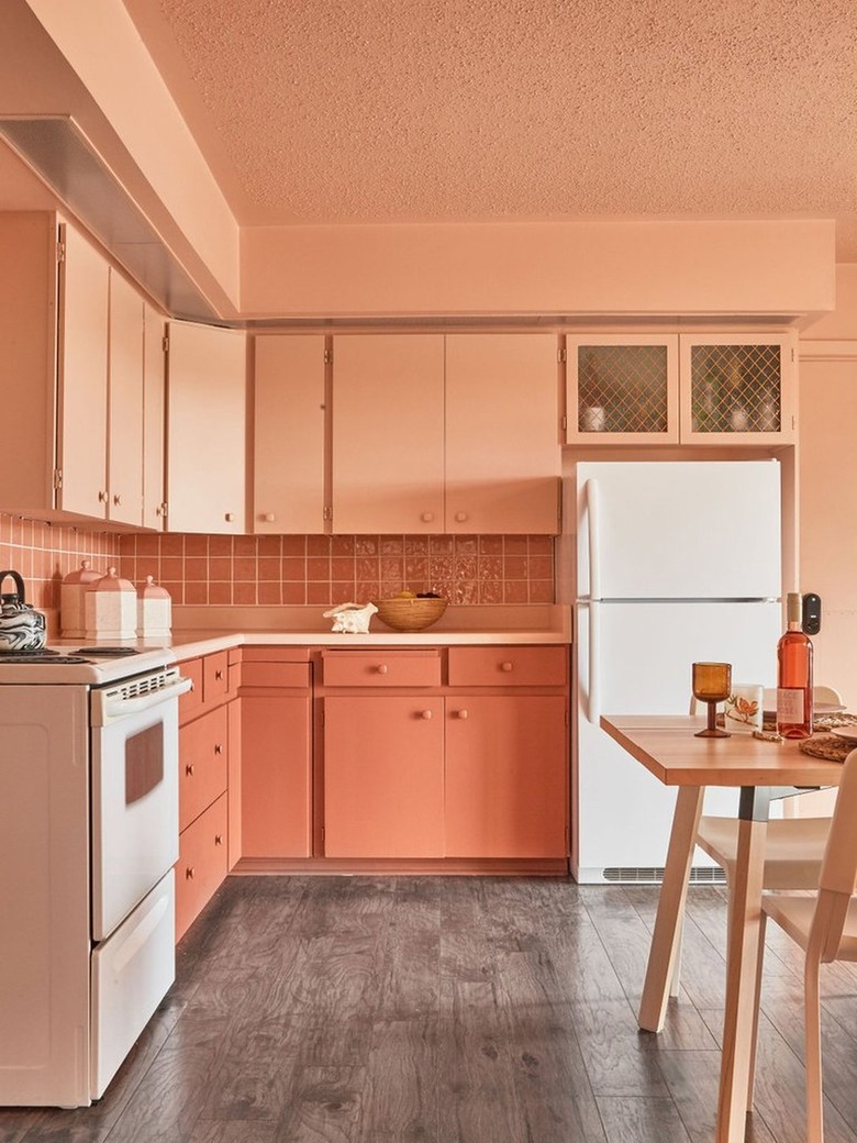
If you didn't catch the renovation of The June Motel in 2021, you're in for a treat. This cute kitchen was made over as a staff space, and clearly, they received the two-tone memo. The lower cabinets have been given a punch with a coral hue that continues up to the tiled backsplash, while the walls and upper cabinetry are a similar but lighter peach shade.
17. Make your island pop.
17. Make your island pop.
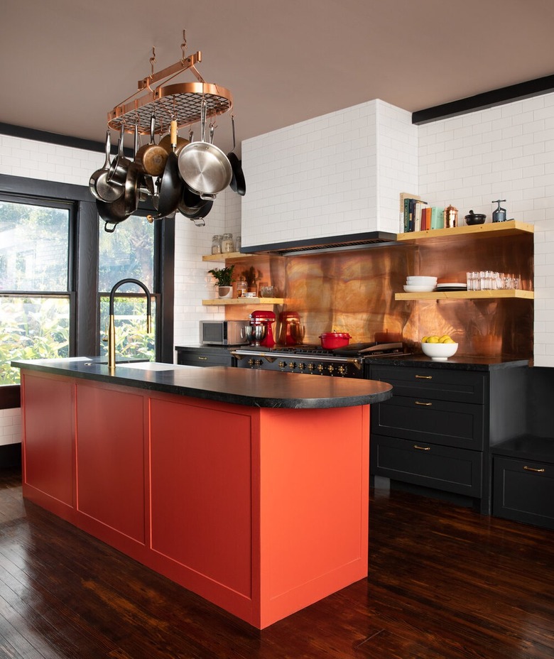
The best thing about choosing black cabinets is that it really allows other colors an opportunity to take center stage. Mary Patton Design has made good use of the technique in this industrial-style kitchen that showcases a central orange island complete with black countertop and similarly hued copper fixtures.
18. Change up the cabinet hardware.
18. Change up the cabinet hardware.
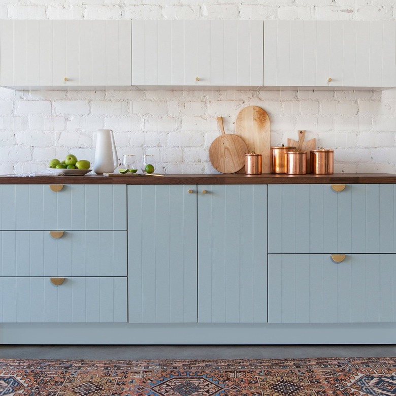
Though the white and sky-blue hues in this kitchen are in direct contrast with one another, the upper and lower cabinet doors are connected by a beadboard texture thanks to the Semihandmade SSS collection. The style creates a unified look that's further heightened by the painted brick wall that serves as a backsplash. Brushed brass and half-moon-shaped pulls by Sarah Sherman Samuel complete the modern scene.
19. Accent with a colorful tile backsplash.
19. Accent with a colorful tile backsplash.
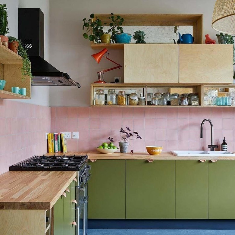
Focus your attention on the lower cabinets and backsplash as seen in this quirky kitchen. The olive-green cabinetry is the perfect match to the pastel-pink tiles from Bert & May, and the natural wood accents don't detract but rather enhance the overall setup.
20. Welcome wood countertops.
20. Welcome wood countertops.
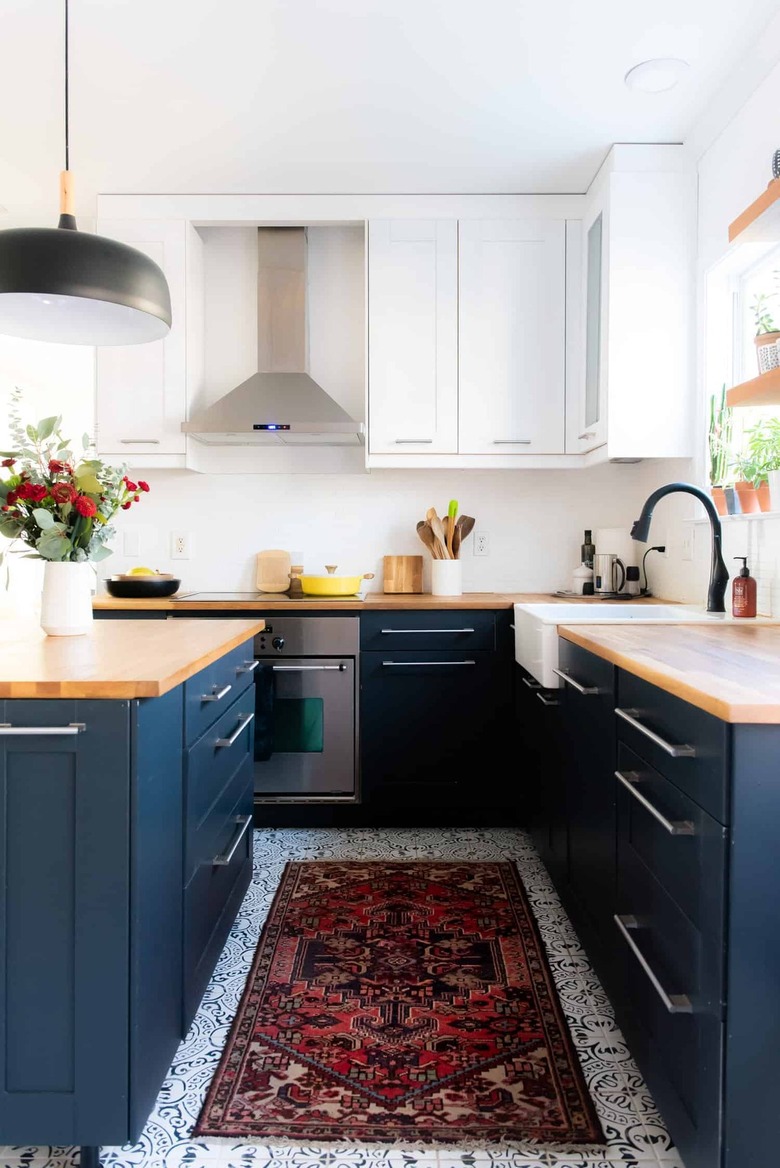
Another classic look for your two-tone kitchen is white paired with a dark navy blue à la this culinary space by Place Of My Taste. The white and blue patterned flooring brings a sense of cohesion while the neutral wood countertops add the perfect dash of warmth.
21. Give it a retro feel.
21. Give it a retro feel.
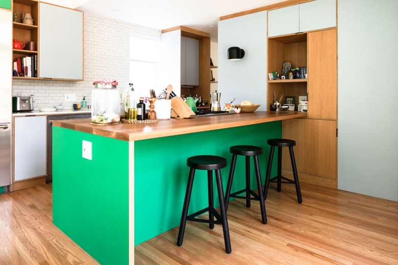
If you're hoping to create a space that nods to the past, turn to this retro kitchen design for inspiration. The bright Kelly-green island brings the focus to the middle of the room while the white cabinetry fades into the background. The homeowners have kept some wooden detailing that's reminiscent of the '50s.
22. Incorporate texture.
22. Incorporate texture.
Oh, we do love a kitchen that's different, and this midcentury-inspired space designed by Brave New Eco is exactly that. The two-tone space utilizes blue and orange hues with some added texture in the form of teak reeded cabinetry. Embrace new materials and go for something different for your own kitchen.
23. Stick to white on the bottom half.
23. Stick to white on the bottom half.
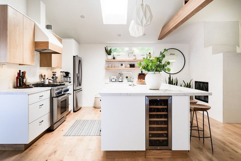
Okay, so maybe color isn't really your thing when it comes to the kitchen. If you only see neutrals in your culinary space, you can still jump on the two-tone cabinet bandwagon by opting for white on the bottom and a light wood finish on the top. Typically, when it comes to two-tone designs, white is featured on the top, but Hunker Editorial Director Laurie Grossman's newly renovated kitchen proves that it's fun to break the rules.
24. Select complementary colors.
24. Select complementary colors.
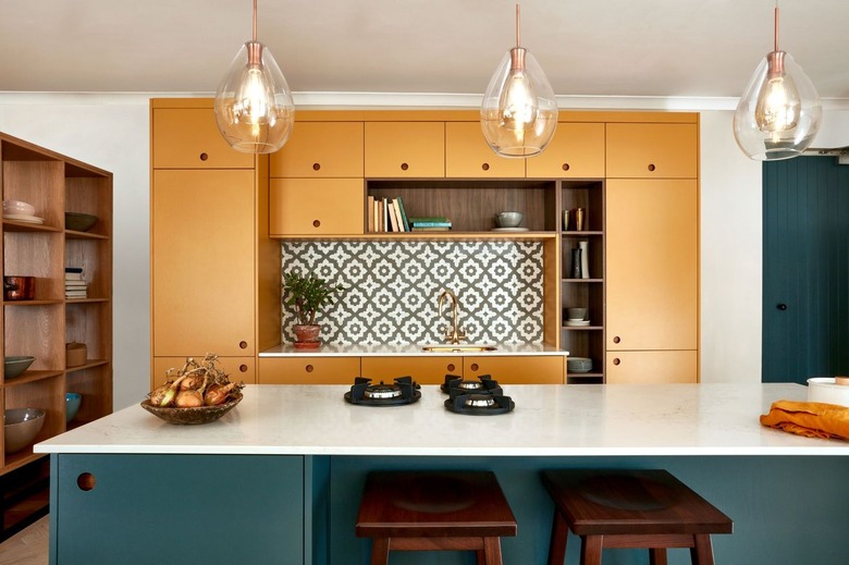
If you're struggling to choose the perfect combination for your two-tone kitchen, take a look at the color wheel for inspiration. For example, mustard yellow and teal blue live on opposite sides of the spectrum and are therefore complementary to one another. In this design by Naked Kitchens, the contrasting combination is full of drama, resulting in a culinary space that looks delightfully bold.
25. Stain, stain, stain.
25. Stain, stain, stain.
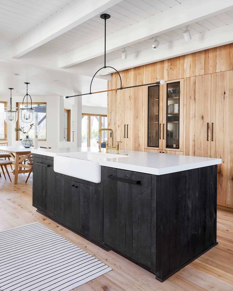
Wood stain is an ideal way to keep your two-tone kitchen looking natural and less brash. Simply use a different stain on your island and voilà — you can have a dreamy, rustic cook space filled with wood cabinetry like Emily Henderson in no time at all.
26. Be brave.
26. Be brave.
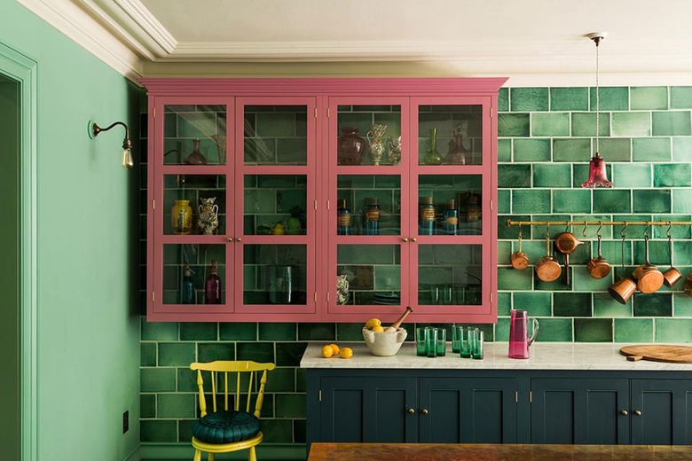
Fancy bringing some energy to your culinary headquarters? Follow the lead of this design from deVOL Kitchens. The pink cabinets and emerald green tile create a striking effect, but they also act as a fun and modern take on the traditional English country aesthetic.
27. Opt for a muted palette.
27. Opt for a muted palette.
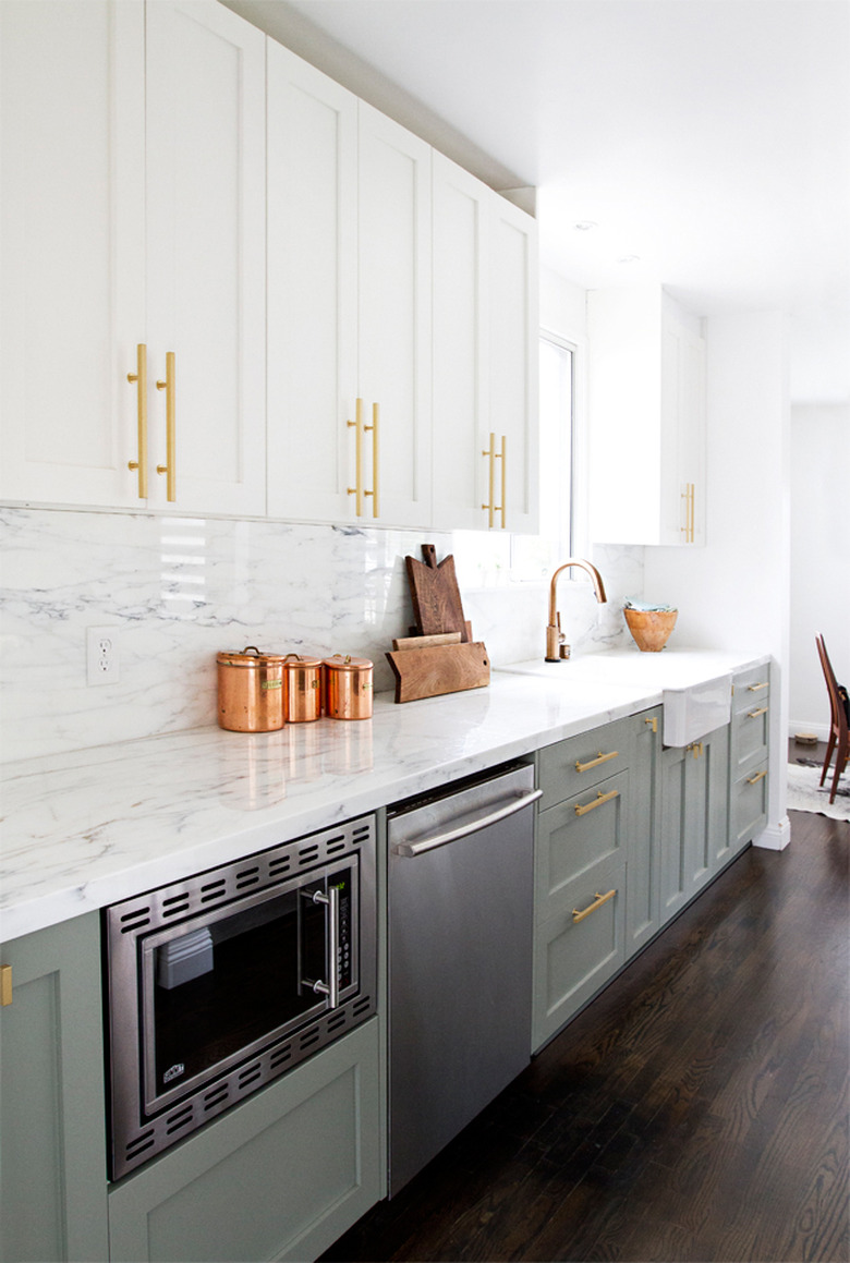
If anyone was going to nail a luxe two-tone design, it would be Sarah Sherman Samuel. After all, in her own kitchen, Sarah paired a muted shade of green on the lower cabinets with white on the top while the marble backsplash and countertop add some subtle texture. Get the look in your own abode with Pigeon & Wimborne White by Farrow & Ball.
28. Try color blocking.
28. Try color blocking.
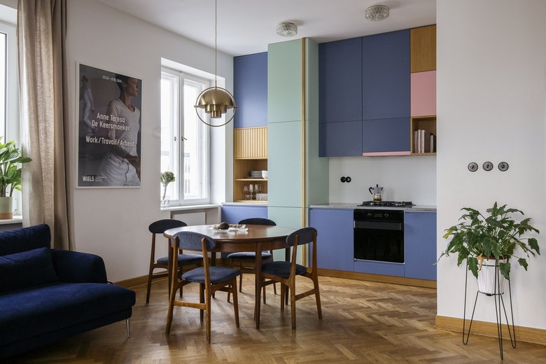
Give color blocking a try to achieve your dream contemporary kitchen. The cabinet idea will bring a graphic feel to the space, as seen in this design by Anna Bialobrzewska of the firm In Architekci. The idea can be achieved with two (or four) different colors, as proven here. Luxe details, such as herringbone wood flooring and sleek light fixtures, are the proverbial icing on this colorful cake.
29. Keep it fresh.
29. Keep it fresh.
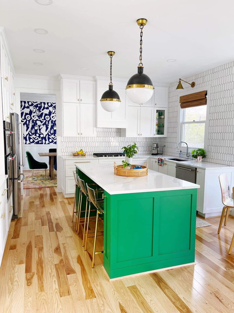
While there is nothing wrong with an all-white kitchen, sometimes a pop of color can help add a bit more personality. Plus, if you ever change your mind down the road, it won't be such a hassle. For example, the kitchen island in this setup by Heidi Noelle is currently bright green, but it could easily be painted another hue to keep things fresh and yet two-tone nonetheless.
30. Consider your backsplash.
30. Consider your backsplash.
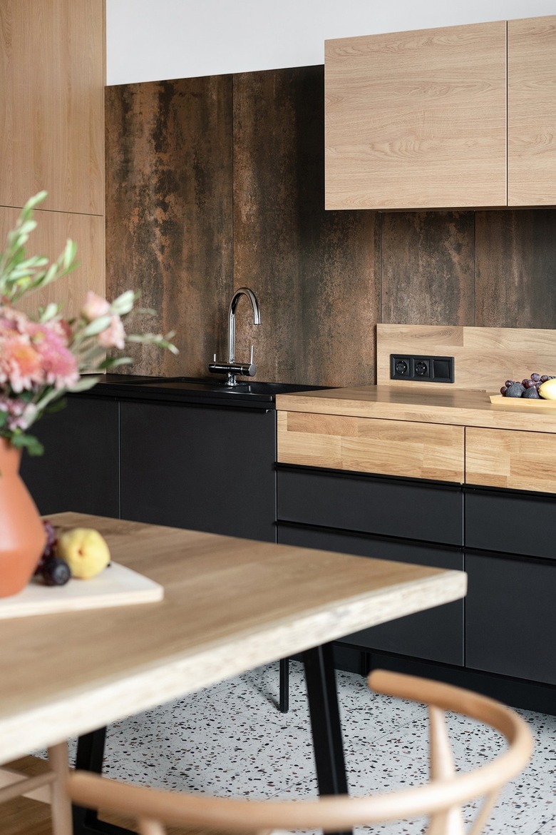
For something high-end, integrate your backsplash. In this modern kitchen by Maly Krasota Design, black cabinetry paired with wooden drawers, countertops, and backsplash work together beautifully yet still offer plenty of variation and visual interest.
