The Before/After Photos Of A Brooklyn Townhouse Reno Are Outstanding
New York firm GRT Architects is known for its ability to add personality to homes with often-colorful design details that we instantly want to steal. (We're still pining over this home's ombre entry.)
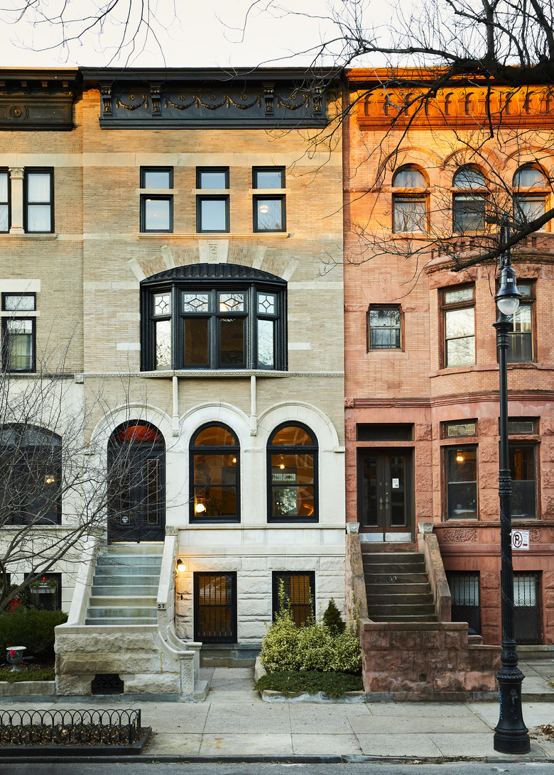
The goal of a renovation of a Brooklyn townhouse was to go from "new to old," adding modern elements toward the back of the house and making more subtle changes toward the front. As always, GRT's use of materials was creative. "We and the clients looked for ways to elevate simple materials," says Rus Mehta, an architect who worked on the project, "because we all liked the challenge of creating something new and were eager not to put fancy materials on display."
The renovation preserves the historical character of the building, while adding a modern playfulness and Instagram-worthy design elements. Read on for the incredible before/after photos and see just how much was done ...
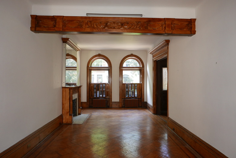
1. Living Room: Before
The architects wanted to remove some of the heavy woodwork that had been aded over the years.
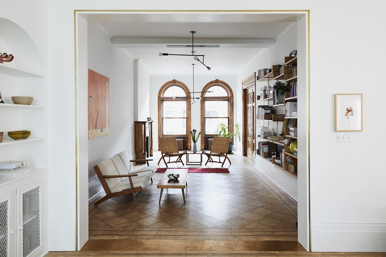
2. Living Room: After
They enlarged the opening between the living and dining rooms, and rather than try to match the original moldings, they framed the doorway with unlacquered brass.
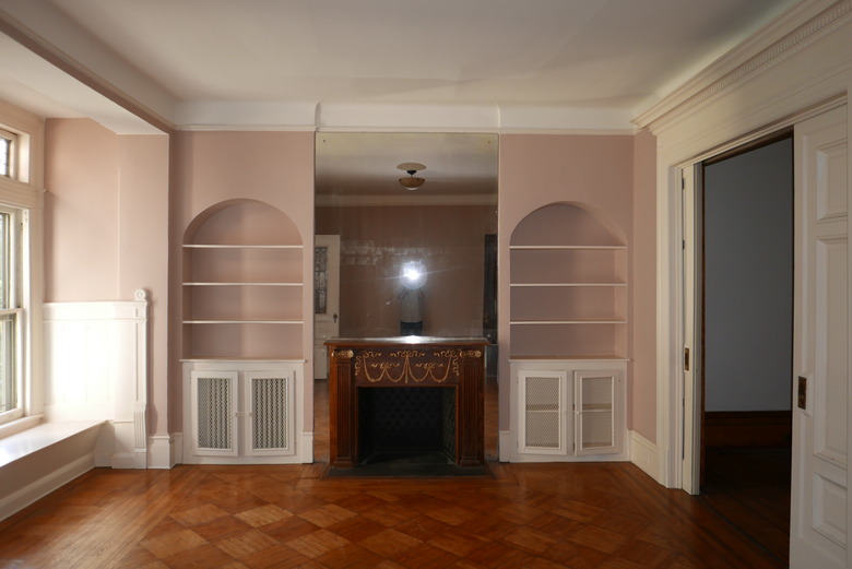
3. Dining Room: Before
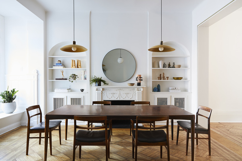
The dining room boasted some beautiful period details, including parquet floors and arched niches.
4. Dining Room: After
The floor-to-ceiling mirror surrounding the fireplace was removed in favor of a more modern round mirror. The architectural elements, such as the fireplace and moldings, were painted white to highlight the details.
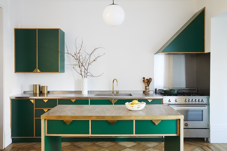
5. Kitchen
The kitchen is the most modern addition to the home and was inspired by the early furniture designs of Gio Ponti and the sculptures of Haim Steinbach and Jan De Cock. GRT Architects designed the brass pulls that were used on the emerald green cabinets and drawers.
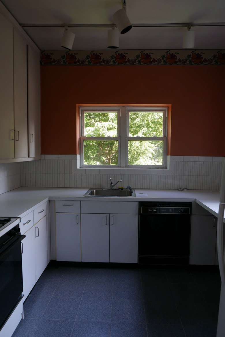
6. Pantry: Before
The addition, which once housed the kitchen, was repurposed into a pantry.
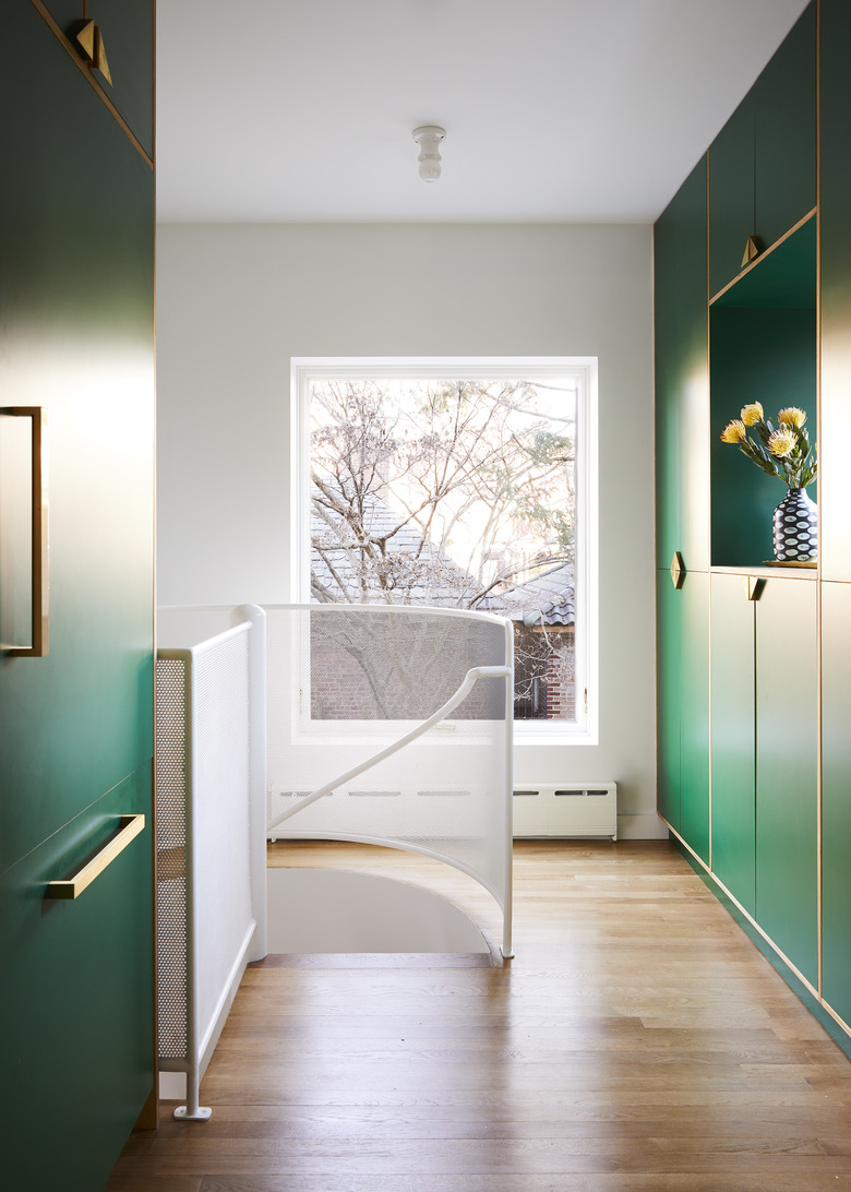
7. Pantry: After
A custom spiral staircase was added in the pantry to connect the parlor floor and the garden level.
8. Bedroom
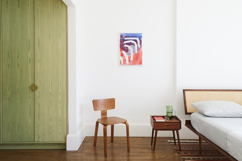
They freshened up the master bedroom by refinishing the floors and painting the walls in a crisp white.
9. Office
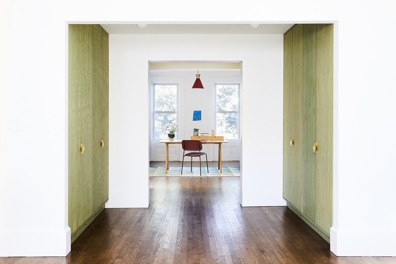
The bedroom and office are separated by a walk through closet. The architects chose a green stain for the closet doors to tie them in with the rest of the home's color palette and used the same brass pulls that were installed in the kitchen.
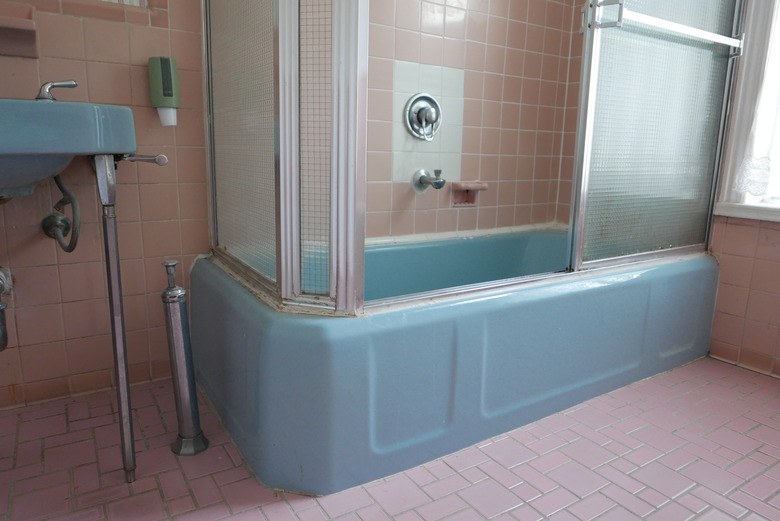
10. Bathroom: Before
Two types of pink tile paved the master bathroom.
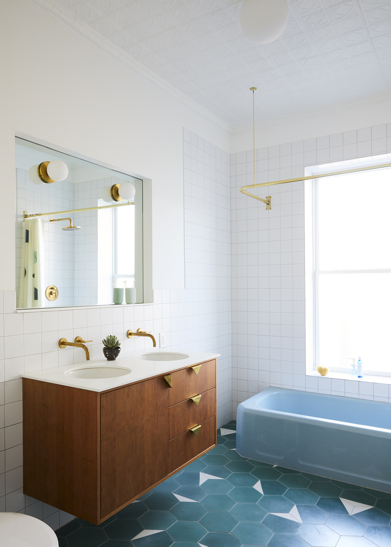
11. Bathroom: After
The original blue bathtub and tin ceilings were preserved in the master bathroom. The pink floors were replaced with green cement tiles by Clé.
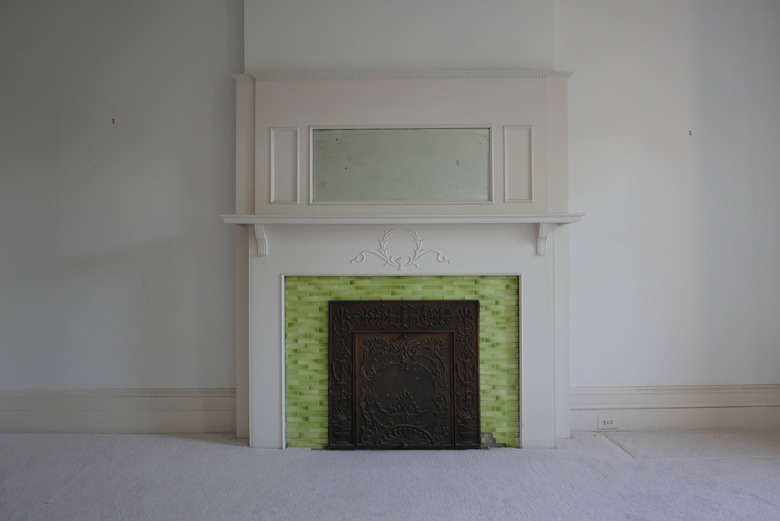
12. Guest Room: Before
The fireplace in the guest room needed a bit of TLC.
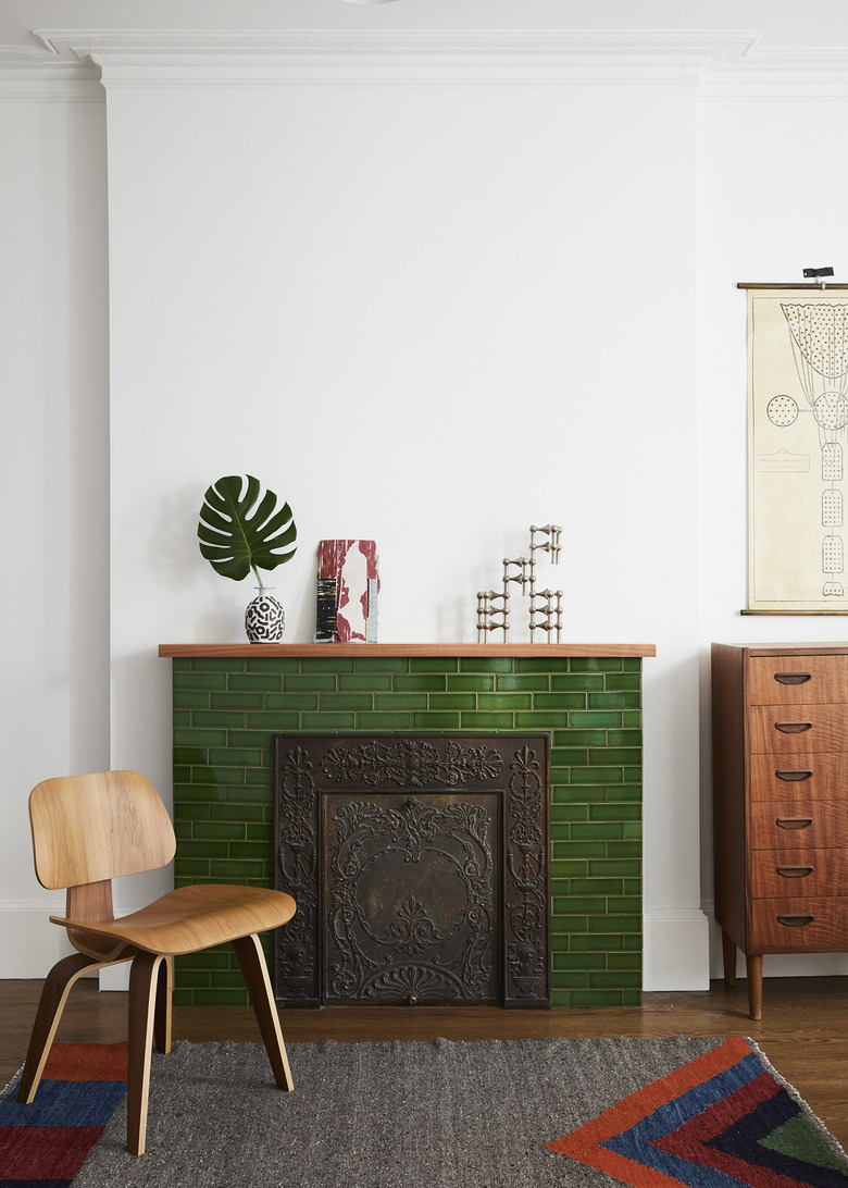
13. Guest Room: After
The guest room's fireplace was revived with hand-glazed green tile and a simple, modern mantel.
