The Decorating Secrets A Zara Home Stylist Knows (That You Don't)
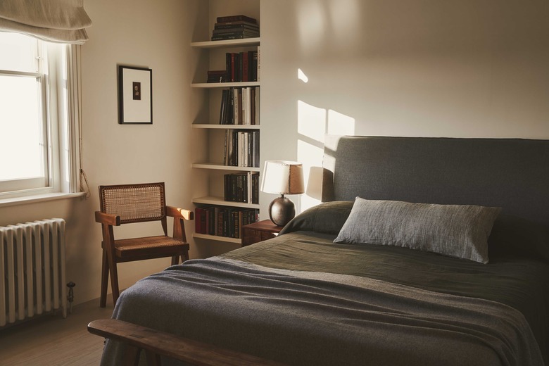
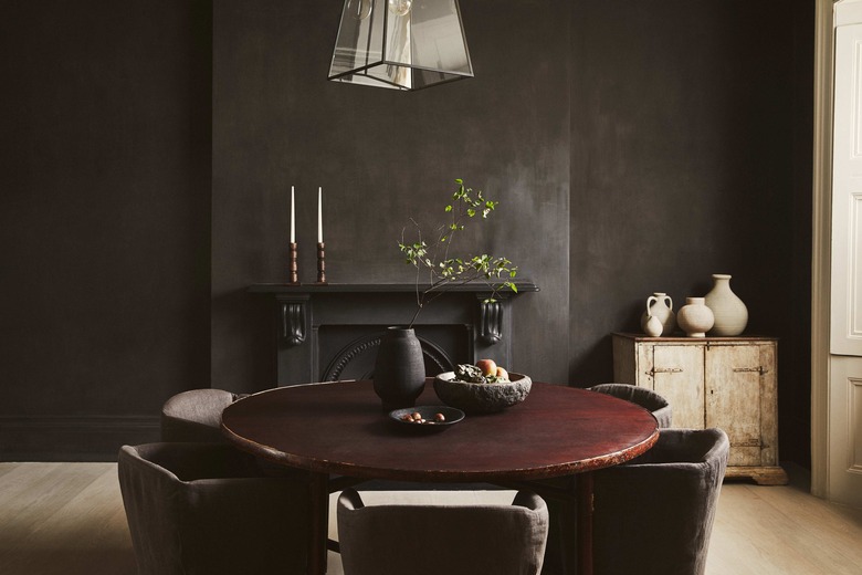
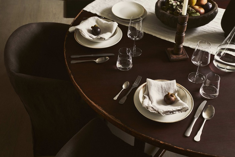
Zara Home's recent editorials have been fire emoji. It's no secret that the high-street retailer is a great source for chic-yet-affordable homewares, but lately, the brand has also been serving up well-styled editorial spreads that are full of great decorating ideas. Think warm-and-inviting living rooms, bedrooms layered with texture, and dining rooms that exude casual elegance.
To get the lowdown on how to recreate Zara Home's lived-in-yet-elevated aesthetic in our own homes, we tapped Colin King, the stylist and designer behind the brand's recent home editorials, and asked him to share his styling tips and tricks. Ahead, he reveals the color trends that will be in every stylish home this season, his favorite Zara Home pieces to work with, and the biggest decorating mistakes he always notices.
Hunker: What are your top trend predictions for winter?
Colin King (CK): Muted colors, curves, wall-to-wall carpet, and specialty finishes on walls.
Hunker: Which metals and materials are "in" (and which are "out")?
CK: Aluminum, terra cotta, colored marble, and plaster are in. Concrete, mosaic tile, and polished brass are out.
Hunker: What color(s) will dominate home decor this winter? How are you going to incorporate the hue(s) into your own home?
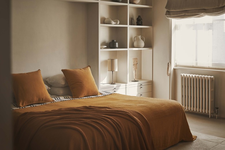
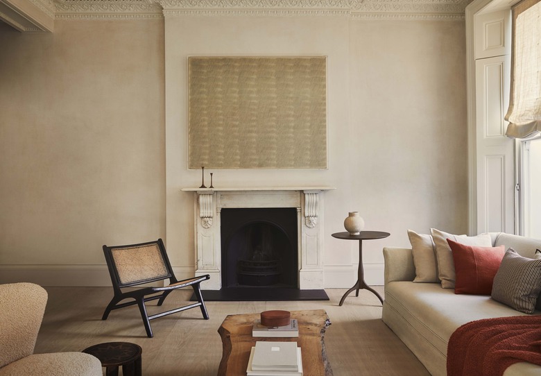
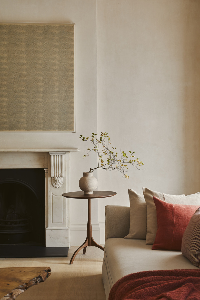
CK: Rust. Warm reds and earth tones will dominate home decor this winter. Living with color can be a commitment, so I tend to incorporate it in smaller ways (blankets, pillows, books, small accessories, and colored taper candles).
Hunker: Zara has perfected textured decor. As a stylist, how do you layer textured items?
CK: When I step into a space, I like to dissect the objects around me and search for opportunities to unearth variety, subtlety, and complexity. I love establishing a narrative in my mind when styling. What's the story a combination of objects communicates? Is there a unified idea, shape, or palette coming through? Is the space trying to communicate linear lines or more abstract ones? Or is it simply the description of the scene?
For combining and layering textured pieces, I start with three components: a protagonist (a base color), an antagonist (an accent color), and a sidekick (a pattern). Then, I build from there. If there is one thing I've learned, though, it's that it's all about trial and error — there is no one-size-fits-all or universal manual.
Styling is like conquering a 1000-piece jigsaw puzzle. You start with the boarder pieces, then you work in some obvious bolder pieces. Then, maybe walk away for a minute, come back with fresh eyes, until, eventually, you get to a place where no other configuration could work. When I get stuck, I step back, snap a photo with my phone, and, without fail, it reveals where there are holes and where things feel heavy or imbalanced.
Hunker: Your Zara Home editorials always look perfectly lived-in. What's your no. 1 tip for making a space look and feel authentic?
CK: I push myself to express a narrative without doing a very staid and corny vignette. I continually challenge myself to tell the story of ritual without making it feel so prescribed or typical. My no. 1 tip would be: Know when to walk away. It's the unusual details and unlikely juxtapositions that I look to capture. And knowing when to let things just be — not trimming the stray floral, not straightening every pillow — and getting comfortable with the emptiness of negative space.
At the end of the day, I have to remember that I get to tell stories for a living and that's all I've ever wanted to do. I get to connect with people and help create a context for the intimate rituals of people's lives. There is a sense of delicacy and sensitivity that has been birthed from working with many personalities and in many different arenas, which I hope comes across in the work I produce. I think what it boils down to is leaving space for the mystery of it all, whether it's purposeful or absentmindedness that leads me to pair unexpected objects and not be confined to the limitations of the obvious choice.
Hunker: What are your favorite Zara Home pieces to work with? Why?
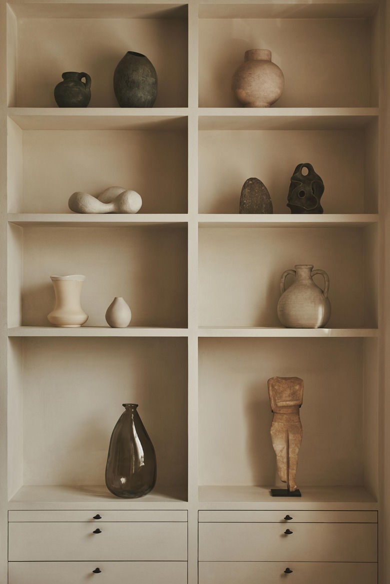
CK: I love working with their ceramics. Not only do they bring form and texture to a space, they also engage us in conversation. The smallest object or combination of objects can shape the identity of a room. Abstract connotations connect the objects to a place or mood. When I style, I always try to incorporate ceramics and found objects into the shot because it retains a laid-back authenticity that never lacks functionality or feels misplaced because it means something to the person [who] lives there.
Hunker: What are the best pieces to splurge on/save on to achieve the ideal high/low mix?
CK: Rugs, art, sofa, and lighting are the best pieces to splurge on. Save on window treatments, pillows and throws, glassware, and accent tables.
Hunker: What are the decorating mistakes you always notice?
CK: Going overboard with trends. A home feels trendy — but quickly dated — when it's all one style or presents a certain "theme." It's a true balancing act of pairing trendier pieces with timeless pieces that will not grow tired. Classic lines and quality materials will carry more than trendy pieces for decades to come.
It's important to find that modern twist and the magic contrast between old and new. Take your time, and don't forget about vintage! Vintage is having a big moment because everyone is being flooded with imagery, and as a result, getting educated on how to use vintage in their home. Recycling and reusing existing decor reduces waste and allows you to collect unique pieces that have their own story.
Hunker: What's your personal decorating philosophy?
CK: A room should arrive at a point where adding or subtracting anything would ruin the overall design. I am drawn to anything of quality, whatever the period or style. Although the aesthetic strands running through my work are pretty consistent, the influences feeding into the design process are typically eclectic and even the most unlikely of subjects can provide food for thought.
