Midcentury Modern Tile Is Always In Style: All You Need To Know
Whether installed from floor to ceiling or just used as decorative accent, tile was and is a staple in the kitchens, bathrooms, and even living rooms of midcentury modern homes. Is your dream a robin's egg blue bathroom with a retro feel? How about a touch of terrazzo in your dining room? We've got dreamy ideas to bring some stylish, minimal, and ultra-cool midcentury tile touches into your space that will stand the test of time.
But first, what is midcentury modern tile? Well, one can trace the origin of midcentury modern design back to Joseph Eichler, a real estate developer in California during the 1940s through the 1960s. Whole neighborhoods of homes called "Eichlers" exist still in California and beyond. Some key characteristics were things like open floor plans, neutral colors (like greys), but also earth tones like orange and green. The tile of this era is where a lot of the color was included in a home. But shapes like geometric, fan, beveled, and large-format looks are also a surefire way to identify the look. As minimal and sleek these homes were, they were also all about using wood and natural materials, so the tiles of that time reflected this in their organic shapes, glazes, and artisan looks.
Let's get inspired!
Earthy Tones
Earthy Tones
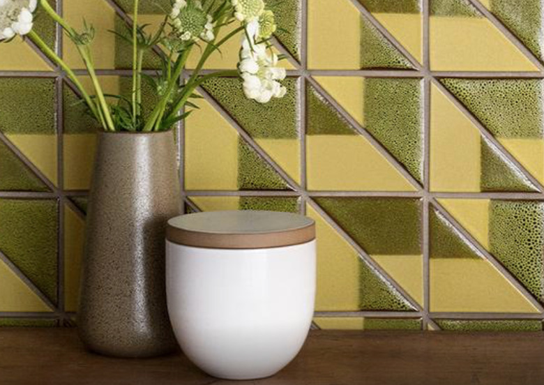
Nothing says midcentury than unexpectedly earthy colors. These Ochre Blend tiles from Heath Ceramics have all the classic signs of the era: the color, the shape, the darker grouting, and that nod to nature with a hand-done glaze. All signs point to some midcentury love.
Magic Mosaic
Magic Mosaic
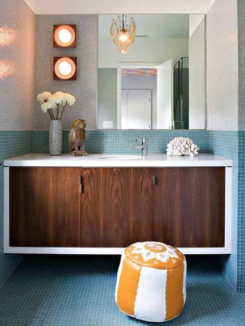
Tiny tiles (either multitoned and shaped, or not) are another signature look of this era. We love this blue and gray effect from Jamie Bush + Co. It looks super simple but adds a sophisticated spotlight on the wood vanity. Continuing the blue vibe on the floor opens up the space and invites us all in.
Totally Terrazzo
Totally Terrazzo
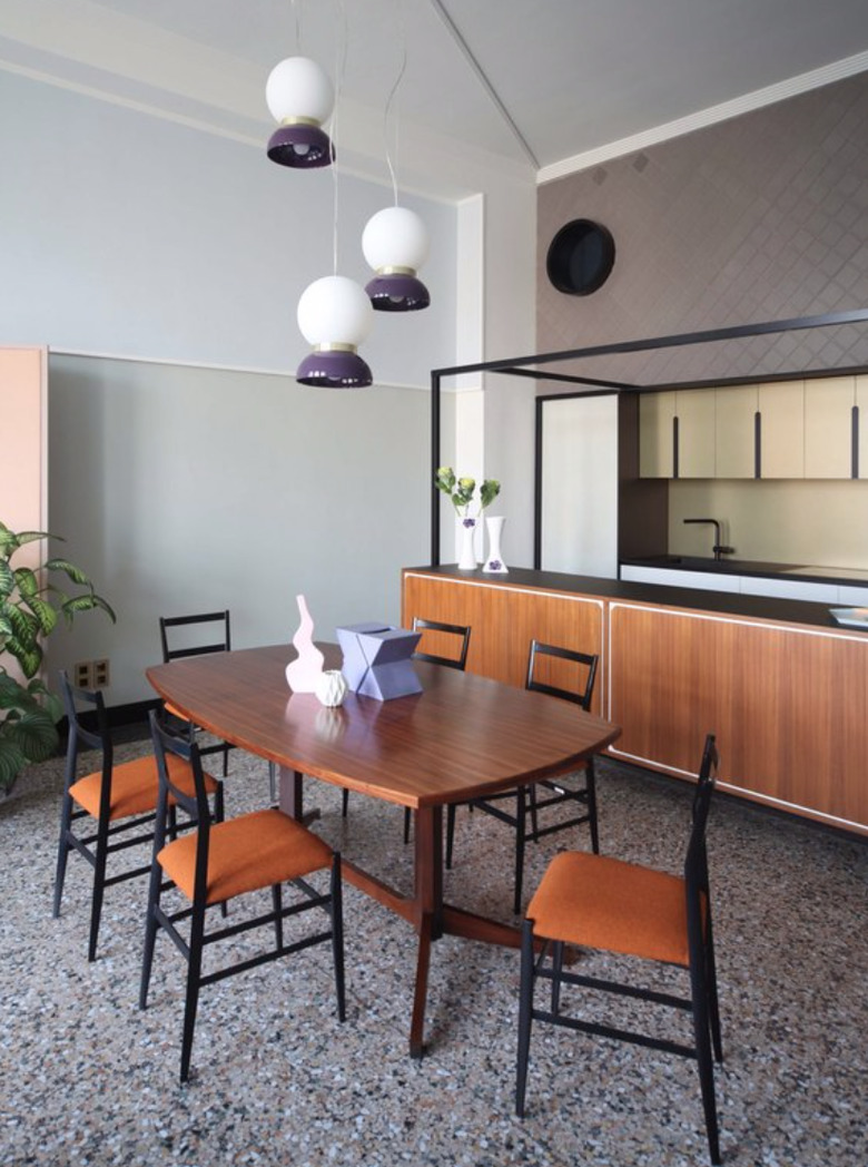
This tile was invented in Venice, Italy in the 15th century from oddly shaped pieces of marble left over from jobs. But it really became popular in homes with midcentury design. These classic tiles in an updated 19th century apartment in Rome have all the 20th century style you'll ever need. Ciao.
Slate Is So Great
Slate Is So Great
Slate is another material that's been around since the 13th century. (OK, OK, we'll stop with the history lessons.) But again, the neutral tones and textured surfaces make it ideal for the midcentury vibe. Also, it's durable. If you want to reconnect with your inner geologist, there's more info on what it is and where it comes from (who had a rock collection?). Here's the scoop. Otherwise, let's keep focusing on this beautiful dark slate floor in a modern setting from West Elm. And exhale.
Textural + Neutral = Pour Me a Cocktail
Textural + Neutral = Pour Me a Cocktail
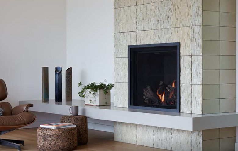
This living room is giving us life with a hearth made of Heath. Keeping it neutral with Stan Bitters tile, it's also giving us all the sculptural feels. For real though, it's giving us a lot. And we love it.
Not So Neutral
Not So Neutral
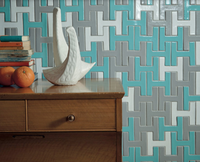
Did somebody say 'wow'? We say a billion times yes. Do an accent wall to pump up the volume in your midcentury and beyond pad like this look from Fireclay. The Chaine Homme style has got us seeing 'h' for holy cow. And the color combo? Come on now, people, it's brilliant.
Subway a New Way You Say?
Subway a New Way You Say?
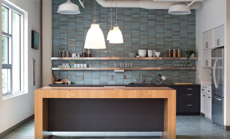
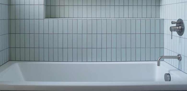
Subway tile seems to be one shape that is always a yes. But this look turns the classic on its head, literally. Installed vertically, the Heath Classic Field Tile in robin's egg is making us think that soaking in this tub will bring us serenity now. The shade is all about the era.
