11 'Home Alone' Set Secrets According To The Film's Decorator
Written and produced by the late John Hughes, the 1990 holiday movie Home Alone follows 8-year-old Kevin McCallister (Macaulay Culkin) after he accidentally gets left behind by his family on their way to France. Though he spends much of this time living out a childhood fantasy with ice cream and a movie he's not normally allowed to watch, young Kevin also comes face to face with burglars Harry and Marv (Joe Pesci and Daniel Stern). He then transforms the McCallister family home into a series of elaborate booby traps, and turns it back into a Christmas paradise before his family returns, allowing viewers to see just how dynamic this set really is.
Knowing full well how special Home Alone is during the holidays, Netflix recently released a Movies That Made Us episode on the film. For the program, the Home Alone production crew describes exactly what went into making this movie. It's chock-full of fun facts, but after watching, we were left wanting to know more about the iconic set design.
That's why we reached out to set decorator Eve Cauley — who also worked on The Untouchables, Dennis the Menace, and Sister Act — for details on what went into making the Home Alone set feel like ... home.
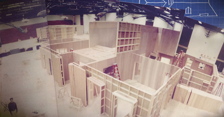
1. The set was built inside a high school gym — not inside the iconic home we see in the film.
1. The set was built inside a high school gym — not inside the iconic home we see in the film.
John Hughes loved making movies in and around Chicago, away from the studio system, which is why he elected to use Winnetka, Illinois's New Trier High School as the set of his production offices for Home Alone. (His films Ferris Bueller's Day Off and Uncle Buck were also filmed there.)
"The designer, director, and location scout found a house that they liked for the exterior, but we never filmed in the house at all," Cauley tells Hunker. "The entire film is built sets. We built the first floor with stairs up and the second floor on a raised platform with stairs down, and we also did the basement as a set."
The sets were built to be big enough to fit all the furniture, actors, and camera equipment (and were actually inspired by the interior of the house the location scout found). As for the staircases, those were optical illusions that didn't actually lead anywhere.
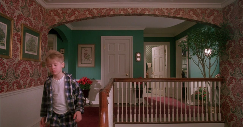
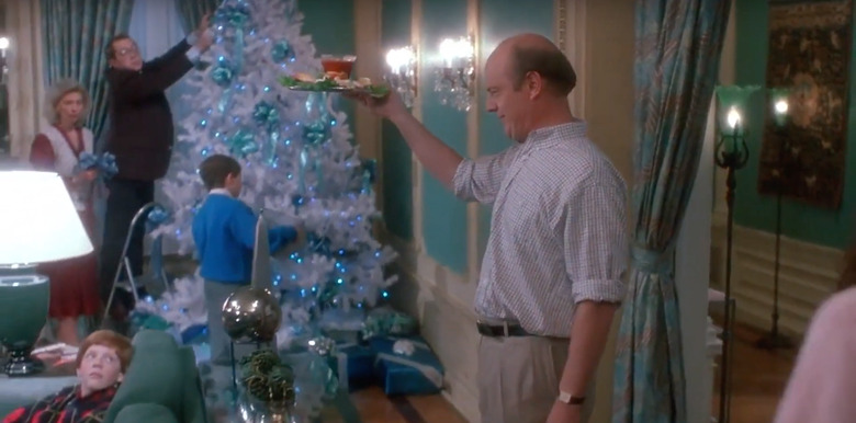
2. The decor featured saturated red, green, and gold colors inspired by antique cards and Norman Rockwell paintings.
2. The decor featured saturated red, green, and gold colors inspired by antique cards and Norman Rockwell paintings.
"Macaulay Culkin looked a lot like the little boy in one of the Rockwell paintings," Cauley says. "So I showed the designer and director the idea of doing very saturated colors that were warm for the house, that looked Christmassy, and they both loved the idea."
However, the director, Chris Columbus, was initially concerned because those colors weren't typical for that period in time (navy blue and dusty rose pink were popular that year, according to Cauley).
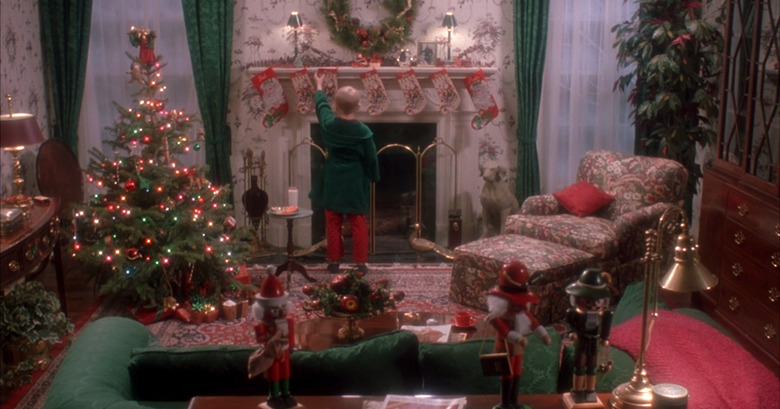
"I felt that it brought out a warmth," continued the designer. "And that when you see a movie and know there's going to be a lot of snow, the color has to be strong to make a mark." A lot of these colors came in the form of F. Schumacher and Ralph Lauren pieces, which Cauley used to help bring the timeless look to life.
3. A lot of the decor items were specifically made for the movie.
3. A lot of the decor items were specifically made for the movie.
"When I would go to the store to find furniture in the strong red, green, and gold colors, there was none to be found," says Cauley. "It just wasn't popular, so I wound up having every single piece of furniture reupholstered for the show."
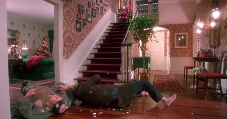
She also had the curtains specially made, along with the wallpaper in the entryway. "I found it in a blue and gold tone, but I wanted it in Christmas colors, so I called the manufacturer and asked if they could print it in the strong jewel tones that I wanted — and they did!"
4. There were doubles and triples of all the furniture and almost every item.
4. There were doubles and triples of all the furniture and almost every item.
Cauley explains that just in case anything was damaged or broken during filming, she had to come prepared with backups.
"For example, when Macaulay Culkin's character rides the sled down the stairs, I had furniture at the foot of the stairs, and we all hoped that he would go right out the door. But just in case any furniture was struck and broken, I had to always have doubles," she says. "And I never needed it — luckily, everything went beautifully."
For the scene in which Kevin falls from the shelves in Buzz's room, while in search of his brother's secret box, Cauley also had to have triples of every single item on the shelves. Fortunately, they were able to do the scene in one take.
5. None of the rooms clash — they were designed to complement each other.
5. None of the rooms clash — they were designed to complement each other.
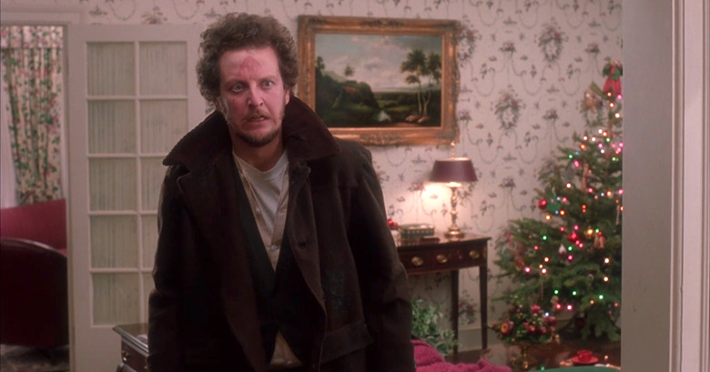
"Each room, if you look through it, there's a beauty as you look from one room to the next," Cauley states. "The wallpapers complement each other. You would go from the dining room, which is red, into the entryway, which [has Christmas colors], and then the living room was a Ralph Lauren paper [with a] timeless design." The designer emphasizes that all the room colors were intentionally picked so they wouldn't clash.
6. The Colefax and Fowler design style was an inspiration, thanks to its timelessness.
6. The Colefax and Fowler design style was an inspiration, thanks to its timelessness.
John Hughes wanted his audiences to leave the theatre feeling uplifted, which is why he liked his sets to have a timeless, natural appeal.
"It was almost a heightened reality in that way," says Cauley. "I did an Americanized version of Colefax and Fowler, being the British traditional decorating, and I just did it by instinct."
7. Kevin’s sisters’ rooms were only decorated as far as the eye could see.
7. Kevin's sisters' rooms were only decorated as far as the eye could see.
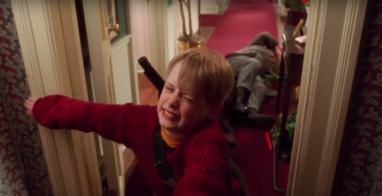
"You have a door cracked open and one wall, and that was where I had to pick a wallpaper and put just enough decor to show a difference in personality between the two girls," Cauley explains. "So I made one modern with a pink and white striped wallpaper, and the other daughter I made more traditional, with a smaller print floral wallpaper and more traditional decor — just what you could see through the door."
With just one wall of decor, Cauley was able to evoke a character's entire personality.
8. There were additional character personality touches throughout the home.
8. There were additional character personality touches throughout the home.
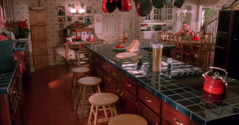
Since Buzz had a pet tarantula, Cauley placed a book about caring for spiders on the kitchen counter.
"Because that's what kids do," she says. "They take something, walk it into another room, they leave it there, and then they run off to do something else." In other words, the designer wanted to make sure that the set actually looked lived-in, like there were real kids running around.
9. The table centerpiece was sawed in half.
9. The table centerpiece was sawed in half.
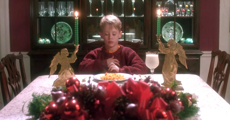
"There was this scene in the dining room where Macaulay Culkin is sitting at the end of the dining room table, but he's so little — they put him up on a cushion to make him a little higher," Cauley tells Hunker. "There's a Christmas centerpiece in the middle of the table that was just high enough so you couldn't really see [Macaulay's] entire face, so [the director of photography, Julio Macat], said to me, 'Would you mind if we just took this centerpiece and sliced the bottom of it off with a bandsaw? That way I can make the centerpiece lower, so I can see Kevin's face better.'"
After making sure that they wouldn't need that same centerpiece for another take, Cauley agreed and the centerpiece was sliced.
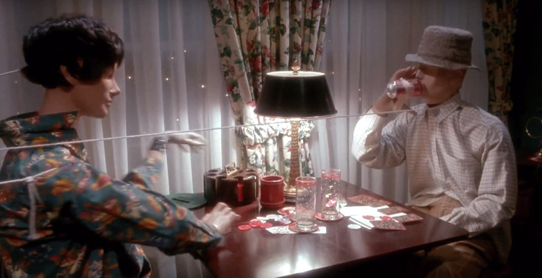
10. The mannequins were there because of a scene in the original script.
10. The mannequins were there because of a scene in the original script.
Have you ever watched Home Alone and wondered, "What's with all the mannequins?"
Cauley answers, "In the original script, the mannequins were part of a scene where they came alive and scared Kevin when he went down into the basement. Eventually, that scene was eliminated ... It was about [creating] the kinds of shapes that might make a little kid nervous while they're down there."
Cauley states that the mannequins also had a dual purpose, since the mom liked to sew.
"When I was decorating the master bedroom, I added a sewing machine and some fabric because when I was younger, my mom made curtains and things for our house," she says. "I liked the idea of the mom having a little sewing area in her room."
11. The movie switches between cool and warm tones depending on where the family is.
11. The movie switches between cool and warm tones depending on where the family is.
When the McCallister family is together, the decor tones are warm. In France, when Kevin is no longer with them, they are cooler. Green, however, is the one color that's consistent throughout the entire film.
Cauley states, "I had the warm and cool tones go with how the story felt, and that was on purpose."
