A 645-Square-Foot Apartment Uses Black And Green To Define Space
Located in Vila Nova de Gaia, a port wine city near a historic center of the Norte Region in Portugal, a cramped midcentury-era apartment got a complete overhaul by Porto-based Hinterland Architectural Studio. Before the renovation, the home — originally built in the '60s as part of an affordable housing initiative — was divided into "small rooms that made it very hard to occupy," according to Hinterland architect Tiago Vieira. With an end goal of maximizing the space, the team rearranged the 645-square-foot residence to opt for a more open design.
But there were dilemmas and constraints: The bones of the home were shoddily built and the budget was limited to about $550 per square meter. Hinterland devised a creative solution: keeping the location of the kitchen, bathrooms, and bedroom. The other spaces in the house, capped by the sunroom, were opened in order to create a more welcoming environment for the apartment's new owners.
1. Entry
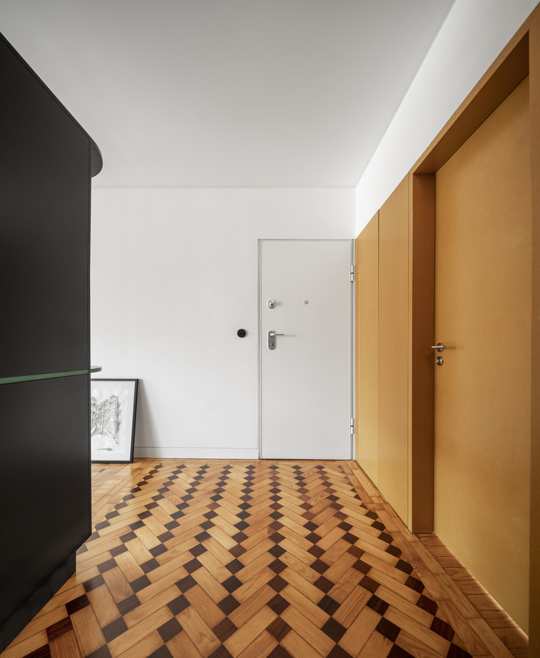
The original apartment included an entrance hall and small corridor, divided by walls that took up space but provided no function. The rearranged layout creates a more welcoming entrance that leads visitors to the common area, or to a closeted coat rack that separates the common space to the doors of the bedrooms.
2. Entry
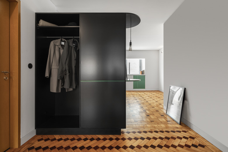
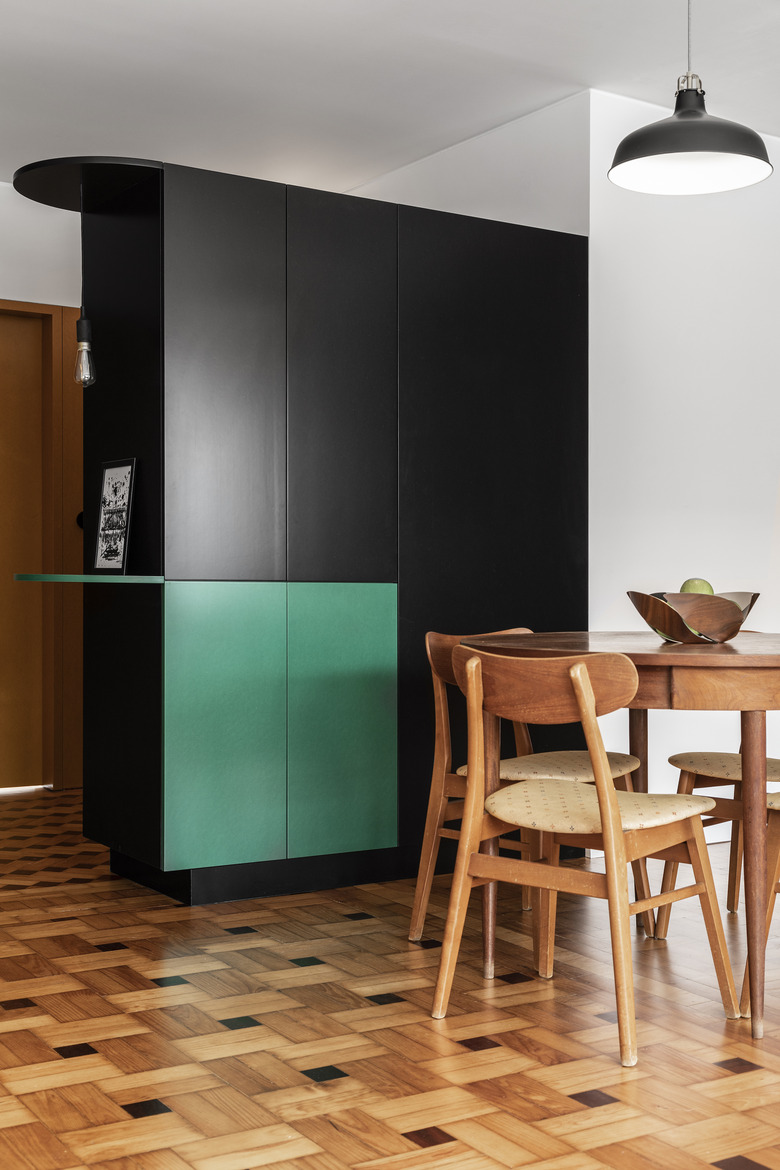
A wardrobe/coat closet doubles as a divider. The cabinet (made from medium-density fiberboard) also functions as a cupboard on the dining area side.
3. Dining Room
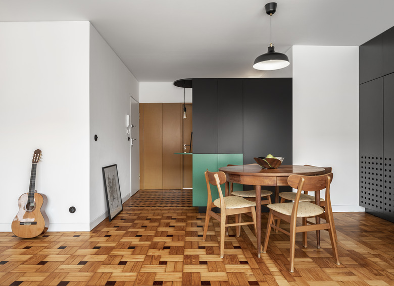
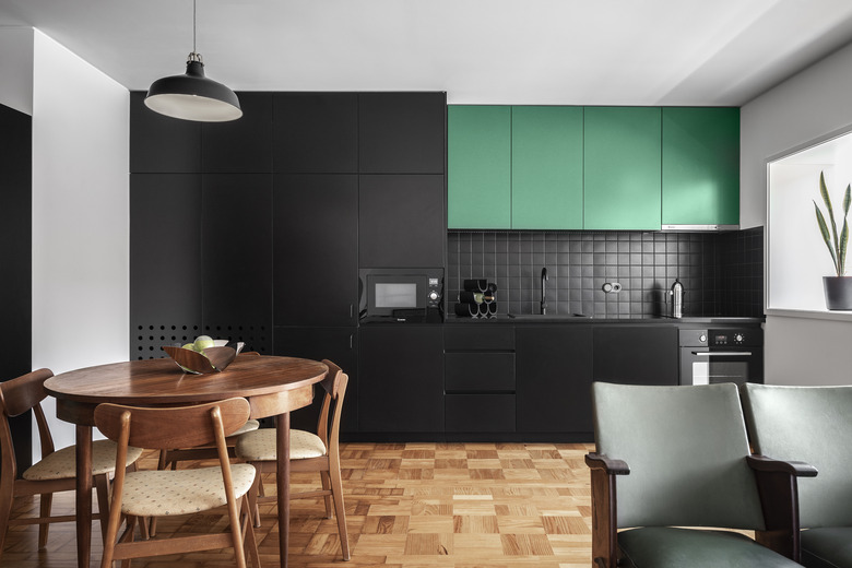
The unique wood floors were original, preserving a bit of midcentury flair.
4. Dining Area
A dining table and chairs, which anchors the dining area, were purchased from local vintage store Mercado do Vintage. A black Ranarp pendant lamp from IKEA helps to center the space.
5. Dining Area/Kitchen
In the kitchen area, the original wood floors were in disrepair and required a construction update. Like the apartment's other custom built-in furniture designed by the architectural studio, the kitchen cabinets were made from MDF. Green chairs, originally sourced from an old cinema, were also found at Mercado do Vintage.
6. Kitchen
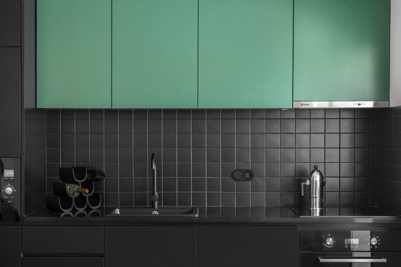
The black-and-green color combo is a bit unusual but ends up creating a streamlined and modern look. Black accessories (like the wine rack) and finishings (faucet) and appliances blend in seamlessly.
7. Sun Room
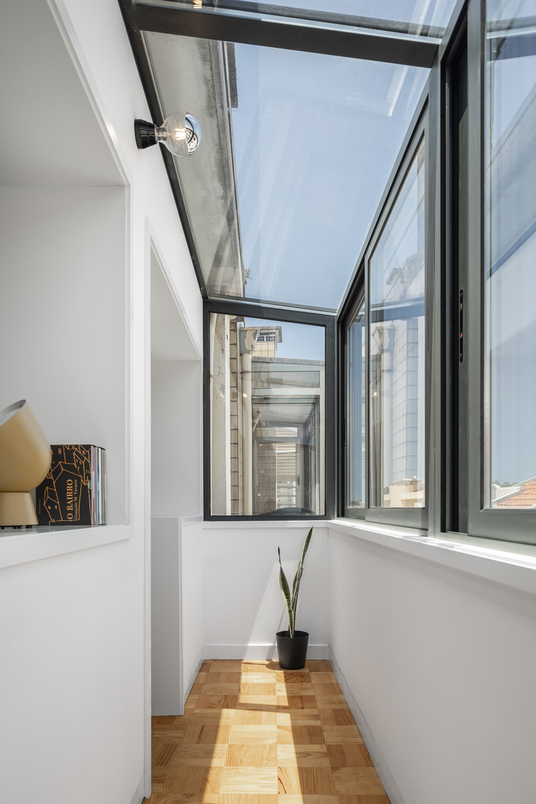
The sunroom became a part of the kitchen and living room, allowing natural light to flow through the common areas of the apartment.
8. Patio
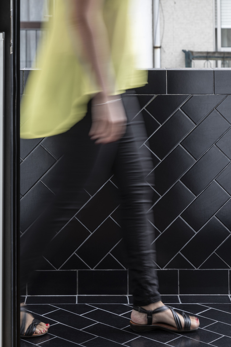
An outdoor patio, ideal for relaxing on warm summer nights in Portugal, was tiled with black tiles from Cinca. Inside the apartment, thermal and sound insulation were added for a more comfortable environment.
9. Bedroom
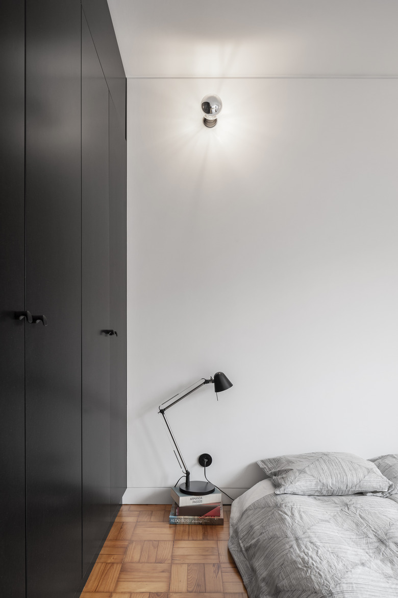
MDF was also used in the bedroom to create custom cabinetry. The material helped the team cut down on cost as the material is easily sourced and inexpensive.
10. Bathroom
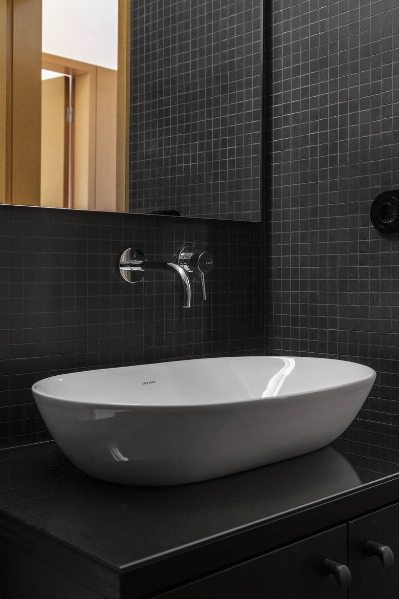
Black tile, also from Cinca, continues into the bathroom where a unique countertop, black glass on top of a custom Valchromat cabinet, functions as a display for a beautiful white ceramic sink from Sanindusa. A bathroom faucet, seemingly floating from above, was purchased from Bruma.
