An East Village Duplex Embraces British Maximalism
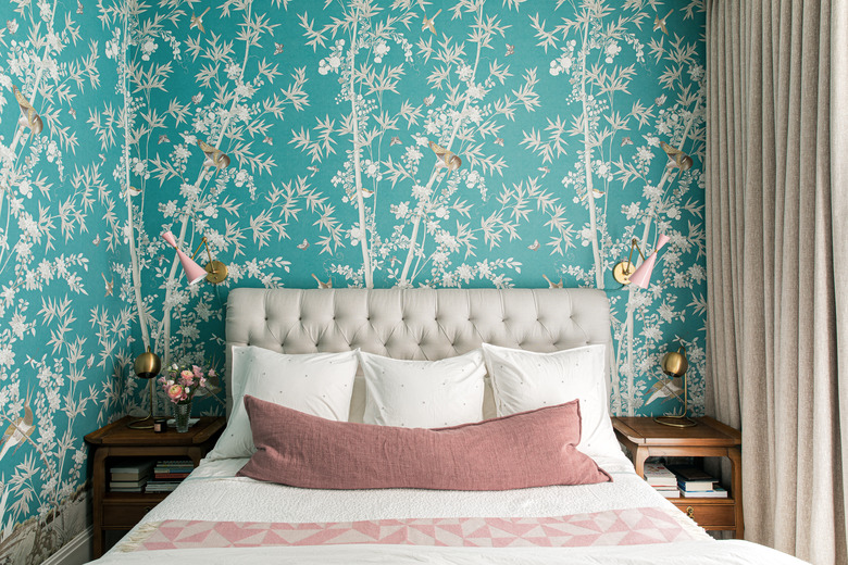
New developments tend to celebrate minimalism, with neutral palettes and sleek surfaces. But for their their new duplex in the East Village, a couple wanted to bring a bit of British tradition. The husband was raised in England, so interior designer (and fellow Brit) Louisa Roeder used his background as inspiration for the design. "Right off the bat, my clients knew they wanted a botanical chinoiserie wallpaper in the bedroom and a traditional red den," says Roeder. "With those items set, we each selected landmark items that we loved and built each room around those pieces."
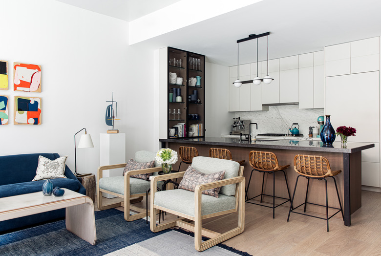
Roeder made the apartment's open kitchen, living, and dining area feel cohesive, grounding the space with a large rug and incorporating blue accents throughout. Floral floor-to-ceiling drapes add a bit of tradition to the modern space, which is filled with paintings and sculptures. The parade of patterns continues into the nursery, which was added to the project during the design process when the couple found out they were expecting. Throughout the entire home, classic prints and antiques are mixed with modern furniture and colorful art, creating a fresh take on tradition.
1. Entry
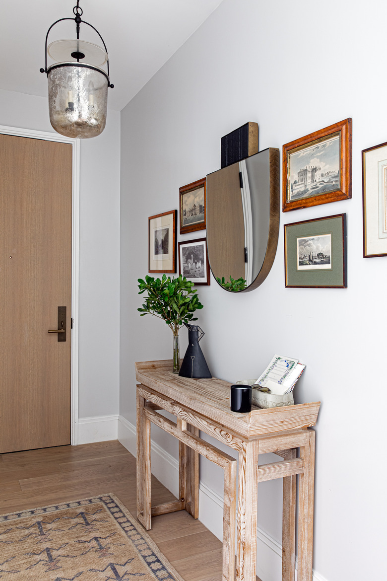
The entry displays prints that are family heirlooms, helping the apartment feel personal from the moment you step inside. Roeder chose a mercury glass lantern by Circa Lighting to hang above the antique rug.
2. Living Room
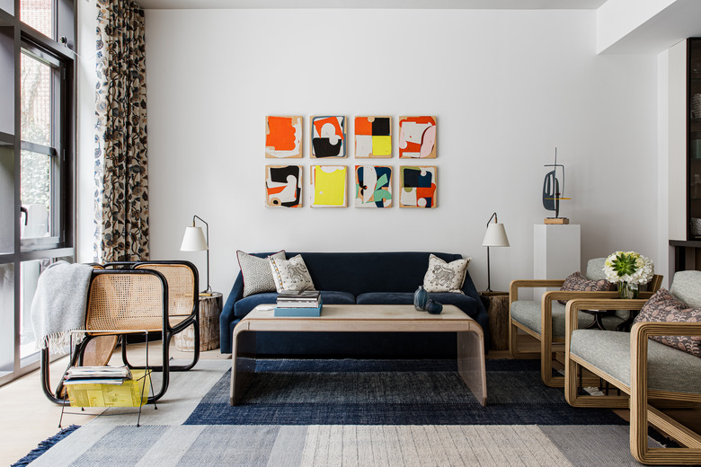
Floral drapes by Duralee frame the wall of windows in the living and dining area. The room's white walls let the artwork, such as a series of paintings by Celia Johnson, be the focal point.
3. Dining Area
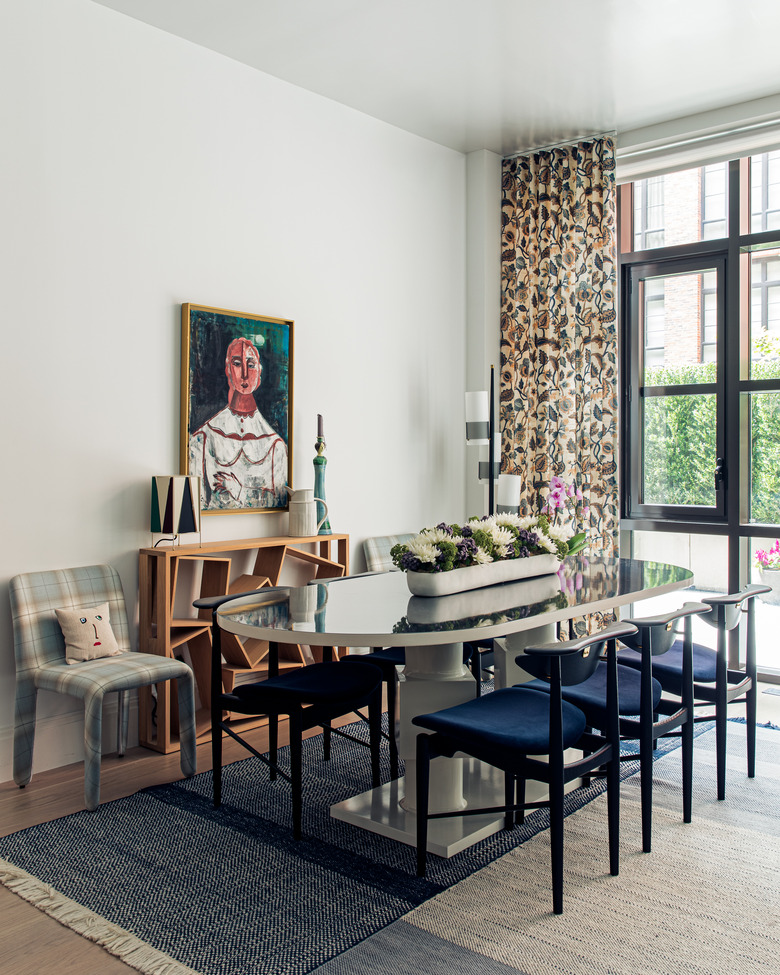
In the dining area, Roeder paired a custom table with chairs from Danish Design Store and covered Molteni chairs in a plaid Duralee fabric.
4. Kitchen
Roeder installed a sculptural light fixture by Lambert & Fils above the kitchen bar and incorporated more blue accents, including the tea kettle and ceramics.
5. Hallway
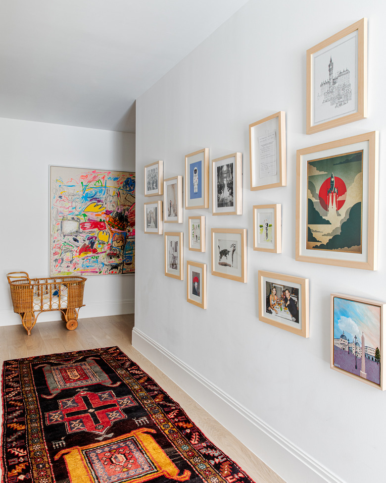
A eclectic gallery wall is tied together with simple wood frames in the hallway.
6. Bedroom
Schumacher wallpaper transforms the master bedroom into an elegant retreat. Roeder mixed traditional pieces such as the antique nightstands with modern lighting, including pink sconces she found on 1stdibs.
7. Powder Room
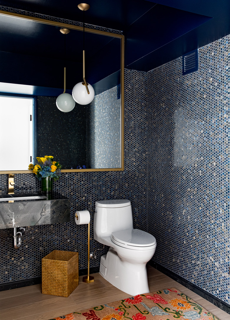
Penny tile lines the walls of the powder room and Roeder painted the ceiling in Benjamin Moore's North Sea.
8. Nursery
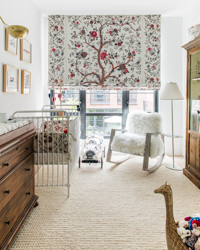
The couple wanted a gender neutral nursery for their new addition. "The showpiece is the Le Grand Genois by Pierre Frey panel used in the roman shades," says Roeder. "We did not want to distract from it, particularly because the room is small and any other patterns or loud colors would overwhelm the space. We picked up the fabric again near the crib's bumper, but otherwise, that is the only pattern to be found." Roeder found the crib, dresser, rug, and rocking chair at RH Baby and Child.
9. Office
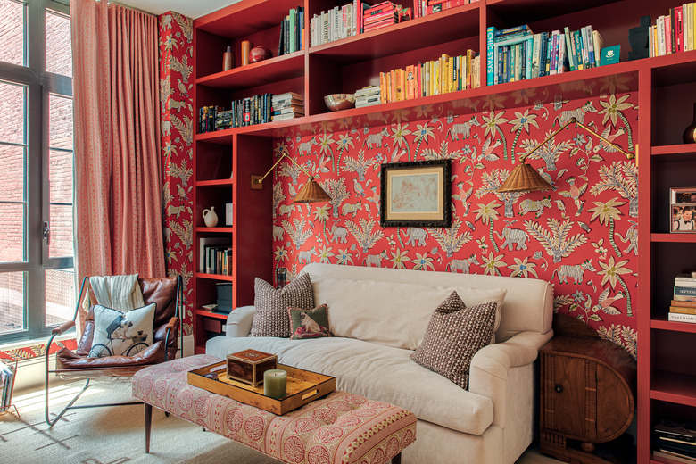
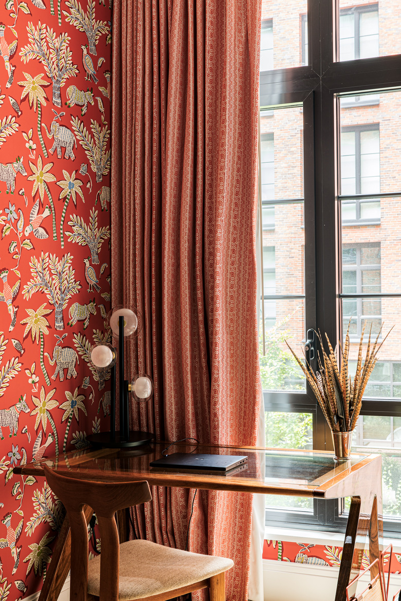
"In the den we embraced mixing patterns," says Roeder. "Between the wallpaper, curtains, bench upholstery, and pillows, we have a lot going on, but everything is in the same color family so it doesn't get too overwhelming." The wallpaper is by Thibaud and the curtains are made of a Kravet fabric.
