This Spanish Home Is Ideal L.A. Dreams Come True
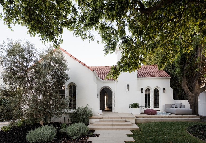
While they may be in the same state, Los Angeles and San Francisco feel worlds apart. So when a young family relocated from the Bay Area to L.A., they decided to embrace their new city's way of life. Enter architect Robo Gerson and designer Jessica Weigley, principals of Síol, who helped update the family's 1926 house in West Hollywood. "Having completed other projects for this client we looked more at how Southern California and L.A. would allow them to live differently than they do in San Francisco: What shape do their days take? What activities become a part of their lives?" says Weigley. "Pool time, bike riding, and a fluidity between the indoors and outdoors were all on the list."
The team took inspiration from the home's Spanish Colonial architecture and worked to preserve and highlight the original details. "We wanted to respect and enhance the original language of the home by working with timeless finishes and materials," says Gerson. "We acknowledge, embrace even, that our time with the project is only a brief moment in its history."
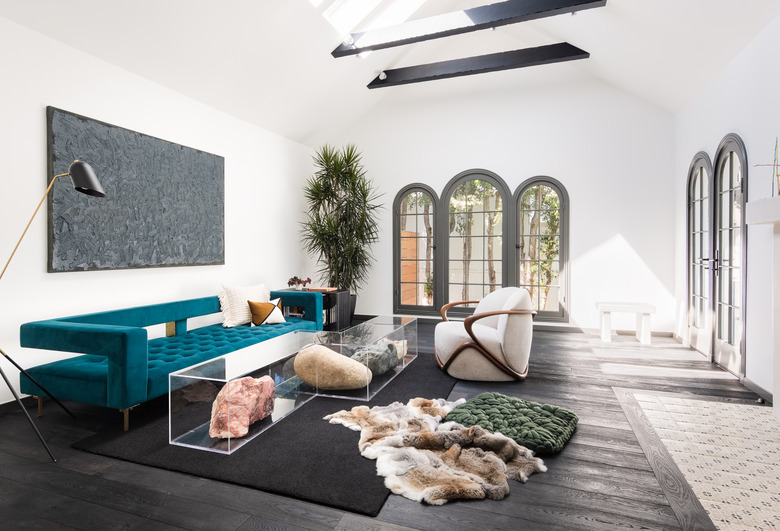
1. Living Room
Weigley and Gerson chose a Los Angeles–inspired palette of soft pink and rich turquoise for the interiors. Sculptural furnishings, including the Nicole Wermers artwork that serves as a coffee table, add to the curated feel.
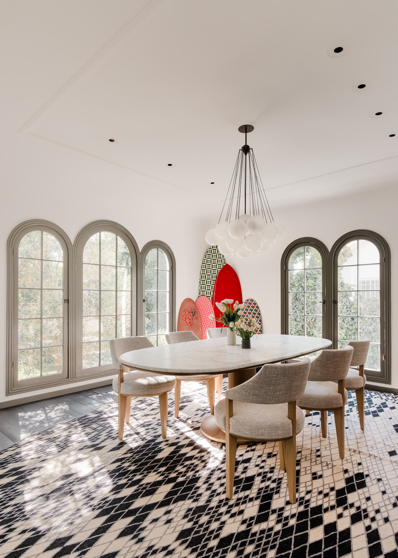
2. Dining Room
A graphic rug by Nanimarquina sets the tone in the dining room, where an Apparatus Studio chandelier hangs above a Giorgetti table and Dmitriy & Co. chairs.
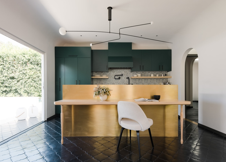
3. Kitchen
"The Spanish Colonial style of home informed the selection of hand-painted terra-cotta tiles, dark toned trims, and wood floors," says Weigley, who opted for deep green cabinets in the kitchen. A brass backsplash and light by Michael Anastassiades add contemporary contrasts to the terra-cotta floor and wall tiles.
4. Breakfast Area
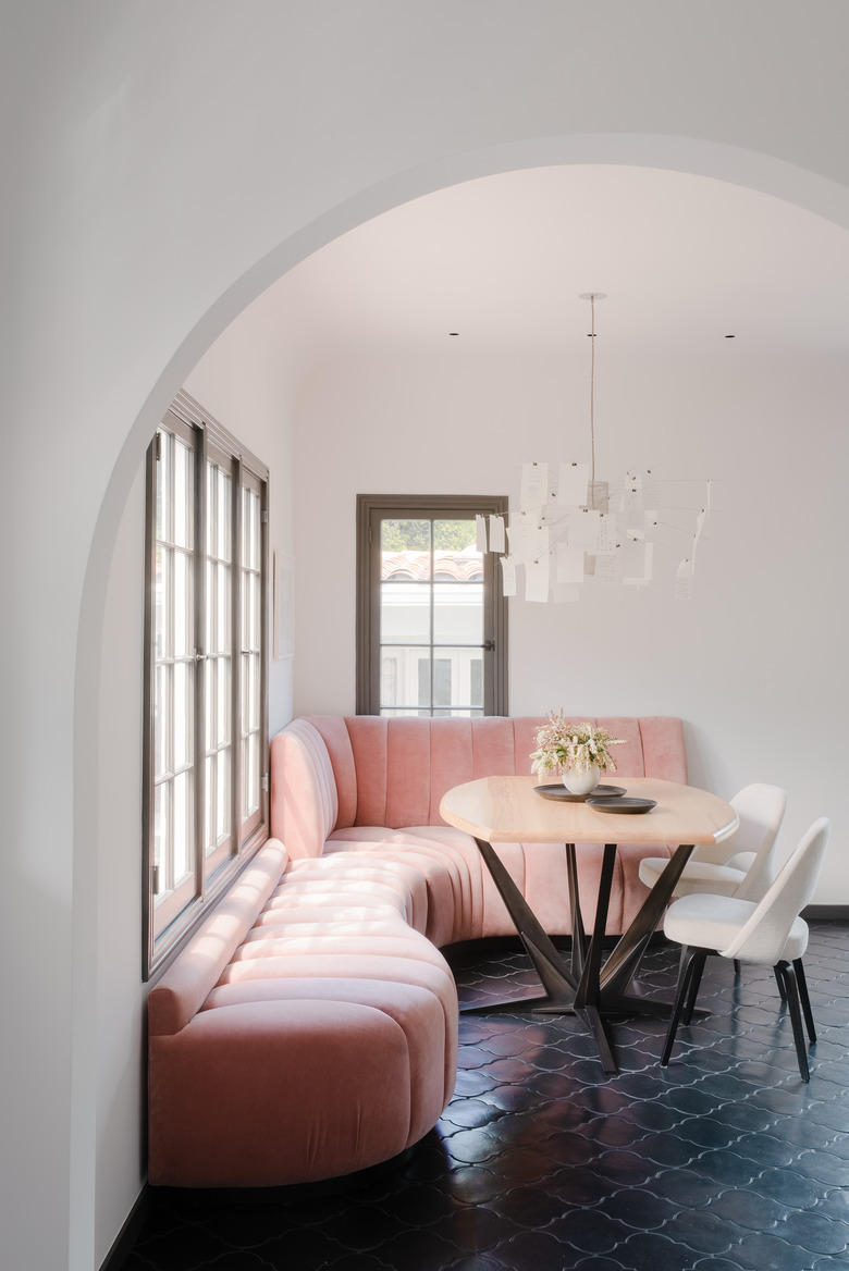
A custom pink banquette curves around the corner of the kitchen's dining area, which is illuminated by a whimsical Ingo Maurer light.
5. Master Bedroom
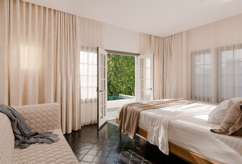
Pale curtains surround the master bedroom, diffusing the natural light and creating an etherial atmosphere.
6. Master Bath
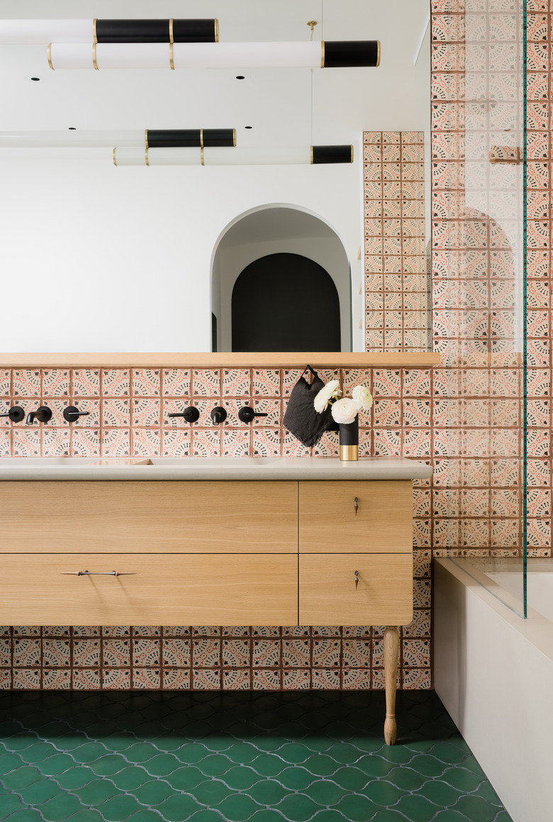
The custom vanity in the master bath was designed with a concrete top by Concreteworks and hardware by Marion Cage. The wall is lined with hand-painted terra-cotta tiles by Tabarka Studio.
7. Kids Room
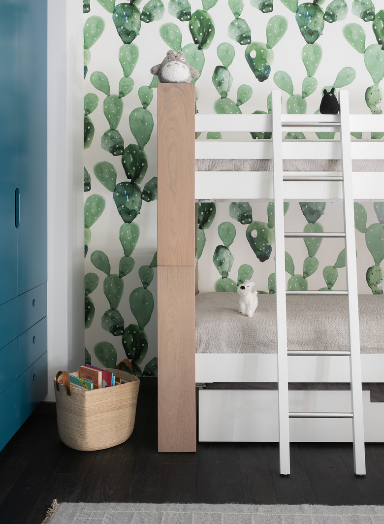
A kids room embraces the Southern California setting with a cactus mural by Anewall. The Duc Duc bunk beds are sleepover-ready and baskets by The Citizenry keep books organized.
8. Kids Bathroom
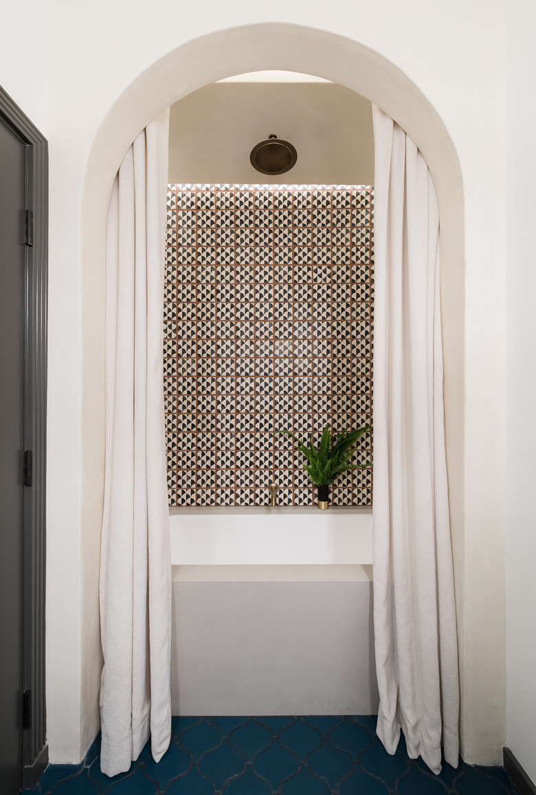
This space proves that a kids bathroom can be just as elegant as the master bath. Concreteworks created the custom tub surround and the walls are lined with another pattern by Tabarka Studio.
9. Lounge
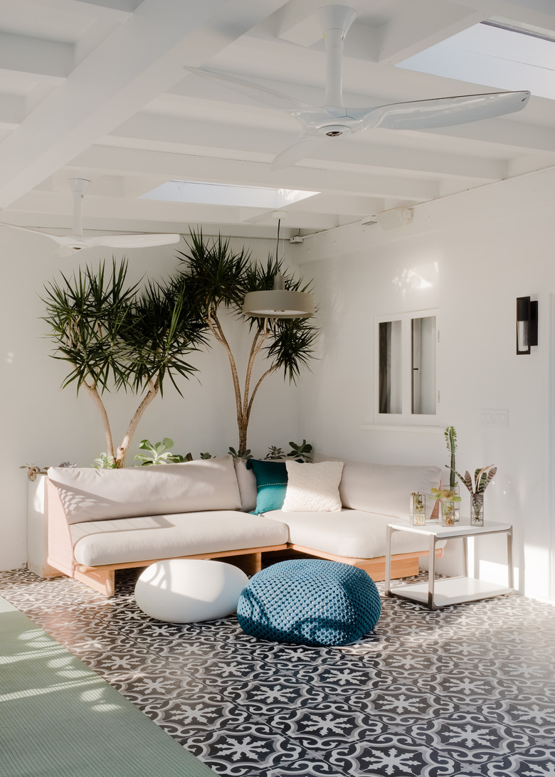
The firm created a covered lounge, giving the family an indoor-outdoor space to relax in.
10. Pool
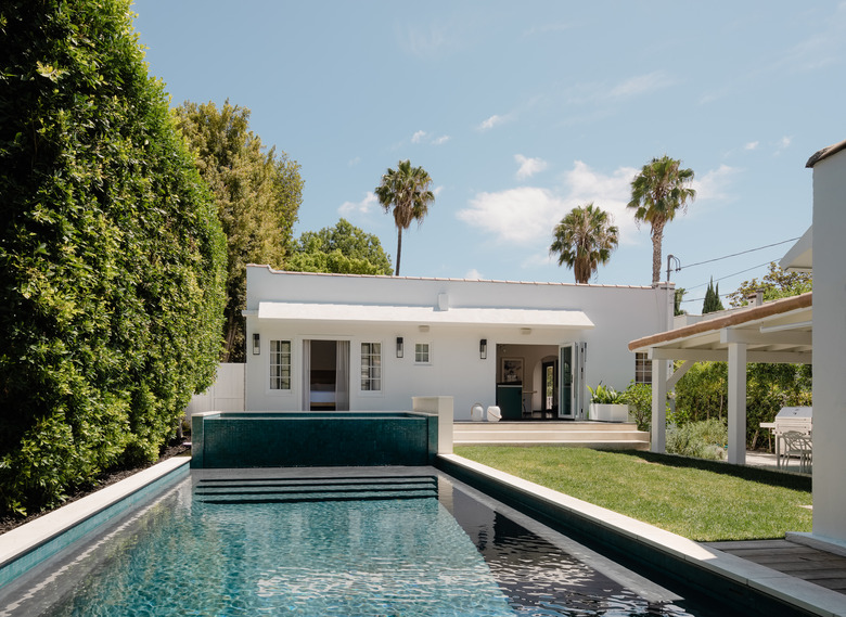
A top priority for the project was making the pool more accessible. "We kept the original pool shape but extended it towards the house with a 6 inch deep 'Baja shelf' and added a seating ledge along each of the long sides," says Gerson. "The client says the kids never want to leave the water."
