But First, Espresso Kitchen Island Ideas
An espresso kitchen island is defined by its dark, rich wood finish — the darker, the better. And, just like the super-caffeinated drink it's named after, it packs a punch all on its own. But like a shot of espresso in a well-made cappuccino or latte (bear with me), a deep, dark island is often made even better and more interesting when mixed with the right design elements: paint, pendants, and textiles, to name a few.
Have an espresso kitchen island, or planning to install one? Here are eight ways to pull off the look without weighing down your culinary space.
1. Counter with glass.
1. Counter with glass.
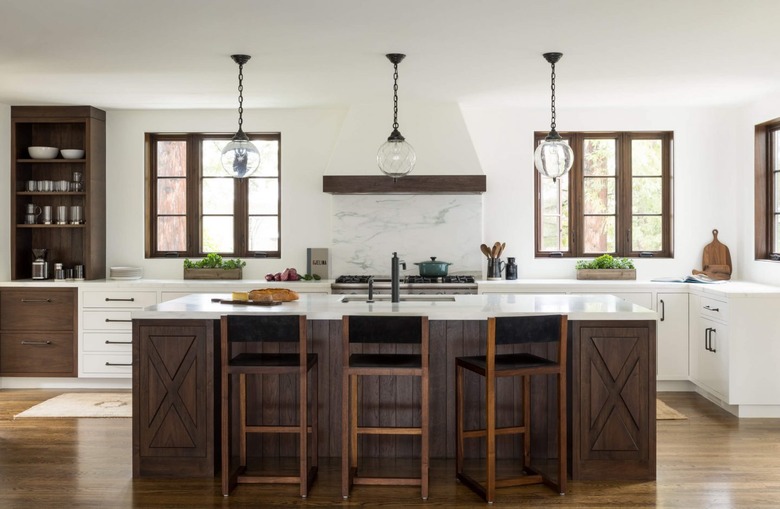
If you have an espresso kitchen island, balance it out with more delicate design elements, like glass pendant lights. They'll draw the eye upward and provide nice contrast to the heavy island below. Let Jute Home show you how it's done.
2. Incorporate shelving.
2. Incorporate shelving.
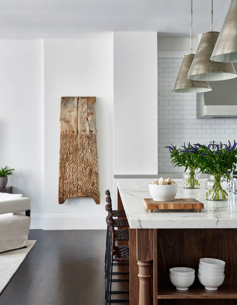
If you're installing an espresso kitchen island, consider incorporating a few shelves on one side like this dreamy setup by Chango & Co. Your favorite white bowls will instantly look sculptural against the dark background.
3. Add a rug.
3. Add a rug.
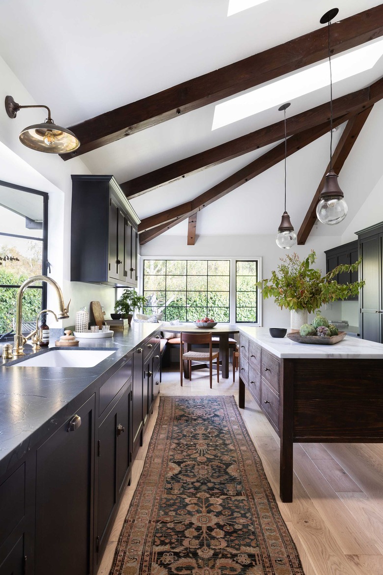
Here's your chance to roll out those rugs in the kitchen: Traditional area rugs and runners in dark and earthy tones go particularly well with a dark-wood island as proven by Amber Lewis with this luxe design. (Dark beams overhead pair nicely, too.)
4. Pair with pale gray.
4. Pair with pale gray.
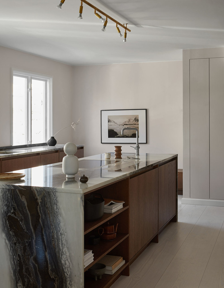
While you might be tempted to go all dark in your culinary space, don't. Limit yourself to a deep, dark, statement-making espresso kitchen island, then pair with a palette of soft, warm grays for a room that's surprisingly serene.
5. Illuminate with a delicate pendant (or three).
5. Illuminate with a delicate pendant (or three).
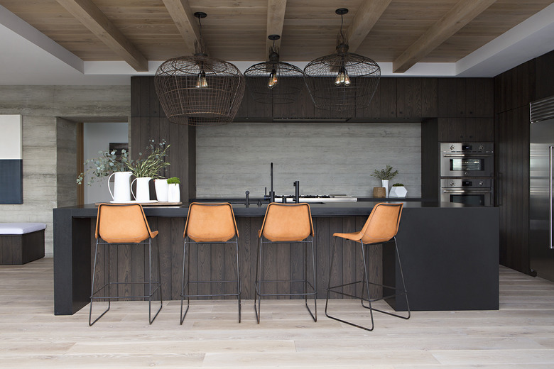
RailiCA Design is showing us how to create an unexpected design moment in a dark-hued cook space: Pair an espresso kitchen island with a light, airy pendant (or three). Here, the woven fixtures add visually interesting layers and texture to the open layout.
6. Keep it midcentury.
6. Keep it midcentury.
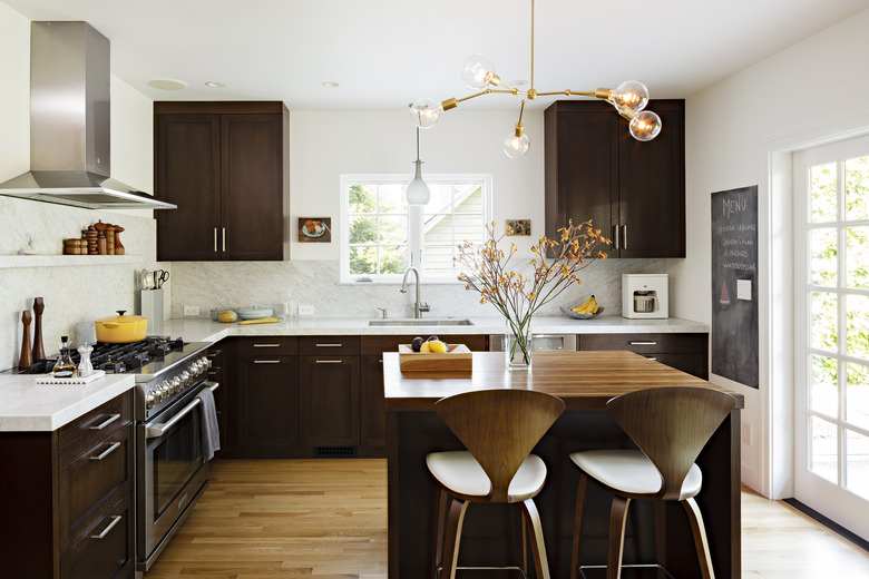
What pairs well with an espresso kitchen island and cabinetry? Midcentury style. Take cues from this timeless culinary space by Risa Boyer Architecture and add mod overhead lighting and a couple of Cherner barstools for good measure.
7. Layer with black and white.
7. Layer with black and white.
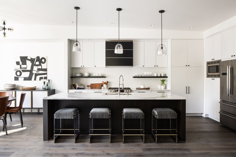
Up the contrast of an espresso kitchen island with lots of crisp, clean white and dashes of black like Tineke Triggs of Artistic Designs for Living did here. Suddenly your culinary headquarters will look modern and two-tone, instead of weighed down.
8. Pair with dark green.
8. Pair with dark green.
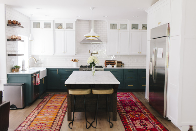
For a kitchen island idea that's particularly of-the-moment, pair a classic, dark-wood peninsula with dark green or navy blue cabinetry, like this design by Tiek Design Group. The rich tones complement each other well. (Optional: Add colorful rugs and accents for an extra pop.)
