We Really Can't Believe This Is An ADU
Accessory Dwelling Units, also known as granny flats or back houses, are having a resurgence in Los Angeles. After new rules made it easier to build ADUs, an Echo Park homeowner decided to add a rental property behind his Craftsman-style house. He turned to Hisako Ichiki and Bo Sundius of Bunch Design and Bunch ADU to create a custom 650-square-foot unit. The owner was willing to give up part of the backyard, but wanted to preserve as much space to garden as possible. "We wanted to work both views and physical parts of the landscape into the ADU design, so we developed a two-story ADU design with a small footprint — a basic "house" shape that runs the width of the property and rests only 8 feet from the rear property line," says Sundius. That 8-foot space gives the ADU its own private courtyard away from the main residence.
1. Living Room
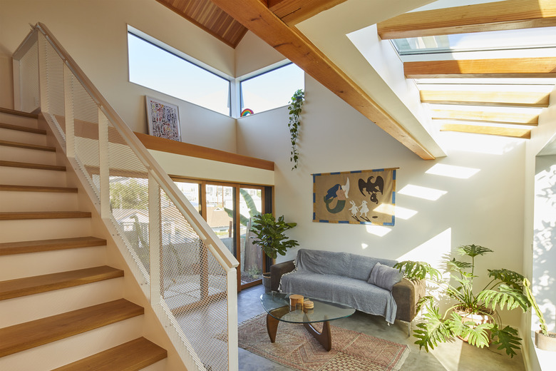
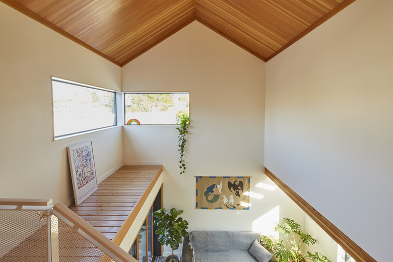
"When you enter into the kitchen, the space is quite compressed, but when you turn to walk towards the living room you catch sight of the skylight and all the sunlight streaming in," says Sundius. "The light seems to beckon you into the living room which is a double volume; it's an old Frank Lloyd Wright technique where you compress the entrance and then open up for the big reveal. This manipulation of space makes the tiny 650-square-foot house feel quite large." Plants fill the space, adding to the connection between indoors and out.
2. Living Room
Strategically placed windows add light while maintaining privacy. "Privacy issues between front house and back ADU are always a concern," says Sundius. "Locating windows as high clerestory or skylights above property walls or framing an opening looking directly at a gorgeous wall or hedge along the rear lot line is a common strategy for us."
3. Kitchen
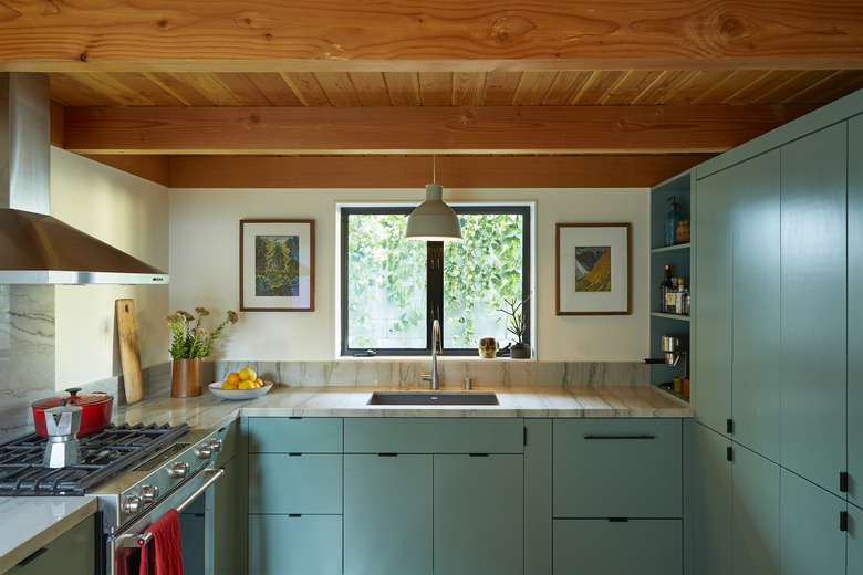
The owner chose the cabinet's green hue, Mother Earth by Dunn Edwards. Since this is a rental property, they picked durable and cost-effective elements, including stone counters from Southland Stone, an IKEA hood, and a Blanco sink. "The kitchen feels like a galley on a ship," says Sundius.
4. Staircase
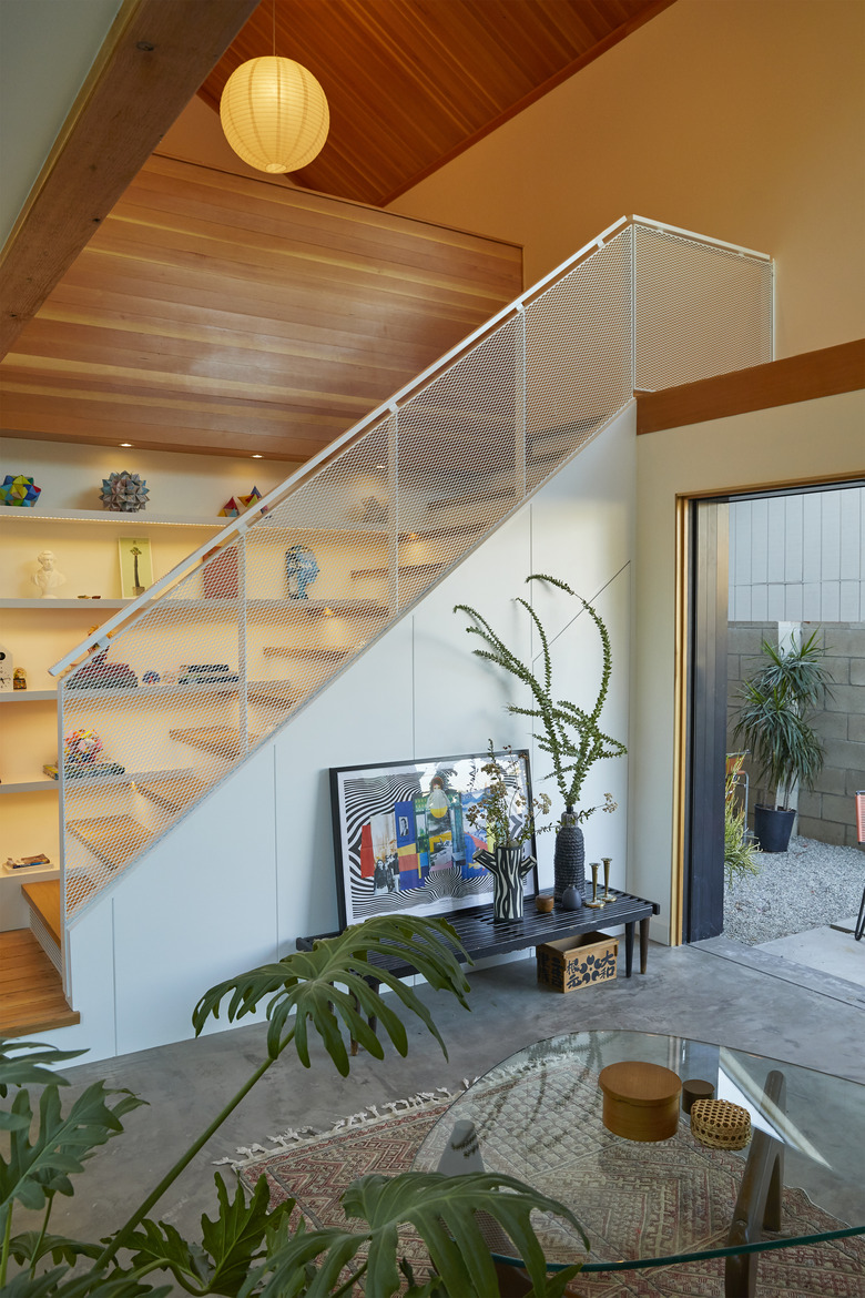
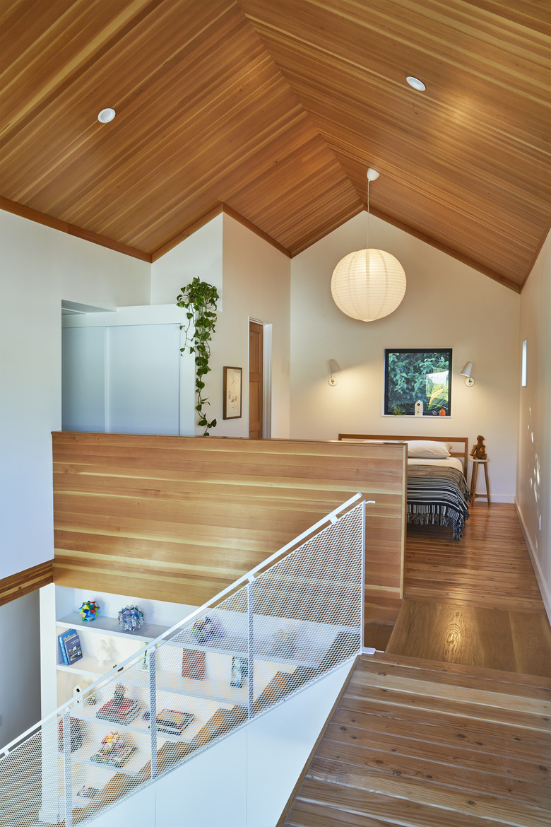
The designers wanted the stairs' guardrail to feel like a net, so they used a white-painted expanded mesh. Shelving lines the staircase, adding storage or a spot to showcase collections.
5. Bedroom
The bedroom is located above the kitchen and feels open to the rest of the home. A simple paper lantern from Chinatown and Cedar & Moss sconces complement the minimalist aesthetic.
6. Bathroom
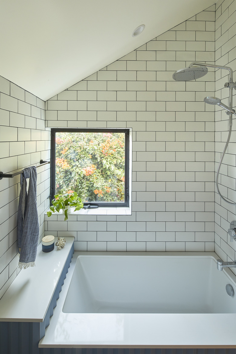
In the bathroom, simple white subway tile mingles with Mutina's deep blue Rombini Triangle tile.
7. Bedroom
The team kept the Douglas fir framing exposed, drawing the eye up to the ceiling of the double-height living area. "Framing is so much better looking than drywall," says Sundius. "I am always sad when all that nice framing work is covered up."
8. Exterior
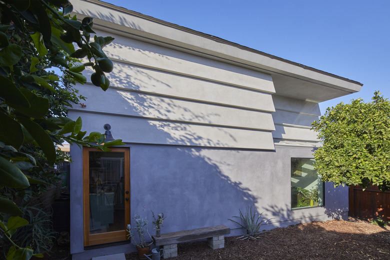
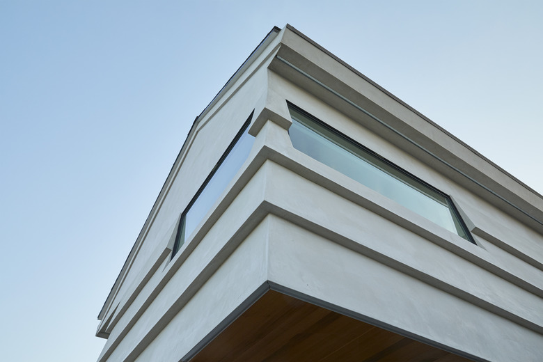
The designers took inspiration from Japanese storage houses called Kura, which they saw on a family road trip. "Kura are two stories, plastered white, and made with inflammable materials," says Sundius. "A family's treasured possessions were kept inside since fire was a common occurrence. The form of these houses and their location on the property inspired our ADU both formally as well as in our choice of plaster and concealed gutters. We wanted the building to look as clean and sharp as these wonderful Kura."
