Minimalism's Enduring Popularity And How To Incorporate It Into Your Space
We may receive a commission on purchases made from links.
Some of us can't stand the sight of too many decor items or the clashing of multiple colors. Something just feels right when a room looks pared-down, clutter-free, and neutral. No need for flashy furniture or bright wall art — just let the basics shine on their own.
The features of minimalism can create a relaxing, stress-reducing atmosphere to walk into at the end of the day. If you're curious about how the style came to be — and how to incorporate it into your home — we're taking a look at this now-iconic aesthetic.
A Brief History of Minimalism
A Brief History of Minimalism
Minimalism as a term is most frequently associated with the Western art movement that emerged around the 1950s. The movement centered on the idea that "art should have its own reality and not be an imitation of some other thing," according a post on the Tate's website. In other words, it didn't have to be representational or even mimic anything you were used to seeing the material world. The movement stands in pretty high contrast to Abstract Expressionism, the popular style that began around the late 1940s and resulted in gestural, layered, frenetic pieces. The aesthetics of minimalism instead focused on geometric shapes, or sometimes even just a single shape.
But minimalism also takes influence from the Japanese concept of wabi-sabi, which embraces imperfection and acknowledges impermanence. It explores a deep simplicity, and you can see a clear through line to Western design (including many celebrity homes). As a whole, Japanese minimalism uses a lot of clean lines, neutral tones, carefully placed tatami mats, and natural materials.
If you look closely, the movement technically overlaps with the characteristics of other styles. The Bauhaus school, which spanned from around 1919 to the early 1930s, focused on creating items that were both beautiful and practical. Some of its most iconic designs, particularly in furniture, would look right at home in a minimalist interior. Once the art movement gained steam in the 1960s, these principles bled into other parts of design and craft. Fast forward to the 1990s, and it seemed to be everywhere as "an entire generation of minimalist architects and designers came to prominence," according to Pamono.
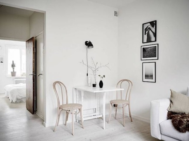
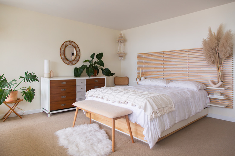
The style, naturally, continues to evolve into different versions of itself. Lately, Scandinavian decor has been having a moment, and many of its main features work perfectly with a minimalist look. A Scandinavian minimalist interior often includes lots of light wood, dried greenery, and clean lines. You can even take this look and incorporate a touch of eclectic decor here and there, like in this Brooklyn townhome with bold art and artsy lighting fixtures.
How to Incorporate Minimalism Into Your Home
How to Incorporate Minimalism Into Your Home
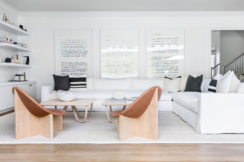
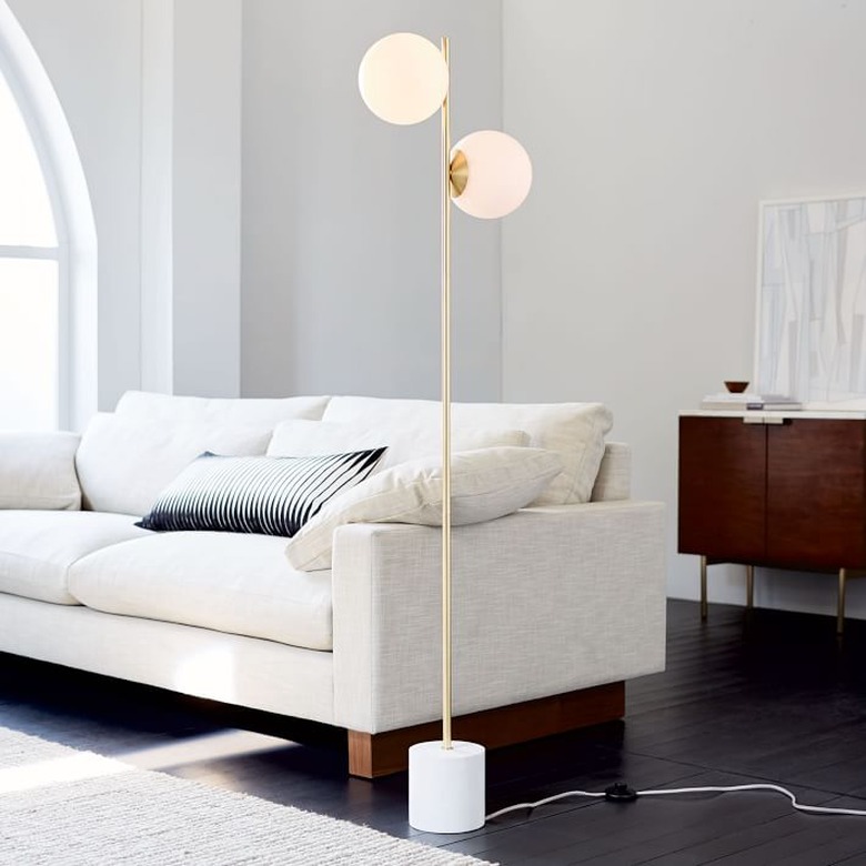
Let's start with your living room. A few key characteristics we often see in rooms that lean towards the pared-down style: white or neutral walls, uncluttered coffee tables, bursts of soft colors, geometric patterns, and plants. When it comes to the living room in particular, make sure these elements come together in a way that invites guests to get cozy. A minimal living room can be both clean and welcoming if you mix textures and visual elements while letting in lots of natural light. Our favorite minimalist spaces also place the emphasis on furniture, especially if you have a rounded or curved couch.
When it comes to the dining room, keep the color palette simple, too. Choose neutral or black accents and perhaps a piece (or two) of dry greenery. Choose chic pieces — like ceramic dinnerware— in light hues to complete the look.
For the bedroom space, it's all about minimal tranquility. Layer blankets and pillow in similar, light tones. Opt for a simple nightstand — or even a hanging one! — that blends into the room.
And don't forget about your bathroom space! Consider a black-and-white color scheme or light wood accents. Stick to simple hardware and just a plant or two for a calming vibe.
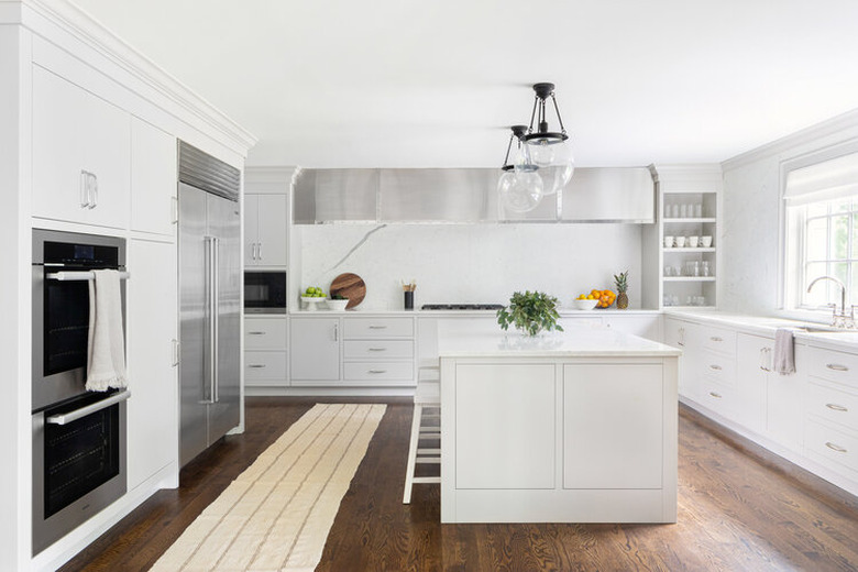
If you're thinking these tips sound tough to use in small spaces, don't give up too soon. There are plenty of workarounds for creating more storage while still sticking to the low-key aesthetic. Consider elements like floating shelves, adjustable furniture, and furniture with hidden organizational features.
Still need more inspiration? We recommend bookmarking social media posts and blog tips from some of our favorite minimalist brands.
Where to Shop Minimalist Decor and Furniture
Where to Shop Minimalist Decor and Furniture
Ready to start designing the minimalist room of your dreams? Here are some of our favorite retailers to check out for pared-down, simple decor, storage, and more.
