How 1920s Design And Decor Works Beautifully In A Modern Context
Style forecasters have been asking whether art deco is the new midcentury modern for a few years now, so it's not necessarily breaking news. I've been seeing some seriously gorgeous '20s decor in hotels, bars, and restaurants across Los Angeles for a while now. Just last year, Red Herring and (the now-defunct) Five Leaves were voted two of the most beautiful new restaurants in Los Angeles, and the new Hoxton Hotel is an Art Deco feast for the eyes. Once the calendar turned to 2020, it was made more or less official: The Roaring '20s are back.
The parallels aren't perfect. The 1920s marked the dawn of the machine age and the birth of mass culture. There was new social freedom (hello, flappers!). There was the exuberance of winning World War I and newfound economic wealth.
Today? Mass culture is fractured (thanks, internet!). Social freedoms are under threat, our most recent wars are never-ending, and class stratification is at an all-time high.
All that said, our eyes are still hungry for something fresh and new — or old, but wonderfully reimagined. And the elegance, ornamentation, and symmetry — even the femininity — of the original Roaring '20s are a welcome answer to neutral minimalism and casual bohemianism, which have held sway for so long.
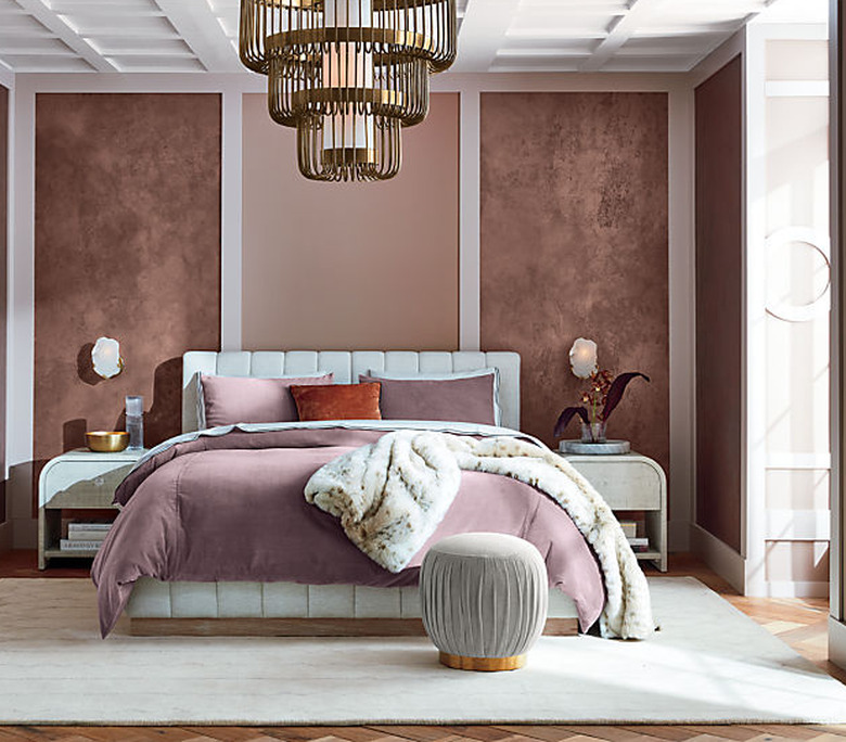
Here are some of the hallmarks of 1920s design and decor that work incredibly well in a modern context.
Repeating patterns. The Machine Age meant you could have a kind of exacting repetition that wasn't possible when so much was handmade. And today, repeating designs offer a kind of soothing symmetry.
Geometry. In that same vein, design with strong geometry came into fashion in the 1920s. Think: chevrons, spheres, sunbursts (which you'll also recognize from midcentury decor).
Symmetry. In the 1920s, things typically came in pairs. Two side tables. Matching accent chairs. Twin sconces. There's a welcome order to things.
Jewel tones. Because the vibe was opulent and rich, the colors of the time were saturated, like rubies, sapphires, emeralds, and, you guessed it, gold.
Black and white. This was probably the gateway for me. Amidst the pops of rich jewel tones, there is a strong black and white palette.
Metallics. The 1920s welcomed all things shiny — chrome, brass, lacquer, and stainless steel. Mirrored furniture is now a thing.
Bauhaus. While art deco is most closely associated with the 1920s, you can't overlook the birth of the Bauhaus, our gateway to modernism.
Curves. In particular, curved furniture. And, machines make this possible: "New steel manufacturing techniques made it possible to incorporate polished metal into furniture, which allowed for dramatic arcs and contours."
"Exotic" motifs. I think of all the gorgeous old theaters across Los Angeles. What do you see? Lots of nude female figures. Animals. Feathers. Leaves. Sunrays. And strong influences from Native American, Aztec, and Egyptian cultures.
Layered on upon the next, these elements can feel overly decorative and dated — which is why they eventually fell out of favor. But used thoughtfully, '20s accents can elevate a space, bringing back a certain sophistication without screaming Great Gatsby at every turn.
