These Bold Kitchen Floor Tile Patterns Are Not For The Timid
You see a lot of bold patterns in the home, but they're not always kitchen floor tile patterns. People tend to think that because the kitchen floor tile anchors the room it should be solid or neutral, with wood planks, slate, or something similar. Luckily, though, that's not always the case. Pattern tile is popping up in interesting kitchens everywhere.
Why are there so many great kitchen floor tile patterns on-trend right now?
"The simple answer is because there are now more patterns to choose from and these patterns are tasteful, and not overbearing," says Katie Michael-Battaglia, design director at Nemo Tile + Stone. In fact, bold kitchen floor tile patterns and porcelain trickled down from the hospitality space. But there are practical reasons to choose pattern as well.
"Using bold patterns in the floor is a way of directing attention to the floor, as opposed to an area of the space that the designer doesn't want [to highlight]," according to Michael-Battaglia. "It also can help enliven a small space [without] using a ton of pattern on the walls, which in a small space may feel enclosing."
Here are eight ways to use kitchen floor tile patterns that will sell you on the trend.
1. Add personality to a small space.
1. Add personality to a small space.
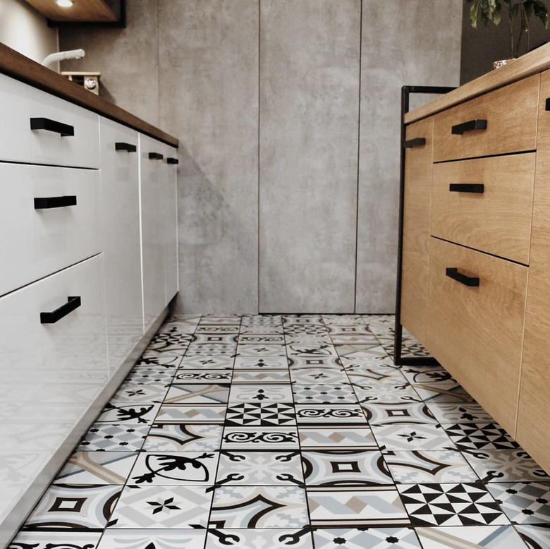
In this cute little Polish apartment, boisterously mismatched patterned tile from Vives Cerámica gives life to the modern galley kitchen. Otherwise, though, the palette is minimal with blonde wood, white, and black. This is how to make a small cook space feel impactful.
2. Reinvent the classic checkerboard.
2. Reinvent the classic checkerboard.
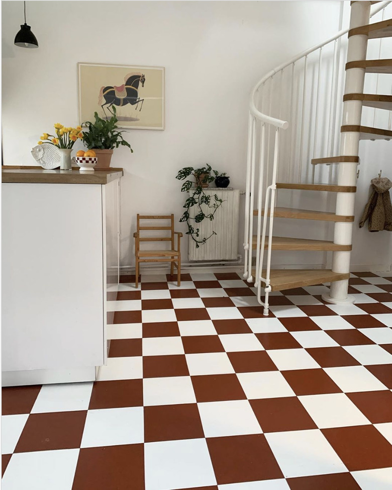
We love this uber-stylish Danish home. Instead of using classic black and white kitchen tile, the owner went with a refreshing rust accent. She shared, "[If you told me a few years ago] I would end up with a floor that actually has a color, I probably would have laughed at you." She embraced this on-trend hue, though. And you can too; consider your home's existing palette. Then pick a similarly bold accent color. Turquoise? Red? Bright yellow? The checkerboard keeps the design familiar, while a new color brings in vibrancy.
3. Have fun with it.
3. Have fun with it.
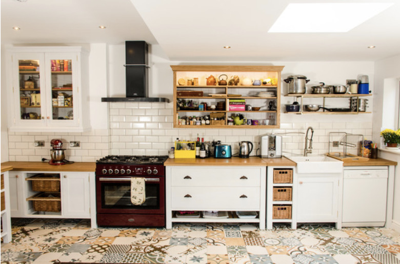
Here's another really bold kitchen floor tile pattern, this time in a somewhat rustic kitchen. In contrast with the white wood cabinets from Clachan Wood, the mixed floor tiles are colorful. They have a quilt-like feel that is both quaint and modern. If you wanted a way to do grandma chic, this is it.
4. Use dense patterns to create texture.
4. Use dense patterns to create texture.
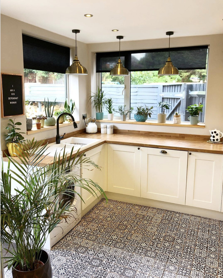
Charlotte Molesworth from My British Home went with Moroccan kitchen floor tiles in a modern colorway. The density of the design makes it seem more like texture than pattern, though. And overall, it's a nice counterpoint to the classic white kitchen cabinets and wood countertops.
5. Extend up the wall to define the space.
5. Extend up the wall to define the space.
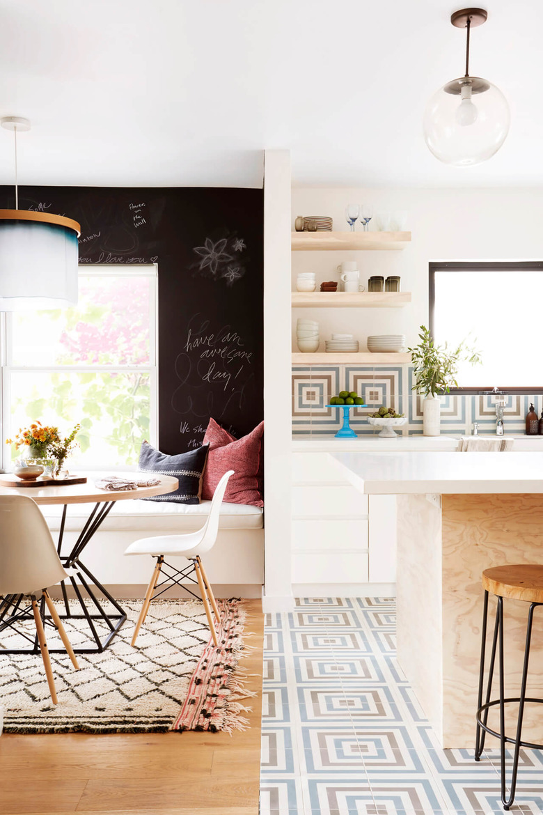
If it's good enough for the floor, it's good enough for the wall, right? This graphic kitchen floor tile pattern with hints of midcentury modern in a sunny SoCal kitchen works equally well on the kitchen accent wall. Not only does the tile make the open kitchen shelving pop, the pattern really helps define the space.
6. Use an unexpected pattern in a neutral color.
6. Use an unexpected pattern in a neutral color.
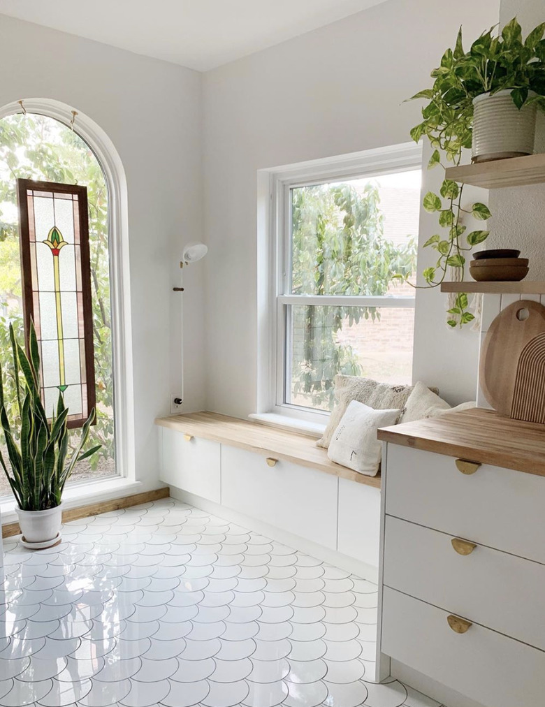
You don't always have to rely on color to make a bold statement with your tile. Here, the art deco scalloped pattern is everything. White kitchen floor tile might seem tricky because it can be hard to keep clean. But here, Bri Ussery of Dor Design House stays true to her white kitchen design while adding a lot of visual interest through pattern alone.
7. Use classic tiles in modern ways.
7. Use classic tiles in modern ways.
Kitchen floor tile patterns don't have to be busy to make an impact. Take these cream-colored hex tiles. They look vintage, but they're budget-friendly. Plus, the floor adds incredible period charm to a more Scandinavian cooking area.
8. Emulate your favorite restaurant.
8. Emulate your favorite restaurant.
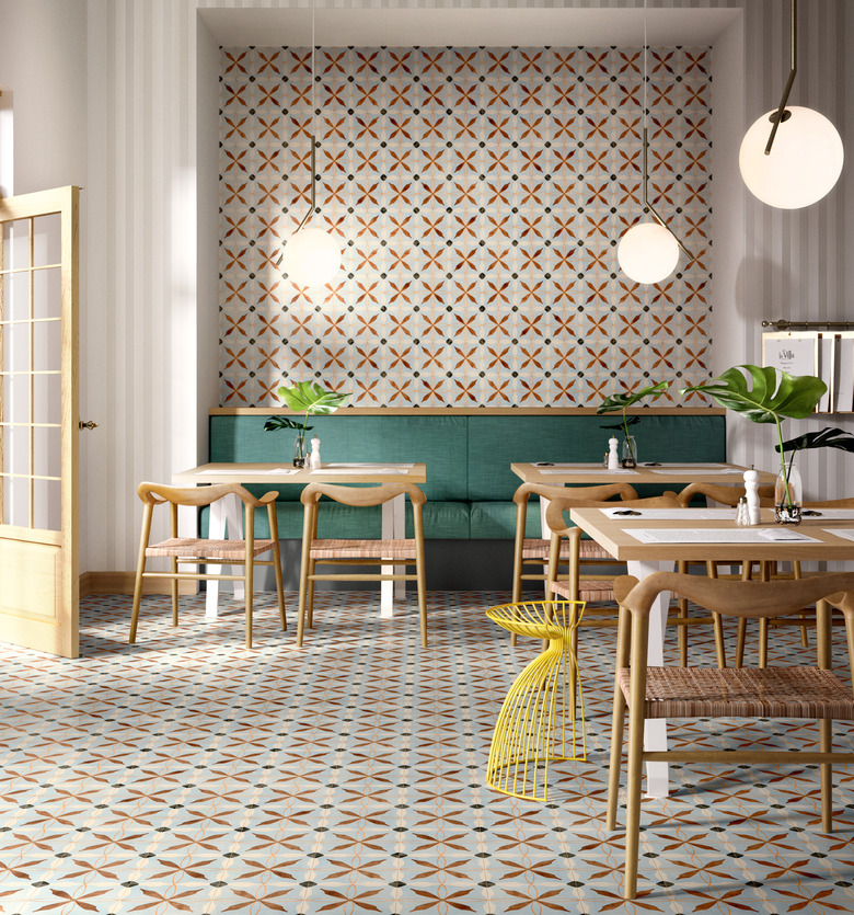
As Michael-Battaglia notes, restaurant and hotel designs often inspire kitchen floor tile patterns in the home. And in this thoroughly modern restaurant, the repeating tile has an almost woven feel. It would totally work in a home kitchen punctuated with bright yellow accents, natural wood chairs, and pendant lights. The tile turns all the disparate elements into one cohesive space.
