A Midcentury Home Gets A Cool Update For 2020
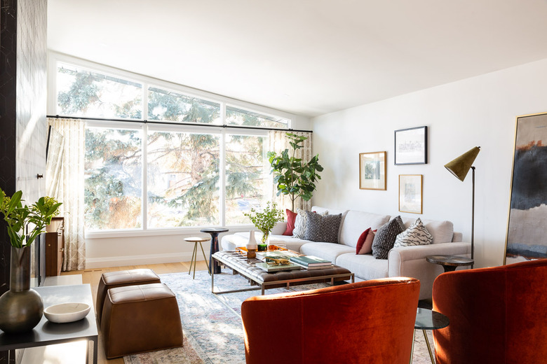
A family's 1950s-era home in Calgary was full of midcentury details, but it also hadn't been updated since it was built, meaning it was time for a major refresh. Designer Aly Velji knew she wanted to save some of the original elements that worked with the clients' lifestyle — such as the wood-burning fireplace, huge windows, and abundant natural light — while making the layout more open and better suited to modern living. "We love the midcentury style and did not want to take this away as this was the heritage of the home," she says. The designer worked to create a design that was "midcentury with a twist," adding bold details, such as geometric tiles in the entry and an eye-catching fireplace surround in the living room.
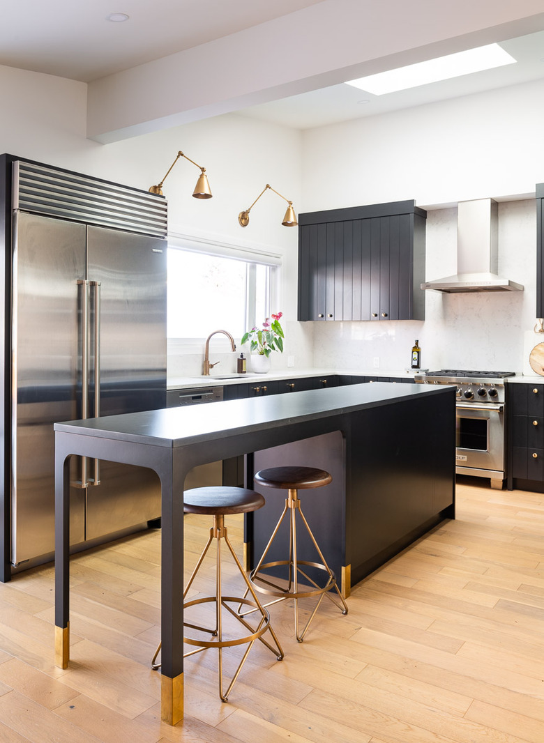
First, she completely reworked the interior and exterior. "It was basically a full gut of the home and we took it down to the studs to rearrange the upper level plan, update the kitchens, bathrooms, and exterior," she says. The clients entertain frequently, so the dining area and kitchen were top priorities. For the kitchen, Velji installed black cabinets and a long island that can be used for prep, serving, and dining.
While Velji used light wood and black accents throughout the home, she balanced the modern elements with a warm color palette to give the home a cozy and welcoming vibe. "We chose a gorgeous burnt orange, olive green, and mustard as accent colors for the home which really helped to warm up the overall feeling in the space." The end result blends the best of midcentury and 21st century style for a comfortable family retreat.
1. Entry
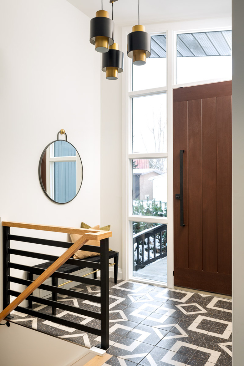
Velji added plenty of geometric accents to the entry, including the Saltillo floor tile, West Elm mirror, and Arteriors light. "The entry way in the home was lackluster so we knew we wanted to make this a focal point," the designer says. "We made this space larger by expanding the doorway out a couple of feet, tiling the entry in a gorgeous patterned terrazzo tile, expanding the doorway by adding in side panels in glass to let in more light, designing a custom stair railing that helped to open up the space, and painting the stone a bright white."
2. Living Room
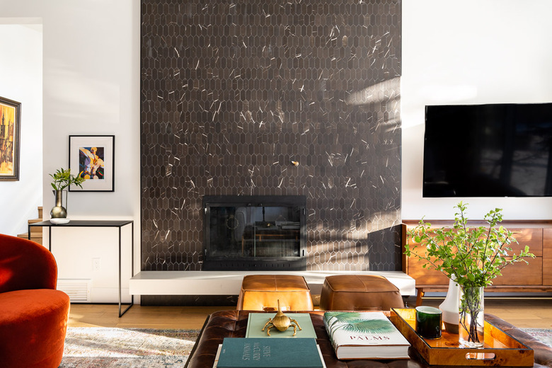
The fireplace became the focal point of the living room thanks a new accent wall of black Daltile and a sleek floating hearth. "The inspiration was to have a space that was sophisticated but not stuffy and one that had a nod to the midcentury heritage of the home," says Velji. "There is a fine line with midcentury as you don't want the spaces to look too dated. The key is to ensure you are using a mix of old and new and using texture to create interest."
3. Dining Room
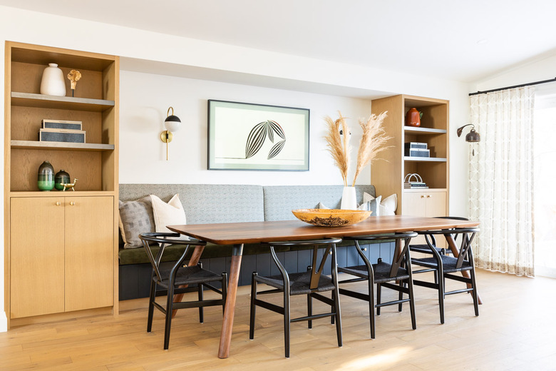
Built-in storage and seating make the most of the dining room's alcove. A table by Möbius Objects is pulled up to the banquette, which is illuminated by Mitzi sconces.
4. Kitchen
The kitchen's millwork was painted in Benjamin Moore Black and Velji added brass accents including sconces and barstools from Wayfair.
5. Bedroom
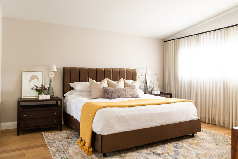
The master suite was decorated with warm hues such as chocolate brown and marigold. Velji installed grasscloth wallpaper from Fabricut for subtle texture and furnished the space with a bed and rug from Lulu and Georgia and nightstands from Crate & Barrel.
6. Bedroom
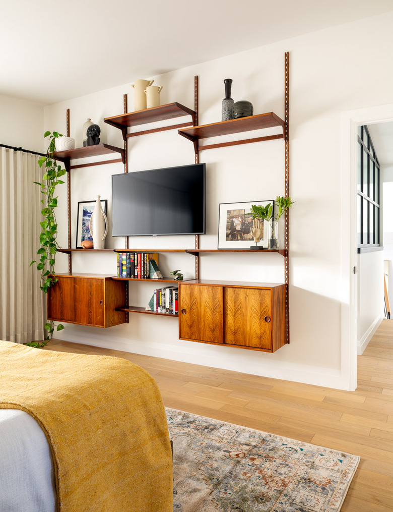
A wall unit from Reclaim to Fame in the master bedroom gives a nod to the home's midcentury roots.
7. Bathroom
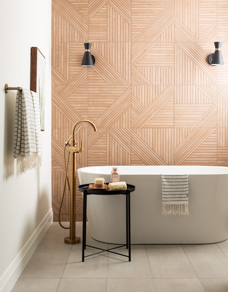
Porcelain tiles that resemble carved wood from Tile Inspired line the wall behind the soaking tub in the master ensuite bathroom.
8. Bathroom
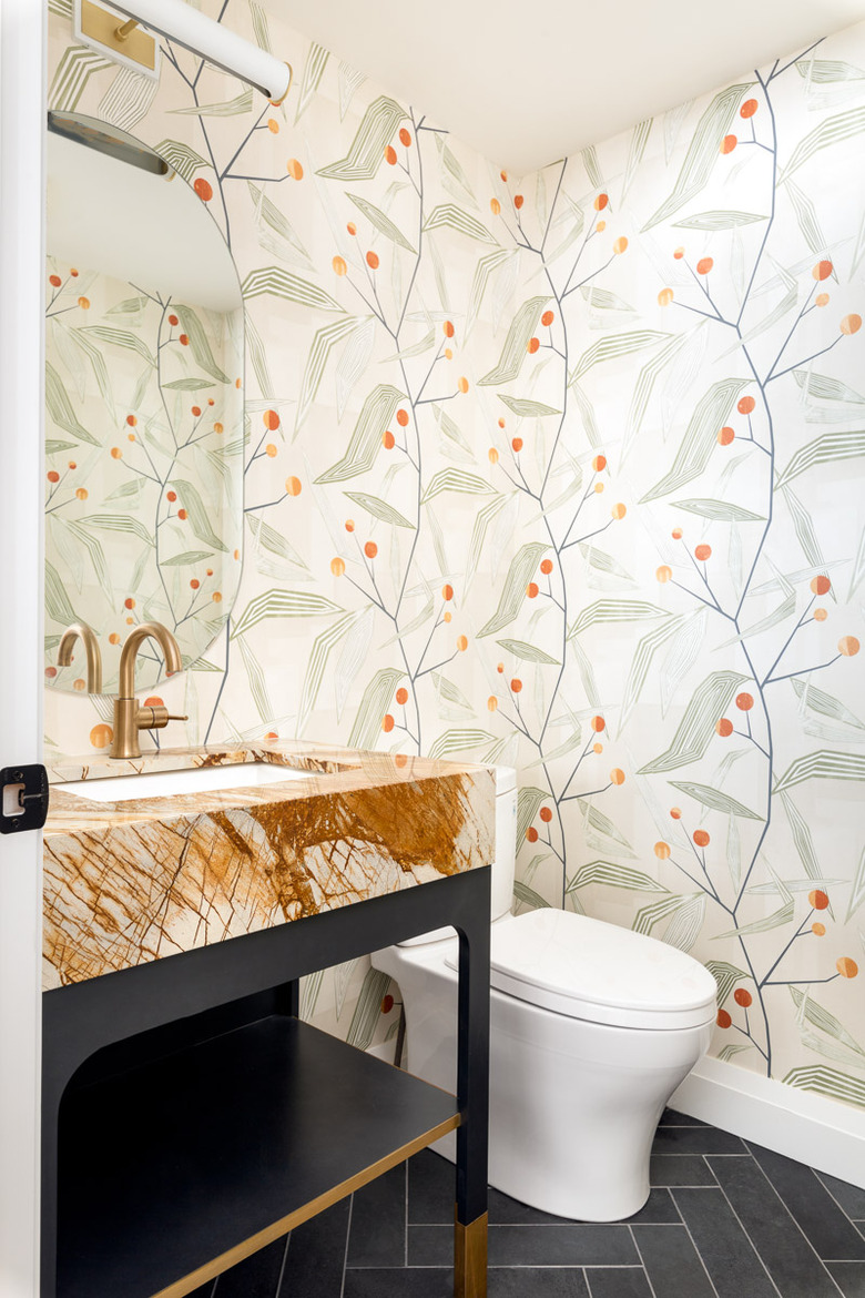
Botanical wallpaper adds whimsy to a powder room and compliments the vanity's bold stone countertop.
