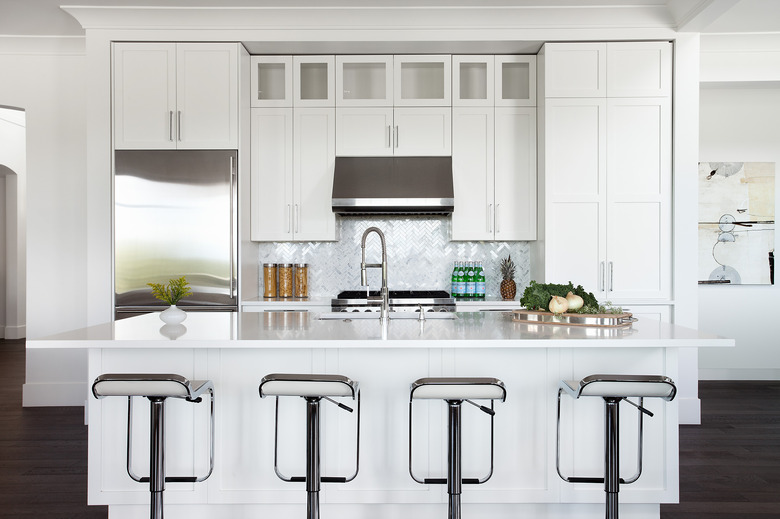
5 Kitchen Reno Tips From Netflix's "Restaurants On The Edge" Designer Karin Bohn
Karin Bohn has been passionate about design since she was a child: "I was hyper-aware of whether people were comfortable in a space, how furniture was set up, what lighting looked like and the colors on the walls," she says. And so it should come as no surprise that she became an interior designer, despite her initial idea to go into fashion design. Today, the Vancouver-based interior designer runs her own firm, House of Bohn, which she started 11 years ago, and works on a range of residential, hospitality, restaurant, and boutique commercial work.
But most recently, her design career has taken an exciting, globe-trotting turn: Karin is now one of the co-hosts for the Netflix show Restaurants on the Edge, where she's been in charge of designing and reimagining the renovation of restaurants all across the world, from Malta to Costa Rica, Hong Kong to Arizona. With Season 2 of the show coming out on May 8, we took a few moments to speak with her and gain some insights about how she goes about designing one of the most critical spaces in any home: the kitchen. Read on to see what suggestions she has in store.
1. When possible, start from a blank canvas.
1. When possible, start from a blank canvas.
When she's working on a new project, Karin ideally likes to start with a blank canvas. "I really like a space to have a completely cohesive look and feel," she explains. "If I can gut a space completely, I will!" This allows for as much flexibility and freshness in the new space as possible, opening up a world of options and opportunities.
2. Otherwise, work with what you've got.
2. Otherwise, work with what you've got.
If she's working in an existing space that has great architectural elements, Karin recommends keeping as much as possible. Elements like high ceilings, grand windows, or character-infusing moldings and casings make a space special. "Retaining and celebrating the old, heritage architectural elements is always part of my design philosophy," she says.
3. Hardware and countertop selection can add that personal touch.
3. Hardware and countertop selection can add that personal touch.
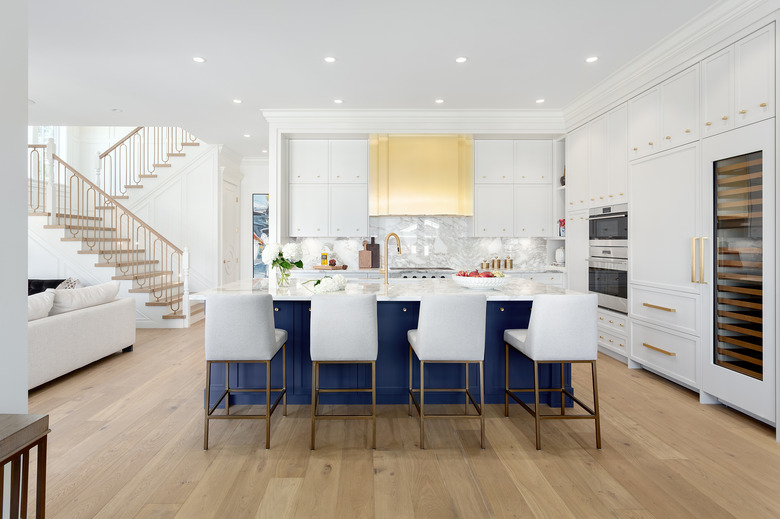
White kitchens are a staple in the design world, but they can get bland (and show dirt and wear and tear) pretty quickly. To avoid this, Karin recommends changing out the hardware on cabinets and drawers. "Black or brass hardware on white cabinets can give the space an instantly refreshed feel with amazing contrast that is less than bland!" If that's not enough for you, Karin says she would pair a white kitchen with a bolder stone countertop or tile backsplash. "Adding that element of texture and visual interest can go a long way for adding flavor to a white kitchen," she notes.
4. Maximize height in smaller spaces.
4. Maximize height in smaller spaces.
"One of my favorite ways to maximize storage and space is to utilize otherwise wasted space in height. Building shelves or utilizing space up high can be a really great way to bring your eye up and in return, have a few extra inches for storage," she says.
A few other recommendations she suggests are installing specialty accessories like magic corners, spice organizers, or pantry pull-outs to maximize even the funky-shaped corners. And mirrors, she says, "can make a space feel larger and brighter!"
5. Mix high and low.
5. Mix high and low.
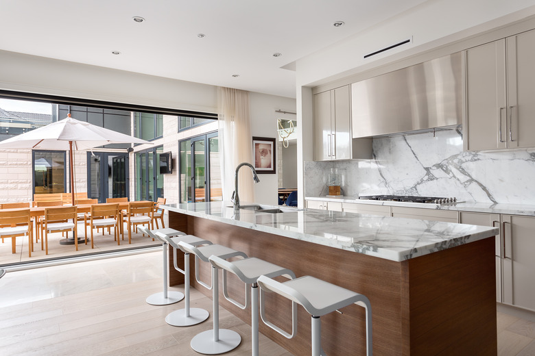
Kitchens can be a notoriously expensive renovation, so Karin says that one way she saved big bucks in her own kitchen is that she paired an IKEA butcher block island countertop that cost her less than $200 with a "gorgeous marble backsplash and countertop." Mixing and matching materials and incorporating higher-end items alongside more tenable pieces gives you "a much more curated look with a beautiful, lived-in feel," she advises.


