A Risky Color Palette Pays Off In This London Victorian
Merging design styles when you get married can be a challenge. For one couple in South London, blending her French country furnishings and his contemporary pieces felt impossible, so they found the perfect mediators: Russell Whitehead and Jordan Cluroe of 2LG Studio. The designers, who recently published their first book, Making Living Lovely, are used to working with couples who have opposing design ideas. "The objective was to bring them together and create a design that represented both of them," says Cluroe.
The couple wanted something bold and colorful — 2LG Studio's specialty. Whitehead and Cluroe chose a palette of pink and blue with elements of lilac, black, and white. "In a very literal sense, it brings masculine and feminine colors together, although we try to avoid gendering colors," says Cluroe.
The designers also took inspiration from the home's Victorian architecture. "We've unified the period features throughout by having the one floor color that connects all the spaces downstairs," says Whitehead. The sitting room's stately marble fireplace influenced the coffee table and kitchen backsplash.
The result is lively, colorful, and best of all, everything the husband and wife both wanted. Says Whitehead. "What happens when neither person compromises — that, for us, is when the magic happens.
1. Living Room
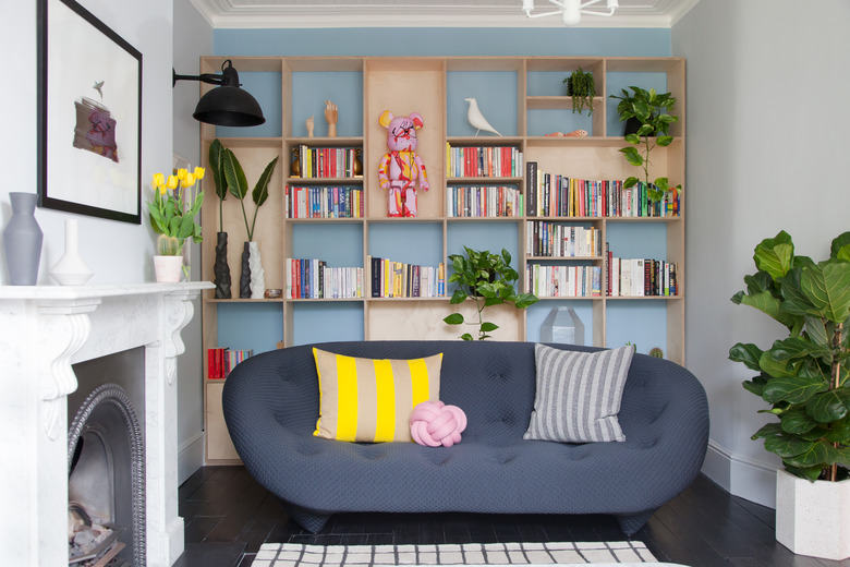
The sitting room was very narrow so the designers added a built-in bookcase brought and the Ligne Roset sofa closer to the center of the space. "We introduced the bright pop of blue behind that to make it stand out," says Whitehead.
2. Living Room
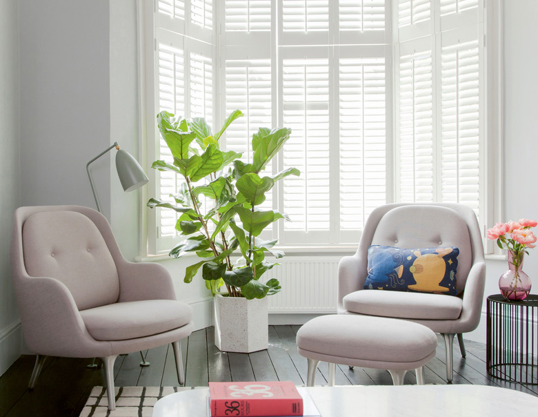
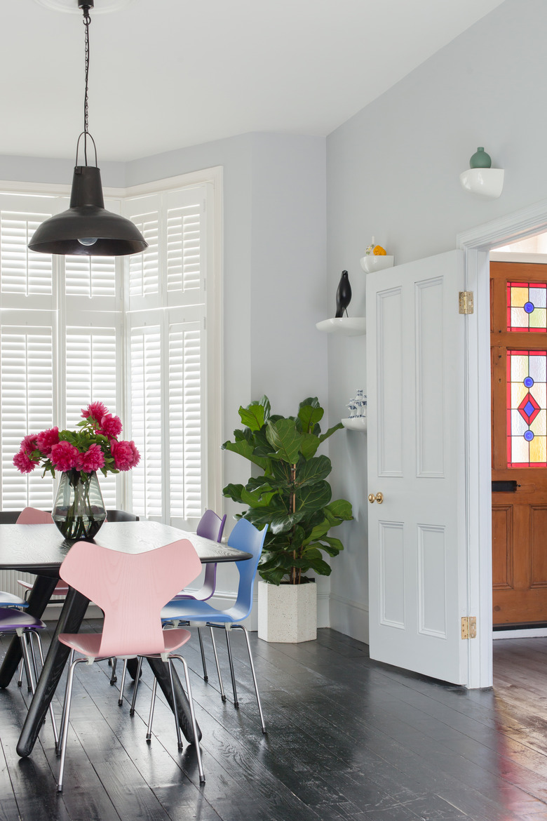
A pair of Fritz Hansen chairs sit beside the bay window at the opposite end of the sitting room, adding a hint of soft pink to the space.
3. Hallway
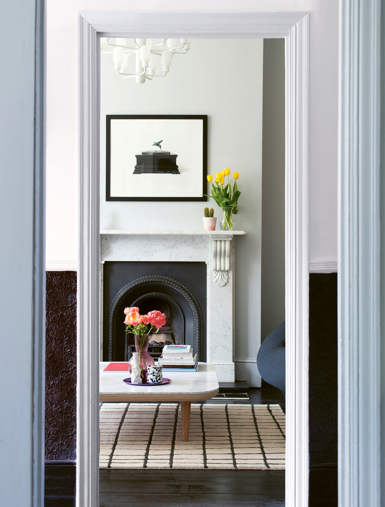
Black floors gave the designers freedom to go wild with color. "The whole color scheme is grounded through this black throughline of the flooring," says Cluroe. The entry hall is lined with embossed wallpaper, which they incorporated throughout the home. "[The embossed wallpaper has] fallen out of favor, but for us it was something that was cool and we were keen to bring back."
4. Dining Room
"The dining room is where all the colors come together," says Cluroe. Pink, lilac, and blue chairs surround a Tom Dixon dining table, which they chose to help anchor the space. "Above, there's a vintage, industrial piece of lighting which stops the look from being too one-note," says Whitehead.
5. Kitchen
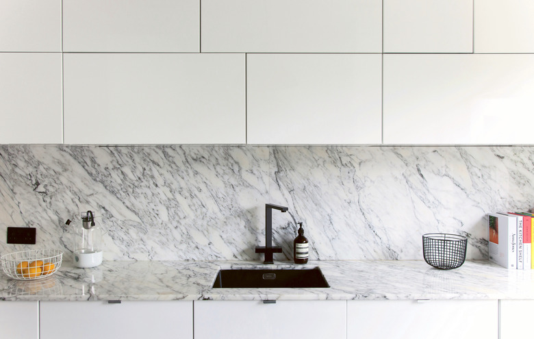
They kept the kitchen streamlined and minimalist. "The couple really wanted to fit some sort of island in, but we felt the space wasn't large enough, so we encouraged them to treat their kitchen table as the heart of the kitchen and allow themselves to enjoy the space in the middle of the kitchen," says Whitehead. The marble backsplash was chosen as a nod the fireplace in the sitting room.
6. Nursery
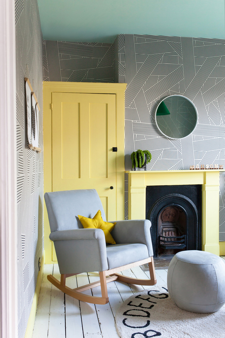
"The nursery was the one place where we used a pattern but even the pattern is geometric," says Cluroe. "We used it on all surfaces and it really reads as a texture." They painted the ceiling in a minty green and used a sunny yellow for the door, moldings, and fireplace.
7. Bathroom
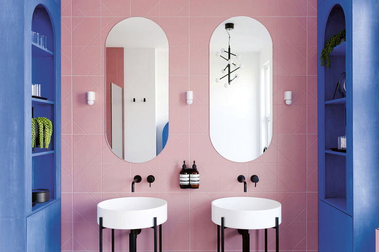
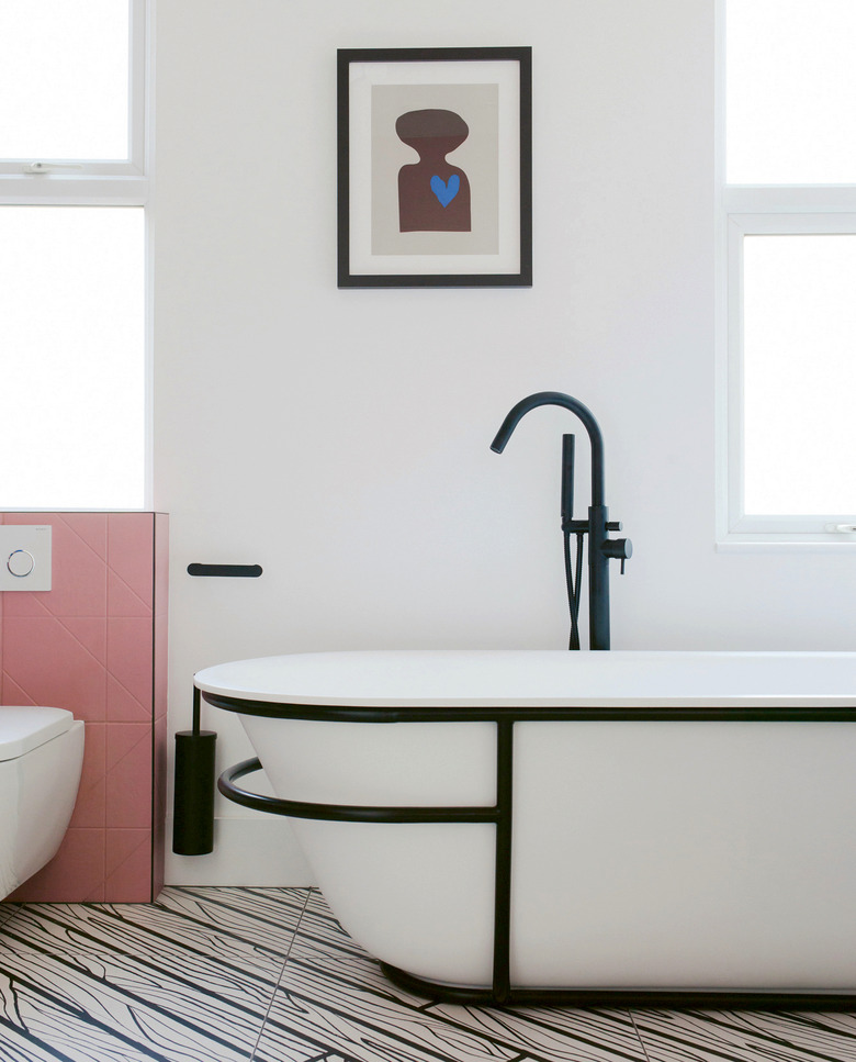
"The bathroom was one of those designs that we presented to the client with the knowledge that we possibly weren't going to be able to get them all the way there, but we were very lucky that they absolutely loved it and they went with it," Whitehead says of the bold bathroom. The designers found inexpensive tile to use on the walls, which allowed them to splurge on fixtures and fittings, including sconces by Micheal Anastassiades and Ex.t sinks. The mirrors and shelving were designed by 2LG Studio.
8. Bathroom
The bathroom's vivid color scheme is balanced out with black and white elements such as the Lusso Stone tub and faux-wood Ornamenta tiles.
