A Couple In Tucson Cuts Their Two Bedroom Home Down To One
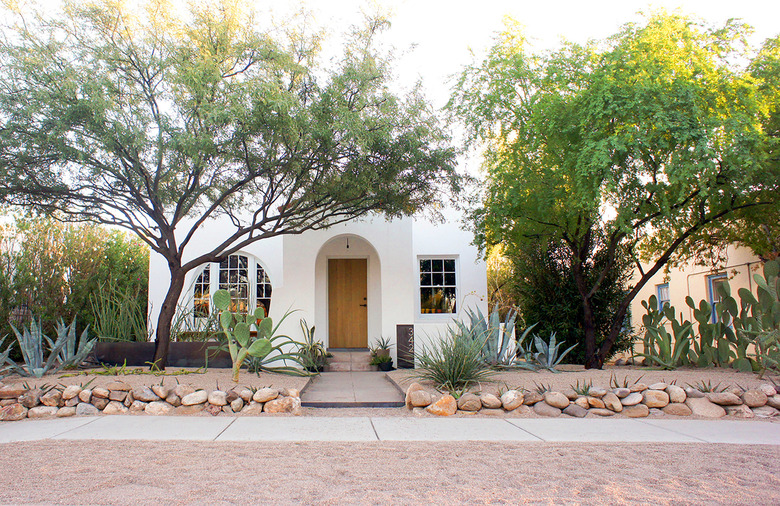
When architects Dale Rush and Darci Hazelbaker started renovating their 1920s Tucson home, they knew they wanted to keep things simple and functional. Part of that was due to their $40,000 budget, as well as the fact that they were their own builders, doing all the work except for the stucco. They also didn't want to lose the historical character of the home.
The house had two bedrooms and one bathroom, but they decided to redo the layout and sacrifice a bedroom in order to have a bigger bathroom, more storage in the bedroom, and more usable space in the living room. The new floor plan also brought in the bright desert light. "Opening up the layout to allow for natural light was also a priority since the house was small," says Hazelbaker.
They made sure to retain some of the original details and reused materials, such as the wood cladding around the entrance to the bathroom from the living room. "Renovations of historic homes are always intriguing to us as we enjoy honoring the sense of past and place of the previous owners who lived there, while making necessary updates that address present day realities," says Rush.
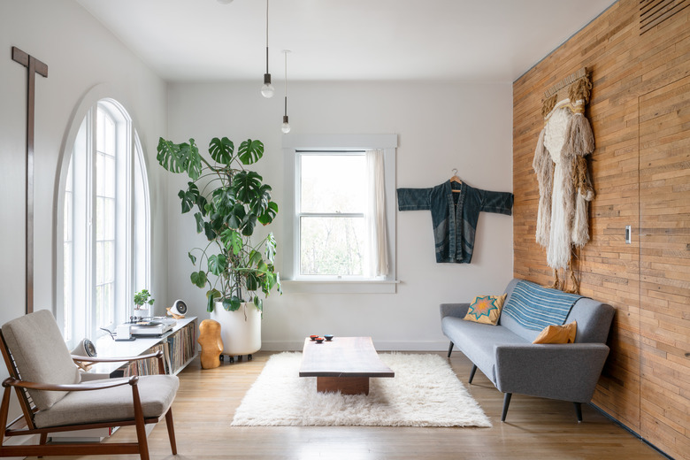
1. Living Room
The living room is filled with a mix of midcentury pieces and the couple's own designs, including the record shelf and coffee table. "We have been collecting midcentury pieces since our early twenties." says Hazelbaker. "The T-square was from the estate of a well known Albuquerque architect, George Pearl, and the Finn Juhl chair was from the first estate sale we went to when we moved to Tucson."
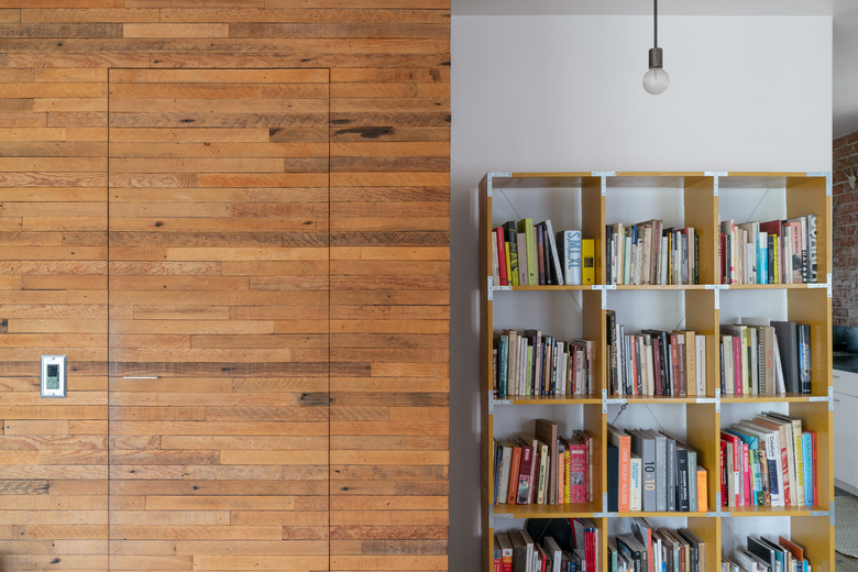
2. Living Room
A custom bookshelf made by the couple sits beside the entrance to the bathroom. "We left some of the old details and materials to contrast with the new, such as repurposing the wood lath as cladding around the bathroom volume," says Rush. "We pulled all the nails, gave them a quick sand, and then put them back up on the walls in a similar way."
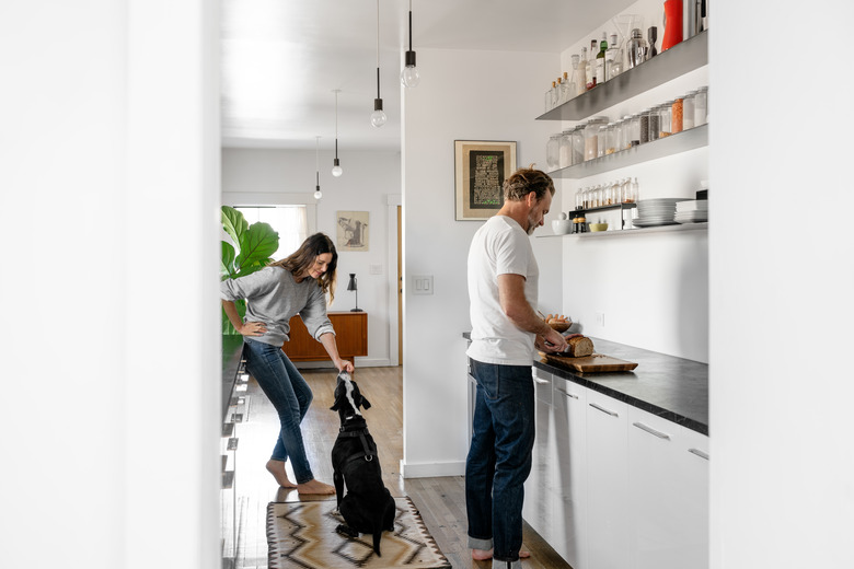
3. Kitchen
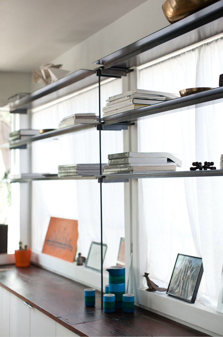
In the kitchen, they topped IKEA cabinets with soapstone countertops and installed custom steel shelves. They kept the walls white throughout the home. "We always like white on the walls," says Hazelbaker. "I think it has to do with the desert light — white allows us to understand the ever-changing qualities of the day and the seasons. It also allows the objects you have in your home to be displayed in such a way that feels gracious ..."
4. Bedroom
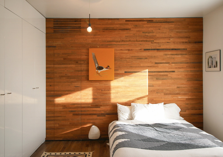
Wood lath also lines one of the bedroom walls and conceals the door to the bathroom. A blanket from The Joinery tops the bed, and a Noguchi table lamp sits on the floor.
5. Bedroom
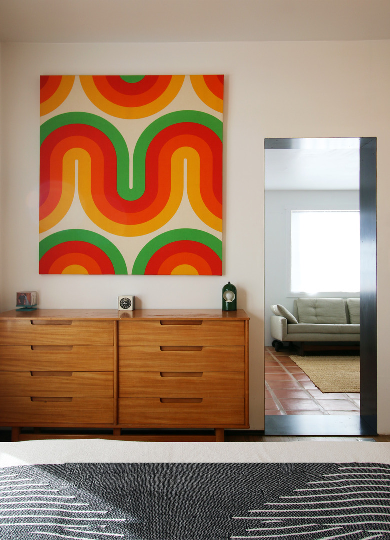
"I think it's important to work with the space of the home and to tell a story via color, textures, patterns, and forms that are full of beauty, inspiration, and soul," says Rush. "Choose pieces that will be timeless, as well as try to create a balance of old and new."
6. Bathroom
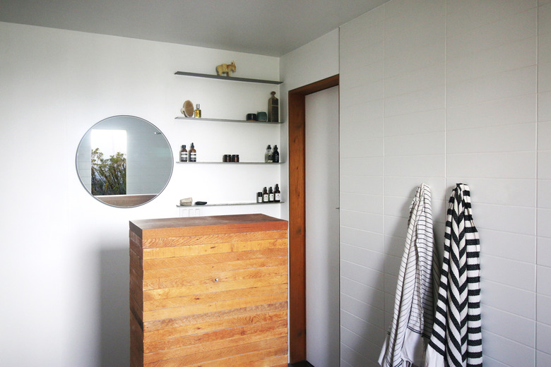
They kept the bathroom simple with streamlined steel shelving, white tile, and more wood lath, which covers a pedestal with a sink on the opposite side.
7. Bathroom
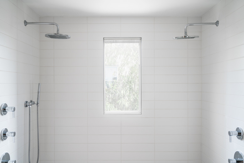
The double shower creates beautiful symmetry in the bathroom. They installed a steel window box on the exterior of the house to create more privacy.
8. Family Room
Treasures and books are displayed on custom steel shelving in the family room. They also added additional storage with IKEA cabinets outfitted with a custom wood top.
