Cheers! These Champagne-Colored Rooms Will Inspire You To Raise A Glass
Champagne is the epitome of elegance, and has been for centuries, since it became associated with royalty in the 17th century. The French sparkling wine is the go-to beverage for all things celebratory, and for good reason — it's an effervescent treat that pairs with everything from caviar to French fries. Perhaps drinking the apertif isn't an everyday occurrence, but champagne colors, named for their resemblance to the wine, can be incorporated into everyday designs.
These buttery and beige tones are luxurious in an understated way, just like the drink, and can be incorporated with paint.
1. Use it in any room.
1. Use it in any room.
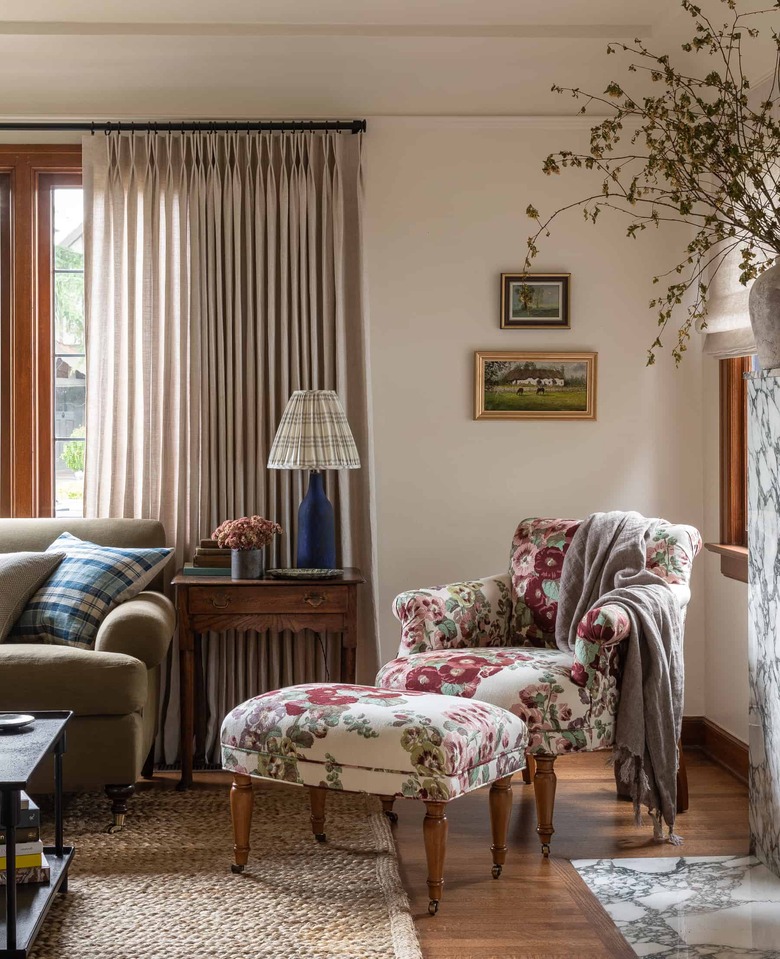
For an all-over warming effect, Heidi Caillier Design not only painted the walls of this living room a pale champagne color but also extended the comforting hue to the ceiling. All shades of neutral — taupe, sand, and olive — coordinate with the color, allowing for easy decorating. From the matching floor-length drapes to a not-your-grandma's floral chair and ottoman combo to a glam marble fireplace, this space proves everything goes with champagne.
Get the look: Benjamin Moore Sparkling Wine
2. Pair a champagne wall color with crisp white wainscoting.
2. Pair a champagne wall color with crisp white wainscoting.
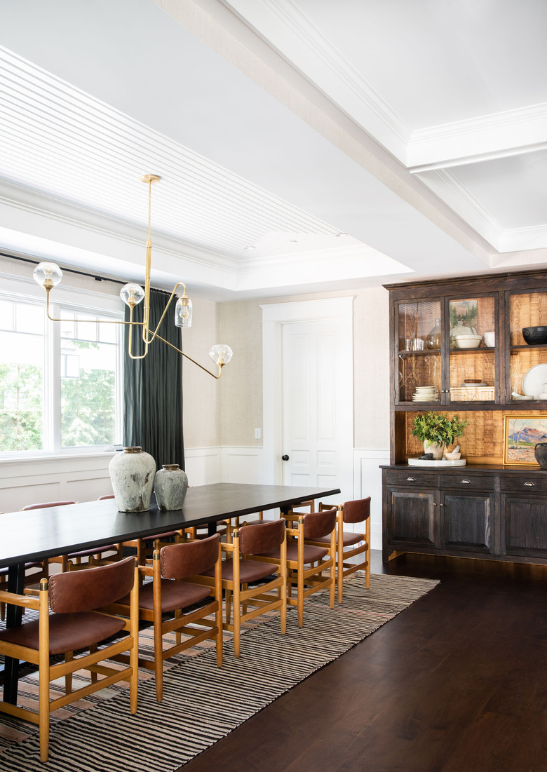
Dinner party, anyone? This dining room, designed by Amber Interiors, makes a lasting impression with refined leather chairs, an architectural light fixture, and a heavy-duty hutch. And all of those touches are anchored by an understated champagne wall color. Painting the wainscoting and ceiling a crisp white makes the walls pop even more.
Get the look: Benjamin Moore November Rain
3. Play up the versatility.
3. Play up the versatility.
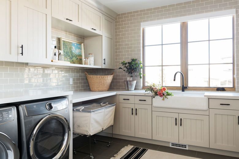
The color champagne can be just as nuanced as the sparkling wine, as proven by the enviable laundry room cabinets in this space from Studio McGee. A little gray, a little beige, with a hint of a yellow undertone and a dollop of white? Yep, that's champagne. We love how the white ceiling, taupe backsplash, and charcoal floor tiles highlight the various tones within the paint.
Get the look: Dunn-Edwards Champagne Bubbles
4. Use it in the kitchen.
4. Use it in the kitchen.
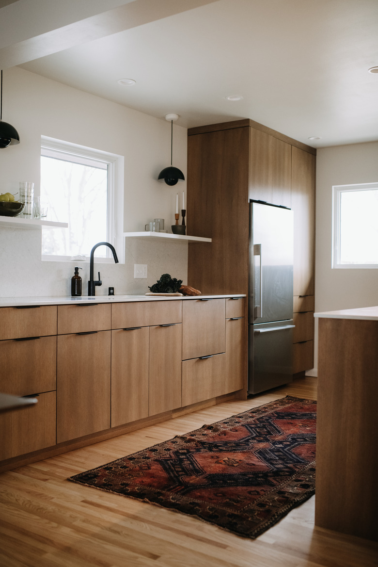
The only thing this super sleek kitchen is missing is two glasses of bubbly. Minneapolis-based Prospect Refuge Studio set the scene for a serene cooking space with a pale champagne paint color, while seamless flat-panel cabinetry and black light fixtures complete the midcentury look.
Get the look: Sherwin-Williams Alabaster
5. Choose a barely-there champagne color for a relaxing bedroom.
5. Choose a barely-there champagne color for a relaxing bedroom.
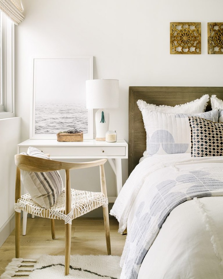
This champagne-colored space is light and airy just like the drink. The subtle yellow base of this wall has a lived-in look that pairs perfectly with the white frames, bedding, furniture, and Roman shades. Add an ocean view and voila! A perfect beachy bedroom.
Get the look: Farrow & Ball Clunch
6. Make guests feel welcome with a warm entryway.
6. Make guests feel welcome with a warm entryway.
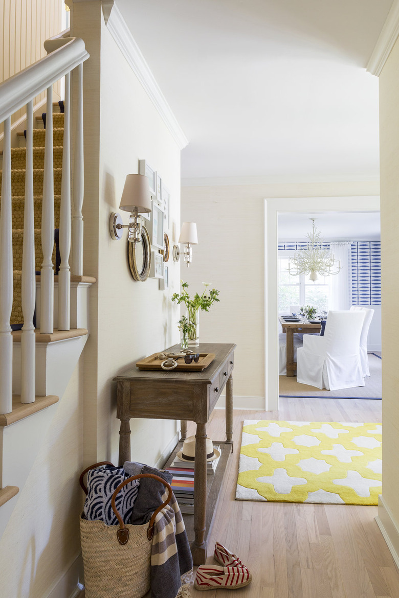
Chango & Co. went an ultra-traditional route with this entryway. The buttery champagne paint color can easily be extended to other areas of the home — it's a neutral you'll never tire of. The tone complements the yellow of the rug, the browns of the wood, and the crisp white of the dining room chairs, making it a no-brainer choice.
Get the look: Sherwin-Williams Champagne
7. Embrace a woodsy look for a zen office.
7. Embrace a woodsy look for a zen office.
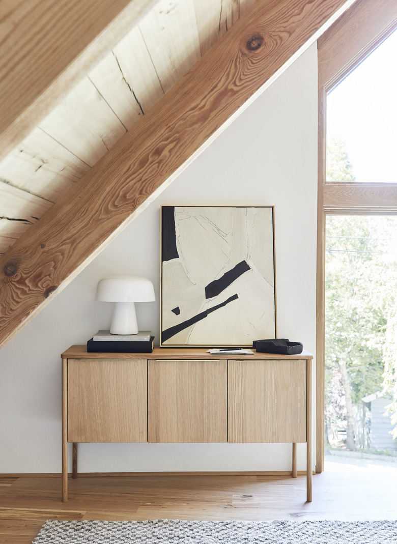
Emily Henderson's mountain home office is enviable for countless reasons, and the calming wood-on-wood look paired with a barely-there champagne wall color is one of them. The tone brings out the soft yellows of the wood features, from the floor to the pitched ceilings to the console. Pair with neutral art and decor, and you'll have yourself an office that's perfect for WFH.
Get the look: Farrow & Ball Wimborne White
