17 Gallery Wall Ideas From Instagram That Are Almost TOO Good
We may receive a commission on purchases made from links.
We'll let you in on a little secret: When it comes to gallery walls, there are NO rules. There's no mathematical formula that yields the perfect arrangement, and no one trick to getting the right balance. That said, gallery walls can feel daunting because A), there are a million different options to arranging your frames, and B) you really don't want to be putting holes in your wall and then changing your mind about what goes where. Looking for inspo or don't know where to start? We pulled these gorgeous ideas from Instagram, each a potential blueprint or direction to take for your gallery wall.
1. Round the corner.
1. Round the corner.
An unexpected way to work a gallery wall — especially in a small space — is to use the corner of the room as your palette.
2. Start at the top.
2. Start at the top.
There are two basic approaches to gallery wall arrangement: Either you've got a set assortment of art, or you have a collection to get you started, that you want continually add to. If you're in the latter camp, start your gallery wall at the top (or at one side) of the wall, giving you room to expand as you acquire new pieces.
3. Mix vintage vintage posters (or reproductions) with the new.
3. Mix vintage vintage posters (or reproductions) with the new.
We're a sucker for vintage art exhibition posters, especially midcentury ones. Try your luck scoring one by searching Etsy for "midcentury art exhibition poster." Then fill in with newer works for a fresh feel.
4. Go for a bold base.
4. Go for a bold base.
A punchy color — like this Pepto pink — can really up the wow factor of your arrangement.
5. Go all-in on theme.
5. Go all-in on theme.
Okay, so this space truly is a lewk, and maybe not the most realistic to achieve, but if you're starting in on your search for gallery wall decor, consider looking at the colors that are already in your room, or playing on pre-existing themes (like plants).
6. Start with a focal point.
6. Start with a focal point.
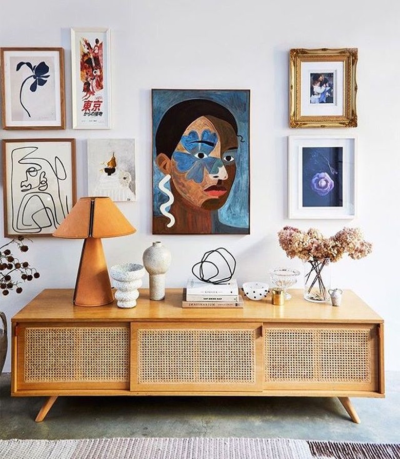
This photo offers two helpful tips: Either use the width of a piece of furniture (like a couch, media console, or sideboard) to act as a guideline for the spread of your arrangement, or use your largest piece of art as a center focal point, and build out from there.
7. Put it on a ledge.
7. Put it on a ledge.
You can stretch the definition of a gallery wall by grouping frames on a ledge. This approach gives you lots of freedom when it comes to rearranging/switching out art.
8. Head to the stairs.
8. Head to the stairs.
Not sure where to put your gallery wall? If you live in a two-story home, the staircase is a prime space.
9. Bring in texture and dimension.
9. Bring in texture and dimension.
Your gallery wall doesn't need to be ALL art. Try adding mirrors, plants, or sconces to round out your composition.
10. Add a shelf.
10. Add a shelf.
If you don't have enough art to fill up your space, consider installing a floating shelf you can top with plants, books, or other treasures.
11. You DON'T need to frame everything.
11. You DON'T need to frame everything.
Framing (especially professional framing), can add up quickly. Consider framing your most important items, and opting for budget options — like poster clips, or even colored tape — for the rest.
12. Go gallery wall-on-gallery wall.
12. Go gallery wall-on-gallery wall.
Why not embrace maximalism and add multiple gallery walls to a space? Like we said, there's no wrong move.
13. Stumped on layout? Work in a spiral.
13. Stumped on layout? Work in a spiral.
Here's a good image to follow if you really can't figure out your arrangement: Put one piece at the center and imagine the rest of your art making a spiral or star-like shape around the middle.
14. Make a mini-moment.
14. Make a mini-moment.
A gallery wall doesn't have to be a sweeping decor change — even small corners can benefit from clusters of wall objects. We love this Instagrammer's use of wooden spoons to create a very on-theme display in the kitchen.
15. Go neutral.
15. Go neutral.
If you're concerned about a gallery wall feeling like a hot mess, then try making a collage of prints that embraces more neutral hues. Stick to blacks, whites, tans, and dusty pinks/oranges.
16. Add antiques.
16. Add antiques.
A gallery wall is a prime opportunity to display treasures, like family heirlooms or antiques scored at flea markets. Of course, if your family left you bupkis or if you prefer to shop from home, there's always good old Etsy.
17. Stay similar on frames.
17. Stay similar on frames.
If you are seeking cohesion, try going sleek and simple on your frames — either opt for frames that are all the same, or stick to two basic colors, like black and white.
