From Sanatoriums To The 'Millennial Aesthetic,' Wellness Has Evolved With Design
We may receive a commission on purchases made from links.
These days, it's almost impossible to open a design magazine, browse a home goods store (in person or online!), or even walk into your own home without hearing about wellness — pandemic or no pandemic. But the truth is that for as long as the concepts of well-being and health have been around, they've been deeply intertwined with design and architecture, and have profoundly affected the way we live, decorate, and move through our homes, streets, public spaces, and beyond.
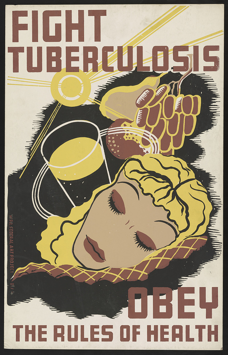
Most experts trace the current connections between health and home to the late 1800s, when diseases like tuberculosis were discovered to be contagious. Because of growing populations and the Industrial Revolution, cities across the United States and Europe often suffered from overcrowding, unsanitary conditions, and poor air quality — the perfect breeding grounds for infectious diseases. As a result, specific building types like model tenements for the urban poor and sanatoriums (or, if you want to be fancy, sanatoria, coming from the Latin word sanitorius, meaning "health-giving") for the infected wealthy emerged.
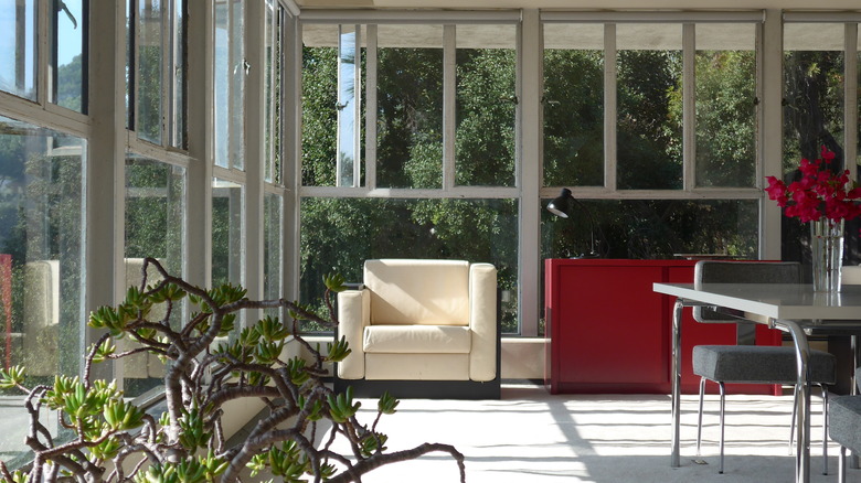
So what were these newly established building types like, and what were the physical characteristics that made a room, building, or even a whole city "healthy"? Doctors, designers, politicians, and planners alike believed that access to light, air, and greenery was the solution. "Sunlight was seen as an essential cure for diseases like tuberculosis," explains Lyra Kilston, author of the recent book Sun Seekers: The Cure of California. "A sun and fresh air 'cure' was often prescribed to patients as doctors believed that such elements would dry out wet lungs," she continues, so designs developed that incorporated terraces, balconies, large windows, and white, easy-to-clean surfaces like subway tile.
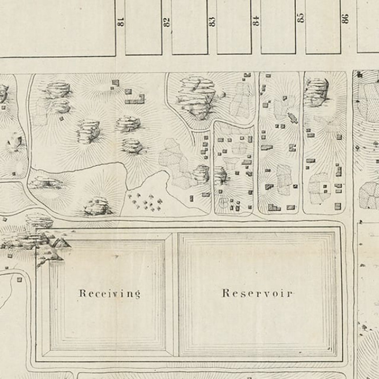
These design tenets and reforms also played out on an urban scale, as cities created new public spaces in the form of parks, playgrounds, and green spaces. But these developments and designs often came at a cost to poor, immigrant, and Black residents: New York City's beloved Central Park, for example, was intended to grant access to fresh air and green space to city dwellers, but it was located miles away from the city's poorest neighborhoods — where such improvements were much needed. What's more, its creation displaced the residents of Seneca Village, a thriving community of African American landowners. And it's important to remember that the definitions around "health" were largely determined by a group of upper-class, white males who often had little personal understanding of life beyond their immediate frame of reference.
After the turn of the twentieth century and into the 1920s and 1930s, the mantras about health and sun, wellness and fresh air continued — and evolved. With the rise of European Modernism, architects like Le Corbusier, Walter Gropius, Marcel Breuer, and Ludwig Mies van der Rohe emphasized functional, minimally adorned buildings whose clean lines emulated the cleanliness that was believed to promote good health.
But in contrast to the highly pragmatic, even clinical aesthetic of Modernism, others pursued a more humanistic strain of the style. Finnish architect Alvar Aalto, for example, designed a ground-breaking but still distinctly Modernist tuberculosis sanatorium at Paimio (1929-1933) that drew from its forest setting and prioritized the experience of patients and staff, with sinks that were specifically designed based on the motions of hand washing. The British journal Architectural Review called it "the most revolutionary hospital building erected within the last decade," and it's remained a significant touchpoint for the relationship between nature and design — so much so that it's still in use as a medical facility today and has been nominated as a UNESCO World Heritage Site.
Across the pond in the United States, though, Modernism and wellness lovers migrated to select parts of the country, Southern California in particular. "It was a prime location based on its low population, year-round sunshine, and arid climate," says Kilston, "and it drew thousands of 'health seekers' who in turn laid the foundation for California's reputation as a source of health and fitness fads."
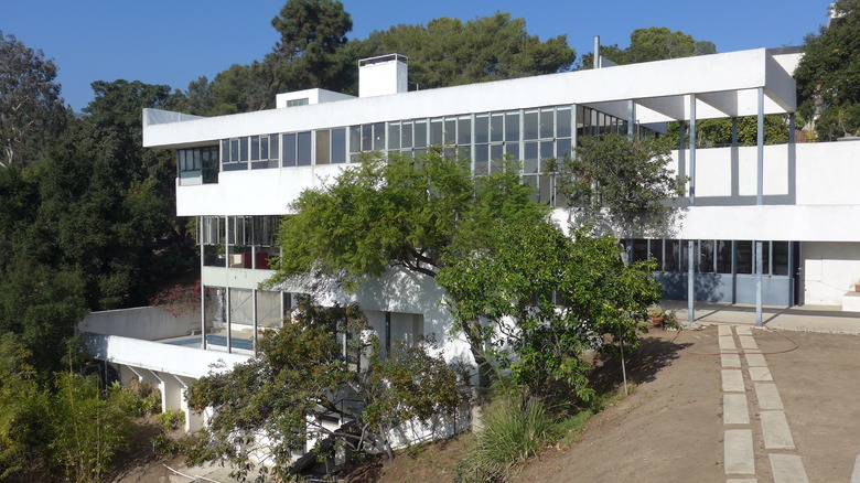
Among those heath seekers was none other than naturopath and author Dr. Philip Lovell, who moved to Los Angeles in the 1920s and hired an up-and-coming Modernist architect, Richard Neutra, to design a residence that embodied Lovell's progressive ideas about mental and physical health, exercise, and one's environment and diet. The resulting home, called the Lovell Health House (1927-1929) was dedicated to healthy living, with "broad spans of windows that allowed sunlight to fill as much of the interior as possible and operable panes opened the house to fresh air from every side," describes current resident Josh Gorrell, who is writing a book about it. Built into the hillside, the home's asymmetrical, boxy steel form and three levels ensured that residents would constantly be climbing stairs, and "each room had a sleeping porch for healthy, outdoor air to fill the lungs while sleeping," Gorrell explains.
The house not only put Neutra on the map, but it also put Modernism and its concerns about wellbeing at the forefront of the American design scene. The home was featured in MoMA's seminal 1932 exhibition on the International Style, and California continued to thrive during the 1940s and the postwar period as a hotbed for those in search of sun and Modernist design.
So why aren't we surrounded by thousands of copies of the Lovell Health House? Well, for one, its cost implications meant that it just wasn't a possibility for most Americans, most of whom couldn't (and still can't) afford expansive hillside homes filled with sunlight and sleeping porches, and access to vegetable gardens and specially designed kitchens. "Wealthier neighborhoods typically have more trees and green space to clean the air, while poorer areas often lack parks and access to healthy groceries," points out Kilston. "In addition," she adds, "poorer neighborhoods are sometimes built on or near industrial, polluting sites like factories or freeways," rendering some of the most fundamental elements of healthy living like clean water, unpolluted air, and walkable streets disproportionately inaccessible to poorer communities, including communities of color. The World Health Organization has urged urban planners and other designers to consider the ways that planning impacts human health, and the Center for Urban Design and Mental Health notes the many links between mental health and good urban planning.
Of course, the wellness category has evolved in many ways since the middle of the last century, in turn driving changes in the way it's manifested in our built environments. The popularization of non-western modalities like Chinese medicine, Ayurveda, Indigenous practices, and other traditions have driven us to consider wellness as a more holistic concept, encompassing the emotional, mental, and spiritual as well as the physical. Our interiors have changed in kind to reflect our fascination with these traditions — sometimes leading to problematic reductivism and appropriation in the home decor space, but also leading us to embrace a shift away from the impersonal aesthetics of the International Style, acknowledging the impacts of elements like color, scent, sound, and lighting on mental health, and how psychological well-being is connected to physical health.
Moreover, with the rise of the environmentally conscious consumer, we've begun to align a sense of our own, personal wellness with the broader health of the planet — leading us to embrace natural materials and environmentally conscious products and practices.
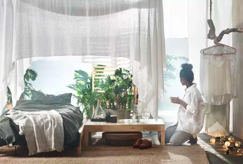
As wellness in the home has become big business, big businesses in the home space have responded. Major national and international retailers like IKEA and Walmart have picked up on this link between design and health and are bringing it to the masses, launching a wellness collection and a well shop, respectively.
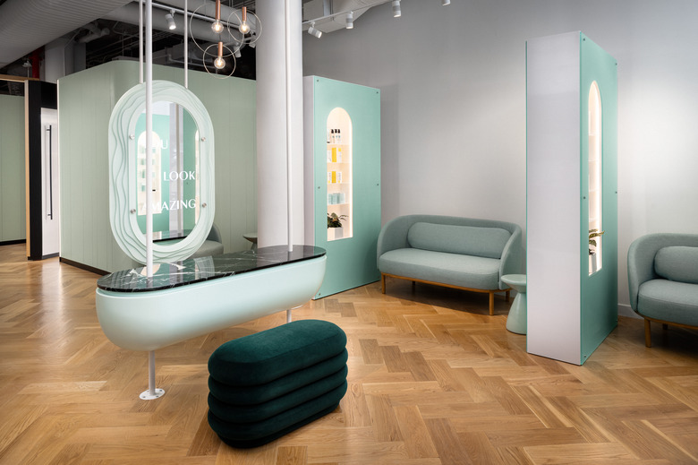
This desire to integrate our more contemporary notions of health into the spaces we inhabit is increasingly seen in spaces that are more explicitly focused on wellness, like fitness centers and spas. Kate Twist, co-founder of cosmetic dermatology service Ever/Body, says that their interiors were "created in contrast to the clinical, cold and analogue environment of the traditional doctor's office," and that spaces like treatment rooms were designed "not only [to] convey the strict medical safety standards we adhere to, but also to help our clients feel relaxed and at ease." This was done with a combination of natural materials (think warm, hardwood floors) and effective lighting, along with what Twist describes as "an abundance of plant life" and the use of green to "bring structure, warmth, and brightness."
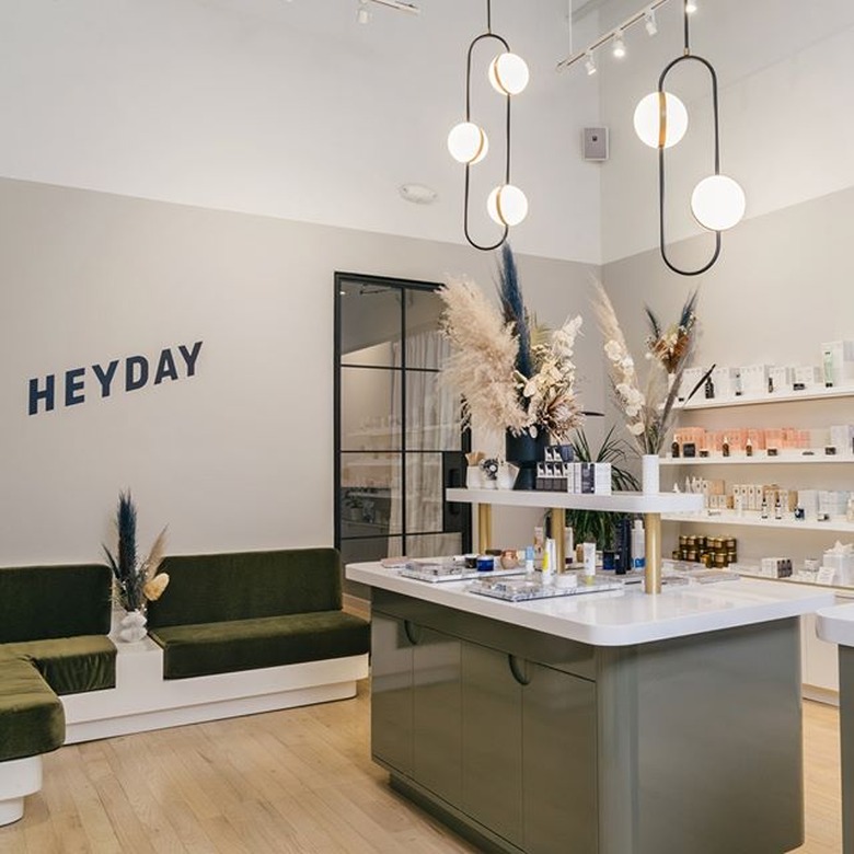
But has this interest in health and design gone too far? Or, maybe, in some cases, not nearly far enough, reducing the notion of wellness to a mere aesthetic? In the rise of the "millennial aesthetic," defined by writer Molly Fischer in an article on The Cut, we see a style that seamlessly enfolds wellness features and signifiers into any and all spaces, including, she jabs, "a place to do laundry that looks like a spa, a place to get therapy that looks like The Wing, a boutique newsstand that sells scented candles and has an app." Even apps focused on healthcare have picked up on the so-called "millennial style," like Tia, a membership-only female health care provider. If everything is about wellness, does wellness mean anything anymore?
One thing that hasn't changed much: Wellness is all too often defined by — and accessible to — wealthy white consumers, while Black and POC experts, consumers, and practitioners are all too often made to feel unwelcome or unrecognized in these spaces. It's perhaps not surprising that many of the "millennial" brands that have embraced the language and trappings of wellness have come under fire for exploiting, excluding, and/or tokenizing women of color.
"Many Black people and people of color have never walked into a space or clicked on a site that is explicitly designed to bring them joy," explains Naj Austin of Ethel's Club, a Brooklyn-based membership community created specifically for people of color. She found this to be even more of a problem when she started looking into the world of social clubs and other third spaces, and is seeking to flip the narrative with a new community that's a welcoming and healing place, bringing in Shannon Maldonado of Yowie to help make the digital and physical spaces a vibrant place for people of color.
Most recently, the pandemic has driven new developments in the dovetailing of wellness and interiors. Jamie Gold, a wellness design consultant and author of Wellness by Design: A Room-by-Room Guide to Optimizing Your Home for Health, Fitness and Happiness, has recently noticed "a heightened awareness of the value of outdoor living," and an appreciation for "the connection between daily life, relaxation and nature." And as people look to accomplish more at home, they're optimizing their spaces to accommodate wellness and fitness rituals, from healthy cooking to yoga to meditation nooks.
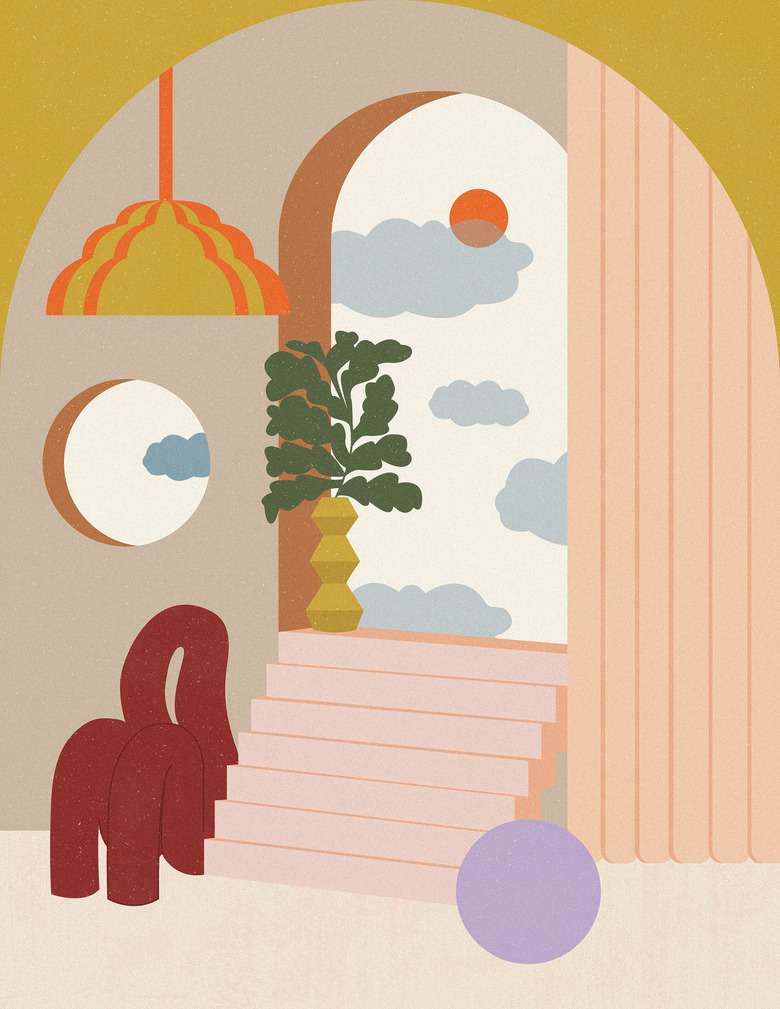
So what's next? Will the pastel colors, scented candles, oversized green leaves of the monstera plant, and terrazzo everything of the millennial aesthetic just be another trend, like so many before it? Almost certainly. But will the wellness trend with which it's associated go with it? History suggests not. Wellness design may feel like a trend, but one thing is clear: It's been around for a while. And it's not going anywhere.
