Nina Cho Is A Rising Design Star Interested In Negative Space And Collaboration
We may receive a commission on purchases made from links.
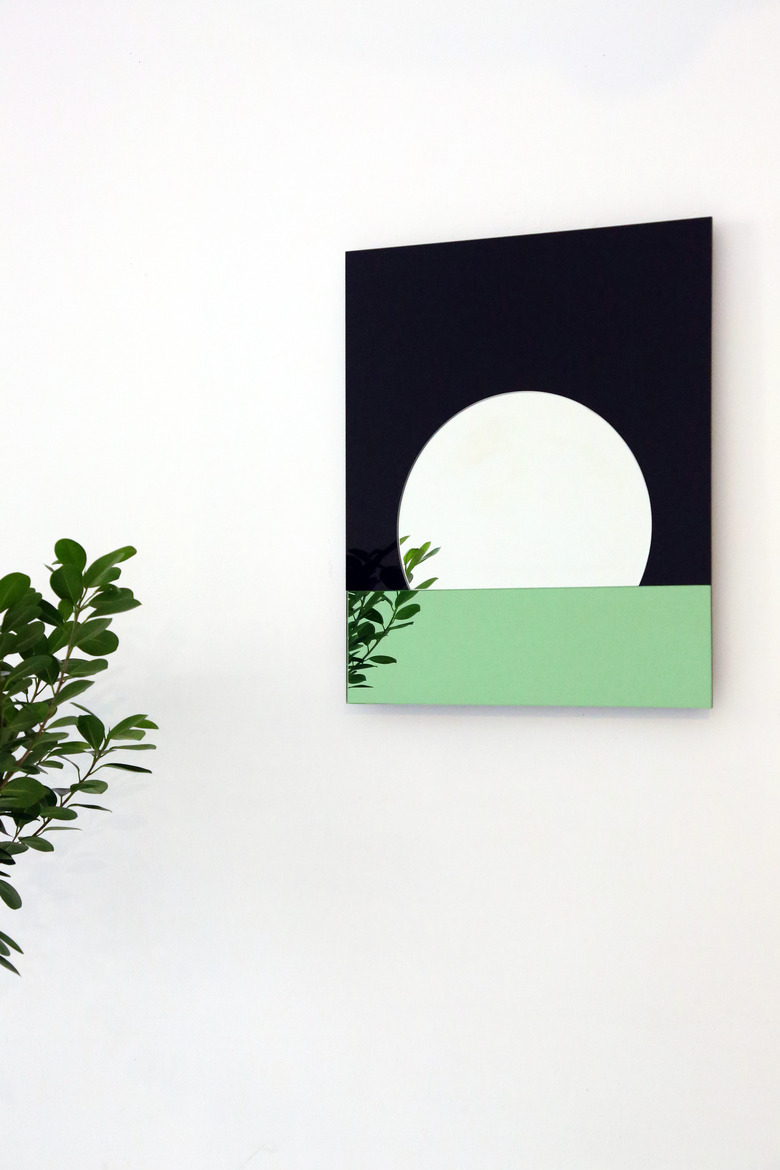
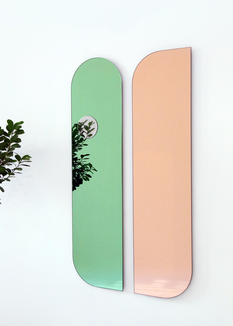
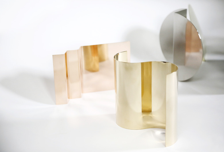
When you look in a mirror, do you quickly check your reflection or sometimes stop and wonder about the way the object even works? Detroit-based designer Nina Cho drew out the threads of how we interact with mirrors in her Maung Maung series, made up of mirrors that toe the line between design and art.
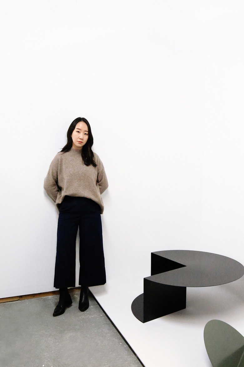
Cho delves into the nature of recognizable objects often, pushing the way that we perceive and interact with them. The designer bases much of her approach on the Korean aesthetic of emptiness and the void, making her pieces both aesthetically impressive and thought-provoking.
Her work has been grabbing the attention of design lovers and institutions alike. The Maung Maung mirrors received a 2020 NYCXDESIGN award in the accessories category; Cho was the recipient of the 6th Annual American Design Honors by WantedDesign in February. She is also featured in the forthcoming book Design in Asia: The New Wave, out October 13.
We spoke with Cho about her process, current projects, and where she finds inspiration.
Hunker: Oftentimes, modern design can seem cold or clinical but your work really merges the conceptual with the personal. How has this evolved since you started your practice?
Nina Cho: I didn't go through a conventional product design program. Both Hongik University and Cranbrook Academy of Art have a unique approach to the design process where I learned to have more freedom in forming my own way of working.
As an undergrad at Hongik University in Seoul, I studied woodworking and furniture design. It was an interdisciplinary study of both craft and design. I was encouraged to tell my own story and design unique furniture inspired by my identity. Through that I found an intrinsic value in furniture design. I practiced creating design as a way to talk about my thoughts. This practice led me to think profoundly about my intentions. At Cranbrook, I continued developing my own design process.
Hunker: It's really interesting to see how you share your drawings. It seems sketches are a way to explore concepts at a time when other parts of the production are on pause. Has this style of sketching changed the way you approach your design process?
NC: There are two different kinds of sketching in my practice. One is to visualize my idea thoroughly to communicate. The other is drawing to imagine further. This drawing can be more abstract and ambiguous ... I'm a bit of an analog person. I prefer pencil and paper over drawing on a tablet.
In other times, drawing helps me visualize what I'm poetically/conceptually imagining. It's a way to share what's inside of me, my feelings or thoughts to others. There were two drawings I did for my latest work, Maung Maung Mirrors. That drawing was to deliver my concept/statement about my work and show the story behind the object I made.
Hunker: In the past, you've talked about how the design world can do a lot more to support young designers. Have you seen any progress in this area?
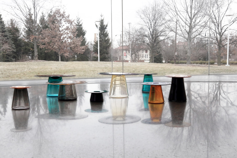
NC: From my personal experience, the answer is yes. I'm grateful for the opportunities I've had as a relatively young designer who's been in this field for five years ... I wouldn't have been able to make Layering Transparency without the residency I held at Toledo Museum of Art. They're famous for glass making. They financially and physically aided the project.
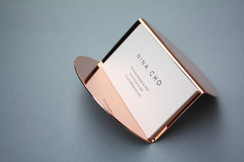
I'm also happy to work with Souda to see my Business Card Holder design being mass produced and distributed to the retail stores at an affordable price. I'm currently working with a local company on creating a new coffee table as well. They are investing in its production. This way of working helps me focus only on design and offers financial support to produce a new collection.
I would hope to see more established brands and manufacturers to create such opportunities. It could be licensing designs or collaborations. Without financial foundations, it's hard to keep up with creating new good design ... Merging the resources that a company has and fresh new perspectives from young talent can be mutually beneficial.
Hunker: What's on your drafting table or desk right now that helps you get into the mood of designing?
NC: A candle gifted by my friend Bud, and warm lemon balm tea.
Hunker: You've mentioned that you love reading biographies. Are there any recent ones you've read that you feel Hunker readers would find inspiration from?
NC: It's not a new book for me and I read this several times. It's called Designing Design by Japanese graphic designer Kenya Hara. I read this book in 2008 when I was in undergrad in the Woodworking and Furniture Design Department. Hara's approach to design was very fresh and unique to me at that time.
The project I was most impressed by in the book was using white cotton fabrics to design signage inside the hospital for pregnant women and children. Normally white fabrics become dirty easily, making them seem a poor choice in a place that prioritized cleanliness. Hara, however, saw this as a positive attribute in that by maintaining the white fabrics regularly, the hospital could showcase their commitment to good hygiene and support their ethos of health. I think it's a paradoxical way of thinking to find an answer, and definitely led to a creative solution.
Seeing Hara take his own distinctive approach to the design process helped influence me to do the same. I felt inspired to strengthen and embrace my unique way of design thinking.
Hunker: Tell me about the coffee table you're currently working on. What are you most excited about with this project?
NC: I believe, especially in these challenging times, collaboration and cooperation have never been more important to support each other. This new coffee table will be manufactured by the local company in Michigan called Object and Space. They're currently fabricating the prototype. There's a synergy effect when creativity and expertise support each other.
This new coffee table will be made out of wood, and has a sculptural yet simple form continuing my form exploration. The table has negative spaces created within the piece which can offer a space of storing/display to be utilized by its users. I'm planning on launching this fall.
